
This post is all about how to paint the illusion of detail. That is, how can we trick the eye into thinking there’s more going on than what’s actually there.
I’ll cover:
- What It Means and Why It’s Important
- Placing the Right Colors in the Right Spots
- Feature Details
- Small Bursts of Color, Light, or Dark Accents
- Palette Knife
- Broken Color
- Linework
- Key Takeaways
- Want to Learn More?
- Thanks for Reading!
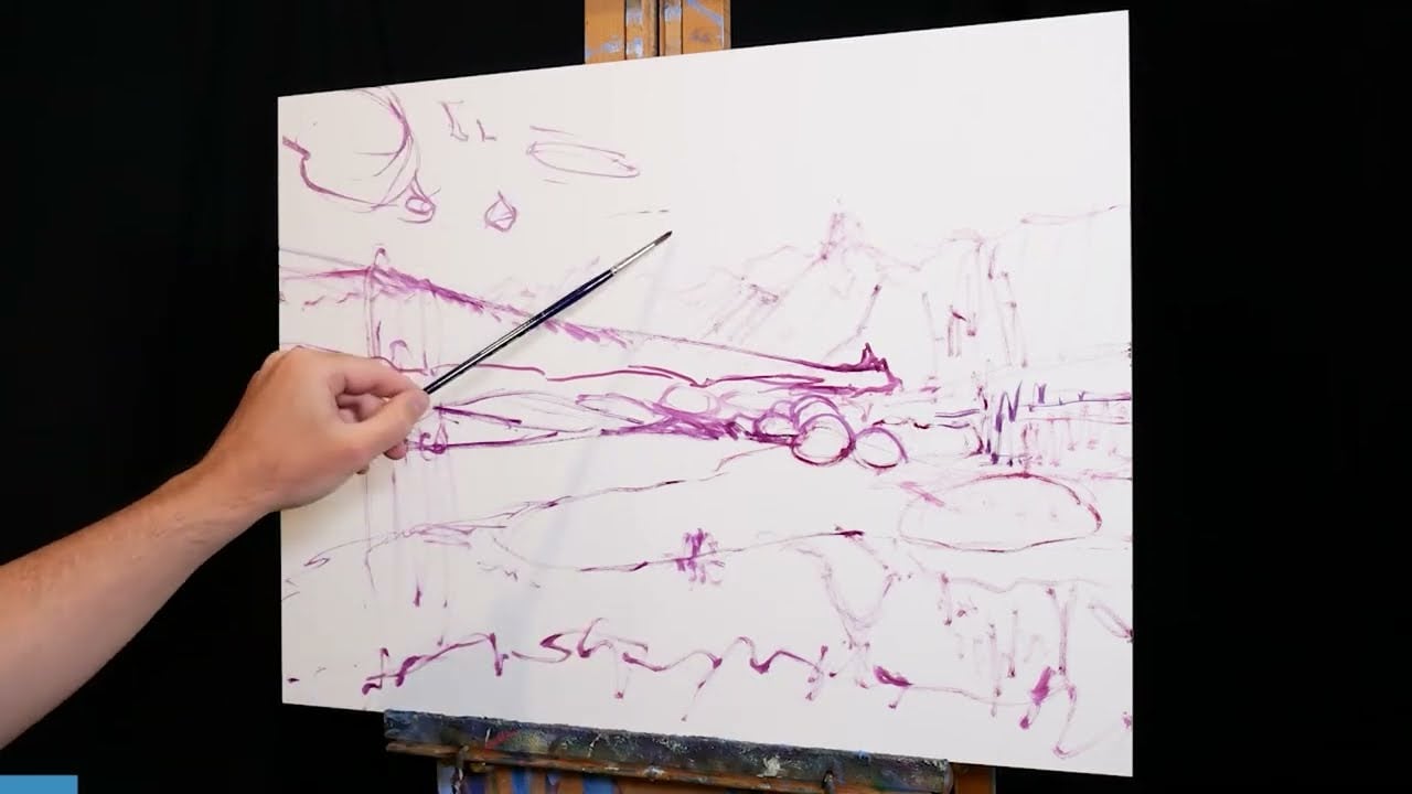
I’ll walk you through the entire process using one of my recent paintings. You’ll see how I go from idea all the way through to reflecting on the finished painting.

What It Means and Why It’s Important
First, let’s go over what exactly the illusion of detail means and why it’s important.
A common problem for aspiring artists is getting caught up in the details. They try to paint every leaf, branch, blade of grass, highlight, shadow, line, or shape. This ends up being overwhelming, not only for the artist but also for the viewers of the cluttered painting. Albert Pinkham Ryder sums it up nicely:
“The artist should fear to become the slave of detail… they should strive to express their thought and not the surface of it. What avails a storm cloud accurate in form and color if the storm is not therein?” Albert Pinkham Ryder

The illusion of detail combats this problem. It involves distilling all the “noise” and information down into the most basic elements, then painting those elements. It’s about getting more done with less. The Russian Impressionists do it well. I’m always amazed at how much information they can convey with a single stroke of their brush.
It’s a fun way to paint, but it’s not easy. Copying the subject is easy. Simplifying the subject and painting with fewer strokes is hard.
The rest of this post will focus on specific techniques for painting the illusion of detail. Keep in mind, the first step happens in your head. You need to simplify the “noise”. If you need help in this area, I have more details in my Painting Academy course.
Placing the Right Colors in the Right Spots
It’s amazing how all the pieces fall into place when you put the right colors in the right spots (I think Richard Schmid said something along these lines in one of his demonstrations). This alone can make it appear like there’s more going on than what’s actually there. The imagination ends up doing much of the work for you.
Take John Singer Sargent’s pleasant watercolor below. It’s a simple painting. A few dark shapes, light shapes, and thin washes of color. But there’s no mistaking it’s a landscape. Sargent didn’t need to paint the blades of grass, rocks, insects, leaves, or plants. Our imagination can take care of those details.

Sir Arthur Streeton also comes to mind. His work is relaxed and effortless as if he painted without a single hesitation. Yet it’s realistic. It puts you right there in the dry Australian landscape. It all comes down to his remarkable use of the fundamentals-value, color, line, and shape. This allowed him to be more relaxed with his brushwork and detail.
, 1924")
A good test to see if your fundamentals are accurate is a thumbnail test. Look at a thumbnail image of the painting on your computer or phone. Does it look realistic? If not, the fundamentals might be off.
I’ll show you what I mean. Below are thumbnails of three paintings. Notice how realistic they appear, despite us being unable to see any of the details up close. This suggests the fundamentals are on point.

The paintings are Claude Monet’s Camille Monet on a Bench in the Garden, Ivan Shishkin’s Oaks, and a landscape by Isaac Levitan (not sure of the name).
Feature Details
Feature details are small bursts of clarity, activity, and detail. A prominent rose in a bed of flowers, a deep contour of the water, an interesting pattern of dappled light, and the subject’s eyes in a portrait. They focus your attention and in doing so, draw attention away from other areas. This allows you to simplify the other areas without compromising the quality of realism.
This mimics the way we see the world. When we focus on something, the surroundings blur and soften. You can try it now. Focus on something in front of you. What do the surrounding objects look like? Probably nothing but vague color shapes.
The thing about painting is, that you get to decide what is in focus (and what is not). You control where the viewers should look.
I’m going to use Streeton again as an example. He often made clever use of feature details to direct your attention to important areas, allowing him to simplify the surroundings.
Below are photos of his Cremorne Pastoral I took at the New South Wales Art Gallery. Look at the grassy area in particular. Those intricate plants and flowers focus your attention. The rest is nothing more than simple colors and brushwork.

")
")
In the pointillist work below by Jan Toorop, look at the sky and sea. It’s nothing but light blue dots, a faint horizon line, and waves breaking at the shore. Those waves focus your attention and give context to the surrounding sky and sea. (If they are waves, then that must be the sea, and that must be the horizon line, and that must be the sky above.) Instead of painting every detail in the sky and sea, Toorop got the job done with just a few waves.

Small Bursts of Color, Light, or Dark Accents
This one is similar to feature details, but instead of using intricate detail to focus attention, simply use bursts of color, light, or dark accents. The Impressionists did this all the time. A small burst of yellow depicts a flow in a landscape. A dab of bright green for sun-lit leaves. A multicolored stroke of white, yellow, and orange for dappled light on the ground. These are simple details, often painted with a single dab of the brush. Yet they command attention and can make or break a painting.
Below is a painting by Konstantin Korovin. It’s a gloomy landscape. There’s a burst of color and light in the foreground. Dabs of red, yellow, and green suggest sun-lit plants and flowers. There’s also a burst of light in the sky just above the horizon line. These areas focus your attention and draw you through the painting.

In Claude Monet’s Impression, Sunrise, the burst of orange light and a few dark accents focus your attention. You might not notice how simple the rest of the painting is.

Here’s another example by Monet, The Poppy Field. It’s a simple landscape, with the scattered red poppies and dark accents commanding your attention.

Palette Knife
The palette knife has been my favorite tool lately. It’s perfect for scraping, scratching, impasto, multicolored strokes, and clean colors. All these techniques inject life into the painting without having to do much tedious work.
High-quality palette knives crafted with stainless blades and ergonomically designed handles.
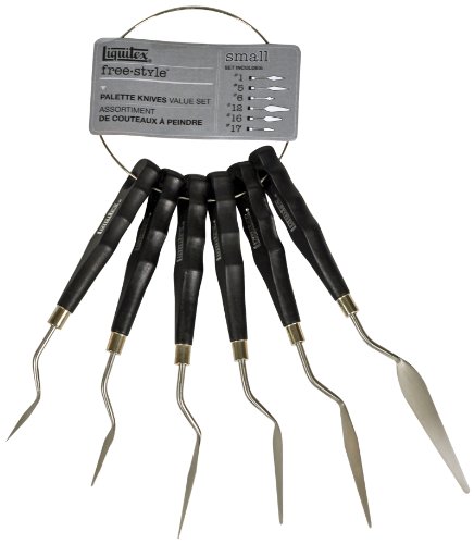
It’s a challenging tool to use effectively. Poorly done palette knife work can look careless and brash. The best palette knife painters weave a sense of dexterity and sophistication amongst the bold strokes. Tibor Nagy is a great example.
Below are a few of my recent works painted with mostly palette knives, starting with Dramatic Sunrise, Caloundra. Palette knives allowed me to capture the sunrise’s drama and broken color without laboring over every detail.

The more subtle counterpart below was a mix of brush and palette knife work. They worked well together. Brushes captured the subtle color transitions; palette knives captured the bursts of light and their reflections.

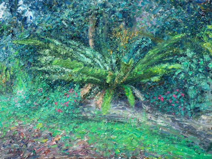
In Sierra Nevada (below), I used palette knives for crisp color transitions and impasto texture. The paint for the bushes at the bottom is particularly thick, suggesting closeness and depth.
Tip: Many readers struggle with the idea of atmospheric perspective. A simple tip is to start with thick texture, rich colors, and hard edges then gradually smooth, mute, and soften everything as it recedes.

Here’s a timelapse of the painting:
Broken Color
Broken color is perfect for nature. Open skies, mountains, clouds, fog, water, crashing waves. It allows you to distill all the information into a vibration of color on the canvas, without needing to paint every little detail. It also mimics nature’s untamed qualities.
Below is Joaquín Sorolla’s Elena Among the Roses. Look at the luscious broken color. Effortless realism.

Below is a more subtle example of broken color by Adolphe Joseph Thomas. Notice all the different yellow, blue, and gray tones. Broken color gives a sense of variance and depth, without compromising the structure and forms.

Linework
Lines are powerful. They focus and direct our attention. Our eyes like to follow them. A simple outline can transform shapes and colors into something much more.
Take the painting below by Johan Antonie de Jonge. What would it look like without the linework? Not much more than faint colors and shapes. The lines inject life and meaning into the painting. They transform the colors into people, boats, and movement.

Childe Hassam’s Peach Blossoms-Villiers-le-Bel features an interesting contrast between simple color shapes and intricate linework. The feature tree and its branches focus your attention, particularly with the subtle background. They also give context to the rest of the painting. They transform dabs of green and off-white into leaves and flowers.

Key Takeaways
- Painting the illusion of detail is about tricking the eye into thinking there’s more going on than what’s actually there.
- The first step to painting the illusion of detail: get everything else right first. Put the right colors in the right spots. Use the thumbnail test to see if your fundamentals are on point.
- Use feature details or bursts of color to focus attention on key areas and away from simplified areas. Check out Sir Arthur Streeton’s work for examples.
- The palette knife is perfect for capturing the illusion of detail. Scraping, scratching, impasto, multicolored strokes, clean colors. All these techniques inject life into the painting without having to do much tedious work.
- Broken color is perfect for nature. Open skies, mountains, clouds, fog, water, crashing waves. It distills all the information into a vibration of color.
- Lines are powerful. Use them to transform simple colors and shapes into something much more.
Want to Learn More?
You might be interested in my Painting Academy course. I’ll walk you through the time-tested fundamentals of painting. It’s perfect for absolute beginner to intermediate painters.
Thanks for Reading!
I appreciate you taking the time to read this post and I hope you found it helpful. Feel free to share it with friends.
Happy painting!
Dan Scott

Draw Paint Academy


Incredible lesson. Not a wasted word and the pictures were well chosen to illustrate the text. Thank you!
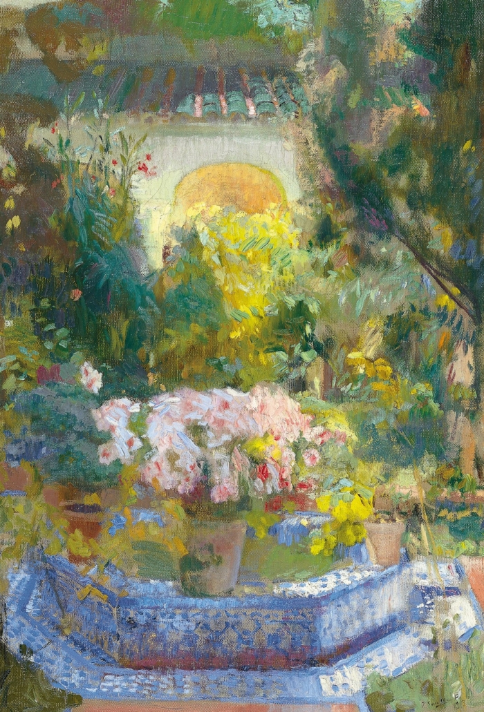
Beautiful job on painting your mother’s garden. When I first looked I thought it was a picture. Thank you for all you do to help us. I look forward to your email all the time.. You inspire me! Thank you
Thank You Dan! I love the concept of little details to catch the eye and leave the rest to the audience’s eyes. Your paintings are outstanding!
Inspiring! As I settle into retirement I am looking for a relaxing hobby and I am now pleased to try my hand at painting. Thank you!
One of the best article on illusion. Thanks
Thank you, Dan. You make me think and see my painting with fresh eyes and it is as if you are looking over my shoulder as you offer your gems. The quote from Ryder about Expressing the thought and not the surface of it, is challenging and liberating at the same time.
Thank you for a great article
VERY VERY good information; you are a good teacher. I like how you show wonderful examples with your teachings. Being a visual learner, it makes all the difference in world.
Tks Dan. Another great article . I love your Dramatic Sunrise at Caloundra. Tks so much for sharing your expertise & hard gained knowledge.
Dan, I find this article very practical and helpful. By featuring paintings, you show us what you’re saying! Thank-you!!
Thank you fir your tips on painting but I need to unsubscribe due to too many things in my inbox
Found the title of the Isaac Levitan piece, at least according to Artist Ninja: it’s just entitled “Landscape” or “Scenery” 😉
Anyway, neat breakdown of the process for adding detail without literally adding every detail. Thanks.
Thanks for your excellent instruction. I’m trying to get back into oil painting after 40 years of being away from it. Trying to avoid using too much detail in my painting. I will try your suggestions. Thanks.
Thank you. I do tend to get caught up in details, and it’s hard to loosen up. This has been very helpful!
Dan, you have given me a lot to think about. And to put to good use! In looking as some of my finished work, I actually did get a few of them right! But what astounds me is that those are my paintings that I feel the best about, like the most. That really shows me you are right!
Now.. I need to relax and do this, not get too obsessed with it!!
Thanks again!!
Karen
Hi Dan
I am from the UK and have learnt so much from your posts and courses. You simplify these techniques which make me want to try them. I have used several of your photo’s from your Gallery and I am beginning to simplify the subjects. Not their yet, but definitely improving thanks to you. Thank you so much.
Your “Dramatic Sunrise” really affected me. Thanks for posting. I’ve been struggling for years (eons) with artist’s block. Finally realized that dealing with this was as simple as getting paint onto palette and cup of water or linseed oil and then applying the brush to canvas. Also, the transition from drawing to painting was very difficult. I am finally “getting it.” Just noticed your drawpaintacademy a week ago. The articles are extremely helpful.
thanks you for tutorial, very helpfull.
Hello from Invermere, BC Canada
I absolutely enjoy your emails and your good advice. I am very detail oriented, retired emergency R.N.,,, you get it I am sure! So, for me, at the age of 75, this is quite exciting….I am even letting some of the dusting go!!
Cheers from a Canuk.
you’ve been watching Stuart Davies haven’t you?
But it doesn’t work with acrylics, only oil [mostly] . Acrylics dry too fast.
I tried it but only the sky came in well, the landscape just would not co-operate!
Thank you for the information and supporting pictures. It was very enlightening. Your Nevada picture was a beautiful illustration of how different colors work.
Good Morning Dan,
I TRULY love the colors and reflection in you Sunrise, and Sunset, Caloundra, 2020! Palette Knife for texture-I’m guessing. You give such INSIGHTFUL information.
Thank you and stay safe!
Great info that I had never thought about before; thank you so much! You have distilled the emotions invoked into a formula, if that makes sense?
I just finished a pastel painting and find that I can’t get high lights as the chalk is too thick and I need to use a different medium. What is compatible? I so very much appreciate your emails and “how too’s”
I have painted on and off since I was 12. Took five years of all art classes. I am getting back to painting at 84 after taking your free course and encouraging me to get going again. Thank you again for giving so much of yourself. I have shared your websites with many of my artist friends.
Thanks for this timely post! I remembered seeing some old masters’ very large paintings in a museum that seemed incredibly detailed until I looked closely; the painted gold jewelry really was just a few dabs of maybe two shades of yellow and bright white. I tried that today on a small gouache painting of a candy tin with gold accents. Was not quite as successful as some of those Dutch old masters, but…still learning! LOL
Getting mired in stultifying detail has been a huge problem for me. Thanks for addressing it. I think I will re-read this lesson quite a few times to absorb the possibilities you describe.
Another fantastic article. I love how you can distill key insights and illustrate them so effectively. You are a master teacher, Dan, and a wonderful artist. Thank you so much!
I love the text and information and the art history we get along the way. If only it were so easy as you make it sound. But they everyone would be a magical painter, eh?
Thank you Dan, very helpful and useful as usual.
Thank you Dan, so helpful, as are all your tutorials. The trickiest thing is to take your information and use it! I’m so much a perfectionist and detail orientated when painting. Learning to relax and let go of detail is not easy but your tutorial certainly gives some good pointers to help. Thanks for including examples with watercolour as that’s the medium I use.
Your dramatic Sunrise, Caloundra” and your “Sierra Nevada” paintings in particular are wonderful!
Thanks for the helpful reminders to paint with an overall focus on the theme, not the details.
I find this useful in both oil painting, as well as watcolours. Appreciate your thoughtful lessons,
Bodhi
Thank you Dan. This is so on point to the next painting I am preparing for of a river in the fall, that has shoreline river rock. I also reviewed your How to Paint, “Rocks & Cliffs” and “Realistic Water”. Thanks to you and am greatly improving and starting to have fun.
Excellent information. Your Sierra Nevada painting is beautiful and my favorite of yours so far.
Hello Dan,
I, for one, appreciate photorealism (Ralph Goings, David Eichenberg, Ester Curini, Elizabeth Patterson – to name just a few) But, I with to congratulate you on your Sierra Nevada painting which captures the landscape, local flora and ambient light remarkably well.
Cheers
So much useful information! It is much appreciated!
If only we could just paint with our minds, and not rely on our stupid hands. All the thinking does little to teach how to use the BRUSH. Why so fixated on the mind of painting and not the tools. “a single dab of the brush.” What does that mean?
I needed this today. Thank you!
This was extremely helpful. Thank you..
Interesting, I need to work on the issue of getting bogged down in details. I am not sure if any of these were in watercolor or acrylic which I work in. But there are transferable points for these mediums nevertheless. Thanks.
Thank you,
I am a beginner painter on my 8th ever painting. I can hardly wait to put some of the effects i have seen hear to work in my next effort.
Thank you, again
Dan, It’s most helpful when you beautifullly return to a difficult issue that was covered in your course. I’m easily overwhelmed with all the information so I find it crucial to zero in on the most important aspects for a successful painting experience. With the “helps” you send out it helps me to narrow down the essentials to a workable few and then fan out, as needed. Thank you from the heart.
Thank you so much! These tips are so useful, although pallet knife in my hands is still a poor tool… All the best, Dan!
Thank you Dan,
I really enjoyed your Palette Knife paintings as I love to use my palette knives when painting. I have done some abstract paintings and trees with the palette knives.
Thanks Dan for a great summary. I will definitely be saving this as a constant reminder👏👏
As always, your insights are awesome! I’m going to print this one out, underline key points and keep it next to my easel! Thank you for being so generous with your knowledge, skill, and reflections on art and the painting process.
Dan, this idea of a Pointalism carries a lot of weight for me just as new compositions and ideas. It’s not real Pointalism
but brush strokes that have a way of speaking its own language. The first washes as you and so many artist keep telling us, preps me for the mood of warms and cools. What happens later along the way colors the composition better than the whole thought process of trying to make things happen. Thanks, Dan
Thank you Dan
I found this very informative and helpful. I am returning to painting with soft pastels after being unable to paint for some time due to health issues. Your article gave me some handy tips.
So informative and helpful Dan. I think your pallet knife paintings are wonderful!!
Thanks for the great lesson. As a beginning artist, this info will really assist me in my art, all media.
Thank you Dan. Your article made me rethink all my work and how I can improve it.
Thank you Dan , I’m learning something new every time I receive your tutoring and I look forward to it. Merci
And thank YOU, Dan. As a portrait artist, I get caught up too much labouring in all the details, when maybe it should be the eyes looking at you and with some detail in the smile – and the flow of lines
Great series. Love knowing about other wonderful artists i never heard of.
I also enjoy painting absolute detail sometimes too. Like Kim Bells (USA or Canada, I forget which). Especially textures of rocks and trees.
Hi Dan,
Thank you so much for sending the tutorial! Your painting are beautiful! Sierra Nevada is exceptional from the sky to the water and foreground!
Ottimo articolo
Very informative and good examples.
Thank you
I really enjoy your regular posts & find them not only interesting but also very useful – thankyou😊
Thank you Dan for your generous teaching!
Hi Dan
Do you paint mainly in oil? I use act and watercolours and I’m struggling to get depth into my paintings. I love the idea of reducing the detail😀
Thank you so very much, Dan. I love to read your comments which are so full of insight. Your use of paintings to illustrate your ideas is spot on. Very enjoyable! Thank you!
Wonderful write up, very helpful with good examples for each point made.
Your articles and lessons have been so informative and I revisit them again and again!
Thanks Dan, This is such useful advice. I am going to read this a few times, and try and remember to simplify.
Thank you for your interesting articles !
This is a really helpful lesson with very good examples on how it works in practice .
With many thanks.
Thanks, Dan. I lived in Brisbane for many years so all your landscapes are familiar. I find your tutorials so instructive and the giving of your time so generous
At the moment I am recovering from recent major surgery so I am clinging on to inspiration and motivation to get me up and painting. Fingers crossed.
This is such a useful and formative lesson from you, many thanks. I I’ll be saving it into my Dan Scott folder for frequent reference!
Thank you, Dan for this info. I really like your Sierra Nevada painting too.
I will save this also- thank you ! I love your Sierra painting 🖼
This tutorial was immensely helpful and I truly appreciate it! The explanation of how this was accomplished in the examples shown, made things very clear and the lesson memorable.
Thank you !!
Love these articles thank you so much
Maureen