
Broken color in art refers to the technique of building up layers of different colors on the canvas in a way which allows lower layers to be exposed. This usually involves painting with small dabs of color until the canvas is filled. The end result can appear like a vibration of color, as your eyes jump between all the different colors.
The idea is to utilize optical color mixing, which refers to the way our eyes will optically mix two distinct colors which are closely intertwined.
The technique was commonly used by the Impressionists. It allowed them to quickly fill the canvas with color and capture the fleeting nature of light.
Master artist Nicolai Fechin describes the use of broken color in the following quote:
“To avoid murky results, it is necessary to learn how to use the three basic colors and to apply them, layer upon layer, in such a way that the underlying color shows through the next application. For instance, one can use blue paint, apply over it some red in such a manner that the blue and the red are seen simultaneously and thus produce the impression of a violet vibration. If, in the same careful manner, one puts upon his first combination a yellow color, a complete harmonization is reached – the colors are not mixed, but built one upon the other, retaining the full intensity of their vibrations.”
In this post, I’ll cover:
- Demonstration of Optical Color Mixing
- When to Use Broken Color
- Examples of Broken Color in Art
- Want to Learn More?
- Thanks for Reading!
Demonstration of Optical Color Mixing
Have a look at these yellow and blue circles. The colors are clearly identifiable as yellow and blue on top of a white background.

But watch what happens when I make these circles much smaller. The colors are optically mixing and we can now see green.

This effect gets even more dramatic the smaller I make the circles. The square below now appears to be just a solid green color. But it is comprised of the same blue and yellow circles.

When to Use Broken Color
Here are some common times to use the broken color technique:
- To create the illusion of numbers when painting grass, sand, rocks, cliffs, etc;
- To paint the dense leaves on a tree;
- To paint choppy and turbulent water, or the reflections on still water;
- To paint wispy clouds in the sky; or
- To paint the rough texture of a wall, path or other rigid structures.
Examples of Broken Color in Art
When I think of broken color, Claude Monet is the first artist who comes to mind. In his painting below, if you look closely you can see all the different colors he utilized – purples, yellows, reds, oranges and blues.
, 1891")
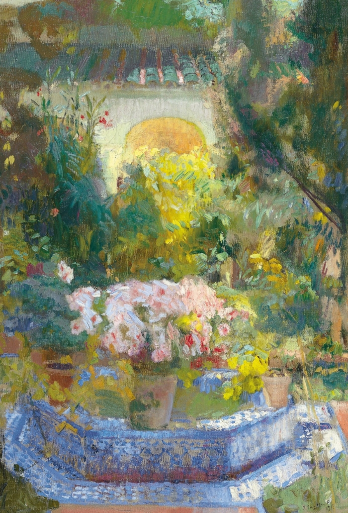
Below is another painting by Monet. Notice all the blues, greens, yellows and grays used for the choppy water. Also notice the light yellows, oranges, blues and greens used to paint the texture of the arch.

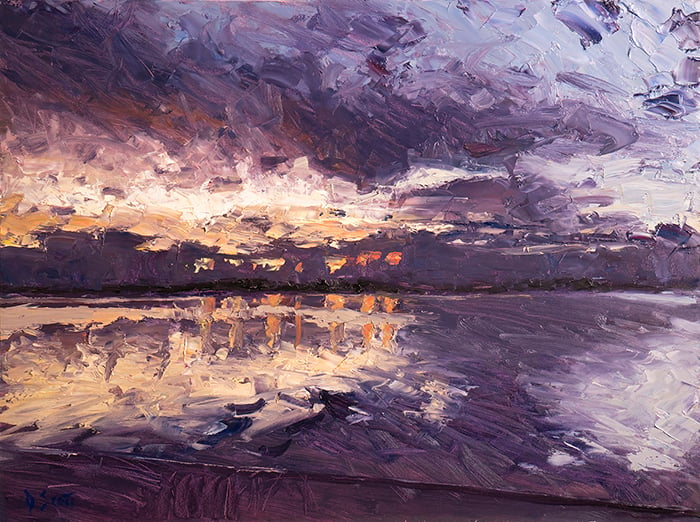
Below is a stunning example by Childe Hassam of using broken color to paint sunset reflections on still water.

Vincent van Gogh used broken color in many of his paintings. In the painting below, notice all the different yellows and greens used for the grass. On a separate point, also notice the directional brushwork used to lead you around the painting.

In Pierre-Auguste Renoir’s painting below, broken color is used to paint the choppy reflections in the water. This contrasts against the more solid color used in the rest of the painting.

Below is a stunning example of the pointillism, which involves placing small dabs of various colors until the canvas is filled with broken color.

Want to Learn More?
You might be interested in my Painting Academy course. I’ll walk you through the time-tested fundamentals of painting. It’s perfect for absolute beginner to intermediate painters.
Thanks for Reading!
I appreciate you taking the time to read this post and I hope you found it helpful. Feel free to share it with friends.
Happy painting!
Dan Scott

Draw Paint Academy


I’m new to painting and never heard of “broken Painting” until I read this. It is quite interesting. I may give it a try.
Thanks for enlightening me.
So interesting and helpful! Thanks so much especially for the insight that even the greats sometimes missed it!
Thankyou Dan, I continue to learn so much from you.
Thank-you, Dan. Wonderful explanations as always. They are the practical studio applications of art history and its theory.
I’ve learnt a lot with your lessons. Thank you!
Love this article. I am a big fan of Renoir and have been for years. I find the differences in his portraits might correspond with the year painted. As a senior returning to art, I know the impact age has on vision. Too bad cataract intervention is fairly new to those needing it. it could have had a profound impact on some painter’s longevity, style, careers Looks like age could have impacted Renoir this way still love his works
It feels so healthy and refreshing to dive into the world of idea and principles without having to watch movie clips with all those artificial voice controls, almost desperate gestures sometimes, that urge to make a show ouy of everything.And yes, your simple, direct and allcovering explanation style,with all those examples …so, my largest and deepest gratitude.
You have the best information. It’s very helpful. Thanks for all your effort.
Thank you so much, I’m learning a lot.
It was quite informative reading about broken colour technique and how great masters used it in their works. My question is it is good to know about different techniques. Every great artist had/has his/her signature style. For a budding artist what you suggest , should they work on developing their own style by experimenting on the techniques or should they first study the styles and techniques of great artists to get an overview and then come out with something of their own?
Thank you Dan.
Whew—I’m learning a LOT! I’ve been drawing and “colouring” since young—as an old senior I’ve painted without having any idea what I was doing, just “dabbing” a lot and almost by accident making a few appealing scenes — had no idea of the basic terms nor “focusing”, how to use color even how to use brushes. I’ve chosen my first scene to try to apply your super information. The extreme forward color will be a challenge to allow a background scene to shine. Thanks for all the help–wish me luck!