
In this post, you will learn fundamental tips for painting leaves. I cover:
- Simplify Down to the Basic Elements
- Use Broken Color
- Identify the Darkest Darks and Lightest Lights
- Save Highlights for Last and Don’t Overdo Them!
- Be Careful With Color Saturation
- Take Advantage of Negative Space
- Build up a Sense of Movement
- Want to Learn More?
- Thanks for Reading!
Many painters seem to get caught up in all the intricate details when painting leaves. They use a small brush to painstakingly depict every single leaf on a tree. But, despite the effort, the end result often looks overworked and tedious.
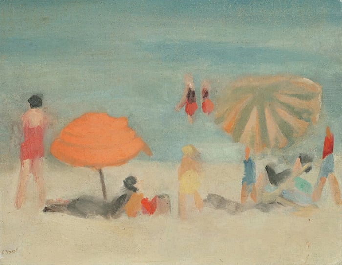
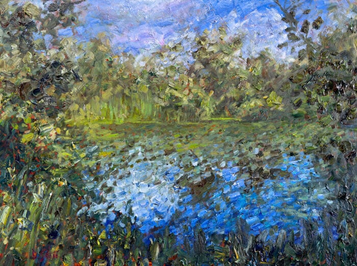
These tips will help you take a more efficient approach to paint leaves. Throughout this post, I will use the following painting as an example. It depicts the stunning landscape at Queenstown, New Zealand after I finished walking the Routeburn track.

I’ll walk you through the entire process using one of my recent paintings. You’ll see how I go from idea all the way through to reflecting on the finished painting.

Simplify Down to the Basic Elements
One of the most challenging aspects of painting leaves is simplifying all the “noise” down to the basic artistic elements (shapes, colors, lines, edges, etc). In the reference photo which I painted from (below) you are confronted with countless shapes, colors and lines.

Below is a rough outline of the basic shapes which I can see in the leaves. These basic shapes help me pinpoint where and how to start; they give me the foundation to build the rest of the painting on.

After simplifying the leaves down to basic elements (which I briefly do in my head before picking up my brush) I apply my ideas to the canvas. Below is the result after the initial block-in.

Use Broken Color
Broken color refers to the technique of using small dabs of distinct color to render form. It is highly effective for painting leaves, as it allows you to easily and efficiently capture all the different colors as they appear in nature.
On my trip to New Zealand, the colors were out in force; rich yellows, greens and oranges filled the landscape. The big idea for my painting was to try and faithfully capture some of those beautiful colors.
My strategy was to apply a general wash of color, then go over the top with small dabs of distinct yellows and greens (broken color) until the trees came to life.

Note: The broken color technique does not involve carelessly placing dabs of color all over the place. Every dab of color should add value to the overall form of the subject. But of course, there will invariably be a sacrifice in intricate detail, brushwork and edges.
Identify the Darkest Darks and Lightest Lights
If you are struggling with simplifying the leaves down to the basic elements, then start by identifying two of the most important reference points – the darkest darks and lightest lights.
For the Queenstown scene, the darkest leaves are on the left in the background. The lightest lights are scattered throughout the leaves, but there are some light clusters here and there. Below is the scene in grayscale so you can see the darkest darks, lightest lights and all the other values.

Save Highlights for Last and Don’t Overdo Them!
Highlights can really make or break your painting. Be patient and save them for last, after you have painted in all the shapes and mid-tones.
Also, make sure you don’t overdo the highlights. At most, they should be strong accents. They should not start taking over the mid-tones. Highlights are more powerful when used sparingly.
Tip: Many artists default to pure titanium white every time they need to add a highlight. But, most of the time, pure titanium white will look out of place in your painting. Instead, consider using light versions of other colors (light greens, yellows, oranges, etc).
Be Careful With Color Saturation
You will rarely see vivid or highly saturated colors in nature. Most of the time, you will see toned-down versions of colors. All those rich greens, yellows and blues you see in nature are far from vivid colors.
Even for painting the colorful New Zealand landscape, I had to significantly tone-down all the colors I used. If I had used any vivid colors straight from the tube, it would look jarring and out of place.
To show what I mean, I placed a vivid green and vivid yellow shape over the photo below. Observe how dull the yellows and greens of the leaves are by comparison. This example may seem slightly dramatic, but it demonstrates my point.

Take Advantage of Negative Space
Negative space refers to the space that surrounds an object; space that the object takes up is positive space.
People tend to only focus on the positive space (the object itself) rather than the negative space (the space around the object). They focus on painting all the leaves on a tree (positive space) but ignore the exposed blue sky between the gaps in the leaves (negative space).
In my Queenstown painting, the small dabs of blue to indicate gaps in the leaves are just as important, if not more, than the leaves themselves. Those dabs of blue provide essential information about the trees; where they are positioned, how dense the leaves are, what is behind the trees, how high the land is in the background, etc.
The following numbers and corresponding notes give you an idea of what the negative space tells us.

- Just a few dabs of blue indicate there is some exposed sky behind this area.
- There are more dabs of blue around this area, suggesting the leaves are less dense and that there is exposed sky behind.
- There are dabs of both light blues and light purples. This tells us where the distant mountain stops and the sky starts. The blue is also a touch lighter than the blue at the top of the painting, which helps provide a sense of depth.
- This area is fairly complex and a strong feature of the painting. The considerable amount of negative space indicates that the leaves are not that dense and that there are no overlapping trees.
- This area marks the end of the tree line. The yellow leaves and blue sky are interlaced at the transition.
- This is an interesting area where negative space actually becomes the main focus.
Build up a Sense of Movement
If you want to add a level of complexity to your painting, then try to capture a sense of movement in the leaves. Ask yourself:
- What paths do your eyes follow?
- How are all the leaves connected?
- Which way is the wind blowing, if at all?
You don’t need to make it obvious. In fact, subtle is usually more effective.
Below, I indicate the general movement captured by my brushstrokes.

Want to Learn More?
You might be interested in my Painting Academy course. I’ll walk you through the time-tested fundamentals of painting. It’s perfect for absolute beginner to intermediate painters.
Thanks for Reading!
I appreciate you taking the time to read this post and I hope you found it helpful. Feel free to share it with friends.
Happy painting!
Dan Scott

Draw Paint Academy

this really helpful and thoroughly informative. Thanks so much for yu insight and help.
Boy did I need this! (Years ago 😅) I love reading your posts. They are down to earth, with important information made understandable. Especially with your use of illustrations. Thank you.
I try to read all of your writings this year. Don’t guess they get old. Your drawing on the drawings help so. I new what negative space was, the sky and around objects, but it seems I forgot to look in the trees. Thank a lot Dan.
Chuck
This is the most articulate ,articulate , detailed instructive article which explain and step, by step demostrats of how to paint leaves . acually these procedure , especailly about Positivr and negative effects, could be applayed to all subjects.
I usually paint intutively with abstract , and enjoy playing with colores. I like to learn about color
relations and effecs. I would like to register in your painting schoo. Because you are a generous and competent and very patient teacher. thank you very much.
Thank you Dan. That certainly has helped me when it comes to leaves. Really enjoyed reading this.
Thanks for posting. This gives me new insight into painting trees and leaves. I hope to see more about landscapes.
Thank you Dan. This is just the advice I needed. Absolutely love your paintings, especially because the colours are gorgeous and believable and the style is loose.
Enjoy these insights and I follow them faithfully. You are so generous with your knowledge in a great way. Definitely a talented teacher. Thank you.
Dan, thanks for the lesson! I am a pensioner, I live in Kazan, working with oil is my hobby. Your lesson has completed and streamlined my knowledge, especially about negative pop viewing. I really liked that the theory is accompanied by a demonstration of pictures, everything is very clear. Thank you!
Thanks for your expert advice. I have only done one scene with landscape and animals. It is much more work and time consuming. But I want to get better at landscapes, trees and live animals and people which are a challenge.
This is very helpful thank you for explaining so effectively
Fantastic lesson.
Thanks for simplifying the basic masses of color.
Thankyou for sharing your knowledge, I am finding your tips so useful
Ruth
It is really very fine tips..most useful. Thanks
Thanks Dan that was a very very helpful lesson! I love painting landscapes so this especially has been helpful.
Regards Ingrid Repetti.
I know that beach. It is the main beach in front of the town. Down to the very left is a huge and very amazing old bent tree. Thanks for the interesting tutorial. I lived in NZ for 12 yrs.
Thank you very much! A lot of valuable information!
Excellent discussion. I learned so much. Thank you for sharing.
Thanks Dan. I am so happy with the course and all these extra. Glad I found your school. You are very generous with your insights.
In an abstract work I do not paint leaves, but I paint color. Color in color. This is true?
Thank you Thank you the lack of blue was what I need most. I tend to overdo my trees.
At last I know where to start. I thought I knew how to SEE. Thankyou for taking off the blinders.
Cynthia
Thank you so much for this very helpful lesson. I tend to get caught up in details and “overwork” things.
Absolutely brilliantly out together!! Thank you.
Well timed here as I am about to attempt a streetscape with a couple of trees in the painting.
The advice you give here is really good. Now I just need to follow it….
I lived in Arrowtown for several years, (39yrs ago), just down the road from Queenstown. Lovely spot.
Thank you again for all the inspiration!
Kind Regards Dianne in St Helens.
This almost makes it too easy. Love it. Thanks:)
Thanks Dan, enjoyed this informative article.
Hi Dan,
I started to read your several post recently. But I learn a lot from them. Thanks so much for sharing the knowledge.
Regards
Tessa
Simply many many thanks Dan — Ann Ussishkin
This article and your Rocks and Cliffs post have been life savers for me. I painted years ago and am starting to get serious about it now that I am retired. I have lost my knowledge and am so grateful to you for helping me relearn so many things!
Hi Dan, Thanks for the tips . You have certainly started me on a pathway that I’m thoroughly enjoying. Your painting course is great. Discovered when I look at trees I look for depth or what’s hidden. I think it comes from my counselling experience because I’m always looking for what’s not obvious. Playing around with gradients of colour and experimenting so important. As well as taking notes and then exploring what I’ve learnt and what requires more work.
Dan, I wish I’d seen this before doing my latest painting, although I was aware of overworking the trees and bushes because of taking your courses. What I especially liked about this lesson on leaves was the lines drawn for capturing the areas and shapes, as well as the lines drawn to show movement. I’m learning so much from you. Thanks for sharing your knowledge.
Thank you so much for sharing this!
Very helpful!!!!!
Thank you so much for your lesson, I have learned so much from your articles! Really appreciated.
This is exactly what I needed to learn! Thank you so much for a great tutorial
Very interesting and easy to apply!
Thanks for sharing!
Kind regards
Elmien
Hi, Dan:
I, too, enjoyed reading this informative post. Did you do an underpainting first? What were your colors for the various areas?
Thanks!!
Hi Anita
Yes I did a rough underpainting which was basically just blocking in the color shapes. I used yellow ochre, cadmium yellow, viridian green, cadmium red, ultramarine blue, cobalt blue and titanium white.
Thanks!
Dan
Hi Dan,
Thank you again for your wonderful help. I signed up last year for your painting academy but have been sidelined with some health issues. I am going to start my painting efforts again and will be checking in with your lessons in the painting academy. I look forward to learning and expressing myself on canvas. Thanks again.
Sounds good Keran, you have lifetime access so the information will be there available when you are ready to get stuck into it! Thanks, Dan
Just as i’m wondering how to begin painting leaves in something i’m working on now, this post arrived! I couldn’t believe it! Thank you!! So helpful!
Hi Dan,
Once again another post for my archive. I enjoyed it immensely and learned a lot. Thank you for your hard work! I hadn’t appreciated how important the negative space is. So very helpful indeed.
Thank you so much
Allyson
Hello Dan,
I just want to thank you for your blog! I absolutely love reading it and have learned a big deal since I started reading. You make easy to see your point and are helping us to improve our painting.
Thank you so much Dan. This is very helpful for me. Sometimes I just do a practice on canvas paper of trees, or rocks….I think I will try that exercise again after reading this. So much to learn! It’s a process!!!
It is really helpful!
I find myself improved my painting from all aspects after reading Dan Scott’s ebook and post.
Hi Vanessa. Dont forget that with watercolour you work light to dark. Dan’s process would still apply in that you would look for shapes and values. But you build with different value washes. Leave highlights at the beginning and add darks at the end.
Thanks for adding that Lyn! Dan
Thanks Dan,
Very informative as usual. You make sound all to simple.
I guess a little bit of talent helps also.
I love trees (who doesn’t ?) so this one really appeals to me.
Thanks ,Dave M (AUSTRALIA)
Hi Dan,I always learn something from what you post,much
appreciated that you take the time to share your knowledge
with others.
Many thanks,Judy
One of the best art instructions I have come across. I am a retired person living in Srilankan and have taken up acrylic painting as a hobby. Your instructions have helped me so much. Can you have an article on how to paint water lilies and water bodies specially the reflections. Thanks once again for the most valuable detailed lessons.
Thanks Janaki. I will look at doing a post on this soon! Dan
You’ll never know how much I appreciate your email lessons! This is an important one for me–I tend to get too much into detail even when I don’t want to. I think it must be practiced to be able to free up one’s painting. Thanks again!
I have just faced the leaves dilemma in painting autumn trees round Lake Taupo. What you state in your advice is so apt. I found looking at them as shapes with value variations worked for me.
Very good lesson in painting trees! Probably the most important thing is to see the tree shapes and forms as you have demonstrated. That I believe is the KEY. I sort of paint as you have except that I could not explain how or why to paint in these ‘steps’ as you have shown very clearly.
Evergreen trees give me the most trouble where I sometimes make them too dense. Hope you will show how to paint these in your landscape course.
Thank you. Love this
You gave a lot of information. Straight forward, easy to understand and mist important if all…REMEMBER. You are a gifted teacher. Thank you.
Thank you. I get caught up in tremendous detail and quit. Appreciate the help.
Thank you, that was so helpful at so many levels. I can hardly wait to try it out.
Dan u r cool.
Thanks Dan…keep it simple! Good to remember the values. Love your work.
Gratitude for your time, passion, knowledge as well as your effective way to explain a process. I’ve learned loads with you, man.
Liz Coyle
Thank you for this post —very helpful! I have a lot to learn!
Thanks Dan. Glad you got to enjoy our beautiful part of the world. Thanks for sharing the tips – always appreciated… its a journey 🙂
Always Enjoy your Posts Dan. Great Learning tutorials!
Excellent ! Quick question . The cast shadow in the photo is dead . The cast shadow in your painting is alive … and much more convincing . How do you determine the hue and tone ? THANKYOU !
Hi Russ. Interesting question. I made the assumption the photo was underexposed in the cast shadow. My thought process for the cast shadow color was to use a dark and cool version of the local color of the grass. Cool because it was getting hit by light from the cool blue sky. So I mixed green with blue and toned that down with some red.
Hope this helps!
Dan
Really very helpful , Thanky you
connie thank you you explained just right just what i needed special about th e movement and the darks and lights
Very helpful!
Superb explanation, thanks Dan.
Thank you very much for this post Dan!
I like to paint landscapes from the photos I take and hopelessly struggle with details.
I try to follow your tips next time
Very well done and succinct. Wonderful instruction and helpful tips. Thank you Dan
Thank you so much for taking the time to write this post. I learned so many new things. Very helpful!
Thanks Dan…keep it simple! Good to remember the values. Love your work.
Thanks Dan. Very helpful!
Great ..much appreciated
Hey Dan! That was a great post about painting leaves. Simplify is key. I do get lost in detail a lot of times. Your post was very helpful. Thanks again.
You covered it very well. Thank you for that.
I’d love to know how this technique applies to watercolor!
Thanks Dan,very useful tips,hope I master it.
Hi Vanessa. Dont forget that with watercolour you work light to dark. Dan’s process would still apply in that you would look for shapes and values. But you build with different value washes. Leave highlights at the beginning and add darks at the end.
Thanks Dan! This is so helpful to me and will be to my senior women drawing students.
Very helpful in something I am painting now.
thank you so much for your timeless post and i really enjoyed reading your post and learned
Thanks for the advice.hope to see more.
Now THAT (leaves) was one of your best free lessons. Thank you hugely.
Here you’ve shared such critical information to consider when creating a sense of real depth, enough about the form of the leaves, and various colours
Within the specific areas of the tree. I’m sure I’d have tried to tackle this image in the most tedious and painstaking fashion
Without your insights.
Agree, Tom. I won’t write another comment because you said exactly what I wanted to say. Thanks, Dan, for giving us useful examples in a straight forward way.
Great tips. Thanks
Enjoyed all your helpful info!
Thank you for this detailed lesson. It is one that I have looked to have from professional artists that I have come teach to my Artist’s Guild. They have not captured the whole lesson like you have. The marked paintings have helped me really get the lesson fully. It has been a difficult transition from icons and pen and ink to oil painting. I’ve had to learn to go from tight, exact to loose and impressionistic. This lesson could have saved me some agonizing turns of Paint-swear-throw away-paint-again! I now do a daily painting and it has taught me a lot. Thanks again!
Thanks for the article.
Dan, I am learning so much from all your posts. Needed this one for sure.
Very helpful post. Thank you!
Great post. Thank you!
Dear Dan, everytime I read your advice I a surprised about your generosity. You are a very kind teacher whom’s painting ‘rules’
I happely follow.
I would like to thank you for all that from the other end of the world. Belgium is where I live
My thoughts exactly, And I live in Australia!!!
All very helpful advice. Cheers and thank you very, very much. Paul
Hi Dan,
I have been your blog and I did email as well. I have been looking for someone who can teach like you have been doing.
Manoj
So helpful!! I always struggle with leaves ! Great and easy advice , thank you , will definitely apply this lesson to my art.