
In this post, you will learn fundamental tips for painting grass. The idea of this post is not to show you a strict, step-by-step process. Instead, I want to take the fundamental ideas and theories and show you how they can be applied to painting grass. This is much the same format as my earlier post on leaves.
- Identify the Basic Shapes
- Use Directional Brushwork to Capture Movement and Form
- Identify Important Areas and Simplify the Rest
- Take Advantage of the Stained Canvas or Underpainting
- Use Broken Color to Paint the Illusion of Numbers
- Take Advantage of the Physical Texture of Your Paint
- Use Small Points of Interest to Create Interest in Bland Areas
- Additional Resources
- Thanks for Reading!

I’ll walk you through the entire process using one of my recent paintings. You’ll see how I go from idea all the way through to reflecting on the finished painting.

Identify the Basic Shapes
Grass can be a challenge to paint because of all the information it provides (the strands of grass, colors, lines, shadows, highlights, etc.). Therefore, the first step for painting grass is to simplify it down to the most basic and abstract shapes. This will allow you to “see” more structure and form.
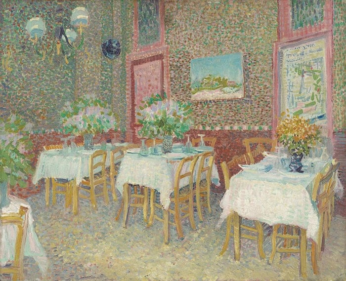
In the painting below, Konstantin Korovin painted the basic shapes of light and dark and left it at that; he did not paint any of the finer details.

I did a similar thing in my painting below. Grass, whilst an important part of the composition, was not a key feature and therefore did not need to be finely rendered. Instead, I spent more attention on the leaves at the top of the painting.

In Willard Metcalf’s Hillside Pastures, the shapes are much more complex due to all the different colors, rocks, and shadows. When the shapes are complex, it is important that you spend more attention on them at the early stage of the painting before adding more of the finer detail. Otherwise, it will be like decorating a cake before stacking the layers.

Once you have established the basic shapes, then you have the option to move on to other rendering techniques which are discussed below. But, you could leave the grass as basic shapes, like in the earlier paintings by Korovin and myself.
Use Directional Brushwork to Capture Movement and Form
A simple but effective technique is to use directional brushwork which matches the form and movement of the grass. For example, if the grass is pointing upwards, then use upwards brushwork. If there is a strong wind blowing the grass to the left, then work your brush to the left in the same way.
Vincent van Gogh took this to the extreme in his painting below, with strong, vertical brushwork to depict the grass on a seemingly calm day. This also creates a strong stylistic effect, typical of van Gogh’s work.

In Reflections of Spring, Peter Monsted took a more subtle approach with directional brushwork. If you look at the bottom of the painting, notice the vertical brushwork used. Then it flattens out in the distance, giving a sense of perspective in the painting.

Identify Important Areas and Simplify the Rest
When painting grass, you don’t need to render every strand of grass. It is far more effective to identify and focus on just a few important areas and simplify the rest.
For example, in Ivan Shishkin’s painting below, he used remarkable detail for the foreground area but relatively simple detail for the grass in the background.

Below is a watercolor by Shishkin. Most of the realism in the grass can be attributed to those few highlights and dark accents; the rest is just thin washes of color.

Tip: When deciding what to paint with detail and what to simplify, consider the few areas which convey the majority of information. Areas like key shadows or highlights, hard edges, vivid colors, or dark accents.
Take Advantage of the Stained Canvas or Underpainting
I often start a painting by staining the canvas with a dull, earth tone (raw umber, burnt sienna or yellow ochre). One of the benefits of doing this is it gives me the option to leave parts of the stained canvas exposed in the finished painting. This is particularly useful for painting grass, as the exposed earth tone mimics dirt, rocks, plants, etc. Richard Schmid is a remarkable artist who does this in many of his landscape paintings.
Use Broken Color to Paint the Illusion of Numbers
Broken color allows you to easily paint the illusion of numbers without having to delicately render every strand of grass. Claude Monet was a master of this technique. In paintings like the one below, he used small strokes of distinct color which look like grass, rocks, plants, etc. from afar.

Below is another example by Monet. Notice all the different greens, yellows, and reds which make up the grass.
Tip: Broken color does not mean you need to use many different hues. You could use just a limited hue range but vary the saturation and value. In Monet’s painting below, most of the broken color is made up of different green tones (light, dark, and dull greens).

Take Advantage of the Physical Texture of Your Paint
You can use the physical texture of your paint to mimic the texture of the grass you are painting. In Frederick McCubbin’s The Edge of The Forest, he built up thick, textured paint to depict the rough foreground. The end result is rather stunning.

Using the physical texture of your paint is particularly effective when combined with contrasting techniques, like:
- Thick paint in the foreground and thin paint in the background;
- Thick paint for highlights and thin paint for shadows; or
- Thick paint for warm colors and thin paint for cool colors.
Also, when using thick paint, the small marks created by each bristle of your brush can represent individual strands of grass. But, this is more effective with firm bristled brushes (like hog hair brushes) rather than thin and weak bristled brushes (like many synthetic brushes).
Use Small Points of Interest to Create Interest in Bland Areas
Another effective technique is to use flat planes of color, then add small points of interest over the top. Arthur Streeton did this in many of his landscapes. Below is a photo of his Cremorne Pastoral which I took from the Art Gallery of New South Wales, along with a close-up of his brushwork. Notice all the small plants, flowers, rocks, etc. which give context to the landscape and direct your attention around the painting. They are also great for sprucing up an otherwise bland area of land.

")
Additional Resources
How to Paint Leaves (Without Getting Caught Up in the Details)
How to Paint Mountains with Depth
Thanks for Reading!
I appreciate you taking the time to read this post and I hope you found it helpful. Feel free to share it with friends. If you ever want to learn more, check out my Painting Academy course.
Happy painting!
Dan Scott

Draw Paint Academy


Thanks for this comprehensive explanation of how grass “moves” ( especially your review on the Shishkin painting) in the world of painting and how important the underpainting is. Hope I personally can grow my progress through your help.
Thank you for explanations. I would love to receive your newsletter
Hi! Thanks for sharing this. It sure looks great.
Hi! Thanks for sharing this, it sure looks very interesting.
I have had a few lessons on landscapes with watercolour and found that the colours were drab and always with the same paints. I just opened your segment on How to paint Grass. The pictures I saw are duplicates of what I see through my eyes when I travel. Thank you for your words of encouragement and showing me how I can learn to paint in the 3 mediums. You will be hearing from me.
Your information was very clear and helpful. Thank you very much.
Thank you for the informative lesson. Hoping my next landscape will reflect this.
Really enjoyed reading this article!! Thankyou!! Looking forward to more great tips as I signed up!
Very informative
Hi Dan, Greetings from Bangkok. I’m going to put your advice to use on my Provence landscape. Many thanks for great tips.
best,
namtip
I have the right equipment, but have no confidence, but I know with your help I will be fine, thankyou.
Your explanations and examples are informative, clear and I have found extremely valuable to my process. Thankyou
Would like to see free hints please
Hi Wilma
If you join up to our newsletter which is free, you will receive regular free tips. https://drawpaintacademy.com/newsletter/
Thanks
thankyou just the sort of information and examples that i was looking for.
This is so informative. Thank you. I seem to have “painter’s block” like writers. I want to be confident and I will study with your help. Thank you again.
Great help!
Found this really helpful taken up painting again in lock down thank you very much.
Hi dan
This was really helpful!
Thanks for the time and the thorough explanation!
Irit
ISRAEL
I am very confused re how to use the Grid and Grayscale Tool. I would appreciate some more detail, ie, step by step. I downloaded your sheet but Step 1: Upload your reference photo below (“choose file”)
I don’t know where to go with that or where to find it. Can you help?
Hi David.
Can you please email us at admin@drawpaintacademy.com and I can help you out directly and give you some more information.
Thanks David.
Can you apply these teachings to pencil watercolors. Beautiful works. Thank you.
Thank you! This was a great comparison to see and study for so many possibilities of painting something so common in landscaping art.
Thanks again for a well timed great article.
Thank you Dan, this is very helpful. I am working on a painting consisting mostly of wheat field and sky – the colors are intense but I am going to do a couple practice runs on trying to paint the wheat – just the article I needed.
I love the way you explain the paintings. thank you
I am retired and finally can paint to my hearts content. I am a self tought artist. I just LOVE painting which I do daily, living on a small budget. I cannot afford your full courses, but these short lessons/tips are enormisly helpful I learn something new every time. Thank you.
I could not leave this page without saying Thank You for your very useful articles. Indeed all your posts are excellent.
Reza
Excellent tutorial. I appreciate the insight as I’m just now going back to painting after many years
being too busy.
Thanks for this helpful info on painting grass. I love the way you give e.g.s
Thank you Dan for all your articles, tips and educational prompting and encouragement to look beyond and try it for ourselves.
I have never had any formal tuition or classes, so I am loving this introduction into artists, lots of whom I have never heard but now look up and ‘see’ their techniques ..quite spellbinding and exciting.
I always look forward to your emails coming through. Thank you
You are a great gift/teacher to our art generation. Keep the fire burning!
Thankyou, very well done and informative.
Thank you for posting these very useful articles. Your writing is clear, and your instructions always easy to understand, and to follow. I love reading your postings and have saved them all for future reference. Thanks again very much.
Great paintings. Are any of these available as paint by number?
Thank you for this, Dan. Your instruction is always so well researched and clear to follow.
Very Nice, Clear Instruction.
Thank you for posting these fine articles. Most of the artists were unknown to me and I enjoyed seeing their artwork. Your writing is clear, understandable, and inspiring. Thank you.
I love your information on painting techniques. It is very helpful, and also simple to understand.
I have been introduced to artists I didn’t know about, and that is very interesting..
Thank you so much, I look forward to your emails.
Thank you for your very helpful information.
This was a great article. You really made me aware of so many possibilities and the fact that you provided exemples was most useful. Thank you very much.
Thank yo, so many interesting things on this information!