“I must have flowers, always, and always.” Claude Monet
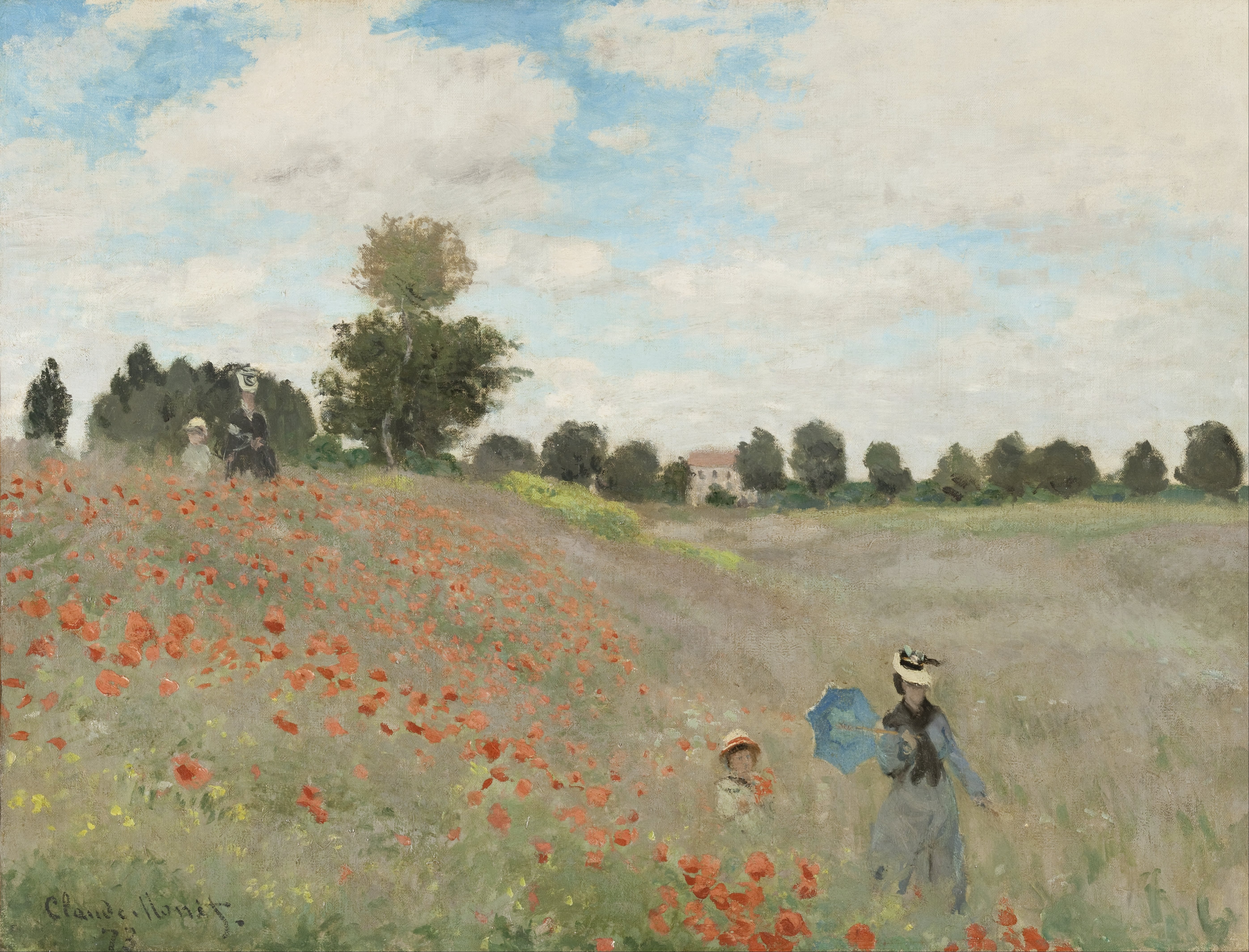
In this post, I take a closer look at a pleasant landscape painting named The Poppy Field by Claude Monet. It depicts four people (probably including Monet’s wife and son) strolling through a poppy field at Argenteuil, Paris.
Unlike many of the other paintings I write about, there is no hidden meaning or controversial history with this painting. With that in mind, I will be addressing mostly the technical aspects of the painting, namely color, value, edges, and composition. I cover:
- Use of Color
- Compressed Values and Dark Accents
- Soft and Hard Edges
- Simplifying the “Noise”
- Key Takeaways
- Want to Learn More?
- Thanks for Reading!
(Before diving into this post, make sure to pick up a copy of my free Landscape Painting Starter Kit.)
Use of Color
Color appears to be the main feature of the painting, with a split-complementary color scheme of reds, greens, and blues. The greens and blues are restrained, allowing the reds to dominate (which is appropriate given the name of the painting-The Poppy Field).
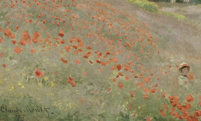
Going back to basic color theory for a moment, red and green are complementary colors. That is, they have a striking contrast when placed next to each other. Monet was clever to restrain the greens and allow the reds to dominate. Otherwise, the two colors would compete for attention and it might be jarring to look at.
If you look closely at the red poppies, notice how two different red tones are used: one weak tone and one strong tone used mostly as an accent. This, of course, adds variance, depth, and form to the poppies.
A more subtle observation is how the weak red tone creates a link between the poppies and the surrounding weak greens used for the grass-both colors are around the same in terms of saturation and value.
There is also a subtle link between the poppies and the red used for the distant building. Take note of the diagonal positioning of these two elements, as it is a common theme throughout the painting.
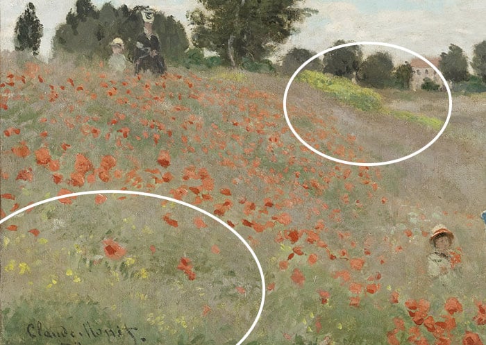
To me, the blues in the painting play more of a supporting role to the reds and greens. There is a link between the blue sky and the blues used for the woman in the foreground (circled below). Again, note the diagonal positioning.

Finally, in terms of color, I draw your attention to that burst of relatively saturated green in the distance (circled below on the right-hand side). This small but important burst of color helps draw you through the painting.
It also adds another subtle color link, with small dabs of the same color being used in the grass in the bottom left-hand corner. This may not seem obvious or even significant, but it is touches like this that make the painting appear so pleasant and realistic without Monet using that much detail.
Compressed Values and Dark Accents
The painting has a strong but simple value structure, as you can see in the grayscale image below:
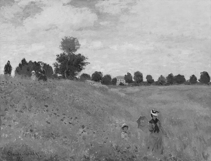
There are three dominant value groups: the light sky, the middle-value foreground, and the dark accents used for the garments and distant trees.
The sky and foreground are kept within a very compressed value range. That is, the colors are roughly the same in terms of lightness. Without color, these areas appear flat and lifeless (take a moment to compare the grayscale image to the full-color photo shown at the start of this post).
Monet relied almost entirely on hue and saturation contrast to create interest within these areas. This technique is challenging but highly effective if you are successful with it.
I liken this to a beautiful symphony, with the drums being the fundamental value structure and the violins, flutes, piano, etc. being the subtle dance between the different hues and saturations.
The dark accents in the painting are used to depict the distant trees and dark garments. These accents do not take up much space in the painting, but they command your attention due to their sharp contrast against the light surrounding colors.
Tip: A small area of sharp contrast can have the same impact, if not more, as a large area that lacks contrast.
The dark trees act as an anchor for the painting, connecting the sky and the foreground. Also, notice how the dark garments worn by the woman on the left-hand side of the painting blend in with the dark trees. This is an example of simplifying the value structure.
In the bottom right-hand corner, the dark garments worn by the woman and child create small but powerful dark accents amongst the sea of dull greens. These are around the same value as the dark trees (yet another color link).
Soft and Hard Edges
Most of the edges in the painting are soft and muted. This allows your eyes to easily transition between areas. Monet seems to have used broken color to soften the edges, rather than blending.
In particular, notice how Monet used soft edges for the bottom of the woman and child on the right-hand side (see the close-up below). The two figures almost appear to blend in with the surrounding nature.
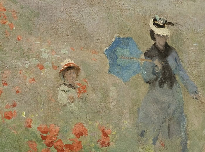
Relatively hard edges are used for the dark accents and the small bursts of saturated red. These hard edges help command your attention and provide small moments of clarity in an otherwise fleeting scene.
Simplifying the “Noise”
This painting is an excellent example of simplifying the “noise”-the countless colors, values, shapes, lines, or other little details you are confronted with when you look at nature in life. Monet extracted the bare essence of the scene and transferred that onto the canvas. There is just enough information for the painting to appear realistic. But if you look closely, you will see that much is left to the imagination.
The faces of the four people are left obscured. Their garments are nothing more than simple color shapes. A few strokes of green plus the red poppies create the illusion of the tall, sweeping grass.
The rendering of this painting is not complex, unlike what you might see in a painting by say, Ivan Shishkin. But, Monet makes up for it in all the other areas.
Key Takeaways
Here are some of the key takeaways from this painting:
- Just because a painting looks simple, does not mean it lacks sophistication. The more I looked at this painting, the more I realized how clever Monet was.
- When painting with complementary colors, it is usually a good idea to allow one of the colors to dominate over the other. Otherwise, they will end up competing for attention.
- A strong and concise value structure can provide a great foundation for your painting. It also allows you more freedom with how you use hue, saturation, and other elements.
- Compressing the value range means that the colors stay around the same level of lightness, but you vary the hue or saturation. This is a challenging but highly effective technique if you are successful.
- Use soft and hard edges to help guide the viewer through your painting. Soft edges allow for a smooth transition between areas. Hard edges are like an exclamation mark that commands attention and provides moments of clarity.
- You do not need to paint every single detail you see. Try to simplify the “noise” and capture the essence of the scene. You will end up with a more concise and powerful painting.
Want to Learn More?
You might be interested in my Painting Academy course. I’ll walk you through the time-tested fundamentals of painting. It’s perfect for absolute beginner to intermediate painters.
Thanks for Reading!
I appreciate you taking the time to read this post and I hope you found it helpful. Feel free to share it with friends.
Happy painting!
Dan Scott

Draw Paint Academy

This is before I’ve looked at your website, but I’d like to see alot of your own work to become familiar with you before I join.
Are you the one who has sent a recent email about value or tone? Pretty sure it was value. I get alot of email.
Thanks Leslie. You can see some of my work here:
https://drawpaintacademy.com/gallery/
I try to keep this updated with new paintings. It might have been me who sent that email – I am not sure sorry!
Let me know if you have other questions.
Dan
Loved it as I see this painting much powerful until you showed how to look at tonal values and saturation. Quite a good exemple
Thanks for the eye opening!
I still haven’t completely browsed your site, but do you provide info on what brushes to use to produce certain effects?
Hi Leslie – this post might help:
https://drawpaintacademy.com/brushwork/
Thanks!
Dan
“…no hidden meaning or controversial history”
Is it possible the mother and child are the same people dressed differently and used, in position, to give us perspective?
I always look forward to your insightful emails.
Thank you,
Thank’s again Dan.
Interesting idea Tom! Maybe – only Monet would know. Dan
very helpful and explicit, thank you,
Thank you for these insightful comments! I have always liked this painting and now I can understand better why it is so beautiful!
Nicole
PS I am taking your course and have emailed you a question/comment but since I’ve not received your reply, I’m wondering if you did receive it…
Thanks Nicole! Putting together another response to your email now. Dan
This was extremely helpful and provided a very clear message. I have way too many colors on my pallet and need to focus more on values, hues and saturation.
Thank you.
Good discussion of Monet’s technique is this painting. I wonder if it was deliberate to mis-size the woman and child at the top left that put the height of the woman at tree level. The aerial perspective is thrown off in comparison to the size of the woman and child in the foreground, don’t you think? -Liz
I have a print of this at home where I lie and snooze. Your points about the figures on the hill have always puzzled me too. I have wanted to ‘repaint’ them.’
Dear Dan,
Your analysis of some of the great paintings has been so helpful to an aspiring artist such as myself. I’m learning so much.
Thank you,
Dianne
Thanks Dan for taking the time to share your insights, and describing how Monet went about achieving this beautiful painting.
Thank you Dan for your insights. I love reading you. I hope to join your academy after the holidays.
Frances
Denver Art museum has an exhibit of Monets works (124) …so this is so timely for me. So far I have been twice…and each time I enjoyed more. Now to look through my Monet art books while re-reading your comments . Thank you so much!
That is some collection! I will put that down on my list of places to visit. Thanks! Dan
Nice commentary. I wish you’d tied this painting to the general view on the immediacy of Impressionism. Plainly, Monet’s painting is much more artistry than swift record, and yet it leaves a sense of quick execution.
Thanks Bruce. I will try do that for the next Monet painting I look at. Cheers! Dan
I learn so much from you. Your teaching is clear and understandable. Thank you
Thank you for sharing this Dan!!
This analysis is soooo helpful! Thank you, Dan.
thank you, I learned so much!
Dan, I literally wait until I have a good section of time to devote to these emails you send out – thank you so much! I had studied your Woman Pouring Milk (?) and then saw it in the Museum in Amsterdam and I felt like a pro looking at it. Please continue to send out these emails where you talk about a great painting. I actually have done 4 large Monet’s water lily’s and love the process. Again, Many Thanks! Lane
Thank you Dan, a million times. Your critiques are insightful and I always learn so much from you. Our Museum recently obtained Monet’s beach scenes and the color work was so different from this and other paintings he has done; good to know that it’s “ok” to delve into different techniques and values.
I believe your not looking close enough, Monet left some clues to a story, one overlooked, send me an email address and I’ll send you something unavailing
I love and admire all of Monet’s artworks. Your analysis makes clear quite a lot of points about that painting, so often put up everywhere and now much better understood. Another Impressionist, I think he was one of Monet’s friends, was Sisley that of course you must know well. He´s a source of inspiration for me too. Thank you for sharing all your wisdom including those wonderful Russian Impressionists I had never come upon before!