I have been busy over the past few weeks creating color charts as recommended by Richard Schmid in his book Alla Prima. My charts are still in progress, but I thought I would publish this post in the meantime for others who may want to join me in doing this exercise.
I cover:
- Overview
- What You Need
- What Medium Should You Use?
- The Process
- Key Observations
- To Be Continued…
- Want to Learn More?
- Thanks for Reading!
Be warned, this is a time-consuming and surprisingly challenging exercise! But, when a master like Richard Schmid recommends you do something, it is wise to do it. In his own words:
“Surprisingly, the charts only took two weeks to complete, and when I finished I knew more about my paint than I had ever thought possible.”
Overview
(If you are not familiar with this exercise, the following may sound a bit confusing. But stay with me! It is easier to understand once you see the full step-by-step process later in this post).
The idea of this exercise is to explore the different color combinations from your frequently used colors.
You start by creating a “pure” color chart. Pure colors (straight from the tube) are at the top. Each row down the colors gets lighter as more white is added. The colors on the bottom row have just a hint of color. Here is mine to give you an idea of what it looks like:

From there, you create a separate chart for each color (“color dominant charts” as Richard Schmid calls them). These involve taking the main (dominant) color and mixing it with a small amount of each other color. And again, for each row down the colors get lighter as you add more white.
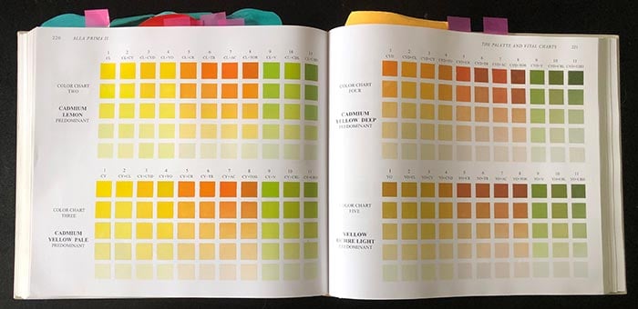
Below is my color dominant chart for cadmium lemon. This shows the range of possible colors with cadmium yellow predominating.
The first column is pure cadmium lemon; the second is cadmium lemon with a touch of cadmium yellow; the third is cadmium lemon with a touch of cadmium yellow deep; the forth is cadmium lemon with a touch of yellow ochre; and so on.

You then repeat the process for all other color dominant charts. Keep in mind that the first column for these charts will be the main (dominant) color.
What You Need
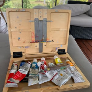
Here are the supplies you need:
- Your frequently used colors. I used cadmium lemon, cadmium yellow, cadmium yellow deep, yellow ochre, cadmium red, terra rosa, permanent alizarin crimson, transparent oxide red, viridian green, cobalt blue, ultramarine blue, and titanium white. I used similar colors to the ones used by Richard Schmid as I am fascinated by his use of color and sometimes the best way to understand is to imitate.
- Brushes and palette knives. I do most of the color mixing with brushes, but you may want to use palette knives instead. I used a different brush for each color to avoid any unwanted mixing.
- A palette for mixing. You should do most of your mixing on the palette, not the canvas.
- Canvas boards. These are economical and sturdy. The size will depend on how many colors you are using and how large you want the segments.
- Paper towel, a container for holding used brushes, and solvent for cleaning up (if using oils). The paint needs to be thick and straight from the tube, so avoid adding any mediums or solvents.
- Thin tape (ideally less than a cm). After hours of searching, I managed to find 6mm tape from a local office supplies shop. It is amazing how hard it is to find thin tape!
- Ruler.
- Pencil.
What Medium Should You Use?
I use and recommend oils for this, as does Richard Schmid. The slow drying time gives you a chance to get the color right before you place it on the canvas. But any other medium would be fine.
The Process
Here is my step-by-step process. If you join me in doing this exercise, you may want to vary this process to suit your own situation and preferences.
Step 1. Get your supplies in order.
Organization is key here. You do not want to be flustered or searching for supplies whilst doing the charts.
Step 2. Plan the measurements.
Your measurements depend on how many colors you use, the size of each segment, and the size of the canvas board.
Start by working out:
- How many segments you need (the number of colors multiplied by 5).
- How large you want each segment (I suggest around 1 inch in width).
- How much space you need for a border (for writing down what colors you used).
Then grab a ruler and calculate the measurements you need. To give you an idea, here are my measurements:
- 1-inch border at the top and left sides.
- 1-inch width and ¾-inch height for each segment.
- 11 colors.
- 55 segments (11 colors multiplied by 5 rows)
- 2 charts per canvas board (because the canvas boards I found are rather large).
Make sure you write down whatever measurements you use so you can stay consistent for each chart.
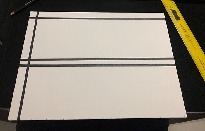
Step 3. Mark the canvas board and place the tape.
Use a pencil and ruler to mark the measurements on the canvas board. Then place your tape. If your measurements are correct, this should be rather easy.

Step 4. Audit yourself.
Make sure you have enough segments and that they are all roughly the same size.
Step 5. Organize the tubes of paint in the right order.
The order of colors needs to be consistent. To avoid any frustrating mix-ups, place the tubes of paint above the relevant columns (see below).

Step 6. Mix and apply the colors.
Work from column to column, from left to right.
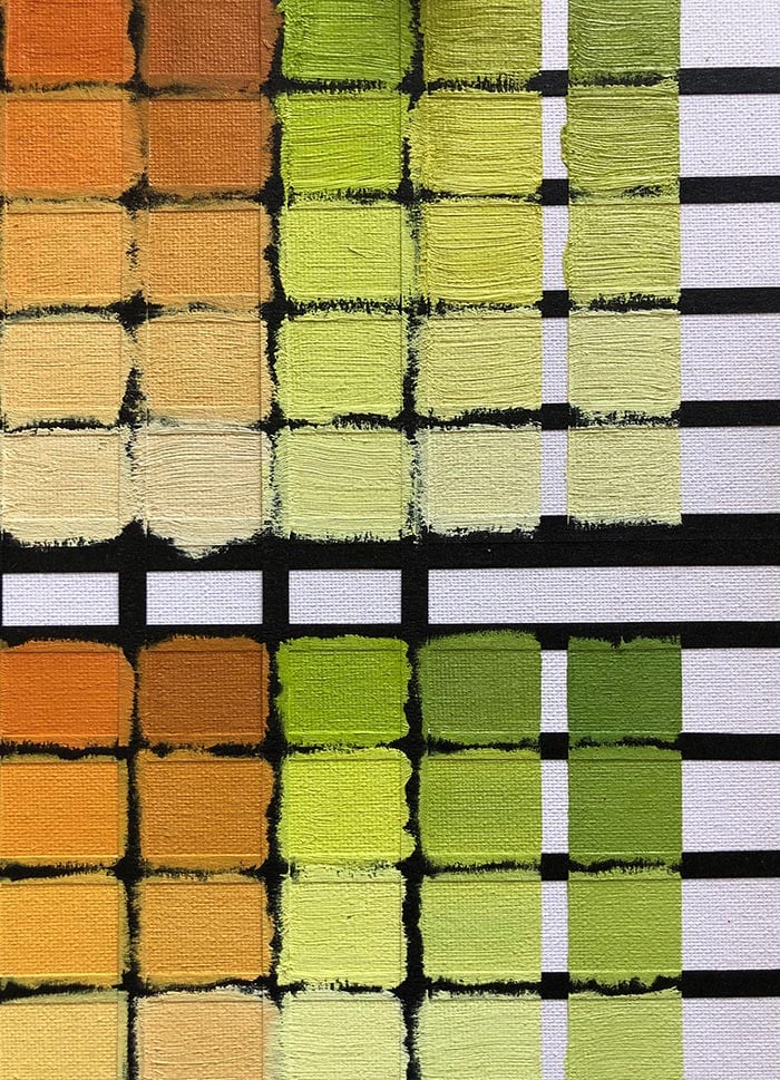
For each column, start with the top “pure” color and work down. Start by mixing the pure color on your palette, then apply it to the top segment. Then work your way down the column, adding more and more white to the color. Aim to have even steps in value (a challenge by itself).
Keep in mind that some colors are stronger than others and you will need to use more white to make them lighter.

Step 7. Remove the tape.
Do this before the paint dries (otherwise, the tape may lift paint from the canvas).
Step 8. Place the chart in a safe place to dry.
Step 9. Take a photo for reference.
The actual charts are the best reference, but a photo is a close second.

Key Observations
Here are some key observations from this exercise so far:
- As colors get lighter, the contrast between them reduces (compare the top row to the bottom row).
- As colors get lighter, they get weaker and cooler in temperature.
- Some colors are MUCH stronger than others. This is referred to as tinting strength.
- It is eye-opening to see all the different colors you are able to mix (or unable to mix).
- The dark colors (such as ultramarine blue and viridian) seem to get richer with just a small amount of white.
- The charts are a valuable reference point for any “how do I mix that color?” questions.
- This is a simple exercise, but it is not easy!
To Be Continued…
I will update this post once I finish the rest of the charts. Feel free to join me in doing this exercise. I would also love to see photos of your attempts (just subscribe and send me an email).

Want to Learn More?
You might be interested in my Painting Academy course. I’ll walk you through the time-tested fundamentals of painting. It’s perfect for absolute beginner to intermediate painters.
Thanks for Reading!
I appreciate you taking the time to read this post and I hope you found it helpful. Feel free to share it with friends.
Happy painting!
Dan Scott

Draw Paint Academy

fabulous
I agree, Dan is just the most brilliant sharer, his knowledge always inspires me.
You are not only a fabulous artist you are also so generous with sharing your knowledge. From the bottom of my heart, thank you. Laura
I made my charts several years ago, use them often. They are a great exercise and also a useful reference. Love them!
Why do you need these charts?
Your explanations and examples are wonderful. They have enough info, but without being overwhelming. Some instructors (not necessarily art) tend to overlook small but crucial info because they’ve been doing it for so long. It’s become second nature and they assume it’s common knowledge and/or it’s done automatically without thought. Thank you!!
I’m learning so much from these emails and tutorials. I have a background in photography, drawing and color pencil “painting”, so the value/color/lighting theory experience has proven very helpful. Acrylic painting is new to me, and I’m loving it. It’s sometimes the small gems of tips I get from Dan that are helping me the most. I’m loving this!
I am gaining a lot of knowledge also. I want to say thanks for keeping a lot of this free as I am very poor and cannot afford the classes. I also know about Black and White photography, acrylics and watercolours of which my big brother Jim taught me. I guess it’s in my family!
Good exercise
Is this the same in WC ?
I believe in WC charts you will add water to make the color lighter, not white.
I’ve started the chart with wc but have difficulty controlling water to assure color is correct value. Any suggestions?
Yes you should be able to do the charts in watercolor, but as Louise has pointed out, it is harder to control. Water is unpredictable by nature. If anyone has a good watercolor attempt, feel free to share (just flick me an email – dan@drawpaintacademy.com).
When adding water it’s the viscosity that has to be consistent in watercolor. Anna Mason has a workable gauge: watery, milky, creamy, buttery.
Dan, my question is how do you replicate a “touch” each time you add paint to your mixes?
What about using China white (gouache)?
Hallo Scott. I have been following your emails for a while now. They are amazing.
The tape you mention in this article is available at quilt shops. It is a 1/4″ wide. Perfect for your use.
Annette
Usually auto finishing shops also.
Hi Scott – thanks very much for this post – it’s just the kind of exercise I had been thinking of doing for some time, and you mention all the sloppy bad habits to avoid that I constantly fall into, like mixing the colours on the canvas, so I will try to be more disciplined!
Amanda
That is brilliant and so useful. I do struggle with color selection and what to mix with what. Thank you so much.
Gina.
Great exercise! You can also use automobile pinstriping tape which is quite economical.
I was so thrilled to get this in my inbox! I just finished doing color charts in the past two weeks! They are still drying. I learned so much and it was actually a fun process. I will share my charts with you as soon as I get pics of them. I’m currently reading Richard Schmids book Alla Prima 11. So much to take in from this master painter!
This is totally awesome. I can’t wait to start this. Thank you so much.
Thanks Scott-
So do you next make charts where you mix columns together? This could go on indefinitely.
How fun! Can’t wait to start!
Have always wanted to try this. Would also
LOVE to “do” a Zorn.
Tks again
How fun! Can’t wait to start!
Have always wanted to try this. Would also
LOVE to “do” a Zorn.
Tks again
I just finished a Zorn workshop!
I am sorry, my little dictionary dose not have the word Zorn, may I please show my ignorance and ask what it is.
Anders Zorn, a Swedish portrait artist, used a very limited palette of Vermilion, Ivory Black, Flake White and Yellow Ochre. It’s amazing what can be done with those 4 colors. You might find a demonstration on youtube.
What a coincidence, I purchased the Alla Prima II last week and was about to start the process of preparing the charts. Ohh La your emails is timely and god sent. This will be greatly helpful. Thanks for taking us through by sharing your personal expericences.
Ronald
I will never do this extensively as you are doing now. But, I commend your efforts and appreciate you sharing this. Thanks a million.
Fab. I always add more than two colours to adjust a hue but this would ensure lovely clean colours. I’m just not sure I’m disciplined enough to actually use it and can you imagine having the gallery of references on hand while trying to stay connected to your model? Oh la la.
Your emails are so generous I’m in awe. We will work together. Watching for a UK workshop one day.
I am grateful see this process. Last night I finished another type of grid. Mine is taking the 12 colors I have never used together before and applying them across the top of the grid, then down one side. I also added two different (Windsor and Sennelier) Paynes Gray and Kynite, to see how each interacted with my colors. I find this tells me if my palette is harmonious. It allows more flexibility when choosing a scheme I used watercolor and my chart allows me to have three different values of the true color In the spread. I am going to do this with oils this week. I have never painted with oils. I need help with brush selection.
Brilliant and so useful…. thank you!
Brilliant. I did this a few years ago after purchasing Richard Schmidt’s Alla Prima A great exercise After your post today – I’m going to do it again ! Thank you
Thank you so much! I always wanted to do this but wasn’t sure how. You explained it so simply and now I have no excuse not to try! I know this will help me. Again, thank you.
Dan I did this for a class several years ago and it is so helpful!! Mine aren’t as tidy as yours and I used canvas paper. I need to do this for some new colors I’ve added. The difference in the yellows is so neat!!!
Hi Dan. Probably ly being stupid here but is the tape used to separate the chart colour mixes? If so, couldn’t you leave the tape on to avoid tearing? Thank you for all the great lessons tho. Very thorougly researched and so generous of you.
Hi Fean – yes the tape is to separate the colors and for organization. You could leave it there, but it may not be that archival (the tape may end up falling off). Thanks! Dan
I expect the color of the tape (black) may also cause more optical contrast distortion than white?
Thank you for sharing this exercise. I have a gift of new Vasari paints that I’m afraid to use. Now I know where to start!
Hi Dan,
Thanks so much for your email on Richard Schmidt’s color charts. I did the charts a few years back and was amazed how much I learned- after I finished, I took the charts to Kinkos and had them laminated. they last longer and are now hanging in my studio for quick reference. Thanks again
I just did this in a class in my hometown and it is invaluable to me. However, we made each color pallette on an individual floppy canvas sheet about 6″ x 8″. After they are dry, a hole punch in the upper left corner and collect them together on a binder ring. Now you have it at your fingertips or in your lap to flip through as needed. So handy and so useful!
This is exactly what I need. Thank you!
Thank you so much for teaching us and taking your time to show us.
I have learned so much from you.
thank you so much
This takes me back to what I did as a profession. I had a printing business for about 35 years.
There is a system of color charts for printers, called Pantone colors. You can mix hundreds or even thousands of colors on demand. When I was in the art supply shop, I found a set of artist colors that are the basic primary 4 colors ( black, magenta, cyan, & yellow) that are used for process colors, (full color), these are transparent colors, when they are over lapped on a printing press they form what ever color you wish.
Let me explain a little further about how process color (full color} is done in the printing business.
A photograph is made into a halftone, which is a series of dots of different size that forms the overall picture. This is photographly transferred to a metal plate for the press. The process colors are transparent so you have overlapping dots that form the different colors, like in art where you use a wash of other colors to create what you want.
This will probably confuse everyone. But I am using my pantone color charts to mix my artist colors.
If anyone has any other questions let me know and I can explain further
Charlie: In the Ozark Mountains of Missouri USA
Brilliant. My husband has owned a printing company for 45 years and I have never thought about that
Please explain this further Charlie. I’m a disabled artist and any help would be much appreciated.
Hi Dan
Thank you very much for sharing. I will do the exercise.
Reza
Wonderful chart!
I love this! I have done this with other mediums, like pencils and some acrylics. I have not gone in depth like this though. When doing your charts and you were mixing the two colors together are you using a specific ratio.
Hi Pam. Generally around 80% dominant to 20% other color. However, judgment is needed because some colors are stronger than others.
I’m not mathematically inclined. What does ratio mean anyways? Sorry but I’ve always couldn’t do things that involved a ruler or counting. Can you explain the measurement of the squares of colour?
Dan,
Thanks for sharing this. A couple of questions. Does this mean that you paint (in your paintings) only using mixes of any two colors plus tinting with white? Are there not times that you would need to paint with mixtures or three or more colors in a mix? Or can you achieve any color you need using only two colors plus white (and does that help to eliminate making mud?
Right now, I’m mostly only painting in acrylics, which uses multiple layers of different paints.
Thanks,
Chris
Hi Chris. Good question. When I am actually painting – I am much less structured with color mixing. I will often mix numerous colors together. The idea of the charts is to see what is possible with just a few colors. But that doesn’t mean you are limited to using those colors. It also keeps the charts simple. Thanks! Dan
“Border Tape” or graphic art tape available at Amazon in different widths.
Thanks Susan! Will check that out.
Cool! I made a similar chart (tho w/o the tints) for myself years ago, after I’d been painting for only a short time. I still use it, along with my notes describing “great color mixes/complements”. I created my chart by first drawing a penciled grid on a canvas board, dabbing the unmixed “master colors” across the top and down the side, and then applying each color mix within a corresponding square. So I’m curious: Why bother taking the time to mark your grid with tape? Is it helpful, or necessary, to have neat, clean edges on each color block? I’m a kinda messy [abstract] painter; maybe using tape only for the sake of neat, clean edges gets a little too fussy for me. Regardless, creating such a color mixing chart IS a fun, very useful, and very meditative exercise!
Hi Debra. The grid just helps keep it organized. I do not care so much about it being “neat”. Also, the grid helps keep the colors separate (you don’t want any unwanted mixing). Thanks! Dan
Thank you so much for sharing these colour (Australian spelling 😊) charts. I can’t wait to get stuck into my charts. They are so going to be heaps helpful!
Thanks again Dan
Also Canadian spelling! ” Colour” !
Hi Dan! Nice work! I have also work in progress. Not so clean like yours. I am using thick paper for oil painting, but same size tape like you! Using size A4 and putting chart in clear plastic pocket and thinking to take charts with in one file if going plein air for first time when ready. But I have 19 hue…
I just thought id suggest making one stencil instead of using tape over and over.
Mark out where the tape would go onto something waterproof (like a clear projector sheet), then cut out the squares with a stanley knife. Then just clamp or tape the edges when using the stencil.
Hi Rae – good idea!
I did something similar only in watercolors when I was fairly new to the medium. I had made a ¼-½” vertical black strips (drawn with permanent black marker) drawn on a half-sheet of 140# cold pressed watercolor paper to show the transparency of each color. I made the left side straight from the tube and the lightest color I could get on the right side of the line. Made a great reference chart.
I’ve never done one for my oils yet, but this I definitely want to do. Thank you to Cynthia’s comment. I like the way you said you did yours. I have a tablet of Canvas Paper and think I will use that.
Dan, I hope you never tire of doing this! I have learned so much and been inspired. Keep the emails coming. I’ve been so frustrated with the brushes I’ve bought in the past that I finally order several from Rosemary and Co. and can’t wait until they arrive to try them out! Thank you.
Apologies if this has already been addressed but are the colours named anywhere on the chart so you can easily see what you mixed to get a particular colour?
Hi Alice. Yes the charts SHOULD be named, but I have been lazy. Will name them soon 🙂 Dan
Thanks Scott! I have Alla Prima 11 and I have been wanting to make the charts. A few people I take an art class with would like to get together to make the charts. We’ll being doing this next month. Thanks for the directions and encouragement to get it done!
Excellent sir. Right after reading this email I started….. basic chart has been completed. Thanks for such a fabulous tip.
This is awesome. Thank you so much Dan for all your time, passion and encouragement.
Do I just keep adding white to the pure color and so on down the chart? Thank you Dan1
Hi April, basically yes. Just makes sure there are even steps in value. Thanks!
I think its useful to write down the pigment numbers that are shown on the paint tubes, especially for watercolor charts. Also, I thinks its easier just to blur the mixes at the edges to eliminate the taping. You get one big sheet of color gradations, like on your computer.
I just learned from Jon Cogley with Daniel Smith Paints that the pigment colour codes just represent families of a particular colour. PB19 will be used representing more than one colour and from the same company and paint colour will differ between companies. This made me look through an old reference book by Michael Wilcox “Blue and Yellow Don’t Make Green” which is an excellent book I would recommend to everyone.
I was also hoping by looking at the paint ASTM labeling on my own paint I could better understand the permanence, lightfastness and staining power of each tube -not so much.
So your paint identification is relevant to add to your chart. I think you need to create these tables just to better understand the paints you own. There’s much more to this than I counted on.
Just wanted to be sure I was still on the mailing list. I appreciate all the help.
Hi Jackie! Just checked – you are still subscribed. I have just been less-frequent with emails lately. Thanks!
Many thanks for all your excellent tips on watercolours.
I am an oldie’ having a great time experimenting in this new medium. Wish me luck.
Thank you so much…so helpful!
This is good.
Awesome Dan – and I love the the tidiness of the tape, plus it leaves room for colour names and mixes. Many years ago in great anxiety, overwhelmed, I charted my newly acquired oils in a very orderly manner starting with 4 blues, and was soon stunned to find it really trained the mind and eye profoundly. Did Prussian straight from the tube then mixing white down to palest in 5 squares, next row 5 squares again Prussian again with a smidge of Ultramarine, and down to palest, next row Prussian (!) with a dot of Pthalo blue down to palest, the next row of Prussian mixed a little Cobalt then down to the palest. Wrote underneath each row what they were. Kept going with Prussian the main ingredient, with all my colours (about 20) same method, four different reds, the cadmiums and lemon yellows, the gold and red ochres, browns, greens and 2 purples Then charted Ultramarine and white, next row ultramarine with a touch of Prussian and paling it, right through blues, reds the whole box again. then the systematic rows of every other colour. Kept the pages safely in a binder. It uses a nasty amount of paint and time – but the greatest value was it quickly and deeply taught me the mixing 2 oils and white without taking a lifetime to learn it. A bought chart doesn’t do that to you, trained eye and mind. Love your teaching.
Doing color charts is the best time spent. I had tubes of paint I didn’t use until I did a color wheel for each one. I have also done a double primary color chart and that was intense but totally worth it to see how the cool and warm colors mixed. I think the Richard Schmid color chart is next!
I just started these color charts and it is such a helpful tool to train my eye and brain in color mixing! Thanks for the tip!
So I started this exercise but, only with the supplies I had. I wasn’t exact on measuring and didn’t leave a space free of paint around the border. Needless to say, things got messy taking off the tape, as well as the tape pulled up some of the surface paper I was using. However, these charts will greatly help me understand color theory. I learn easily through doing and seeing things for myself so I’m glad I came across this exercise! Thank you for sharing this simple, but wonderful exercise.
I am a beginner artist and have just done a workshop with colour charts. Your tuition certainly shows me the value of doing this myself and spending time to absorb the learning of colours. Because it seems to be so simple and so difficult but is the essence of producing a painting that is well balanced in portraying colour and light dark and shades of colour. I really enjoy your posts and love the way you share your knowledge. Thank you so much.
I had the pleasure to study with Mark Boedges who is a great supporter of the chart system. He also turned me on to a chart system specifically used for this process. Check out colorfrontier.com. It makes the whole process so much easier.
Awsome. Colour. Chart and how. To
This is wonderful! I’ve learned so much in two days alone! Thank you for making this available for free as I am very poor and cannot afford online classes.
I want try to, thanks for sharing. It’s Richard schmid advise and can not just ignore it.
Thank you!
I do not know how you knew I’ve been planning to do a color chart with my watercolors and (separate) gouche, this is very helpful!
I can’t believe it – I’ve actually done this. I have a stack of the finished products in my supply cabinet. I was – and am still – a beginner but thought it would be a good exercise. It was! Now I can’t wait to dig them out and take another look at them.
Thanks for this post, Dan ! I was offered Richard Schmid’s book some time ago. But I’ve not yet discovered its contents. I saw the charts, though.. But thought it would be a looot of work, so didn’t start. I’m a watercolourist and I thought it would be too difficult and time-consuming. After reading your and everybody’s comments, I might give it a try.. Some colours at a time..
Hello, Dan- this was so helpful! My friend and I have been painting our charts together. We eyeball the paint values for each other before putting them on the charts. Did you ever finish yours? Sometimes with a dominant color like cad red, our whole chart looks very similar- I wonder if the secondary color should have been increased to create more differences in the colors? Thanks for publishing this, it got us started and was a great help!
Awsome post and ideas Dan. Thankyou mate ps hope you’ve had a awsome Christmas hoho ho
Thank you for the how to make a color chart. I am a novice wishing to learn how to paint. This great information for a beginner.
I’m making these charts for the second time (first in the ’80s). I use inch wide painter’s tape, taped to a flexible cutting board, use a T-square and sharp blade to cut the desired width…not perfect but meditative process and functional result.
Amazing!
Thank you
Re the tape 1cm thin I guess it should be narrow.
I am going to make this asap but I don’t have too much trouble to do them as I use only the primary colours.
Thanks for the tips and tutorials.
God bless.
Joe