
Rocks and cliffs form a key part of landscape painting, but many people seem to struggle with painting them. This is probably due to the organic and irregular shapes they come in, combined with a lack of understanding about light and shadow.
In this post, I walk you through how to paint rocks and cliffs, using some stunning master paintings to help demonstrate my points. I am grouping rocks and cliffs together because the process is basically the same for both.
- Ask Yourself "What Is the Purpose of the Rocks and Cliffs?"
- Break the Rocks and Cliffs down to Basic Forms (Boxes, Cylinders and Spheres)
- Color and Light
- Identifying the Light and Dark Accents
- Dealing With Water
- Painting the Illusion of Numbers
- Other Master Paintings of Rocks and Cliffs
- Additional Reading
- Want to Learn More?
- Thanks for Reading!

I’ll walk you through the entire process using one of my recent paintings. You’ll see how I go from idea all the way through to reflecting on the finished painting.

Ask Yourself “What Is the Purpose of the Rocks and Cliffs?”
The first thing you should consider when painting rocks and cliffs are their overall purpose in the context of your painting.
Will they be key features?
Will they be for atmosphere and context?
Will they be used to lead people into the painting?
Will they merely be used to take up space?
The purpose of the rocks and cliffs will dictate the level of attention you give them. For example, if there are some insignificant rocks in the corner of your vast landscape, you could get away with using simple detail. But if the rocks are the focus, like in the painting below, you need to give them more attention.

Break the Rocks and Cliffs down to Basic Forms (Boxes, Cylinders and Spheres)
Before you start to consider color and light, you should think about the construction of the rocks and cliffs. Try to break them down into the most basic forms of boxes, cylinders and spheres. This will make the rocks and cliffs appear more manageable and organized.
Paul Cezanne once said:
“Everything in nature is formed upon the sphere, the cone and the cylinder. One must learn to paint these simple figures and then one can do all that he may wish.”
I prefer to replace the cone with a box, but the idea is still the same. It is all about taking the vast amount of information which is in front of us and simplifying it down to something we can easily understand.
In the beautiful painting below by Edward Potthast, notice how well he has simplified the form of the rocks. Looking at this painting, it is easy to understand how the rocks are constructed. But that is because Potthast has already done the hard work in simplifying what he saw.

In the image below I have indicated some of the simple forms I can see.

Color and Light
With the basic forms established, you can start to bring in color and light. I group color and light together because you should really think about them hand-in-hand. Without light, there is no color, and if you try to use color without considering light, then your colors will probably end up looking muddy and awkward.
First, you should gain an understanding of the light that illuminates your subject. Try to answer these questions:
“Where is the light coming from?”
“What is the dominant light source?”
“Are there any secondary light sources?”
“How strong is the light?”
“What is the color temperature of the light?”
“How much reflected light is there?”
Your answers to these questions will help you establish a theme for your lights and darks. Here are some common scenarios:
You are painting under the midday sun.
In this case, the light will be strong and overhead. It will also be slightly warm in color temperature. There will also be a secondary light from the blue sky, which will be cool in temperature. In this case, I would paint a strong contrast between warm lights and cool shadows. I would also use colors which closely match the local colors of the rocks and cliffs (usually dull oranges and browns).

You are painting on an overcast day.
In this case, the light will be defused by the clouds. I would use less contrast, muted colors and perhaps warm shadows, depending on what I actually observe.

Above are examples of themes that you could paint within. A theme is important for establishing a sense of consistency throughout your work. It ensures all your colors make sense in your painting.
Once you have established your theme, you basically need to identify the sides of the rocks and cliffs which are being hit by light and the sides which are not. Of course, you also have to account for mid tones and different types of shadows, but the most important part is broadly identifying the lights and darks. From there you can paint in the cast shadows, reflected light, core shadow, mid tones and highlights.
This is where simplifying the forms comes in handy, as you will be able to easily identify the major light and dark planes. Without simplification, it would be incredibly difficult to make sense of all the tiny changes from light to dark on the surfaces of the rocks and cliffs.
Every time there is a change in the plane of your rocks and cliffs, there should be a change in color. But what you will find is that planes that share similar angles to the light will share similar colors (provided that are the same local color).
The painting below by John Singer Sargent is a perfect example of painting different planes on rocks and cliffs.

The change from light orange, to dull blue, back to light orange provides a lot of information about the direction of the light and the formation of the rocks.

Identifying the Light and Dark Accents
To add a finishing touch to the rocks and cliffs, I usually go over with light and dark accents. These are small bursts of light or dark color which contrast against the base colors. These accents give a lot of information about the light which is hitting the subject.
Light accents (or highlights) are usually the result of light bouncing directly off an object. In terms of rocks, you will usually not have many really strong highlights. Dark accents will be areas where very little light is getting to (such as reflected light or direct light from the sun). Think of dark cracks or areas around the base of a rock.
You need to make sure you place the accents where they make sense. Placing a dark accent where light appears to be hitting would not make sense, nor would placing a light accent in a dark shadow.
I often paint my accents last because I find if I paint them early on, then I spend the rest of the painting time trying to preserve them. To me, it makes more sense to paint the mid-tones in first. But I know many artists like to start with the lightest light and darkest dark. At the end of the day, it comes down to personal preference.
Dealing With Water
Water can add an element of complexity to painting rocks and cliffs, especially if you are painting rocks which are submerged in water. That “wet” appearance can be created by reducing the contrast, adding a hint of blue (or whatever color the water is) and using richer colors. For painting submerged rocks, you can further hint at the presence of water by painting some ripples over the top with a lighter color.

Painting the Illusion of Numbers
Small rocks usually come in vast numbers. How do you go about painting thousands of rocks? You don’t, at least not with much detail.
To paint the illusion of numbers you should paint a base that roughly matches what you are painting, then indicate a few rocks on top of this base. Our eyes will do the rest of the work.
Below is a good example of this. It might look like laborious work to paint in all those rocks at the bottom, but if you look closely it is just a build up broken color and some lines to outline rocks at the top.

Sargent’s watercolor below is another great example of painting the illusion of numbers. Notice how little detail is actually used. Sargent painted a few of the dominant light and dark planes then lets our eyes do the rest of the work with the broken colors and loose brushwork.

Other Master Paintings of Rocks and Cliffs
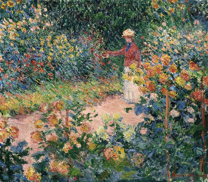
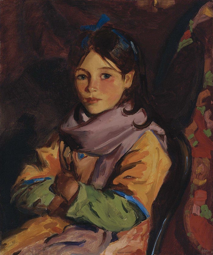
Here are some other master paintings which feature rocks and cliffs. In particular, I draw your attention to the painting directly below by Childe Hassam. Observe the clever linking of colors between the female subject and the light rocks.


Additional Reading
10 Landscape Painting Tips Perfect For Beginners
Want to Learn More?
You might be interested in my Painting Academy course. I’ll walk you through the time-tested fundamentals of painting. It’s perfect for absolute beginner to intermediate painters.
Thanks for Reading!
I appreciate you taking the time to read this post and I hope you found it helpful. Feel free to share it with friends.
Happy painting!
Dan Scott

Draw Paint Academy


Thanks for the varied and detailed teaching on rocks and cliffs. Very helpful indeed.
Thank you. Very insightful.
Hello…I am a novice from way back! I took a semester of art in college in 1950 so you can see how old I am. I still have my tools from then , also took some ceramics locally about 30 years ago….have done a little sketching for fun and am just now getting around to painting with acrylics on canvas. It’s just for fun but I feel a little better each piece I paint. I do love it now that I’m almost too old to work at it but I am enjoying myself. Just wish I was a little more talented. Anyway I’m looking forward to seeing your technique and learning a bit more about this fun project. I’m sure my family will be happier if what they get to hang on their walls isn’t a total mess! Lol. Thanks for your support…..it will be a joy to observe!
I so love the direction and knowledge you provide! If only it would stick to my brain LOL
Cheers!
Thank you for your clear and insightful directions and suggestions. J S Sargent and
C Hassam are 2 artists I have admired and enjoyed and now I am beginning to understand what makes them so impactful. I am just starting to explore watercolor and not terribly competent. I think your explanations will help me loosen up and improve.
Hi again Dan, just got this article out to help me with a painting I’m attempting, also re-read your article on light and shadow. Don’t know why these things seem so difficult….but sometimes they do and it tells me I need to go back to basics. Thank you very much for this work you have done that we all can benefit from.
Thank you for this very helpful article! I’ve been painting for only 6 months and have struggled with leaves, or rather the suggestion of leaves in landscape paintings. This is the most useful article I’ve come across. Your descriptions of technique and illustrative images are a great help to me. I’m currently painting a scene of a rushing stream in a wooded area of trees with autumn foliage and feel more prepared to tackle the trees now.
Thank you ! Your article is very helpful. I have just painted over the beach in an old painting of mine which I never quite liked (too simple) and now I will use your article for inspiration. Thanks again !
Thank you Dan for sharing your talent as well as a beginners guide for us! Your pictures and explanations of rock painting is VERY helpful as I am trying an acrylic painting of a lighthouse from Lake Superior. 👩🏻🎨
Lights and darks in the night
Thanks.Sir.Your sending are nice to read.
While i have not read and studied through, your generous contribution is recognized. Thank you ?
Thanks.
Very interesting. I guess it’s a lot of playing around with light and dark and color.
Thank you Dan. I have trouble with rocks among other things. We are going camping at Arches National Park in Utah USA at the end of this month. I got my dad’s little plein air painting kit ready and am looking forward to seeing and hopefully painting some beautiful rock formations and colors. To practice I am working on copying one of Edgar Payne’s colorful rock paintings – in the hopes that it will help me understand the process better!! Thanks again.
That is great Joan! Let me know how your trip goes. Thanks, Dan
Hey there Dan, I need to get down to business and get your lessons. I am thinking I need some help so that I can enjoy painting, I get frustrated and agitated with my self and I take a day or two off. You will be herring from me soon. Thank you for your openness and teaching.