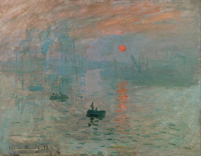
In this post, I take a closer look at one of my favorite paintings, Impression, Sunrise by Claude Monet—the painting which gave Impressionism its name.
- Key Facts About Impression, Sunrise
- Color and Light
- Brushwork
- Composition
- Key Takeaways
- Learn More
- Thanks for Reading!
(Before diving into this post, make sure to pick up a copy of my free Landscape Painting Starter Kit.)
Key Facts About Impression, Sunrise
- Impression, Sunrise was painted in 1872 when Monet was 32.
- It depicts the port of Le Havre in France, where Monet grew up. It is one of a series of paintings based on Le Havre painted around the same time. Below are two of the other paintings in the series:
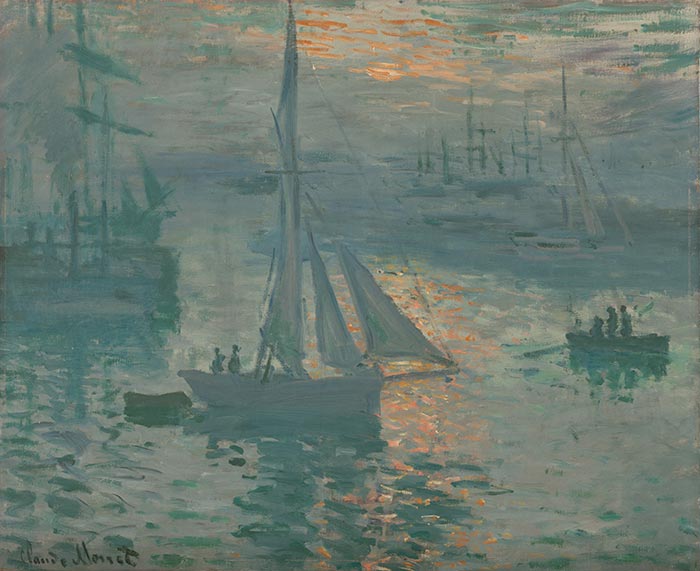
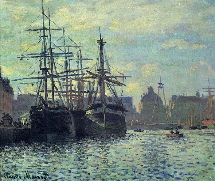
- The series was exhibited in 1874 at the “Exhibition of the Impressionists”. Some of the other artists who exhibited alongside Monet were Camille Pissarro, Alfred Sisley, Paul Cézanne, Berthe Morisot, and Edgar Degas.
- Art critic Louis Leroy wrote about the exhibition in the newspaper Le Charivari and used the term “Impressionism” to mock the loose and relaxed nature of the paintings. But, despite the intended criticism, the artists adopted the term as the name of the movement, Impressionism. Here is an extract from Leroy’s article, which takes the perspective of two skeptical viewers discussing Monet’s painting:
“Impression I was certain of it. I was just telling myself that, since I was impressed, there had to be some impression in it – and what freedom, what ease of workmanship! A preliminary drawing for a wallpaper pattern is more finished than this seascape.”
- Monet named the painting based on his loose depiction of the port. He explained:
“They asked me for a title for the catalogue, it couldn’t really be taken for a view of Le Havre, and I said: ‘Put Impression.'”
Color and Light
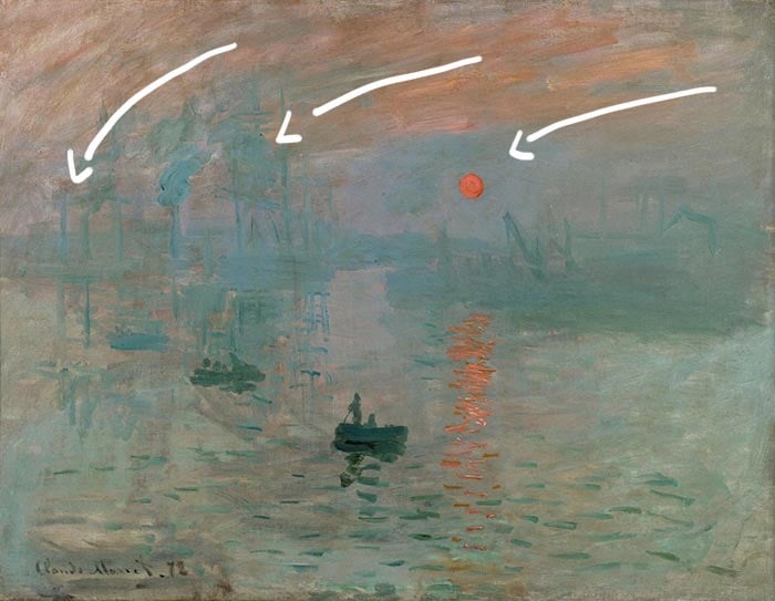
The focus of this painting is almost entirely on color and light. The brushwork is loose, the detail is simple, and the composition is fairly basic. But the use of color to depict light is enough to make this painting work.
Most of the painting is made up of dull oranges, blues, and greens, which form the backdrop for the dark green boats and the vivid orange sunrise.
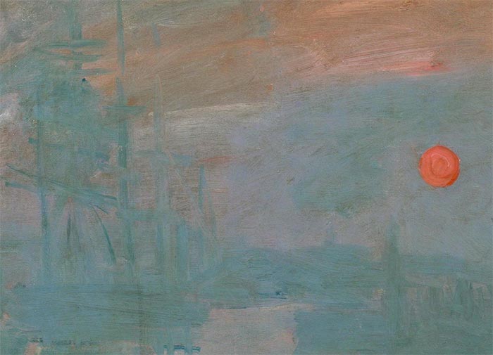
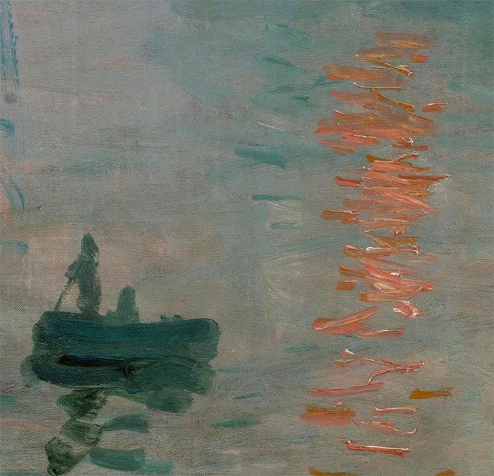
In my opinion, the most interesting part of the painting is the use of vivid orange to paint light. The sun and its reflection really jump out from the rest of the dull tones. Before you continue reading, think about how light or dark the orange sunrise and its reflection are compared to the surrounding colors.
The answer is they are almost the exact same value, as revealed by the grayscale image below. There is basically no value contrast, only saturation and hue contrast. The dark boat, on the other hand, represents a strong value contrast from the surrounding colors.
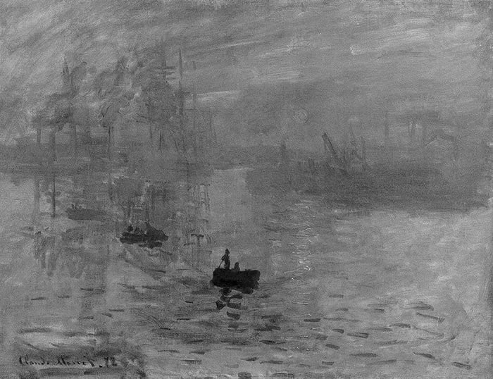
Whenever we are painting an actual light source (like the sun, a lamp, or street light), a dilemma we face as artists is that our paints are not able to hit the same intensity of light itself. The other dilemma, especially for painting a warm light source like the sun, is that our colors tend to get weaker and cooler with the addition of white. What Monet shows with this painting is just how powerful saturation contrast can be, particularly for painting a warm light source.
Brushwork
The brushwork is relaxed and fluent as if Monet painted this without hesitation. There is a contrast between the thin paint used for the background and the thick, impasto paint used for bold accents (the boats, the sun, and its reflection).
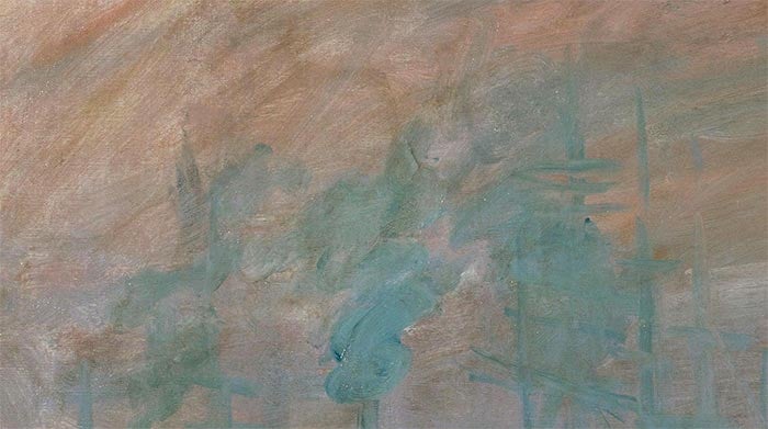
Below is a close-up of the sky. To me, it looks like a build-up of thin washes, with some vague details painted on top using (I assume) a wet-on-wet technique.
The dark green boat seems to have been painted with just a few bold strokes with a relatively large brush (you can see the individual brush marks in the close-up below). More aggressive brushwork was used for the sunrise reflection.
Also, notice how the sunrise reflection was not painted with a solid orange color. There are touches of unmixed white and various orange tones in there. This gives each stroke an interesting broken color effect.

Monet used a similar technique at the bottom of the painting with the dashes of dark green. This suggests movement in the water and adds to the depth to the painting as they are only present in the foreground.
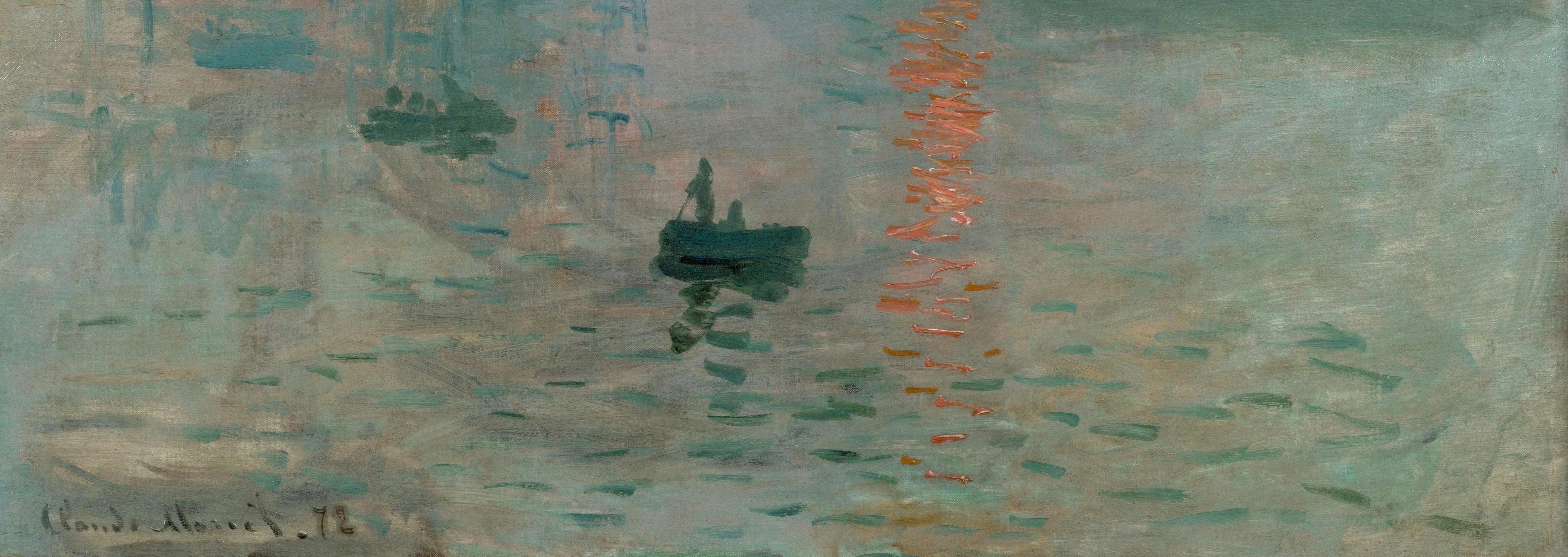
The brushwork in the sky follows a downward curve which gives the painting a sense of movement and keeps your attention within the painting. Had Monet painted the sky with neat, horizontal brushwork, it would look much more static.
Composition
The composition is fairly basic, but there are some important aspects:
- The focal points are clearly the dark boats, the sunrise, and its reflection. Everything else is really just there to create a sense of context and atmosphere.
- The focal points are positioned off-center around the middle.
- There is an interesting clash between light and dark where the sunrise reflection meets the dark green shadows. The sunrise reflection represents a strong verticle line in the painting, despite it being made up of short, horizontal dashes. The dark green shadows in the foreground are spaced out and as a whole, represent a loose horizontal line.
- The horizon line barely exists. There are just some buildings and faded blue shapes in the distance which suggest where land meets the sky.
- The horizon line is positioned slightly above the center. Many artists avoid placing the horizon line directly in the center as it tends to appear unnatural.
- Depth is created by the gradual fading of objects as they recede into the distance. Also, the relatively cool colors used around the horizon line push that area back in perspective, whilst the warm colors used for the top of the sky come forward.

Key Takeaways
- Value (how light or dark a color is) is often taught as being the most important element of a color. But this painting by Monet demonstrates just how powerful saturation contrast can be (just look at the contrast between the orange sun and the dull, surrounding colors).
- If you want to draw attention to a particular area in your painting, then simplify the surrounding areas. In this painting, Monet draws your attention towards the vibrant oranges and dark greens, which stand out from the dull and simplified background.
- Your initial impression of a subject is a powerful thing. Learn to capture it by painting with instinct. I always try to start my paintings with loose brushwork to capture my first impression of the subject. I then refine from there if necessary.
Learn More
A Closer Look at the Mont Sainte-Victoire Series by Paul Cézanne
A Closer Look at The Oxbow by Thomas Cole
A Closer Look at The Starry Night by Vincent van Gogh
Impressionist Art Movement – Masters Of Light And Color
How to Paint Like Claude Monet
Thanks for Reading!
I appreciate you taking the time to read this post and I hope you found it helpful. Feel free to share it with friends. If you ever want to learn more, check out my Painting Academy course.
Happy painting!
Dan Scott

Draw Paint Academy


Dear Dan, I love reading your reviews of individual paintings. This one was especially insightful for me. I love Monet and everything about him. Thank you for educating all who read your remarks. Sincerely, Chris Pfund
Thanks Chris! Dan
Thank you so much Dan! Saw the Monet documentary this afternoon. This post is certainly very timely!
Wonderful! Glad you enjoyed it. Thanks, Dan
Hi my name is Gwendolyn i have a canvas painted and signed by claude Monet that came from Italy and given to me by my grandfather which he is deceased now. The painting look to be over a hundred years old. The picture is impression Sunrise. I was hoping to send you a picture.
I so agree with you Chris
Glad to hear Rhonda! Thanks, Dan
Thanks Dan,
Very insightful.
Frank
No problem Frank, Thanks! Dan
Fabulous analysis. Very helpful to me
Happy to read this Judith! Thanks, Dan
Thanks Dan,
Every day learning more.
Angel (Curaçao)
That’s great Angel! More to come. Dan
A nice breakdown of the components of this painting. Thank you.
No problem Mimi. Thanks, Dan
I love the way you break a painting down Dan, I am able to see and appreciate them differently as a result, and I always learn valuable information.
Just one small question. The painting is of a sunrise I thought from the title. And yet you refer to the sunset. Is this a typo, or did I miss something?
Thanks Dan
Thanks for the pick up Deb! I have fixed this. Thanks, Dan
Love your analysis,thank you so much
Varda
My pleasure Varda! Thanks, Dan
My comment is the same as that written by Chris in the above comments.
I do love and enjoy your articles. Thank you very much.
Brenda
That is great Brenda! Thanks, Dan
Thank you for this great analysis and painting tips. You are an exellent teacher.
Just happy to help Michelle. Thanks, Dan
Thanks Dan — I agree that you are an excellent teacher — Ann Ussishkin
Thank you Ann! Dan
Hello Dan,
Seeing Monet ‘s work , inspires me to pick up my brushes. Beautifull paintings. Have an great day.
Don.!
That is what I want to hear Don! All the best with your painting. Dan
Thank you for interesting information and teaching. You are grate teacher!
Lyudmila.
Thanks Lyudmila. Glad you enjoyed it. Dan
I really enjoyed your insights on this painting! You have a great talent for breaking it all down, in concise way and easy (or easier) to understand. I’ve had some, but limited professional training in colors/hues/values, etc., but thoroughly “get” what you are saying. Thanks for breaking it down for us!
Great to hear Paula! Happy to help. Thanks, Dan
Thank you Dan.
My pleasure Sheba! Dan
Hi my name is Gwendolyn i have a canvas painted and signed by claude Monet that came from Italy and given to me by my grandfather which he is deceased now. The painting look to be over a hundred years old. The picture is impression Sunrise. I was hoping to send you a picture.
it is modern art
?why you considered that is modern art?
From the 15th April to 15th May 1874 Monet exhibited his work together with Camille Pissarro, Alfred Sisley, Édouard Manet, Paul Cézanne, Edgar Degas, and some other thirty artists. They organized their exhibition on their own as they were usually rejected at the Paris Salon. Most visitors were disgusted and even outraged over such a graffiti. Monet’s Impression, Sunrise enjoyed the most attention and some visitors even claimed that they were absolutely unable to recognize what was shown at all. The painting is credited with inspiring the name of the Impressionist movement.
Apenas uma colocação… o circulo laranja não é o sol, mas a lua cheia ao amanhecer.
O sol ao amanhecer irradia luz e não seria tão definido.
Nunca visualizou a lua cheia e laranja ao amanhecer?
Eu chamo de lua de Monet!