
The fundamentals of art are the building blocks of an artwork. They are color, composition, value, form, brushwork, and perspective.
The fundamentals are, for the most part, universal across different mediums and styles. Learning them will help you become a well-rounded and versatile artist.

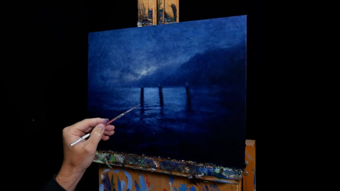
I’ll walk you through the entire process using one of my recent paintings. You’ll see how I go from idea all the way through to reflecting on the finished painting.

Color
I like to break color into two parts: color theory and color mixing and application. Successful use of color in painting requires a thorough understanding of both.
Color theory refers to the body of principles that address how we see color and what it is.
The theory is much easier to comprehend by breaking color into its three individual elements: hue, saturation, and value.
Hue: Where the color is located on the color wheel. Red, blue, yellow, green: these are different hues.
Saturation: How vivid or rich a color is. A color that is highly saturated is vivid. A low saturation color is weak and close to gray.
Value: How light or dark a color is, on a scale of white to black. High-value colors are light and low-value colors are dark.
Color mixing and application is all about taking what we know about color and effectively translating that into our paintings.
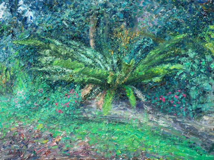
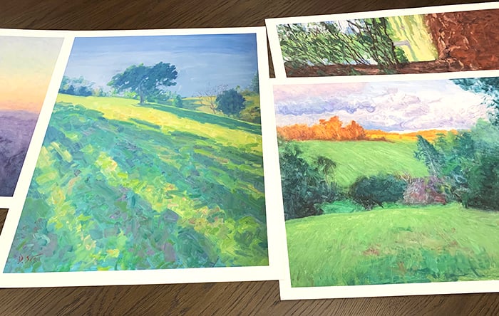
Most of this comes down to experience and time spent on the canvas. Color mixing exercises and creating small color studies (like the ones below) are also incredibly valuable for training your use of color.
You can learn more in my Color Guide.

Composition
Composition broadly refers to how well all the visual elements work together in an artwork. The visual elements are the building blocks of artwork and comprise of line, shape, color, value, space, form, and texture.
A well-designed composition will be inviting and convey the big idea of the artist. Everything will just look like it fits.
Composition is often discussed in association with the principles of art, which are a set of criteria that are used to explain how the visual elements are arranged in a work of art. They comprise of pattern, balance, emphasis, contrast, harmony, variety, movement, proportion, and scale.
Some other concepts which can assist with your compositions are:
Rule of Thirds: A technique that involves segmenting the composition by thirds both horizontally and vertically. The intersections are considered to be aesthetically pleasing areas to position focal points. The rule of thirds can also be used to ensure your composition is not overly symmetrical.
In the beautiful Ophelia by John Everett Millais, notice how key features of the painting are positioned around the intersecting lines, in particular, the female subject’s face.
")
Simplification: Much of art and composition is about taking what we see and simplifying it into something clear and concise on the canvas. It is about simplifying the “noise”.
In John Singer Sargent’s Venice in the Fog, notice how much of the detail has been simplified. The people and boats are depicted with nothing but a few dark color shapes; the buildings in the background are faint and basic; the water and sky are just thin washes of color.

Rule of Odds: The idea that objects in odd numbers can appear more naturalistic than objects in even numbers. This influenced my decision to have three boats in the painting below rather than just two.

You can learn more in my Composition Guide.
Value
Value refers to how light or dark a color is. It is one of three elements of color (the other two being hue and saturation), but it is usually considered as a separate fundamental area due to its importance to the structure and appeal of an artwork.
Painting with accurate values can go a long way in giving your art a quality of realism, even if your brushwork is loose. Take Sir Arthur Streeton’s painting below, for example. If you look closely, you will notice that Streeton did not carefully render every detail. His brushwork was loose and fluent. But, despite this, there is a wonderful sense of realism about the painting. You really get a feel for the dry Australian landscape. That is because Streeton had a remarkable eye for value.

You can see all the different values in the grayscale image below. Note that the value relationships are more important than the individual values. That is, how light or dark one area is compared to the surrounding areas. Streeton painted in a high key (painted with mostly light colors), but all the value relationships are very accurate, giving his work a strong quality of realism.
")
Form and Structure
Form and structure refer to the use of visual elements to convey three-dimensional objects on a flat surface. This could be done through methods such as shading, contrast, or contour drawing.
Most subjects can be simplified down to basic forms of spheres, boxes, and cylinders. Take the seascape painting below by Frederick Judd Waugh.

The waves and rocks are really just an arrangement of spheres, boxes, and cylinders.

Understanding the basic forms and structures which make up your subject will allow you to paint more convincing depictions. That is why many portrait artists dedicate so much time to studying human anatomy.
Brushwork

How you use your brush and manipulate paint on the canvas can be a key feature of your artwork. Much like the bold strokes in Vincent van Gogh’s work or the fleeting dabs of color in Claude Monet’s work.
A general guideline I like to follow with my brushwork is to match the nature of my brushwork to the nature of the subject I am painting. For example, to paint rough, turbulent water, I would use rough, turbulent brushwork. For calm water, I would use calm, smooth brushwork.
I also like to use my brush to follow the contours of the subject. This helps reiterate the form. Van Gogh did this in many of his paintings, like his A Pair Of Leather Clogs below:

Perspective
Perspective in art refers to the depiction of a three-dimensional environment on a two-dimensional surface in a way that captures the relative size, position, and appearance of objects. It is made up of two parts: linear perspective and aerial (or atmospheric) perspective.
Linear perspective is used by artists to determine the relative size, position, and shape of objects by using drawn or imagined lines that converge at a point on the horizon (vanishing point). When one vanishing point is used, that is called one-point perspective. When two vanishing points are used, that is called two-point perspective, and so on.
Below are two examples of one-point perspective in action:


Linear perspective is more important when painting rigid architecture than it is for landscape painting. That is because mistakes in perspective tend to be more apparent when painting things like buildings, houses, roads, paths, etc.
Aerial (or Atmospheric) Perspective
Aerial perspective is the effect of the atmosphere on the view of objects as they recede into the distance. As an object recedes into the distance relative to the viewer, the contrast, value (darkness), color saturation, and detail all fade.
When beginner painters ask me to critique one of their paintings, one of the common problems is the distant elements of the painting (i.e. the distant mountains in a landscape) are painted with the same level of detail and color as the rest of the painting. This gives an unnatural aerial perspective.
In many cases, the most “realistic” mountain you could paint in the far distance may be nothing more than a simple, faint blue color shape. Check out the mountains in the distance in this painting by Monet:

You can learn more in my Atmospheric Perspective Guide.
Thanks for Reading!
I appreciate you taking the time to read this post and I hope you found it helpful. Feel free to share it with friends. If you ever want to learn more, check out my Painting Academy course.
Happy painting!
Dan Scott

Draw Paint Academy


it was really interesting to study your notes and well understanable.
Lovely article that made me ready to develop my skills, thank you.
Thanks for the information.