
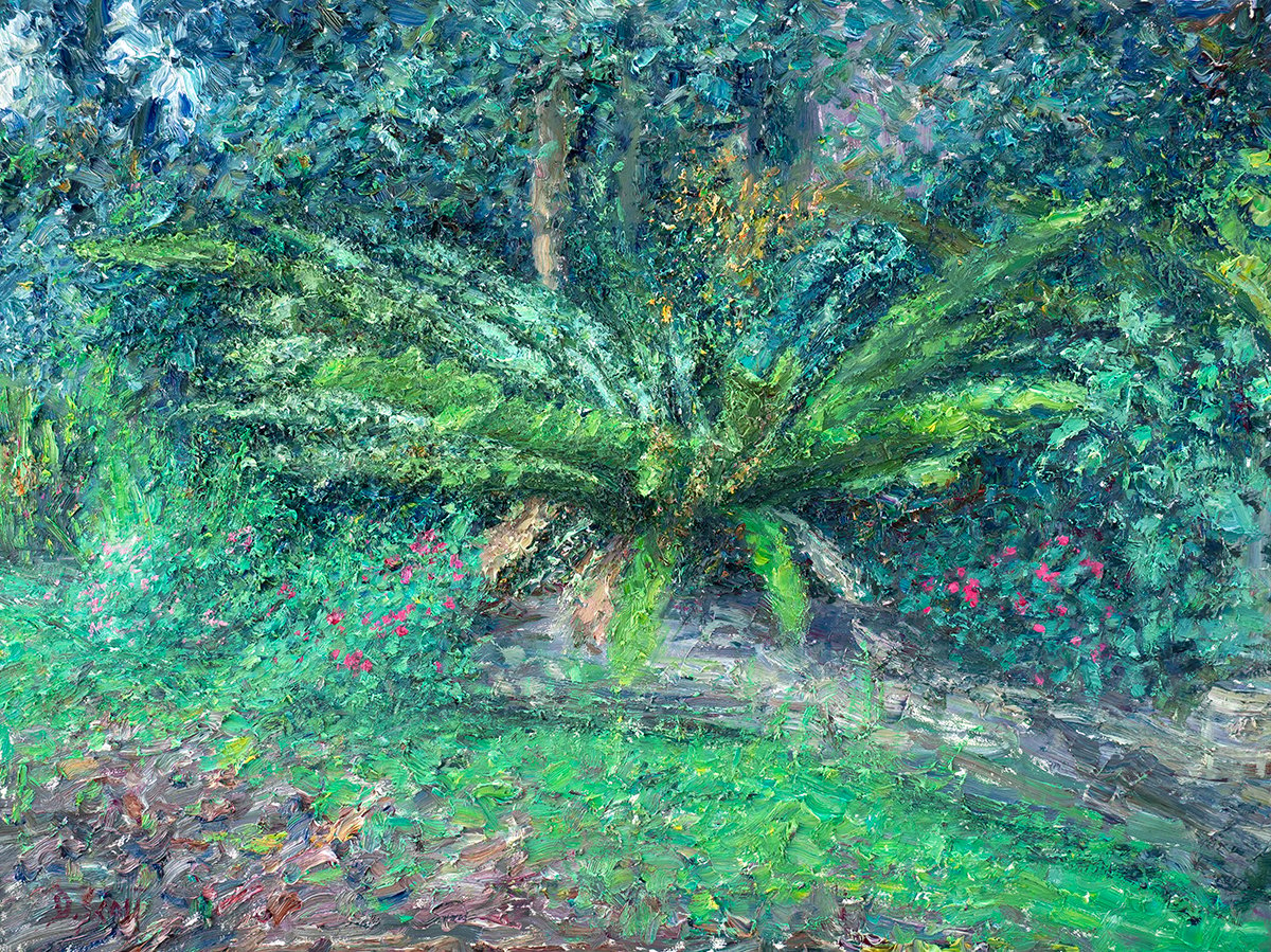
I recently put the finishing touches on my painting Montville, Lush Greens, Rainy Day. This was a tricky one with all the plants, leaves, flowers, and trees weaving in and out of focus. All up, it took about five hours spread over several sessions. The last couple of hours were just spent tinkering and adjusting to make everything work together. I’ll walk you through the key lessons from the painting regarding simplification, varying the greens, edge control, and color techniques.
(Note: I used oils but most of the information here can be applied to acrylics, watercolors, or other traditional mediums. For the surface, I used 18 by 24 inch Ampersand Gessoboard.)
I’ll walk you through the entire process using one of my recent paintings. You’ll see how I go from idea all the way through to reflecting on the finished painting.

Reference Photo
Below is the reference photo I painted from. You can also download a high-resolution version of the photo here. Feel free to try and paint it yourself. Just let us know how you go!

Simplifying a Complex Landscape
Simplification was essential for this painting. I had to tune out all the “noise” and see the subject as an arrangement of basic shapes and colors. Refer to the image below to see what I mean. Whenever I started to get lost in the details, I had to pull myself back and return to a more simplified view.
This isn’t to say I ignored the tiny details completely. I just muted them while I was trying to establish the foundation of the painting. Once I had the foundation in place, I then turned my attention to the tiny details and intricacies.

Capturing the Lush Greens
It was a wet and rainy day in Maleny, Queensland, Australia and nature’s colors were out in full force, particularly the lush greens. It was a challenge to capture all the different greens whilst maintaining a sense of structure and organization. (Side note: This painting of Elora was from that same weekend in Maleny.)
As I painted, I had to constantly think about the greens in terms of the basic elements: value, saturation, and temperature (or hue). I asked myself…
How light or dark is this green compared to the surroundings?
How rich or dull is this green compared to the surroundings?
How warm or cool is this green compared to the surroundings?
This ensured I was varying the greens with purpose and intent rather than just for the sake of it. I also approached the subject as an arrangement of different segments, each with defining characteristics, as follows:
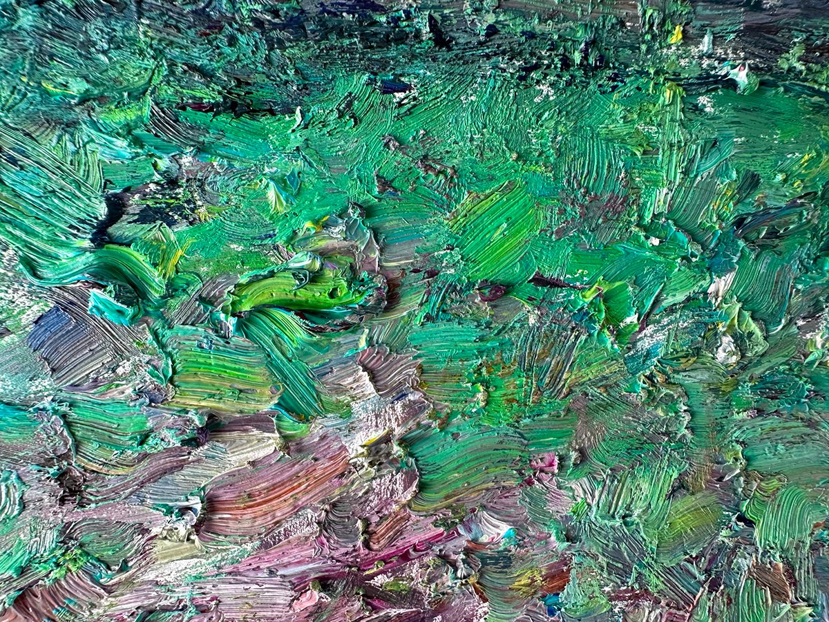
The Grass
Value: Middle to light on the value scale. Saturation: Strong with a few bursts of vivid color. Temperature: Slightly cool on the left; slightly warm on the right.
The value (lightness) of the grass is relatively light compared to the rest of the painting.
A few bursts of vivid color add a bit of flare and interest, but not so much that the grass becomes the focal point.
The grass gets a touch warmer in temperature as you go from left to right. The grass on the left leans toward blue whereas the grass on the right leans toward yellow. This subtle gradation conveys a sense of depth and space. Without it, the ground might look a bit flat and static. Also, the value of the grass stays consistent despite the change in temperature. This is what I refer to as a compressed value range.
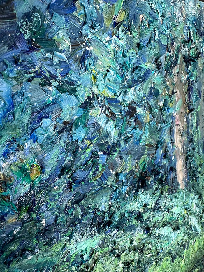
The Background Leaves
Value: Middle to dark on the value scale. Saturation: Weak to moderate. Temperature: Cool.
The area is relatively dark in value. This gives the lighter colors around the middle and bottom of the painting more contrast (dark background, light focal point).
The greens are fairly weak in terms of saturation. This ensures the area falls back in terms of attention and plays a background role. Rich, saturated colors tend to command attention.
The background leaves are cool in temperature for the most part, leaning towards blue.
The Feature Plant (Front)
Value: Light lights and dark darks (high contrast). Saturation: Moderate with a few strong accents. Temperature: Warm.
The focal point of the painting is the beautiful fern in the middle (a “nest fern” according to Google). I approached it in two parts: the front and back.
There’s a sharp contrast between the lights and darks of the plant. This contrast does well to draw attention.
In terms of saturation, the greens are fairly restrained for a focal point. Value contrast does most of the work. But there are a few bursts of strong color for accents around the light areas.
The greens are relatively warm in temperature, leaning towards yellow. It also follows a theme of warm lights, cool darks.


The Feature Plant (Back)
Value: Light lights and dark darks (high contrast). Saturation: Weak to moderate. Temperature: Cool.
The back of the feature plant is wet and reflects more light in some areas. I used sharp and cool highlights to convey this.

The Plants and Leaves Around the Fern
Value: Similar to the grass. Saturation: Moderate. Temperature: Cool.
The plants and leaves around the fern are relatively light, pale, and cool. I used a rough mix of viridian green, cobalt teal light, and titanium white, with more green for the darker colors and more white for the lighter colors.


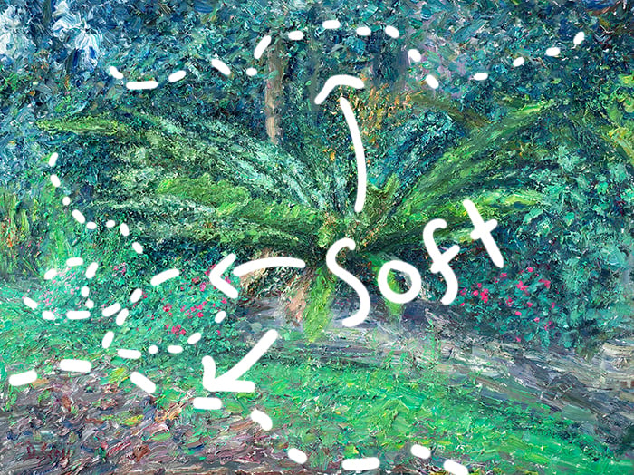
Edge Control
Edge control played an important role in this painting. I used hard edges to bring parts of the subject forward and into focus. These are the exclamation points in the painting. Below are a few examples.

I used soft edges to simplify the painting and ease the transition from one area to the next. For example, there’s a fairly soft edge between the dirt and grass on the ground. Also, I didn’t use blending to create soft edges. Instead, I wove the colors together in a patchwork of broken color. The overlapping colors soften the edge between two areas.
I used broken edges to rough things up and make it all appear natural and interesting. You won’t see many straight lines and neat edges in nature. For example, let’s narrow in on one of the background trees. This is one of the hardest edges in the painting. See how I broke it up with leaves and branches.
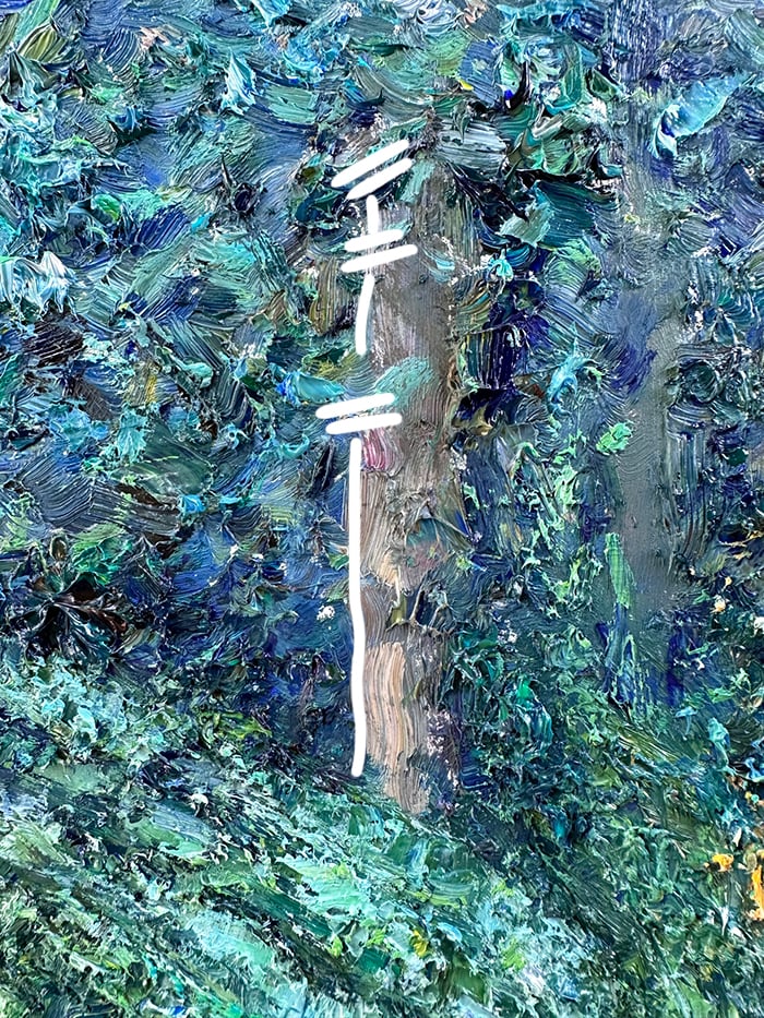
I also did this with the fallen tree on the ground. Notice how the relatively firm edge at the bottom is broken by the grass shooting up and across it. These are subtle but important details to pick up. Without them, the landscape may appear stiff and plastic.

Multicolored Strokes and Broken Color
The main techniques I used were multicolored strokes and broken color. They allowed me to capture nature’s vast detail efficiently without needing to go in and render every single leaf, twig, rock, highlight, and shadow.
For the multicolored strokes, I picked up a few colors on a flat or filbert brush and left them partially unmixed. I then made clean and decisive strokes on the surface and left it at that.
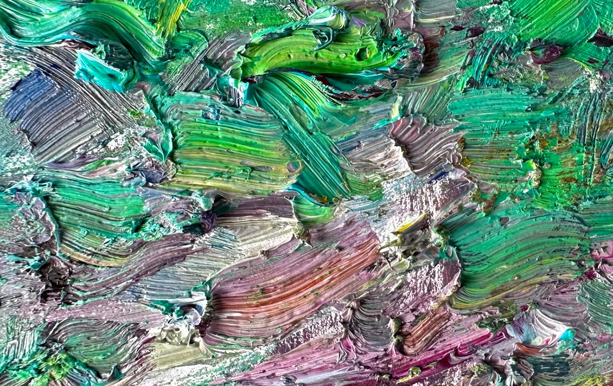
For the broken color, I built up layers of distinct strokes of color. I varied the brushwork to suit the different areas. For the background areas, I used dabs and dots. For the ground, I used longer and more directional strokes. For the plants and leaves around the fern, I used stronger shapes and less color variance.
How I performed these techniques changed depending on how dry the paint was on the surface. When working wet on wet, I could work my strokes into the wet paint, allowing for subtle blending. If I took a wrong turn, I could scrape the paint away and start again. When working on dry paint, I could build up more texture, but I had to be more careful with my strokes as reworking was not as easy.

(I cover both these techniques in more detail in Module 5 of our Color Masterclass. Make sure to join the waitlist to be notified when enrollment opens next)
Key Takeaways
- When thinking about color, always bring it back to the basic elements: value, saturation, and temperature. Ask yourself: How light/dark/rich/dull/warm/cool is this color in relation to the surrounding colors?
- For subjects with diverse colors, consider how to vary the colors whilst maintaining a sense of structure and organization. It may help to break the subject down into segments.
- Edges convey a significant amount of information about the subject. You can use them to melt areas together or bring areas forward and into focus. You can also use them to help lead the viewer through your painting, stopping at key points along the way.
- Multicolored strokes and broken color are particularly effective at capturing nature’s vast detail without having to do that much.
- You can do multicolored strokes and broken color wet on wet or wet on dry, but the way you perform the techniques and the finished appearance may vary.
Want to Learn More?
You might be interested in my Painting Academy course. I’ll walk you through the time-tested fundamentals of painting. It’s perfect for absolute beginner to intermediate painters.
Thanks for Reading!
I appreciate you taking the time to read this post and I hope you found it helpful. Feel free to share it with friends. Let me know your thoughts in the comments.
Happy painting!
Dan Scott

Draw Paint Academy

Love your impressionistic style Dan, and I wish I could paint more impressionistically!! I may try this one!!! I need to use much more paint.
Dan,
This information is particularly helpful because so many of my landscape subjects are mainly green foliage. This reminder of the points to keep in mind about color, plus the reminder about using varied brush strokes, is exactly what I need to work on. Many thanks for your help!
Hi Dan,
As a subscriber, let me thank and wish you and your family a Happy and Bright 2024!
Thank you so much for giving us a very helpful instruction of painting a complex landscape in a step by step method.
I always admire the technique you handle to paint in thick brush strokes and broken colors to enhance the beauty.
Is there any possibility of you taking us through your process of painting a complex landscape on a canvas for us to see.
As some of us learn better by watching the process than reading it, I thought of requesting.
Dan, Blessings for the New Year!! I subscribe to your emails. I have learned that an artist actually thinks and plans their work. I just draw what I see, no thought about light, dark, foreground, background or focal point. Last time I visited the Art Gallery in Muskegon, MI, I noticed these in paintings I have seen a hundred times. This has greatly enhanced my appreciation!! Thank you for sharing your expertise and therefore, helping me “see” better.
Thank you for insightful lesson’s you provided. I learn a lot.
Dear Dan , Thankyou for your inspirational tutorial around your beautiful painting.
I’m now a beginner – intermediate stage artist and have been struggling with a lovely simple yet complex picture of a harbour scene . It has a path walking up to the harbour banked on both sides by varying grasses. Some of the grasses are more blue some veer towards the yellow and lighter and darker shades .It has a small area of little deep pink flowers . Your advice in your tutorial is just what I needed to help me and reassure me as I solve the problems of this painting . Thank you very much
Dear Dan,
Am so inspired plus Motivated when I read your intricate steps on painting landscapes…will surely adapt and see how it goes..am positive to get a great start.
Thank you for the newsletters. I have learned so much from them and from the class I took from you. The comments on managing color value are especially helpful.
Thank you so much for this instruction! I really appreciate your lessons, Dan!
So much information to use regardless of the medium you work in, great takeaways. Enjoy your newsletters and often share with students who don’t subscribe, many do!
I always learn a lot from your newsletters. Thank you so much for sharing. You are so inspiring that someday I may pick up a paintbrush and paint.