
Successful use of color in painting requires a thorough understanding of both color theory and color mixing and application. I wrote about the theory in a previous post. This post will provide you with everything you need to know about color mixing and application. I’ll cover:
- Basic Color Mixing Terms
- The Three Questions to Always Ask Yourself
- How to Lighten a Color
- How to Darken a Color
- How to Lower the Saturation of a Color
- How to Mix Vivid Colors
- How to Mix Browns and Grays
- Common Reference Points
- How I Would Mix That Color
- Key Takeaways
- Want to Learn More?
- Thanks for Reading!

I’ll walk you through the entire process using one of my recent paintings. You’ll see how I go from idea all the way through to reflecting on the finished painting.

Basic Color Mixing Terms
Color is a complicated area, but it helps if you understand some of the basic terms, which are:
Hue: Where the color is located on the color wheel. Red, blue, yellow, green: these are different hues.
Saturation: How vivid or rich a color is. A color which is highly saturated is vivid. A low saturation color is weak and close to gray.
Value: How light or dark a color is, on a scale of white to black.
Color Scheme: An arrangement of colors which are considered to be aesthetically pleasing. The main color schemes are analogous, complementary, split-complementary, triadic, rectangular and monochromatic.
Tint: A color plus white.
Shade: A color plus black.
Tone: Any color which is not pure. You will often hear the phrase “toned-down” which basically means a color has been mixed with other colors and the saturation has been reduced.
Complementary Colors: Colors on opposing sides of the color wheel (for example, red and green).
High-Key: A range of light colors.
Low-Key: A range of dark colors.
The Three Questions to Always Ask Yourself
Before I get into the particulars of color mixing, I want to provide you with the three questions which guide my color mixing. If you can address these three questions, then you should have no issues mixing most of the colors you see (there are always some exceptions of course).
Here they are:
- Is my color light or dark enough (value)?
- Is my color dull or saturated enough (saturation)?
- Is my color too warm or cool (hue)? Or, is my color too red, blue, or yellow?
This whole post can basically be summarized with these three questions. It all comes back to how well you can identify and adjust a color’s value, saturation, and hue. Color mixing is much like a beautiful dance between these three elements.
How to Lighten a Color
Most beginners tend to default to titanium white whenever they need to lighten a color. But when you add white to a color, it not only lightens that color, but it also lowers the saturation (makes it weaker) and makes it cooler in terms of color temperature. That can sometimes work against your color mixing, particularly when you are painting a subject under a warm light source. In this case, you want your colors to get warmer as they get lighter, not cooler.
The alternative is to lighten your color using yellow. This will (in most cases) increase the lightness and retain the saturation, but the hue will change. Here are some examples of when I might use yellow over white for lightening a color:
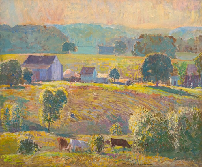
I am painting rich, green leaves on a tree. The green on my palette is too dark, so I need to add either white or yellow to lighten it.
Yellow would be more suitable in this case because it would not only lighten the color, but also retain the saturation. Yellow would also make the green a touch warmer, which would suggest the warm light from the sun.
For example, in my painting below, I needed to mix a light green for some of the leaves on the trees which were hit by the warm sunlight. Yellow made more sense in this case as it lightened the green, whilst retaining the saturation and making it a touch warmer.

I am painting deep shadows which need to be a touch lighter. I start with raw umber plus ultramarine blue, but it is too dark for the painting. Adding white would make the shadows appear weak and chalky. Yellow might be a more suitable option to retain the richness of the shadows.
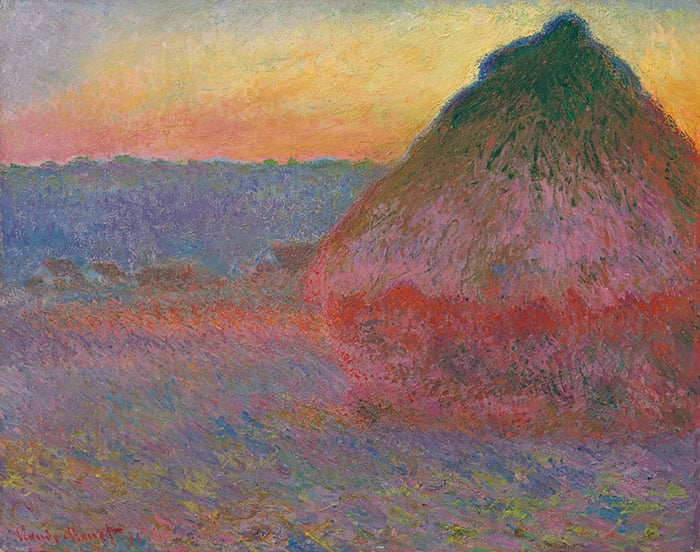
I am painting the vivid oranges of a sunset. I start with a base orange color, but it needs to be lighter. Adding white to the orange would make it lighter, but also weaker and cooler. A better option would be to add yellow, which would make the color lighter, warmer, and retain the saturation. That is how I approached the rich colors for the sunset in my painting below.

How to Darken a Color
To darken a color, the default for most people is black. But you could also use:
- Raw umber plus ultramarine blue, which is basically an alternative for using black from a tube;
- Blue, green, or red, which tend to be naturally dark colors;
- Raw umber, or any other dark earth tone.

How to Lower the Saturation of a Color
There are several ways you can lower the saturation of a color (make it duller):
- Mix the color with its complement (the color on the opposite side of the color wheel). For example, to lower the saturation of red, you could mix it with its complement, green. In a perfect world, mixing two complementary colors would eventually produce a pure gray. However, complementary colors are usually not absolute complements, but rather approximations. Color in painting is not a perfect science.
- Mix the color with gray.
- Mix the color with white. The color would also get lighter and cooler.
- Mix the color with black. The color would also get darker.
- Mix the color with another low saturation color, like raw umber. There would also be a change in hue.
- Mix the color with the muddy paint on your palette after a long painting session.

How to Mix Vivid Colors
If you are painting realistically, then you will rarely need to use vivid colors in your painting; you will mostly be using toned-down versions of colors. However, there are of course exceptions. Perhaps you need a vivid orange for a flower, or a vivid yellow for a sunset, or a vivid green for lush leaves.
For the primary colors (red, blue, and yellow) you need to rely on pre-mixed colors; you cannot mix your own vivid primary colors by mixing other colors together. Cadmium red, ultramarine blue, and cadmium yellow are examples of vivid primary colors. Burnt sienna, Prussian blue, and yellow ochre are examples of non-vivid primary colors.
For secondary colors (orange, green, and purple) you need to mix just two primary colors. Red and yellow mix orange; yellow and blue mix green; blue and red mix purple. The problem is that most of our primary colors are not pure primary colors; they often contain traces of some other color. For example, yellow ochre is a relatively warm yellow and contains some red. Cadmium yellow light is a relatively cool yellow and contains some blue.
So, to mix vivid secondary colors, you need to make sure the two primary colors lean towards the secondary color you want to mix. For example, to mix a vivid orange, you want your yellow and red to lean towards orange on the color wheel. To mix vivid green, you want your yellow and blue to lean towards green. To mix vivid purple, you want your blue and red to lean towards purple.
If you want to learn more on this, you should check out my post on the split-primary palette.

How to Mix Browns and Grays
Browns and grays are usually what you end up with on your palette after a long painting session.
Brown is basically just a dull version of orange. To mix your own brown, you can simply tone down an orange by mixing it with blue (its complement). Or you could mix all three primary colors, using slightly more red and yellow. You can read more about mixing browns in this post.
For mixing grays, you could:
- Mix ultramarine blue with raw umber. This gives me a near-black color. Add a touch of white and you will get gray. This is my preference, as I believe it is the most reliable option;
- Mix roughly equal portions of the primary colors; or
- Mix two complementary colors until you get gray.
Tip: Use browns and grays to draw focus to your vivid colors. A vivid red surrounded by gray appears much more brilliant than a vivid red surrounded by other strong colors which compete for attention.

Common Reference Points
Below are some common color mixing reference points:
Blue Sky: Getting the value right is more important than getting the hue right. The sky will usually be around the middle to light value range. The challenging part of getting the value right is that the blue sky is essentially one big light source. Our paints struggle to hit the same intensity of light itself, so we need to compensate in other ways, like making the color lighter or more saturated in comparison to the rest of the painting.
As for the hue, cobalt blue or ultramarine blue plus titanium white is usually suitable. I sometimes add a touch of orange to tone the color down. However, be careful not to fall into the trap of believing that the sky is always blue. Often there are soft greens, yellows, or pinks in what appears to be a blue sky.
Also, there tends to be a gradation in color and value as you go from the top of the sky to the horizon line. If you ignore this gradation, your sky may end up appearing flat.
An artist who is particularly skilled at painting the blue sky (and the landscape in general) is Josh Clare.
Turquoise Water: I often use a mixture of viridian green, cobalt blue, and plenty of titanium white. In the painting below, I also added a touch of red for the shallow water to indicate some of the lake’s floor showing through.

Greens Leaves on a Tree: Pay close attention to the color temperature of the green. Is it slightly warm or cool? Does it lean towards yellow or blue? This will determine what colors you need to mix the green. For a cool green, I either use viridian green from a tube, or a mix of cobalt blue plus cadmium yellow light. For a warm green, yellow ochre plus a touch of blue works well.
In many cases, the “green” is not actually green but rather a dull orange. Especially if you paint scenes like the dry Australian landscape.

Skin Tone: A challenging color to mix which will depend on the subject and the light source. But usually, it will be some form of dull orange or pink. If you want examples of how to paint skin tones, then check out the work of Anders Zorn.

Tip: Be careful of any preconceived ideas you have about the color of something. For example, the blue sky, the green tree, or the yellow banana. You need to be objective with your use of color when painting and not rely on these ideas.
How I Would Mix That Color
")
I want to give you an idea of my actual thought process for mixing colors. Above is a reference photo from New Zealand which I have not yet painted from. If I were to paint this scene, here is how I would go about the color mixing:
How I would mix the blue sky and clouds: The blue sky is rich and fairly light compared to the rest of the scene. There is also a slight gradation in lightness as you go from the top of the sky to the horizon line. I would use cobalt blue plus titanium white for the sky and make the color gradually lighter as I move down towards the horizon line, to pick up that gradation in lightness.
For the clouds, they appear to be a very light blue. I would just use titanium white with the same brush I was using to paint the blue sky. Pure titanium white may be suitable for the brightest highlights.
How I would mix the snow on the mountain: This is perhaps the most challenging color to mix in the scene. Snow has a light, near-white local color. But because this snow is mostly in shadow and distant, it takes on a blue appearance. Capturing the value relationships between the snow and the rest of the painting is the most critical aspect of this area. If I make the snow too light or dark, it would completely throw out the rest of the painting. My judgment tells me that the snow is darker than it appears to my eyes; just a touch darker than the blue of the sky. I would use ultramarine blue, raw umber, plus titanium white.
How I would mix the mountain in shadow: I would use ultramarine blue, raw umber, titanium white, plus a touch of viridian green. The color would need to be darker than the snow, but still appear distant compared to the rest of the painting.
How would I mix the trees getting hit by light on the left-hand side: This appears to be a dull orange, with some areas leaning towards green and other areas leaning towards yellow. I would use a rough mix of yellow ochre, viridian green, raw umber, and titanium white. The shadows in this area are also very deep, so I would start by laying a foundation of raw umber plus ultramarine blue.
How I would mix the large rock in the foreground: The structure of the rock is more important than the use of color. I would need to accurately capture the different light and dark planes of the rock for it to appear realistic. I would use a mix of ultramarine blue, raw umber, viridian green, and titanium white.
Tip: I tell you what colors I would use, but I do not say anything about how much of each color I would use. So I am really only giving you half the information. The more important aspect is being able to dance between the value, saturation, and hue until you reach the color you desire. This is why I do not believe in “color recipes” or strict color palettes. The actual colors you use is not nearly as important as your understanding of how to use them.
Key Takeaways
Here are some of the key takeaways from this post:
- Learn the color theory terms, especially value, saturation, and hue. They will help you understand how to mix and apply the color in practice.
- The three most important color questions to ask yourself are: Is my color light or dark enough? Is my color dull or saturated enough? Is my color too warm or too cool? If you learn anything from this post, let it be these questions.
- You can lighten a color with white or yellow. You do not need to always default to white.
- You can darken a color by using black, or any other color which is darker than what you currently have. Blue, green, red, brown: these are all naturally dark colors.
- To lower the saturation of your color, you could mix it with its complement, gray, white, black, or raw umber.
- To mix vivid secondary colors, you need to avoid mixing the three primary colors. That means using primary colors which lean towards the color you are trying to mix on the color wheel (if you are trying to mix vivid orange, then you need a yellow and red which lean towards orange, not away from it).
- Use browns and grays to draw focus to your vivid colors.
- Learn to see color objectively. Do not rely on any preconceived ideas you might have (the sky is not always blue).
- Be careful of color “recipes”. Using color is not like following a cookbook. You need to have an understanding of how to use and manipulate color.

Want to Learn More?
You might be interested in my Painting Academy course. I’ll walk you through the time-tested fundamentals of painting. It’s perfect for absolute beginner to intermediate painters.
Thanks for Reading!
I appreciate you taking the time to read this post and I hope you found it helpful. Feel free to share it with friends.
Happy painting!
Dan Scott

Draw Paint Academy


Again thankyou Dan, this has been an amazing colour journey. I am leaning so much.
Cheers
Liz
Hi! Thank you so much for all the information provided on your site. I’m just starting out and I’m really excited.
I would like to ask you a question.
If I purchase Ultramarine Blue, Cadmium Red and Cadmium Yellow, do I still need the primary colors of those three?
What would you suggest?
Thank you,
Mara
Thankyou so much Dan for sharing such a useful informative article.
Kind Regards
Jocelyn
Thank you Dan for a very insightful article and sharing it!!
¡¡¡¡ GRACIAS , GRACIAS, GRACIAS, POR ESTE ARTICULO SOBRE LA MEZCLA DE COLORES, UNA GUIA COMPLETA, PALETA DE COLORES, COMO MEZCLAR LOS COLORES, ETC.!!!!!!! COMPLETO, PRECISO, MUY BEN EXPLICADO, IDEAL PARA PRINCIPIANTES YO TENIA MUCHAS DUDAS, AHORA CON ESTE ARTICULO TAN EXPLICATIVO, SE ME DISIPARON. ME FALTA MUCHA PRACTICA, ESO ES OTRA COSA. SALUDA ATENTANTAMENTE, GRACIELA CEBALLOS DESDE ARGENTINA.
Thanks Dan for the excellent post.
Thank you for this great article! All of the points in this post are like gold to me as I am just beginning to understand color mixing as I do colored pencil mostly at this point. Thank you!
Excellent article! I have great difficulty seeing shadow colours. I need Monet glasses! However, can you address a guide to painting the purples of shadows on a dusty sandy road, or the bright blues used by Monet on landscapes or that wonderful Charing Cross Bridge you used as an example. I could sit there for hours and not see these colours. They may not in actuality be there but boy do they work. The impressionists generally use bright colours for shadow areas where I would simply see greys. Is there a formula one can follow?
Thank you so much for all this valuable information I am 88 years old and love watercolor. I am just taking it up again and really appreciate all the information. You are so kind to share your knowledge 🌹
Very informative for a beginner like myself! Thank you!
thank you very much/ i learn a lot
Thank you for sharing your knowledge. I am a novice acrylic painter and really appreciate your teachings. Regards from Santiago Chile
Excellent information, super helpful. Thank you!
You are very generous with your advice. It all makes such sense. I value your posts, thank you.
thank you so much for sharing!
Great lessons, thank you Dan
Good post Dan,
You kept it very simple, it’s in the printer as I write this reply. Shadows have been a pain for me, as were reflections (which I think I have ok now).
So thanks for another enlightening post to add to my collection, looking forward to the next one.
Dave M (Australia).:)
Super useful advice and very timely as I have just started doing an acrylics course. Thank you Dan.
A really clear and sufficiently comprehensive account of colour theory – thank you Dan, this is a great help!
Thank you DAN,
I ALWAYS make notes from your very informative posts. You make everything clear
And understandable. Thank you so much.
Really learned a lot on mixing colors. Mixing colors is quite an art in itself and your explanation of this was very helpful. What paints do you use when painting grass. Getting the summer greens and fall colors sometimes can be frustrating. Appreciate any input on this.
Thanks, John Anderson
Thank you for this very interesting post, Dan. I am a novice and have read about color mixing but only now understand what the terms mean with the examples given here as well; I am thrilled!
Thank you very much for this post. So informative! I am going to introduce raw umber and see what colours I can make!
That was excellent: I find subtle greys among the hardest colors to achieve, particularly in rock, granite. Thanks.
Such a valuable collection of information Dan; thank you so much for sharing your knowledge and experience with us. While I cannot join your academy for several reasons, I do recommend it to all my artist friends.
Thank you Dan, you are a great teacher! You provide easy to understand instructions. I really enjoy all of your emails.
I do watercolor do your basic principles apply since white Is not used much in watercolor would I benefit from Your academy
I do watercolor do your basic principles apply since white Is not used much in watercolor would I benefit from Your academy