
Color saturation refers to how vivid, rich, or intense a color is. It is one of the three elements of color, with the other two being hue and value.
Below is a saturation scale showing what happens when you take a vivid red and gradually lower the saturation until you have pure gray:

Most artists consider saturation to be more important than hue, but less important than value for painting with a sense of realism. In this post, I cover:
- Saturation Versus Chroma
- The Challenge With Highly Saturated Colors
- How to Alter Color Saturation
- Saturation and Atmospheric Perspective
- Using Saturation to Draw Attention
- Dull Paintings (Low Saturation)
- Bright Paintings (High Saturation)
- Color Saturation Exercises
- Key Takeaways
- Want to Learn More?
- Thanks for Reading!
I’ll walk you through the entire process using one of my recent paintings. You’ll see how I go from idea all the way through to reflecting on the finished painting.

Saturation Versus Chroma
The term saturation is often used interchangeably with the term chroma. They broadly mean the same thing. However, it is important to understand the subtle difference between the two terms.
Saturation is a relative term. It describes a color’s brilliance in relation to pure gray.
Chroma, on the other hand, is an absolute term that can be measured on a scale. In the Munsell Color System, each color has been designated a chroma rank, from 0 for gray to 12+ for vivid colors.
If you were being particular, then chroma is more appropriate than saturation for comparing the brilliance of two different colors. But practically speaking, your use of saturation or chroma will not influence your painting. Personally, I only use the term saturation to describe a color’s brilliance and avoid the use of chroma to keep things simple.
The Challenge With Highly Saturated Colors
The main challenge of painting with highly saturated colors is that it is easy to confuse them with being lighter than they actually are.
Take cadmium red for example. This is a highly saturated, or vivid, red. If you were to place this color on a value scale somewhere between white and black, where do you think it would go?

Most beginners would probably guess too light. That is because it is easy to confuse high color saturation with lightness in value. For reference, below is the color in grayscale. It is around the middle value range.

Note: Being able to identify the value of a color in isolation is a useful skill, but remember that it is always much harder when you are actually painting. That is because you are dealing with so many other variables.
How to Alter Color Saturation
There are several ways you can alter the saturation of a color. However, you need to be aware of the implications a change in saturation might have on the other two elements: hue and value.
Below are the different ways you can alter the saturation of a color and the other implications:
Add gray: The hue will stay roughly the same and the value will get closer to the value of the gray. If the gray is the same value as the base color, then the value will also remain unchanged.
Add white: The color will get slightly cooler in temperature and the value will get lighter. This is also known as a tint.
Add black: The hue will change slightly depending on the type of black you use and the color will get darker in value. This is also known as a shade.
Add the color’s complement: For example, add red with green, or blue with orange. The hue and value will change depending on the portion of each complementary color you use.
Add some other low saturation color: For example, raw umber, or the left-over “mud” on your palette after a long painting session. The hue and value will change depending on the color of the “mud”. This is the most unpredictable option for altering a color’s saturation.
Saturation and Atmospheric Perspective
Atmospheric perspective provides that as an object recedes into the distance, it starts to take on the appearance of the surrounding atmosphere. As part of this, colors tend to get weaker and less saturated in the distance. One of the main exceptions to this might be if you were painting a vivid sunset in the distance and you want to really draw attention towards the light.
In Isaac Levitan’s Spring in Italy, notice how the colors step down in saturation as they recede into the distance. The foreground is filled with vivid pinks, greens, and blues. This brings this area forward in perspective, whilst the background of weak colors falls back.

Below is another example by the masterful landscape painter Edgar Payne. The strong oranges, greens, and blues jump forward, whilst the weak tints in the background fall back.
You should also note that the colors are not only getting weaker in saturation, but they are also getting cooler in color temperature and lighter. Saturation is playing just a small yet important part of the big picture.

Atmospheric perspective is more relevant for landscape painting where you are dealing with a long depth of field. It is less significant for still life or portrait painting where everything is much closer to you in perspective.
Using Saturation to Draw Attention

Saturation can be a powerful tool for drawing attention towards your focal points. Just a few small dabs of vivid color amongst a dull background will stand out like a beautiful violin solo amongst the background choir.
However, you need to be careful that you do not overdo it; less is more in this case. Too much color saturation might seem jarring and garish. You want to make a powerful statement that is still in line with the rest of your painting.
Remember, painting is all relative; your statement only needs to be powerful in relation to everything else in your painting. If you have a subtle painting filled with grays and weak colors, then it will only take a small burst of color to make a powerful statement. But, it may take something more if you are painting a bright impressionist landscape filled with saturated greens, blues, and yellows.
Below is a perfect example of using color saturation to draw attention by Claude Monet. The relatively vivid orange sun and its reflection stand out from the surrounding weak colors.

What I find interesting about this painting is that there is almost no value contrast with the sun and its reflection-they are around the same value as the surrounding colors. The grayscale image below shows you what I mean. Notice how without color, the sun and its reflection are barely visible. Monet relied mostly on color saturation and hue to draw attention to the sunset.
")
In John Singer Sargent’s A Dinner Table at Night, vivid red is used to draw your attention towards the female figure around the middle. The rest of the painting is comprised of nothing but black, grays, and other weak colors.

In Visiting, Abram Arkhipov used saturated pinks and yellows to help emphasize the area in light.

In William Wendt’s landscape Red Poppies, the vivid red jumps out from the background of dull green. Not only is there a contrast in level of saturation (vivid against dull ) but also hue (red against green). Red and green are complementary colors, meaning they naturally contrast against each other.

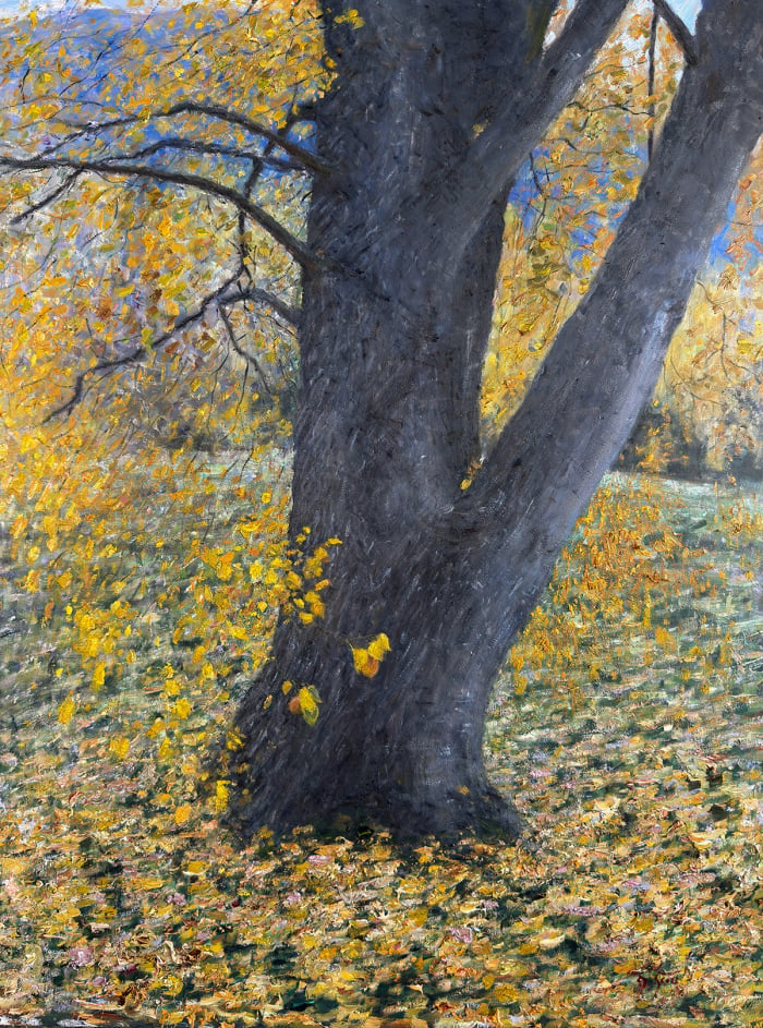
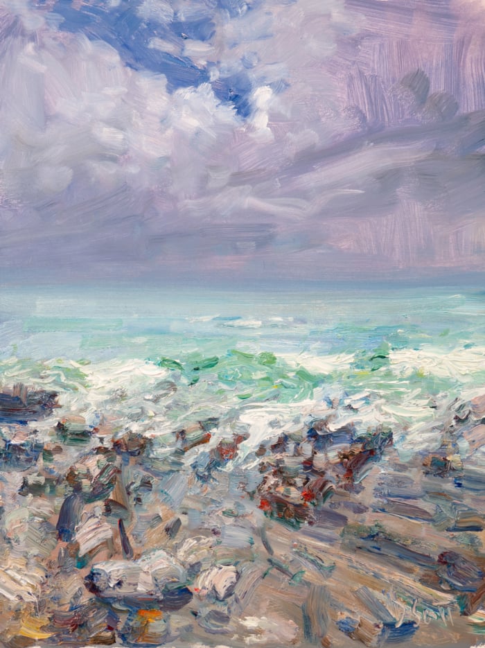
Dull Paintings (Low Saturation)
Below are some examples of dull (low saturation) paintings:


, 1924")

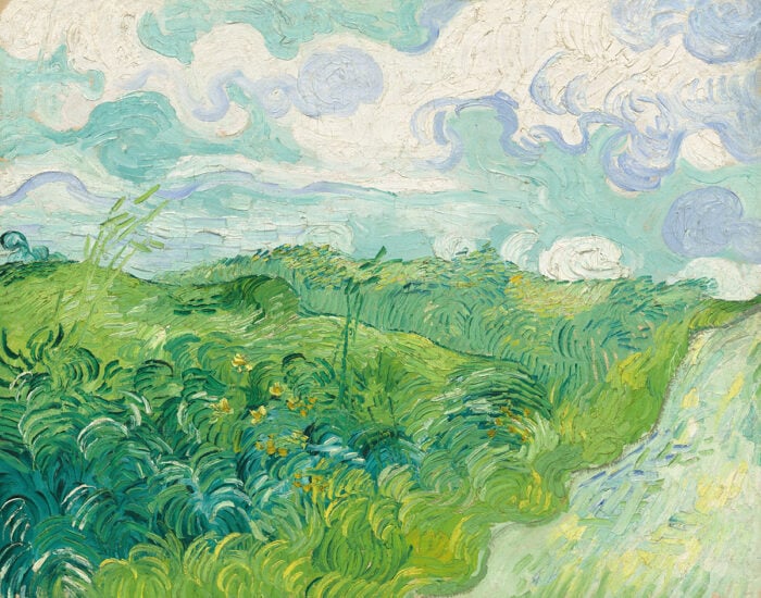
Bright Paintings (High Saturation)
Below are some examples of bright (high saturation) paintings:


Color Saturation Exercises
The following exercises will help you understand and see color saturation:
Monochrome or dull palette painting: Create a painting in a monochrome or dull color palette. This will teach you to be more sensitive to changes in color saturation.

Complementary color painting: Paint a simple composition with just two complementary colors (yellow and purple, or red and green). This will teach you how to balance the saturation of two competing colors.
Color charting: Take your main palette of colors and chart out the different possible combinations of colors. Observe changes in color saturation as two colors are mixed.
Color saturation scale: Pick a base color then gradually lower the saturation without changing the value. You will end up with a saturation scale, like the one shown at the start of this post.
Key Takeaways
- Color saturation is how vivid, rich, or intense a color is.
- Be careful not to confuse highly saturated colors as being lighter than they really are.
- There are many different ways to alter the saturation of a color, but be mindful of any changes to the other elements, being hue and value.
- As an object recedes into the distance, the colors tend to get less saturated (weaker). This is due to atmospheric perspective.
- Color saturation is a powerful tool for drawing attention to your focal point. But remember, less is more.
Want to Learn More?
You might be interested in my Painting Academy course. I’ll walk you through the time-tested fundamentals of painting. It’s perfect for absolute beginner to intermediate painters.
Thanks for Reading!
I appreciate you taking the time to read this post and I hope you found it helpful. Feel free to share it with friends.
Happy painting!
Dan Scott

Draw Paint Academy

Dan, including a picture with each term you describe enables me to understand the description. I save all your emails for later research.
Thank you for your great article and pictures! You’ve helped make the subject so much clearer than anything I’ve seen before. I found it at a good time, for the studies I’ve been creating. The right values make all the difference in creating believable landscapes!
I was intrigued by the Monet Painting Impression Sunrise 1872. Typically a student is told to develop a painting considering an interesting value structure first… as the foundation structure of the painting. Obviously the was not Monet’s first consideration here! Very few instructors really address the phenomenon of high saturation (though technically a neutral value ) effecting the compositional design in terms of gray scale. Thank you for mentioning the issue!
I thought the same thing, really genius of him. This info is gold, specially the chroma facts.
I was intrigued by the Monet Painting Impression Sunrise 1872. Typically a student is told to develop a painting considering an interesting value structure first… as the foundation structure of the painting. Obviously the was not Monet’s first consideration here! Very few instructors really address the phenomenon of high saturation (though technically a neutral value ) effecting the compositional design in terms of gray scale. Thank you for mentioning the issue!
Thank you for the tips on saturation, value, and how they affect a painting. I am starting off in watercolour and have a question: how do you get the colour saturation scale that you shared at the top of this article? Do you have an example, say, starting with pure red to grey by adding colour(s) to it?
Thanks!
Hi Kanwar! You could take a base color, say yellow, and mix it with more and more of the same value gray. This will give you a simple saturation scale. Cheers!
Thank you for this! It is VERY often mistaken. For instance, I have listened to people describe colors as saturated if they are deep or dark versions. I just now listened to someone describe a dark orange-brown color as saturated. Also have heard a midnight blue being described as saturated. I think they really mean they have a lot of pigment or that they are the opposite of washed out or weak (watered down). When I try to explain that saturated means they are closer to the PURE colors (such as primary colors) without being dark or light (shade vs. tint). When in fact, the dark orange-brown color was a less intense or a muted version of yellow-red (or the secondary color orange). and that their midnight blue color was a blue that had been shaded by adding black to it. They cannot seem to understand. I learned all about this in my first art course in high school. SO basic but so complicated for people to understand.
Superb Sir.
From a relative art philistine, interested in finding his way , this was an excellent explanation and presentation.
Thanks Dan, your explanation and examples makes it so much easier to understand saturation.
Thank you so much for your article. As always you provoke thought into how we are painting something. I love how you also provide examples which only reinforce your explanation. Well done and well written. It’s a good reminder to be sure to use this method as I am a landscape artist and if I don’t use this technique the painting will not look correct. Thank you Dan.
This was a great lesson
I thank you for defining what we look but do not know the importance of “saturation”. Somehow it forces us to observe the other parts of the painting.
As in music, the theme would not stand out without a second voice comes through.
(I.e. Bach).
Well said and explained. Helped clear up a few things for me. Great choice of example paintings to illustrate your points too. Just awesome!
Thank you for sharing. Very informative
Thank you Dan. Really helpful article, particularly with the grayscale examples. Excellent
Very difficult subject for me to comprehend but thanks for the explanations.
A other great article. Thank you Dan
Thank you Dan. My conversation with colour will continue and be enhanced
Great article and advise. Love Levitan’s work !
This is a post I’ll want to return to again and again. So much information well supported by paintings that illustrate the point. As always your articles are clearly written and easy to follow. Wonderful.
Thank you, Dan.
Dan,
This is one of your better posts. Very helpful for artists of all abilities.
Keep ’em coming.
Dave M. 😎🇦🇺 QLD.
Very helpful
Thank you, Dan
I enjoyed reading your article.
Really enjoyed this article found it very informative, thank you.
Great job. Love the painting illustrations you used.
Another wonderful article. Thank you!
Thank you! I am learning a lot, your resources are fabulous!
Excellent article, Thank you for your generosity to alway share.
Dan, Thank you for yet another extremely thorough and informative piece. Your research and painting references are spot on. You should consider assembling all your articles into a printed book format.
Extremely helpful. Thank you.
I’m really looking forward to applying these exercises and use them to enhance my paintings overall. I’m struggling with this very topic and find it extremely helpful. Thank you very much!!!
A huge help for me…Already seeing the results of using this helpful lesson.
Today I will paint better!!
Wow! Amazing lessons here. I know I was taught this many years ago, but it is so important And meaningful to return to it. This is so helpful.
Thanks,
Leila Evans
All of you articles or posts are very informative. I think this one will probably be one of the most helpful. Thank you
Very usefull information. Thank you. Will experiment some combinations! G. Wille
I love the example of the Monet “Sunrise” in color and in black and white!!
Thanks for helping me be a better art teacher. You’re the best
Thank you Dan for all your help! It is very much appreciated.
I really feel like I am learning so much from you and look forward to when I have more time to put your teachings to practical use, thank you Dan & Happy Thanksgiving from Canada.
Thank you so much Dan, a very helpful and informative article.
This is a informative article ! Thanks so much, Dan!
MANY THANKS – GENIUS OBSERVATIONS – almost too much info for me to assimilate! still in process of moving house! but will treasure these facts.
really good information and examples
MANY THANKS – GENIUS OBSERVATIONS – almost too much info for me to assimilate! still in process of moving house! but will treasure these facts. A.deRohan
Love you articles. So informative
Dan I appreciate all this information thanks so much Dan
Yolande Fournier
Thank you so much Dan, a very helpful and informative article. I love how you give so many various examples.
Always interesting and informative! Your explanations are easily understood and with the recap and exercise at the end, I believe I can remember to incorporate this knowledge in my paintings when needed. Thanks so much.
Really excellent article. Thank you so much.
Thank you Dan for this wonderful and helpful article!