
Green has always been a troublesome color for beginners. Why that is the case, I’m not sure. It may have something to do with a lack of understanding of how to mix color. Or maybe it has something to do with how we actually perceive green.
As Pablo Picasso once said:
They’ll sell you thousands of greens. Veronese green and emerald green and cadmium green and any sort of green you like, but that particular green, never.
In any case, mixing green is no different from mixing any other colors. In this post, I am going to discuss how to mix green and, in particular, how to mix a vivid green. In this post, I cover:
- What Colors Make Green?
- Color Bias – Cool and Warm Primary Colors
- Exercise – Mixing Different Greens
- End Result – Which Colors Produced the Most Vivid Green?
- Which Colors Produced the Dullest Green?
- What You Can Learn From This
- Green in Practice
- Thanks for Reading!
I’ll walk you through the entire process using one of my recent paintings. You’ll see how I go from idea all the way through to reflecting on the finished painting.

What Colors Make Green?
It is pretty common knowledge that yellow and blue make green. If you are not familiar with basic color mixing, then a simple way to think about it is if you mix two colors, then the color you get will usually be between those colors on the color wheel.
So if you mix yellow with blue, then you will get the color between them on the color wheel, which is green. This is a very basic explanation of how subtractive color mixing works.

But the real question is not “what colors make green?” It is, “what type of green will you make by mixing a yellow and a blue?”
You see, as painters, we do not have an absolute yellow or blue. We have many different variations, such as ultramarine blue, cobalt blue, manganese blue, yellow ochre, cadmium yellow, cadmium yellow light, cadmium yellow deep, naples yellow, and so on.
These colors belong to either the blue or yellow families, but they each lean towards another color. That is, they have a color bias.
For example, ultramarine blue leans towards red, but manganese blue leans towards yellow.
So most of the primary colors we use on our palettes are positioned at different places on the color wheel. This is a very important concept to understand, as it determines what colors you are actually capable of mixing.
Color is not so simple that you are able to just grab any red, blue, and yellow and mix all the colors of the rainbow as some color theory suggests.
Color Bias – Cool and Warm Primary Colors

An interesting exercise you can do is to go through your studio and round up all the different reds, blues, and yellows you have. Above is a photo of all the different yellows and blues I found.
These are the paints:
- Cadmium yellow light
- Naples yellow
- Cadmium yellow
- Yellow ochre
- Manganese blue
- Cobalt blue
- Ultramarine blue
So when someone asks, “what colors make green?” you can see why it is a difficult question to answer. Yellow and blue is a broadly correct answer, but that does not tell us what we really want to know. There are so many different types of yellows and blues to choose from.
Each of these colors is positioned at different locations on the color wheel. You could say that each of these paints is either warm or cool versions of yellow or blue. But remember, it is much more effective to think about color temperature as a relative term rather than an absolute term. So I do not like to refer to a certain yellow as being either warm or cold. I prefer to think of a yellow as being either warm or cool relative to the other yellows.
When you have a few different yellows and blues, what you can do is rank them in terms of relative color temperature.
In theory, the cooler yellows will have more blue and lean towards green. The warmer yellows will have more red and lean towards orange.
The cooler blues will have more yellow and lean toward green. The warmer blues have more red and lean towards violet.
So if I rank the yellows in terms of color temperature from cool to warm I get – cadmium yellow light, cadmium yellow, naples yellow, and yellow ochre.
If I rank all the blues I get – manganese blue, cobalt blue, and ultramarine blue.
Once you understand these color biases, then you will have a much easier time mixing vivid secondary colors. You see, to mix a vivid secondary color, you need to mix just two primary colors together.
But what happens when you mix a warm yellow with a warm blue? Well, by doing that you are mixing a yellow and a blue which both have a touch of red in them. So you are mixing all three primary colors to some extent. What happens when you mix all three primary colors together? You get mud (when enough of each color is present).
Exercise – Mixing Different Greens
After rounding up all the different yellows and blues, I decided to do a bit of a mixing exercise to see the different greens I am able to make.
My goal is to try and mix a vivid green. This is a struggle for many artists. Most of the time, your attempt at vivid green results in something which is much closer to a dirty olive color.
The colors on my palette below are in this order: titanium white, cadmium yellow light, cadmium yellow, naples yellow, yellow ochre, manganese blue, cobalt blue, and ultramarine blue.

I start by mixing the most vivid green possible with the colors on my palette. To do this, I mix the coolest yellow with the coolest blue. In this case, it is cadmium yellow light and manganese blue.
These two colors are positioned closest on the color wheel compared to all other combinations of the yellows and blues on my palette. Cadmium yellow light leans towards green and so does manganese blue. Neither color contains much if any, red.
The resulting color is a nice, vivid green.
Cadmium yellow and manganese blue also mix into a vivid green, but it is slightly warmer and less saturated.

All the other color combinations are considerably less saturated. This is because more red is present in these mixtures.

End Result – Which Colors Produced the Most Vivid Green?
Here is the most vivid green I was able to mix using the yellows and blues from my studio. I mixed this by combining cadmium yellow light and manganese blue.

Which Colors Produced the Dullest Green?
Not surprisingly, the dullest green was produced by mixing yellow ochre and ultramarine blue. Both these colors are relatively warm (contain some red). In addition, the yellow ochre is of low saturation.
The resulting green is almost just a gray-green.

What You Can Learn From This
The big takeaway from this post is that you need two things to mix vivid secondary colors:
First, you need two colors that have a high saturation (chroma). It seems obvious, but you are not able to mix two colors of a low saturation and somehow get a color of a higher saturation.
Second, you need to avoid mixing all three of the primary colors together. So you need to mix two primary colors that lean toward the color you want to mix on the color wheel.
Green in Practice
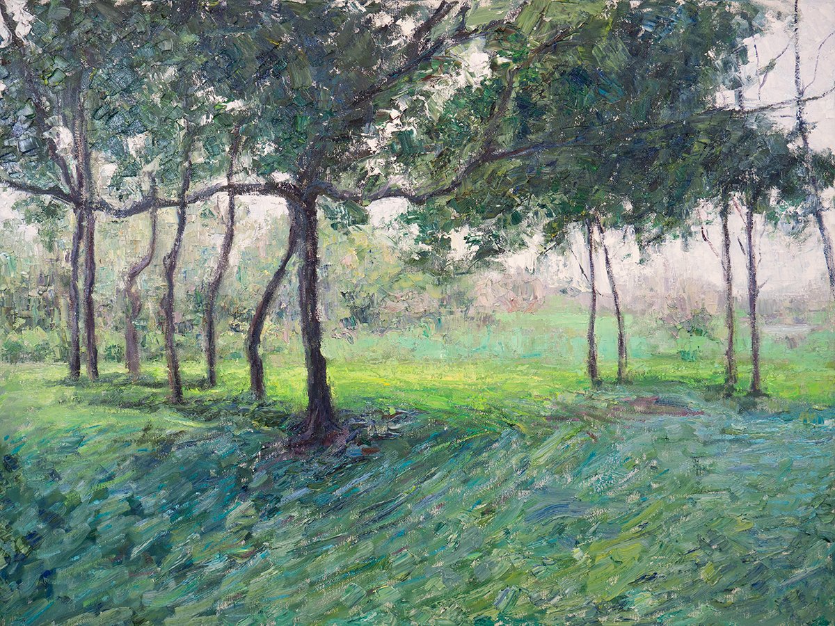
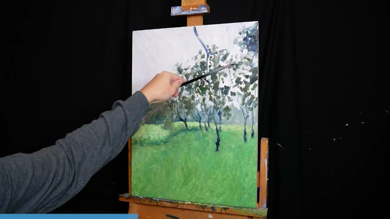
My Minnippi painting was a great exercise in mixing different greens, from the dull green trees in the back to the line of bright green around the middle. You can see the painting come together in this video:
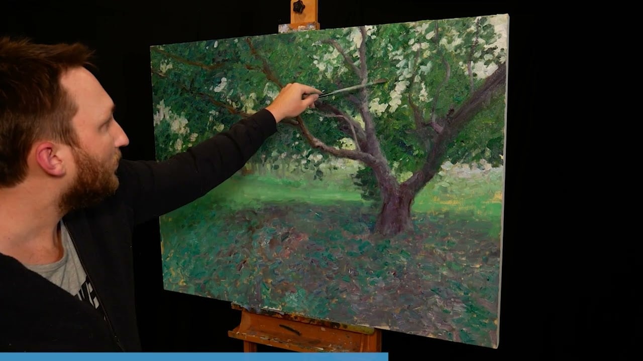
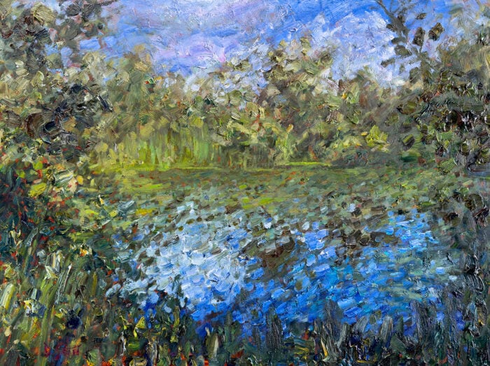
My Tree, Dappled Light painting is another example:
Thanks for Reading!
I appreciate you taking the time to read this post and I hope you found it helpful. Feel free to share it with friends. If you ever want to learn more, check out my Painting Academy course.
Happy painting!
Dan Scott

Draw Paint Academy


Learnt loads this morning about mixing blues and yellow to make green. Who knew this, I didn’t.
Thank you.
So dan where does black and yellow fit in
In your second picture of the colors you mixed, I see the main color straight out of tube on the left, but what color did you mix with each to get the variations to the right of the tube color?
Hi Lynda!
It is all the different combinations of those yellows mixed with those blues. The bottom row is cadmium yellow light with the different blues. Then I added white to each color to show the tints (this is the row second from the bottom).
I repeated this for cadmium yellow, naples yellow, and yellow ochre.
I’ll do an update of this post when I have time to make it clearer.
Thank you so much for this wonderful class.
Your information is always so good. I have been painting for 60 years and always learn something from your posts. Thank you so much.
Thank you Dan that was so helpful, Have a lot of problems with mixing greens.
Gienia.
That’s really sad to me Dan. (Regarding your post on May 31, 2018) I’ve never felt so fortunate . I live in Northern California, USA, and our green landscape has several shades of vibrant greens. Wishing you could have the same visual beauty that I do where you live!
Does your “paint” colors work basically the same with “gel food coloring”? That’s the main reason I ended up on your page, was looking for different shades of “tree greens”
Extremely educational lesson. Thank you Dan.
I don’t see any posts post 2019. Hope you’re still around.
Fantastic post. I’m just learning to paint with acrylics and this really helps with colour theory and having less overall frustration! Thank you so much for sharing this info!!
What a great explanation!
I think this is the clearest explanation I have ever seen. THANK YOU!
Now I understand where I went wrong 30 years ago and what had put me off painting. I’m happy to try again now.
I painted a mostly green landscape recently and shared it with a art group. I was told to add more tones and didn’t fully understand what they meant. Thanks for your article- now I do. Onward and forward to the next mostly green landscape till I get the concept down.
Quite helpful. Thanks for the lesson
I work in watercolor, gauche, and acrylic for different purposes, all simply for pleasure of doing it. I LOVE the very mossy Olympic peninsula in Washington State with its enormous trees and covered in mosses and ferns of all types. If you’ve ever seen them, you will understand. The very air under the trees feels green. The lighting under the trees creates a magical feeling and I so very much want to be able to come even close to it. I have failed completely, but will never give up! You have inspired me to make another attempt! Many Thanks!
HI , I really had trouble to mix and find the greens and my painting was a flower basket with numbers of green leaves ..but now I feel like Master on mixing and producing greens .
many thanks Dan
Thanks that was very clearly explained. Now to experiment …
Wow! I definitely need more paints. I only have the primaries. I did not know there were so many yellows for example. Ver interesting and informative thank you Dan
I have a little theory,,, Maybe we have such trouble with greens because we can distinguish so many shades and tones. Each shade of green gave our hunter-gatherer ancestors important information about whether a plant was food or not, and how fresh it was, and also needed to quickly detect the green of mold or mildew. So we’re very sensitive to greens, and have a stronger response to the wrong shade of green than we do to the wrong shade of any other color. Green has to exact, or we know it. Just a pondering… makes some sense.
I have started painting 2 years ago and I still struggle with the greens. Thank you for the tips and I plan on using them. It will make it so much easier.
¡¡¡¡ MIL GRACIAS DAN !!!!!!! SIEMPRE FUE MI OBSESION, LA MEZCLA DE VERDES. ME ATRAEN LOS VERDES. AHORA QUE ESTOY JUBILADA, QUIERO VOLVER A PINTAR. ANTES PINTABA CUANDO TUVE A MI HIJO AMADO, INTERNADO POR UNA ENFERMEDAD MENTAL. POR SUERTE, LO TENGO EN CASA, YA ESTABILIZADO. HAN PASADO COMO 10 AÑOS. NECESITO VOLVER A PINTAR. ME ENCANTO ESTE ARTICULO. ADEMAS, EXPLICA TAN SENCILLO. SALUDOS CORDIALES, GRACIELA, DESDE ARGENTINA.
Thanks Dan,
This was a great help. I have done my color charts and that has help me but this explain the why.
Thanks
Delilah
As a rose painter for years I’ve always relied on greens that came from a tube because I’ve always leaned towards warmer colors in my painting and any attempt to mix the most vibrant greens was always a loss of paint-always looked like grey/ green. I can’t Thank You enough for this. Everyone knows the greens can sell a painting. With this knowledge not only will my acrylics get a breath of fresh air but my enameling will go over the top- I’m beside myself that I finally found the way to the most beautiful greens.. I can’t thank you enough. This may be common knowledge for many but not me. Next paycheck going to get cool colors- BIG THANKS
Thank u for the tips. Here in the Garden Route, Sedgefield, SA is a lot of greens and every one differs from the next one.
Thanks immensely for how to mix greens. So helpful.
Thank you for all information given. Truly enlightening.
This is really helpful, I am self taught and on my second painting, so I have lots to discover about mixing colours, greens have proved difficult, so thanks for this very useful post.
Thanks Dan,
I found this very helpful since Green can be a very tricky color to mix. Nature has so many variations and distance can be a great influence on just what hue or brightness you need. Also whether its a warm or cold color you need… this just opened a whole gamut of possibilities – Thanks
Respectfully, I disagree with the comment, “The cooler blues will have more yellow and lean towards green. The warmer blues have more red and lean towards violet.” If that were true, and you continued adding yellow (a warm color) you are saying the color is getting cooler, but it’s not, it’s getting warmer. If we can agree that both violet and green are warm relative to blue, then blue green and blue violet must be warmer than blue. The truest blue (without green or violet bias) for most manufacturers is Phthalo Blue). This is the coolest color on the wheel, blues that have a bias towards violet like Ultra Marine are warmer, and blues that have a green bias like Cerulean Blue and Prussian Blue are also warmer than Phthalo. A way to think about it is, if you are standing at the very north pole, and you take one step in any direction, you are heading south. The same is true of Orange, the warmest color and the compliment of Phthalo Blue (this could be Cadmium Yellow Extra Deep or Cadmium Red Scarlet, or a few others depending on the manufacturer), when you add red, you are getting cooler, when you add yellow you are also getting cooler. This has been an area of great study and research, involving conversations with the experts at Gamblin and Golden.
Thanks Greg! Very interesting and I will need some more time to really dissect your comment. Seems there is always something new to learn about color. Mind you, I tend to simplify and generalize things like this to get a broader point across. If I delved into all the complexities of color, these posts might get harder and harder to read. Thanks again. Dan
Thanks Dan for such a good easy to follow explanation,i really do feel enlightened. Thanks again
Glad to hear this Paul. Thanks, Dan
The first thing you have to understand that red, blue and yellow are not complementary colors. In additive color mixing (adding lights together on a black monitor or in a darkened theater) red, blue and green are the scientific primaries, and as weird as it sounds, yellow is a secondary color of mixing red and green lights. The other secondary ones are magenta and cyan. White is the mix of all three.
If you substract colors on a white paper or canvas, you have to use the opposite method. If A is blue, B is red, C is green, then AB is magenta, AC is cyan and BC is yellow, while ABC is white. So your paper is ABC, primary substractive colors have to be AB, AC, BC (as results of single removals) then mixing them (removing more colors) results A, B, C and finally 0 which is black.
This means, the color bias of every painter should be the cyan instead of the blue, and magenta instead of the red. With a proper set, vivid red and blue can be very well mixed. Yellow of course is a primary watercolor, and green is indeed a mix, but paradigms have to be changed to follow the appropriate scientific facts.
This all means one more thing. Orange is just a terciary color, just like lime, violet, purple, blue-cyan and green-cyan. It’s not that hard to see why. Orange is much closer to both red and yellow, than cyan to blue. Also to note yellow is much brighter than any other colors on the classic painter color wheel. It feels out of place without the vivid bright cyan and magenta. Also while you can safely read a light blue text on a dark blue background, no such thing is possible for yellow.
Classic color wheels and theories are in need of revision. Of course nature don’t use magenta and cyan as often as orange, but it’s still the way the colors should be mixed.
I am a beginning painter and never can seem to get the right color and now I know why. Or at least one reason why. Thank you for your tips they have been very helpful.
No problem Gayla. Happy this has helped! Dan
I learn so much from your tutorials! I have used the color wheel and knew about the concept of warm and cool colors…. but I now have a clearer understanding of what colors on the color wheel I need to start, and the ratio of each, when trying to get just the right color I need. All of your lessons on various aspects of painting are so much easier to understand and remember then other articles I have read. You are certainly an effective teacher. Thanks so much for sharing your knowledge and talent.
Hi Cynthia
Thanks for your kind words. I really appreciate them!
Glad to hear the information is extremely helpful to you and easy to understand and follow.
Keep up the good work.
Thanks, Dan
I AGREE!
Thank you so much for this color mixing lesson……I really needed it!!!
My pleasure Jeanie! Sounds like it has helped you out which is great. Dan
This is exactly what I need, I waste far too much paint trying to get the right green. Thank you.
No problem Joyce! Dan
Thanks Dan for explaining how a highly saturated green is mixed. Does the same apply to pinks and purples? I’ve never been able to get that vibrant purple or pink for my orchid paintings unless I buy that neon purple or pink. I tried mixing blues and reds from either cool or warm groups but I’d still get a ruddy purple.
Hi Sharini. Yes the same idea applies to purples and oranges. What I will do is publish another tutorial for purples and oranges if you like.
Thanks! Dan
Thanks, Dan. I have been mixing by trial and error, which meant the next time I wanted the same color I had no idea how I ended up with the first time! Your lesson really will help.
Glad to help Robin! Thanks, Dan
I have experienced all these problems with mixing green, but I did not have a clue why. Thanks for the explanation and i have enjoyed the draw paint academy so far.
That’s great to hear Warren! Thanks, Dan.
Thanks Dan, that was so helpful. I am new to painting, and have been struggling to find the right green for leaves. Mine always ended up an ugly olive color.
Great to hear Jackie, Thanks! Dan
I was an instructor for years in Cosmetology and my one of my favorite things to teach was color. This has helped me gain a better understanding in both painting and coloring hair…and any tidbit of information I can pickup to perfect my technique is well worth it. Thankyou….
No problem at all Theresa. Thanks, Dan
Thanks Dan,
I always thought cool temp meant darker colour, I guess I was wrong.
My favorite shade of green is often referred to as Sap Green. But one thing I noticed is paint differs from one paint company to another. And though it might seem obvious watercolors that carry the same name as oils… They can differ too.
For this reason, I save all my paper “ends” when I cut/size for framing, for test sheets. Speaking of which, the color, weight and type of paper or other medium ur painting on, can have an effect on the color too. Taking notes on the test sheets helps the most. Great read, here. Love reading ur posts!
Hi,
I’m new here, too. I have a Masters in Art Education, and I taught art in elementary schools for 32 years, and you would think I would be more knowledgeable than I am. Because I was so busy with my job, I didn’t paint as much as I should have, even though I did keep my love of painting alive. Since retiring, I now have more time, and hope to be more prolific with my work, and I appreciate this opportunity to keep learning through your posts.
Greens have not been my biggest problem, but I do have problems with yellow. Actually, yellow has never been my favorite color in any venue. For some reason, I seem to find it a little depressing. My students seemed to have more problems using yellow, also, but were amazed when they mixed yellow and black. I finally decided I had to end my aversion to yellow by purposely using subject matter consisting of mostly yellows. I did a composition consisting mostly of large yellow blooms. Took me awhile, because I kept painting over areas that didn’t work. It’s my multi-layer painting.
Sorry this was so long.
Thanks for your post.
Hi, Coloured pencil and watercolour pencil have been my mode of art but I have now bought a few tubes of acrylic (a basic palette as suggested in a book) I will now do the exercise of blending to see what I get. Thanks for you article on the colour green.
Ps. I have phthalates blue and not cobalt blue will see how that turns out
I have always used (W & N) watercolours and sometimes oils. Then … I tried acrylics, thinking they were just fast drying oils! But no. Thats when my colors started being mud. Acrylics seem to have a color bias all their own! Cadmium yellow in watercolour does not seem to translate to Cadmium yellow in acrylic. Why? Is it quality? Brand?
Saturation? I am at a loss!
I have just recently joined and am enlightened by this precise and visual presentation of colour mixing, something I struggle with. Someone mentioned a ‘light bulb going on’, which is the best way to describe my experience whilst reading your tutorial! It has given me the best motivation in moving forward to achieve a diverse, clean colour mix on my creative journey. Thank you for this.
I have shared your post with other friends. Kind regards, SJ
Thanks Dan I was really struggling about the green colour.
This post guided me .
I was in the mids of painting a meadow with trees in the foreground & background. Timely tutorial & quite helpful.
Regards Ray
Thanks Ray
Great to hear!
Very helpful. Will try. Thanks
Thank you for making green simple enough for this blonde to finally get it consistent.
My pleasure Linda!
Thank you so much for this detailed, helpful post. I am a beginner and now I realize that I am a lazy beginner. I mostly paint landscapes and have always thought that it doesn’t really matter which type of green or any other colour it is as nature has limitless colours. Also, I haven’t practiced colour wheel. I just mix colours and paint.
It’s time to be a good student and practice, I guess. 🙂
Thanks Tarang! Glad to help.
Just leaniing. Color has been a real problen. This was a valueable leson
Thanks a milion
Frances
Thanks Frances, Dan
This is very helpful information. Thanks you for sharing your knowledge, Dan!
No problem Agripina! Glad to help. Dan
Hi Dan, i am Maijan. Just joined your site. I am self tought or should i say started art with a gut feeling that “I can”. Love it and now live it.
I was asked to go an island to help out with cleaning and running a accommodation resort. A lot of work on my own. Nights were the time to reflect on my hobbies so “I bit the bullet” and started my art. Joined the art supplies online and started with pastel. Love it. I think i have a talent. This was 15 years ago.
I now paint oils, acrylic, pen and ink or everything else that comes along because of my curiosity and the need to find new things.
Love to send you some photos of all the work i have sold.
But……I have also created bad habits with the lack of knowledge.
I am happy to have joined you. Especially with the colour mixing. Thank you.
I am going to need help with setting up a website.
Now living back on the mainland into retirement.
This is very helpful. I’ll experiment now and see if I can get the green I am imagining!
Glad to hear Assunta! It can be a fun exercise to experiment with different greens.
Dan
In most of Australia (except for the tropics) our greens are dull and tones are so different with changes in light.
Yes same here actually. Queensland. I only rarely get a chance to pull out the vivid greens for landscape painting here. Most of the time it is olive greens and dirty yellows. Dan
Seems like there is a lot of blue in eucalypt leaves.
True. Vivid green is a bad choice in Australia. Greens are quite reduced. If I paint a vivid green, I’ve made a mistake. I find they look tacky in most paintings, actually. Maybe I’m wrong.
Clarity and light bulbs … thank you so very much for sharing your knowledge!
Thanks for sharing this knowledge. This will be very useful when I mix colours .
I have used a biased color wheel for many years and have made charts using all the colors in each medium in my studio. Your explanation is simplified and easy to understand, and I hope your followers will try mixing their paints to see just how easy it is to avoid mud and get brilliant color. Thank you for what you do in sharing your knowledge with others, Dan.
Thanks for the kind words and insight Karen!
Dan
I have mixed colors and mixed colors until I visually got the color I wanted, but not really understanding the science behind it. I knew the basics, yellow+blue=green, etc. Now I have a much better place to start. Thank you for helping me to understand beyond the basics.
Happy to help Carol! Dan
I have had a jumbled version of your post on color bias in my head for a while but now that you have enlightened me , it seems much clearer. Thank you.
Glad to hear Dennis.
Dan
Very interesting read! Now to put it into practice.
Yup the best way to learn color bias is to see it for yourself! Thanks for the comment.
Dan
Hi Dan, thanks for this. In Ireland we have 40 SHADES OF GREEN! This is very useful.
These are great ways to mix a vivid green. You don’t mention that there are other ways to mix gorgeous greens. Ie. Mars Black and yellow or yellow ochre. Paynes grey and burnt sienna or, even better, nickel azo gold. Makes a rich dark green, then add white and you get a really beautiful soft natural green.
I agree! I have been n a puzzle how to paint my groveof trees across the field. And now am brave enough to try.. I think…
Basic color theory I teach to beginners also,but not as broadly in the same lesson. It all depends on the age,ability to be patient,and I find some are talented “colorists” Also everyonedoes Not see color the same way..a surprise to me whenI first started to teach…..
I also teach art. My class title is the science of color. I start my students at age seven and they take my class usually to high school graduation. I loved this lesson on creating green. Im goin to use it. My younger children learn the science of mixing their own colors using pastels. They love the mess and they really have a great chance to test mixing. Thank you for this lesson.
A lot of people cannot physiologically see some shades or the subtleties of shades.
Great!!!!Thank you!!!!
Thank you. Very useful.
Merci beaucoup de ce très utile éclairage .
This is a magical video and very informative but you a born artist- I love the way you apply the paints and great green colours- I will definately mix yellows and blues t get my grees in future. Thank you for the privilage of watching you paint