
Most people will be familiar with the artist’s color wheel, but many do not understand how to properly interpret it.
The color wheel is essentially the visible spectrum of colors wrapped in a circle and it is a useful tool that helps explain what happens when we mix our paints together.

In my opinion, the color wheel itself is not actually that important (other than the obvious historical and scientific significance). What is more important is the theory behind the color wheel. Once you understand this and the basic relationships between colors, then the color wheel itself becomes nothing more than a visual prompt for your color mixing.
This post will be a guide on the artist’s color wheel to help you understand what it is and how you can use it. Toward the end of this post, I also show you how to make your own color wheel.
- Color Wheel Variations
- How to Use the Color Wheel
- What About White and Black?
- Create Your Own Color Wheel
- Limitations of the Color Wheel
- Thanks for Reading!
I’ll walk you through the entire process using one of my recent paintings. You’ll see how I go from idea all the way through to reflecting on the finished painting.

Color Wheel Variations
There are a number of different variations of the color wheel. First, there is the traditional color wheel with the primary colors of red, blue, and yellow evenly placed around the wheel.
This is the most common color wheel used by artists. It is also the color wheel that I will reference throughout this post. It is simple to use, but it is lacking in terms of accuracy. The Munsell color wheel is considered to more accurately represent the relationships between colors.

The Munsell color wheel (pictured below) is similar to the traditional color wheel, but the spacing between colors is slightly different. Notice how the red and yellow are closer to each other on the wheel.

The positioning of the colors on the Munsell color wheel is considered to be a more accurate reflection of how colors are actually positioned on the visible spectrum of colors. For this reason, you may find the Munsell color wheel to provide you with more reliable and accurate guidance for color mixing. But this comes at the expense of the simplicity and popularity of the traditional color wheel.
Finally, below is an additive color wheel. Additive color refers to how we see color in light. This color wheel is not useful for your color mixing, but it is important to understand.
The primary colors of light are different from the primary subtractive colors of our paints. When you mix (add) all the colors of light together, you get white light. This is why it is referred to as additive color. Our paint does not work like this. When we mix all the primary colors of our paints together, we get mud rather than white light.

Which Color Wheel Variation Should You Use?
I do not think it matters whether you use the traditional color wheel or the Munsell color wheel. Just pick one and stick with it. The traditional color wheel is more widely used, so it may be easier to relate to other artists who also use it. The Munsell color wheel is more accurate for color mixing.
How to Use the Color Wheel
The color wheel is made up of the following:
The Primary Colors – Colors which, in theory, are able to mix most other colors in the visible spectrum. In art, the three primary colors are considered to be red, blue, and yellow. However, some artists consider magenta, cyan, and yellow to be more accurate primary colors, as they are able to mix a wider gamut of colors. For the purpose of this post, I will use red, blue, and yellow as the primary colors.
When you mix all three primary colors together, you get mud or a dark gray color.
Secondary Colors – What you get when you mix two primary colors together (green, orange, and purple).
Tertiary Colors – What you get when you mix a primary color with a secondary color.
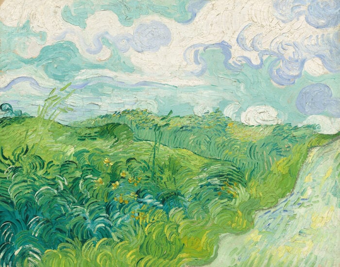
Colors that are close to each other on the color wheel are considered to have a harmonious relationship and are known as analogous colors.

Claude Monet used analogous colors in many of his paintings, particularly in his water lilies series.
, 1906")
Colors that are opposite to each other on the color wheel are complementary colors. There is a striking contrast when you place two complementary colors next to each other. For example, yellow and purple or orange and blue.

Vincent van Gogh was very fond of contrasting orange and blue in many of his paintings.

When you mix complementary colors, you are essentially mixing all three primary colors together and the result is usually mud. For example, say you mix red with green (which are complements of each other). Green can be made by mixing yellow with blue. So by mixing red with green, you are essentially mixing red, blue, and yellow (the primary colors).
Most artists break the color wheel into warm colors and cool colors. I prefer to think of color temperature as a relative term rather than an absolute term. For example, a red color could be warmer or cooler than the color next to it.

What About White and Black?
White and black do not have positions on the color wheel as they do not have direct positions in the visual spectrum of colors. As noted earlier, white is what you get when all the colors of light are combined. This is different from the way our paints work – when we combine all the colors we get mud rather than white light.
When you add white to your colors, you increase the value (make the color lighter). In other words, you create tints of colors.

Black, on the other hand, is the absence of color. When you add black to your colors, you decrease the value (make the color darker). In other words, you create shades of colors.

When you add white or black to a color, you reduce the saturation of the color (make it less vivid). So although white and black do not have positions on the color wheel, they do have the power to alter the value and saturation of the colors (and hue to a small extent, as white and black paint usually have a slight bias towards another color).
Create Your Own Color Wheel
The best color wheel to use as a reference is one you have made yourself. Here is a simple process for making your own color wheel:
Step 1: Draw an outline of a simple color wheel on a canvas board or some other surface.

Step 2: Paint in the primary colors (red, blue, and yellow). You should use the highest chroma primary colors which you have. For example, cadmium red would be more suitable than alizarin crimson. Place the primary colors at equal spaces apart on the wheel (assuming you are creating a traditional color wheel). I like to apply the paint using a palette knife for most of this, as it is easier to keep the knife clean between strokes. You can use a brush to clean up any edges if needed.

Step 3: Use the primary colors to mix the secondary colors. The secondary colors will be directly in-between the primary colors on the wheel. For example, to mix the secondary color green, you would combine blue and yellow.

Step 4: Use the primary and secondary colors to mix the tertiary colors. The tertiary colors will make up all the remaining spaces.

Step 5: Clean up the edges and make any adjustments to the colors.

Step 6: Clean up the mess on the palette.

Limitations of the Color Wheel
Here are some of the limitations of the standard color wheel:
- It does not take into account white and black (as noted above).
- It does not take into account color saturation.
- The color wheel is not a perfect science, especially in painting. For example, the primary colors of red, blue, and yellow are not actually able to mix the full visible spectrum of colors as the color wheel suggests. Instead, you should treat the color wheel merely as a guide to assist with your color mixing.
Thanks for Reading!
I appreciate you taking the time to read this post and I hope you found it helpful. Feel free to share it with friends. If you ever want to learn more, check out my Painting Academy course.
Happy painting!
Dan Scott

Draw Paint Academy


Thanks I was looking for info on colours,as I was struggling .I paint small figures fantasy or military and they dull an bit boring.
Thanks for the Great article of Color Charts.
Upon reading your article of Color Charts interests me to try and make my own Color Chart.
I will be watching out for more of your articles
Sounds good Carole! Thanks, Dan
Thanks for the Great article of Color Charts. I am a self taught painter with some art classes in High School, have taken classes at Senior Centers by ‘Qualified’ Instructors and I am now instructing other Seniors on how to paint but I have never been introduced to a Color Chart.
Upon reading your article of Color Charts excites me to try and make my own Color Chart after understanding the different charts that are available, as indicated in your article.
Hi Carole. Thanks for your comment. Good luck with creating your color chart! Feel free to email me if you need any help. Thanks, Dan
Thanks for the information. But What colors should we use as primary colors?
Reza
Hi Reza. There is no firm answer to that. I personally use cadmium red, cadmium yellow and ultramarine blue for many paintings. But if I am painting a duller painting, then I use alizarin crimson, yellow ochre and ultramarine blue. Dan
Thank you. Very useful
No problem thanks Alison
Thanks! Viveca Dahlen
No problem Viveca!
Dan
Thanks for the very useful lesson on color.
Regards,
Hetta Ludik
Thanks Hetta! Dan
I took a class and one exercise was making color charts with all of the colors our instructor was having us use. It was a very time consuming class but I still have all of the charts and occasionally look at one to see how a color I like was mixed….I think the instructor was using a method shown on line by Thomas Baker.
Your article is very helpful as many times my mind goes blank on how to mix something….I mix a lot of mud!!!
Thank you!
No problem thanks Joan!