
This post is a deep-dive into the concept of hue. I cover the following areas:
- What Does Hue Mean?
- Hue Sets the Theme
- Hue and Realism
- Hue and Color Temperature
- Hue and Value
- Hue and Color Mixing
- Hue and Psychology
- Key Takeaways
- Want to Learn More?
- Thanks for Reading!

I’ll walk you through the entire process using one of my recent paintings. You’ll see how I go from idea all the way through to reflecting on the finished painting.

What Does Hue Mean?
Hue is one of the three elements of color, with the other two elements being value (how light or dark a color is) and saturation (how bright or dull a color is). It basically refers to a color’s position on the color wheel. Red, blue, green, yellow, orange-these are all different hues.
The Munsell color system is always a useful resource to turn to on matters of color. It provides that the “principal hues” are red, yellow, green, blue, and purple. These hues are positioned equally around the Munsell color wheel. In between are the “intermediate hues”, being yellow-red, green-yellow, blue-green, purple-blue, and red-purple. Munsell also gave designations to each color: R, YR, Y, GY, G, BG, B, PB, P, and RP.
A key point to note is that hue is, for the most part, independent of saturation and value. For example, if I tell you an object is yellow, that only gives you information about the hue, but it tells you nothing about how light, dark, saturated, or dull that yellow is.
I will run through some examples of hue in action to make sure you understand exactly what it means, starting with a moody painting by Anders Zorn. As with many of Zorn’s works, this is painted with a limited range of hues-mostly red and yellow (black is not considered a hue). But within that limited range, Zorn varied the level of value and saturation in order to convey a sense of realism.

On the other hand, here is a colorful painting by Claude Monet featuring a diverse range of hues-yellow, red, purple, blue, and orange. Typically, when you use so many different hues, it can be challenging to create a sense of unity and harmony throughout the work (the more hues you have, the more complex they are to manage). In this case, Monet united all the different hues under the umbrella of similar values. That is, all the hues are around the same level of lightness, except for the relatively dark, purple bridge.

Here is another painting by Monet featuring many different hues; but this time, he made no attempt to unite the colors. The whole point of the painting is a stark contrast between red, yellow, pink, white, and green.

Hue Sets the Theme

After looking at thousands of master paintings, a key observation is that most of them feature a rather limited range of hues (usually three to four dominant hues). Think about that for a second-with the vast number of colors we can use as artists, most master paintings end up utilizing just a select few.
In my opinion, there are two reasons for this:
- First, if you try to balance too many different hues, your painting will likely become an incoherent mess. With every additional hue, you are introducing more complexity, sometimes with no added benefit.
- Most scenes, especially in nature, follow a certain theme which is determined by the light and various other factors. Remember, certain colors simply cannot exist under certain light conditions. This means that, unless you are painting under a balanced light with all kinds of different colored objects, you will usually only be dealing with a limited range of hues.
Hue seems to be important for setting the overarching theme of a painting. But from there, saturation and value do the rest of the work.
For example, below is a simple color exercise I do with Landscape Painting Masterclass students. We paint the same subject under varying conditions. Each color study represents a different combination (or theme) of hues. The theme helps differentiate between the vivid sunset study and the bright, sunny day study. But, within each color study itself, value and saturation are what create a sense of realism.

Hue and Realism
Many artists overstate the importance of hue for painting with a quality of realism. Of course, you need to be roughly accurate (it will look odd if you paint a banana red). But, I find that accurate use of value, and to a lesser extent, saturation, are far more important for realism than accurate use of hue.
Fauvist artists started to experiment with this idea. They painted with wildly inaccurate hues-red for the sky, green for the water, purple for the grass-but because they painted with somewhat accurate values, their works retain a quality of realism (you can identify trees as trees, mountains as mountains, etc.).
In the still life below by Henri Matisse, notice the wild array of hues. But, there is still a sense of structure and realism which can be mostly attributed to the somewhat accurate values.

Matisse’s Woman with a Hat would be a colorful abstract work if it were not for the values and edges. I have also provided a grayscale image of the painting, which takes hue out of the equation. The painting appears fairly realistic in grayscale, especially when you are not confronted by all the inaccurate hues.
In particular, take a look at the woman’s face in the grayscale. I can see two dominant values (or tones): a mid-tone for her face in shadow, and a light tone for the highlights. Now, take a look at the woman’s face in the color image. Notice all the different colors-green, purple, yellow, red, blue. This is an example of using hue variance within a compressed value range.

")
The Fauvists obviously took this idea to the extreme and I do not recommend you follow their use of color if you want to paint realistically. But, they were certainly onto something.
I will run through another example using one of my reference photos from Secrets on the Lake in Queensland, Australia.

You are able to do all kinds of interesting things with the colors in Photoshop. One of them is changing the hues, without changing the general value and saturation levels. You can see some of the variations below. Although some are unusual and certainly not what you would expect to see in life, you can still clearly make out what the scene is.
 Web")
But, if you were to randomize or flatten all the values in the image, whilst keeping the hues the same, I doubt it would make any visual sense. There is a fantastic example of this here (see the third image in the post).
The key point is that, if you want to paint realistically, then focus most of your attention on value (and saturation to a lesser extent). Hue helps set the overarching theme for your painting, but if you get the values right, then you will have more flexibility with your hues.
Hue and Color Temperature
First, a quick recap on color temperature:
Color temperature refers to our perception of a color as being warm or cool. We tend to associate blue and green as cool colors, and red and orange as warm colors. That does not mean they have an intrinsic and fixed temperature; it is merely based on our perception.
Incorrect use of color temperature is a common cause of “muddy colors“. This happens if you paint an area which should appear warm with cool colors.
Now, back to hue.
Hue and color temperature tend to go hand-in-hand. A change in hue will usually result in a change in temperature. (That is one of the challenges of color-one change can have a domino effect on all the other elements).
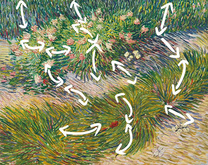
In my New Zealand Reflections painting below, notice the color transition in the mountain: from deep blues for the shadows, to weak oranges for the lights. This represents a change in hue and temperature (from cool to warm).
Even amongst the blues of the mountain, there are subtle but important hue and temperature shifts. The snow is a much purer blue compared to the dark blue for the mountain in shadow. The dark blue contains just a touch of red, making it slightly warmer in temperature.

Some artists depart with the concept of hue altogether, thinking only in terms of value, saturation, and temperature. But, I still think hue is important for broadly categorizing colors, whereas temperature is useful for thinking about the subtle relationships and nuances.
Hue and Value
Every single color has an underlying value somewhere between white and black. The top artists are able to easily and efficiently translate color into value. That is, they can look at a color and position it correctly on the value scale below.

An important point to note about hue and value is that, hues in their purest forms have different values. Pure yellow is lighter than pure blue; pure red is lighter than pure blue.
Also, the pigments we use in painting have fairly standard values (of course, there is some variance between different brands). Burnt umber and ultramarine blue are around the dark end of the value scale, whereas cadmium yellow is around the light end. Here is a fantastic chart representing the values of the common pigments.
All this can provide you with some important reference points to aid your color mixing (knowing the value of each color on your palette is invaluable).
Hue and Color Mixing

In color mixing, the first thing you will learn is what happens when you mix two different hues together. As a quick refresher for you:
- The primary colors are red, blue, and yellow.
- When you mix two primary colors together, you get a secondary color (green, purple, and orange).
- When you mix all three primary colors together, or a secondary color with a primary color, you get a tertiary color.
- Colors which are on opposing sides of the color wheel are known as complementary colors. When you mix complementary colors, you are essentially mixing all three primary colors together. Again, the result is a tertiary color.
This covers most of what you need to know about hue and color mixing. The rest comes down to being able to get the value and saturation right.
As I mentioned in this guide, color mixing can be simplified to three basic questions:
- Is my color light or dark enough (value)?
- Is my color dull or saturated enough (saturation)?
- Is my color too warm or cool (hue)? Or, is my color too red, blue, or yellow?
Most of your attention should go to the first two questions. I usually do not care if my hue is not accurate, provided the value and saturation are.
Hue and Psychology
We tend to associate certain colors with certain emotions. Red for anger and love; green for nature; orange for warmth, and so on. As a result, paintings may evoke different emotions based on the colors which are used.
For example, I get a feeling of calmness from the painting below by Monet.

On the other hand, I get a feeling of warmth and drama from his Sunset on the Seine in Winter.

With that being said, it is important to note that colors themselves are not emotional. A color is a color. How we perceive a color is based on just that: our perception (credit to Richard Schmid to shedding light on this for me in his book Alla Prima II).
You may wish to try and take advantage of psychological triggers in your paintings, but I would not let this area dominate your color decisions. I find that it is usually more effective to simply paint the colors you see. You can always push and exaggerate certain colors if you need help getting your message across (if you want to evoke a sense of anger, then push the reds which are already there, rather than forcefully making everything red).
Key Takeaways
Here are some of the key takeaways from this post:
- Hue is one of the three elements of a color, with the other two being value and saturation.
- For painting with a sense of realism, I would rank the three elements like this: 1. Value 2. Saturation 3. Hue.
- Hue is important for setting the overarching theme for your painting.
- If you get the values right, then you will have more flexibility with your hues, without compromising the quality of realism.
- Hue and color temperature tend to go hand-in-hand. A change in hue usually results in a change in temperature.
- Hues in their purest forms have certain values between pure white and pure black (pure colors are not all the same in terms of value). Ultramarine blue is much darker than cadmium yellow.
- For color mixing, make sure you understand what happens when you mix different hues together.
- We tend to associate certain colors with certain emotions. But remember, color itself has no emotion. A color is just a color.
Want to Learn More?
You might be interested in my Painting Academy course. I’ll walk you through the time-tested fundamentals of painting. It’s perfect for absolute beginner to intermediate painters.
Thanks for Reading!
I appreciate you taking the time to read this post and I hope you found it helpful. Feel free to share it with friends.
Happy painting!
Dan Scott

Draw Paint Academy


Thank you. I now know why a landscape painting that I put aside unfinished felt wrong to me. CAnt wait to make it right.
Good stuff, thank you.
I’ve got 19 books on painting technique and theory…none of them explain the juxtaposition viz VSH (not VHS!) as well as you have – and how you judge the interplay between these three i.e. from a practicing and seasoned artist’s perspective.
Regards
Laurence (Barry in South Wales)
Thank you! Real every word 5 times, each time finding more to learn! Hue has been a BIG problem for me, or the use of too many complicating desired outcome. You put my problem to rest at last, letting my idea of hue, saturation then value find proper priority and balance. Thank you so much. Jaxun
Fantastic explanation, thank you so much for this!
This was great! Thank you. I’ve heard it all before but not is so clear a way.
Very well explained for this complex topic! Thank you! Very much appreciated
I’m so glad I found you in this time of my life I’m wanting to extend my love of art painting and with lockdowns and covid this is pure pleasure you are a wonderful teacher
I am so grateful for your information especially on colour wheel and hues , can’t wait to go and practice 🥰 love you awesome emails
K
You’re a great teacher
You, my friend, are an amazing artist AND TEACHER. I think for the very first time, these concepts are congealing! Many, many thanks.
Thank you so much Dan. I so enjoy and learn from every email I get from you but just had to write about this one. Your teaching on color hue and the color wheel is finally starting to makes sense to me. I have read this info 1000 times before but your explanations with examples is perfect. You almost made it simple! I just LOVE the vwheel.pdf. I have never seen that before. Thanks for sharing yourself with us. I really appreciate it. Do you do watercolor courses?
Excellent article. Enormously helpful! Thankyou!
Excellent excellent article – thank you so very much for your generosity. Colour is my ongoing nemisis. Without an understanding one is dabbling in the dark.
A nice thorough explanation of the topic! Thank you for all the information.
A nice thorough explanation of the topic!
This has been of great help. Thanks.
Thank you so much for giving so freely of you time and excellent expertise. I learn something new with every one of your emails.
Nothing short of awesome! Thank you for your in depth and precise explanation. Very clear and easy to understand, it must have taken a great deal of your time and effort and is greatly appreciated.
Dan, This information was very helpful. I paint with watercolors. I have been learning about the different properties of the colors. I am learning about light fastness and wonder how you paint with fugitive colors? It seems that there are many that are used frequently. Is is possible that you could write about these colors?
you are a master teacher! I love the way you weave in art history and introduce différents artists in your articles, I am learning about Russians (in previous articles) and Scandinavians like Zorn I had never heard of. You also take away the fear of painting we sometimes have.
Thank you so much!
Your hue study was so helpful. Thanks for your help and your time
One of your best articles; truly useful and concise at the same time. Wonderful.
Wow! Thank you. Has helped considerably.
You are an amazing artist . You have let go of your ego and shared your knowledge and skills with inexperienced artist’s. . I soak up the information like a sponge . Your “how to interpret a painting ” was fascinating . Thank you
Great informations here as always, and very clever explanations (ie. the right values in Matisse’ wife portrait/ b&w version).
Thanks,
Good continuation !
Thank you Dan for an excellent guide about ‘Hue’.
Thank you very much.
I have to compliment you and this information being so clear and informative. I teach painting and paint myself. Thank you for sharing.
I would like to see this in book form, so I can have the information without using my computer.
Yes! Write a book!!
What an excellent teacher you are! I look forward to your emails, because I know they are full of valuable information!
Beautifully comprehensive and readable – I am printing this out to keep by me as one of the most helpful articles I’ve come across. Thank you Dan!
I really enjoy reading your tips! It is so nice of you to share your knowledge in this way! I especially appreciate the concise and readable manner of your posts. Thank you so much!
Vicki Reid
You’re welcome. I enjoyed the article and learned so much. It will be a part of my daily study and practice.
Thank you very much
It is great to revisit the colour theory in such a simplistic article. Very valuable, thank you.
Really good info. Refreshed my memory.
Thank you for the time you spent in putting this all together. Thank you for sharing your knowledge in such a skilful way that can be understood. Your truely amazing and deserve praise for the giving of quality help in understanding such complexity of colour theory.
Dan,
Your perspectives and writings are superb!
The analysis of “hue” provides usable insights and clarity to the complex world of color.
Thank you, and Cheers,
David
Totally complete explanation. Thank you.
I love your writings. I read all your emails diligently. Simple and knowledgeable. Thank you
Wonderful step by step easy to understand. I always have trouble understanding this but I can see what works and doesn’t. I have a hard explaining it though. You made sense of it. Thank you
Thanks so much for sharing this information. Your New Zealand reflections painting is so so beautiful – something to strive for in my journey!!
Thanks so much for such a comprehensive write-up. Easy to grasp. As I read your articles my understanding of the importance of values compared to hues and saturation continues to improve. Thanks again.
This is wonderful reinforcement of things I learned in your basic painting course. Multiple readings about a concept presented from different perspectives makes it possible to use the concept correctly in my paintings. Thank you so much!
Thanks for this. It’s very useful.
Thank you so much for including the color value wheel. I haven’t been painting very long and can’t afford to buy a lot of different colors. I preferred to start with the “purest” hues, but was never sure which they were by the names. This was a great help!
your expertise as a teacher is equal to your skill as an artist and teacher. As an educator, you lead us out which is the meaning of the word educate. As an
artist, you lead us in.., into
other worlds and ways of seeing and imagining. As a human
being, you exemplify great generosity. Thank you,
Thank you Dan for such a clear and comprehensive explanation. Every time I read your emails I gain more understanding of some facet of painting.
I agree with Linda, your painting “New Zealand Reflections” is beautiful.
Absolutely fantastic, a thorough, easy to understand explanation. Thank you so much. Neil