
“Good composition is like a suspension bridge – each line adds strength and takes none away. No one is an artist unless he carries his picture in his head before painting it, and is sure of his method and composition.” Robert Henri
This is a detailed guide on composition. I’ll cover:
- What Is Composition in Art?
- Composition in Two Questions
- Composition Versus Copying the Reference
- Visual Elements (The Building Blocks of a Painting)
- Principles of Art (The Glue Holding It All Together)
- Composition Rules, Theories, and Techniques
- Framing
- Leading Lines
- Golden Ratio
- Rule of Thirds
- Rule of Odds
- Triangles
- Breaking the Composition Rules
- Common Composition Issues
- Composition Breakdown Checklist
- Master Painting Examples
- Key Takeaways
- Resources
- Thanks for Reading!

(If you don’t have time to read this now, you can download a PDF version for later here.)
What Is Composition in Art?
Composition is a broad term. So broad it can be difficult to clearly articulate and define. I like to think of it as the way in which we arrange the visual elements to communicate our ideas about the subject.
A well-composed painting is clear, concise, and interesting. All the pieces will appear to work in perfect harmony. It will look like a cohesive painting, rather than an arrangement of parts.
A poorly composed painting is harder to spot. A painting can be wrong for many reasons and it can be difficult to narrow down on the main culprit. You might know something is off, but be unable to put your finger on what.

Composition in Two Questions
Composition theory can be distilled down to two basic questions:
- What do you want to say? (What is your big idea? What is the message you want to communicate through your work?)
- How are you going to say it? (How are you going to arrange the visual elements in a way that communicates your message?)
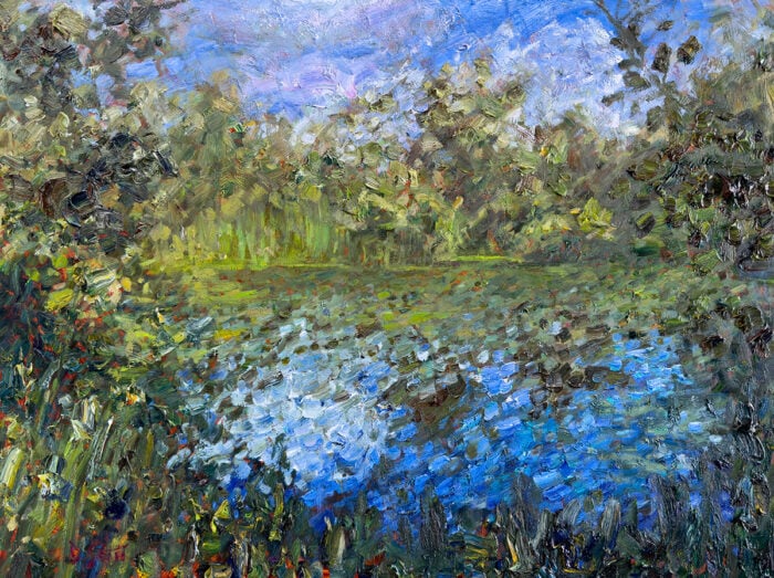
I’ll give you an example. Here’s a photo I want to paint:

What do I want to say? I want to capture the beautiful contrast between warm lights and cool shadows… the interesting design of the overhanging tree branches and leaves… the turquoise blue of the water.
How am I going to say it? I need to ensure the lights are distinct from the shadows. Contrast is key. I’ll use broken color and thick texture for the branches and leaves. I’ll simplify the “noise”, particularly in the shadows. I’ll push the color in the shadows-purples, blues, and greens rather than blacks, browns, and grays.
It’s easy to get lost in all the composition rules and theories. So always try to bring it back to these two questions.
Doing this will also give you more focus and direction going into a painting. Most composition mistakes happen due to a lack of direction. You start a painting with a certain vision, but then something else catches your eye and you pursue that. It’s not long before your initial vision is completely lost and your painting is a confused mass of ideas. Robert Henri has a great section on this in his book, The Art Spirit. Here’s an extract:
“To start with a deep impression, the best, the most interesting, the deepest you can have of the model; to preserve this vision throughout the work; to see nothing else; to admit of no digression from it; choosing only from the model the signs of it; will lead to an organic work.” The Art Spirit, Page 17
Composition Versus Copying the Reference
It’s worth noting the distinction between composing a painting and merely copying the reference. Many artists go to great lengths to copy the reference with complete accuracy. But, you don’t get points for being able to copy the reference. People don’t see what you painted from, they only see your painting. So your painting must be able to stand on its own.
There will be times when you should depart from the reference. Perhaps there’s something about it that doesn’t read well, is misleading, or doesn’t fit with the rest of your painting. Your artistic license gives you the privilege to ignore, add or change the reference as needed.
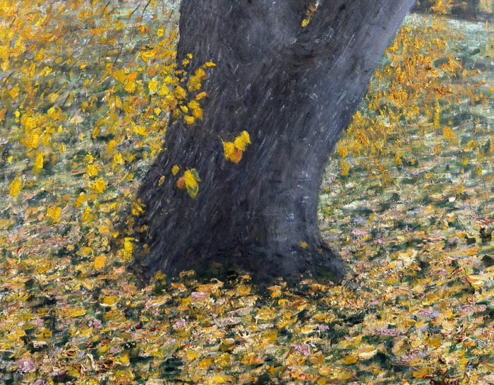
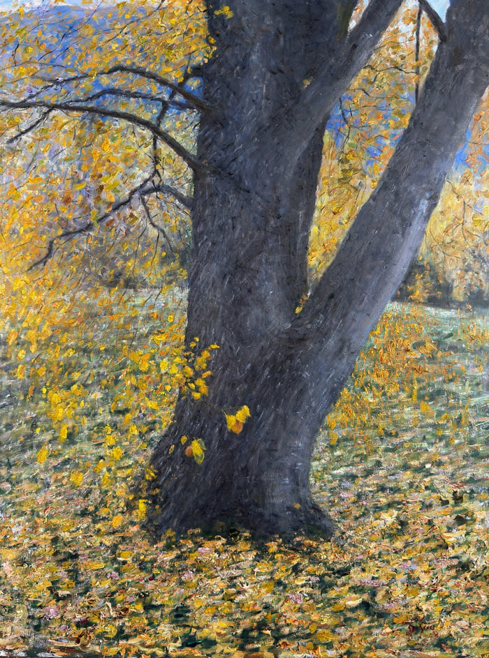
For example, below is my Maryvale, Foggy Morning plus the reference photo. The painting stands on its own. I didn’t copy the reference photo, rather, I used it as a guide and to spark my initial impressions of the scene.


Visual Elements (The Building Blocks of a Painting)
The visual elements are the building blocks of a painting and your tools of composition. They are
Line: A narrow mark that spans between two points. This is the most fundamental visual element at your disposal.
Shape: A contained area defined by edges.
Color: The different hues (red, blue, orange, green-these are different hues).
Texture: How rough, smooth, glossy, etc. the surface is. This could be the physical texture of your paint or the mere illusion of texture in your painting.
Value: How light or dark a color is.
Space: The space taken up by (positive) or between (negative) objects.
Depth: The illusion of distance on a flat surface. Depth is typically segmented into a foreground, middle ground, and background.
")
Principles of Art (The Glue Holding It All Together)
If the visual elements are the building blocks, the principles of art are the glue holding it all together. They are:
Rhythm: The visual tempo of your work created through repetition and pattern.
Balance: The visual weighting of elements.
Emphasis: The arrangement of elements to place emphasis on certain areas. Otherwise known as a focal point.
Gradation: A gradual change in a certain element to help connect the composition (long lines to short lines, large shapes to small shapes, dark to light tones, etc.).
Harmony: The way distinct parts work together towards a similar vision or idea.
Variety: The use of different elements to create interest and contrast.
Movement: The illusion of movement through clever placement of the visual elements (think of Vincent van Gogh’s energetic brushwork).
Proportion: The relative size of one element in comparison to another.
A word of warning: Don’t get caught up on these definitions. You don’t need to memorise them. They merely help us describe and articulate composition. Always bring it back to the two questions: What do you want to say and how are you going to say it?
Composition Rules, Theories, and Techniques
There are several rules, theories, and techniques that can help you craft more interesting compositions. Below are some of the important ones. Keep in mind, these are not to be treated as rule-bound law. Rather, they are suggestions or guidelines at best.
Framing
Framing involves arranging shapes and other elements in a way that “frames” a particular area. The idea behind it is much the same as why we physically frame our paintings. It helps focus and contain our attention.

In Edgar Payne’s stunning landscape below, the high-key background is framed by the trees in the foreground.

I did a similar thing in my painting, Wellington Point, High Contrast.

Below is a more obvious example, with a window framing the landscape in the background.
, 1912")
Tip: You don’t need to try and artificially create frames in your subject. Instead, consider how you can arrange and depict what is already there to frame important features. For example, a prominent tree could be used to frame the left side of your painting.
Leading Lines
Leading lines are suggestive lines that direct attention around a painting. They can be actual lines or implied lines that don’t physically exist but are merely implied or suggested. A line of vision is an implied line. See John Singer Sargent’s painting below. We want to look where he is looking.

Golden Ratio
“Without mathematics there is no art.” Luca Pacioli
The golden ratio is approximately 1 to 1.618. Designs that follow the golden ratio are generally considered to be aesthetically pleasing.
I won’t go into detail on the golden ratio, as I consider the rule of thirds (discussed below) to be a more practical application of the concept. If you want to learn more about the golden ratio, check out this post: Using The Golden Ratio.
Rule of Thirds
The rule of thirds involves placing a three-by-three grid over the subject and using it to assist in the composition design. The gridlines and intersections are “safe” spots to position key features. For example, you could position your focal point at one of the intersections or the horizon line along the top horizontal.
I’ll use Ivan Shishkin’s Morning in a Pine Forest as an example. Notice how:
- The bears gravitate around the middle segment.
- The cub standing to the side aligns with the right vertical.
- The most prominent tree roughly aligns with the left vertical.
- The foreground comes to the bottom horizontal.
- Each segment is unique.

(Resource: You can use my free image tool to play a place over your reference photos or photos of your paintings.)
Simplification
Simplification is perhaps the most important composition concept. It involves taking all the “noise” and detail and simplifying it into something more coherent. By simplifying the unimportant, you focus attention on the important.
Below are some of the different ways you can simplify your composition:
- Use a limited color palette (simplification of color).
- Compress the value range (simplification of value).
- Use larger brushes (simplification of tools).
- Use less refined strokes for unimportant areas (simplification of detail).
The Impressionists were masters of simplification. They distilled all the noise and detail down to the most fundamental essence of the subject.
Take Konstantin Korovin’s Crimean Landscape. He didn’t try to paint every single detail, highlight, and shadow. Most of the painting is vague and ambiguous, but it works because he captured the few details that really matter.

In Claude Monet’s Impression, Sunrise, look at how vague the brushwork is. Monet did just enough to convey form and left the rest up to our imaginations.

Rule of Odds
The rule of odds is the idea that objects in odd numbers appear more interesting and natural than objects in even numbers. That is, a group of three birds appears more interesting than a group of two or four birds. One of the reasons for this is that even numbers can appear overly symmetrical.
Paul Cézanne demonstrates this idea in many of his still lifes.

Below is an old painting of mine, Three Boats at Kingfisher Bay. What would the painting look like with only two boats? Awkward, I think.

Tip: If your subject has an even-numbered group of objects, consider adding or excluding some to make it an odd number. For example, if there are two birds in the sky of your landscape, consider adding a third. But, be careful not to venture too far from your reference.
Triangles
This one is related to the rule of odds. Triangular arrangements are considered to be aesthetically pleasing. Perhaps due to the natural asymmetry. And if the triangle is upright, there’s a powerful sense of structure and stability (think of the Egyptian pyramids). In Cézanne’s still life below, notice the triangular shape of the flowers and vase. A key takeaway here is that you can arrange different objects into a vague, triangular shape. You don’t need to smack viewers over the head with a triangle. Less is often more in painting.

I adopted a triangular theme in Wellington Point, Shimmering Light. Consider what the composition would look like with a rectangular foreground. I imagine it would look blocky and flat. One of the benefits of a triangular theme like this is that you can easily lead from one area to the next.

Breaking the Composition Rules
The “rules” of composition are anything but that. They exist for a reason in that they make sense most of the time, but there will be times when you should ignore them and follow your gut.
Further, if everyone followed the composition rules to the T, we would all paint the same. And what would be the fun in that?
For every rule, there’s a brilliant painting that breaks it. Take Abram Arkhipov’s Smiling Girl (below). The subject’s head comes to the top edge of the painting. You typically would push the subject down and have some negative space at the top. But it works in this case as it plays into the painting’s intimate feel.

I provide a detailed list of examples in this post: Paintings That Break the Composition Rules.
Common Composition Issues
Since starting Draw Paint Academy, I have had the privilege of seeing thousands of student paintings. I put together a list of the most common issues and areas for improvement I see. Keep in mind, a mistake in one painting might be a success in another. Composition is tricky like that. So again, treat these as gentle suggestions rather than strict rules.
Focal Point on the Edge of the Painting
Your focal point is the key feature or idea of your painting. It should be in a prominent spot, not on the edges.
Aligning Objects
It can look unnatural if the tallest tree in your landscape aligns with the peak of a distant mountain.
Too Much Noise
Don’t try to paint every color, value, texture, highlight, or shadow. Simplify. You’ll end up with a more cohesive painting.
Uninspired
It’s hard to make a composition work if it doesn’t start with some kind of spark or idea.
Horizon Line Right in the Middle
Not a big issue, but you should usually give dominance to the sky or land.
Too Many Straight Lines (Particularly in Landscapes)
Straight lines are rigid and tight. Embrace curves. As Steve Huston wrote in his Figure Drawing for Artists (page 38):
“The world is full of watery design lines. Just look around.”
Pushing in the Wrong Direction
If you’re going to exaggerate any elements in your painting, it’s better to push in the direction of your big idea. It’s better to make your vivid sunset a bit warmer. It’s better to make your rigid cityscape a bit straighter. It’s better to make your stormy seascape a bit darker and the waves a bit larger.
Unnecessary Objects
If something doesn’t add to the composition, does it need to be there?
Leading Lines Out of the Painting
Lines are powerful. Our eyes like to follow them. Be careful not to lead people out of your painting.
Collection of Parts
Your goal is to create a beautiful painting, not a collection of beautifully painted parts. Focus on the big picture and never lose sight of it.
Lost Opportunities
Look for opportunities to convey your ideas. Grass can be used to convey direction and movement. Hair can be used to frame the face. Highlights can be used to reiterate key structures. Always think about each part’s role in the bigger picture.
Getting Caught Up in Your Own Ways
Avoid painting the same composition over and over again. Change it up. That’s what I did in my Tree in Perspective. Instead of painting a standard landscape, I looked up and painted from an unusual angle.

Composition Breakdown Checklist
I put together a simple checklist that will help you analyze master paintings (or your own). You can download a copy here.
To give you an idea of how to use the checklist, I used it to analyze my Kobe painting. See below the painting, the checklist questions, and my answers:

Storytelling: What is the artist trying to say? What is the story? (Tip: Think about the visual journey your eyes take through the painting. Where does the artist lead you?)
This painting was a gift to my beautiful partner Chontele. She just turned 30. We consider Kobe to be our first child, so the pressure was on to paint him well!
The story is simple: to capture Kobe’s smile and good nature.
Focal Point: Is there a dominant focal point? Where is it? How does the artist draw your attention toward it?
Yes, Kobe!
I draw attention to him through positioning, detail, and contrast.
Secondary Focal Points: Are there any secondary focal points? What is their purpose?
The landscape is a secondary focal point. The idea is to show Kobe in nature, rather than Kobe by himself.
Kobe loves to be around people and nature, but he doesn’t like the spotlight. A typical pet portrait wouldn’t be suitable.
Framing: Are there any elements that frame part of the painting?
The greenery and ocean frame the top of the painting. The water on the ground and its reflections frame Kobe on the right-hand side.
Movement / Leading Lines: Is there a sense of movement or activity? What is the nature of that movement?
It’s a still painting, other than Kobe’s panting and fur blowing.
Balance: Does the painting feel balanced? Do any parts feel stronger or heavier than the rest of the painting? (Tip: Remember, a small, busy space can have the same impact as a large, quiet space.)
Yes, it feels balanced to me.
Kobe takes up a small part of the painting, but he draws most of the attention.
The top half of the painting is balanced against the bottom half of the painting. The top half has the tree, bushes, mountains, water, and sky. The bottom half has Kobe.
Linked Elements: Are there subtle links between separate areas of the painting?
The light parts of Kobe link with the light parts of the pavement.
The form shadow links with the cast shadow.
The blue reflection of the water on the pavement leads you toward the deep-blue ocean (a subtle, broken link).
Visual Brushwork: Is visual brushwork a key feature of the painting? Does the artist use visual brushwork to convey the nature of the subject?
I used thick brushwork to paint Kobe’s fur, particularly in the lights. I didn’t try to paint every strand of hair, rather, I let the visible brushwork do most of the work.
Big Shapes: What are the big, dominant shapes?
The landscape is made up of big, simple shapes. Kobe is made up of more intricate shapes.
Simplification: What areas have been simplified? What areas are detailed?
The landscape is simple. Kobe is detailed. But remember, painting is relative. If we narrow down on just Kobe, we can see his face is detailed and the rest of his body is simple.
Master Painting Examples
The best way to learn composition is to analyze master paintings and observe why they work and what you might do better. This will help you learn the language of composition.
Let’s run through some master painting examples, plus some key observations in terms of composition.
Sir Arthur Streeton, Australia Felix. Depth is the focus of this painting. Notice the tight foreground at the bottom and the color gradation as everything recedes into the distance.

Anna Althea Hills, Sea View. Nature frames the high-key background. There’s a powerful contrast between the foreground and background. Dark against light, rich against tinted, complex against simple.

Camille Pissarro, The Boulevard Montmartre on a Winter Morning. A complex composition with many moving parts. Simplification plays an important role. Pissarro didn’t paint every tedious detail. He simplified and tuned out most of the “noise”. The architecture creates a powerful sense of linear and atmospheric perspective (the buildings, cars, and people appear to get smaller and fainter as they recede into the distance).

Anders Zorn, Emma Zorn Reading. An intimate composition with a narrow depth of field. The subject doesn’t appear to be aware of our presence. It’s a candid scene. Value contrast is used to focus our attention on the subject. Her line of vision is a powerful implied line. What news is she reading about?

John Singer Sargent, Siesta. A relaxed composition with two people taking a siesta amongst nature. The vantage point creates an interesting play in terms of perspective and depth. This is also a great study of gesture and structure.

")
")
John Singer Sargent, Reconnoitering. A powerful focal point with an ambient background. Hard edges separate the subject from the background, creating a sense of depth. Contrast focuses our attention on the subject. The rest of the painting is simplified in terms of value and detail. His line of vision is an implied line. It doesn’t lead us anywhere in particular, which reiterates the idea of his distant stare.

Valentin Serov, Girl With Peaches. This is similar to Zorn’s Emma Zorn Reading, but in this case, the subject is looking right back at us. Notice how this changes the composition. Her eyes command our attention.

Nikolay Bogdanov-Belsky, The Girl in the Forest. This breaks one of the composition “rules”, in that the subject is looking to the side, directing our attention out of the painting. But, it works as it emphasizes her distant stare.

Vincent van Gogh, Garden Coin With Butterflies. Van Gogh was certainly not contained by rules and standards. His compositions are diverse. I particularly like how he was able to inject life and movement into simple compositions. Look at the energy in his strokes.

Key Takeaways
Here are some of the key takeaways from this post:
- “Good composition is like a suspension bridge – each line adds strength and takes none away.” Robert Henri
- It helps to distill all the rules and theories down to two simple questions: What are you trying to say? How are you going to say it?
- Composition is not the same as copying the reference. As the artist, you have the license to ignore, add or change the reference as needed.
- The visual elements are the building blocks of composition. The principles of art are the glue holding it all together.
- Be careful not to get caught up in all the composition terms. They merely help us articulate and understand composition. You don’t need to memorize all the terms in order to craft beautiful compositions.
- The techniques, rules, and theories exist for a reason in that they work most of the time. But do not follow them as rule-bound law.
Resources
Composition Breakdown Checklist – A simple checklist to help you analyze paintings in terms of composition.
The Art Spirit by Robert Henri – Interesting thoughts on composition, art, and life in general.
Composition of Outdoor Painting by Edgar Payne (buy on Amazon)

Thanks for Reading!
I appreciate you taking the time to read this post and I hope you found it helpful. Feel free to share it with friends. If you ever want to learn more, check out my Painting Academy course.
Happy painting!
Dan Scott

Draw Paint Academy


Thanks for your post Dan! An AI model directed me here to learn more about how to describe art well. Good stuff!
Very userful and easy to understand guide. Works perfectly as introduction. Thank you for share with us your knowlegde.
I’m also mostly self taught. I loved this article because it helped me see things I was already naturally implementing and things I needed to improve on and implement. I bet you’d be an amazing teacher in person. The whole read I felt like I was hearing a great lecture!
Thanks for information.lm teacher and painter .
Thanks for sharing this article with us. It is really very helpful to us as a beginner in this field. Such a great post!!
Hi Dan – I’m an art teacher (3D) and was wondering if I could share the .pdf with my students?
Yes of course! Feel free. Dan
It is so much learn. I understand the colors, It is hard for me but I will try.
Thanks for everything and information
Thank you very much for this fantástic information about composition, it helps me a lot .
Clear and easy to understand.
This is all excellent Information. Will pass it along to my daughter and others who are studying this big field called “Painting”. Thanks.
Hello Dan!
Once again thanks for sharing your expertise. I’m so grateful for all the courses and posts you have provided. I believe they have been the source of the improvement I see in my work , and the increasing confidence I feel about my painting ability. You have given all of us many great gifts!
You have an adorable baby.
I do enjoy your articles and teachings.
Thank you, Dan, for sharing useful and pertinent i formation on composition. You are such a generous instructor.
I can never get enough review & reiteration of highlights of composition. It makes me take a harder look at my most recent works with a critical eye & perhaps improve future works. I could read this stuff all day long I love it so much………..Thanks again !!
Thank you for sharing. I’m a want-to-be artist trying to learn so I’m really enjoying your articles and lessons. Congratulations on your beautiful daughter. Enjoy every minute…they are fleeting! My son that I swear I just gave birth to last week goes off to college next month! In a blink they’re grown ups!
Hey, Dan! Most young babies look like monkeys. Yours is gorgeous! l have a great grand daughter about the same age.
Dan, THANK YOU for sharing so much! Your baby girl is adorable! And the information contain in your newsletter certainly helps me in becoming a better artist.
Great email! I am 77 and have been painting since I was 11. Great email! Great website! Great teacher! Thanks!
Congratulations on you new baby girl! What is her name? I hope you have time to enjoy being with your wife and baby since you give us so much of your time.
I devour each post you send us!
Marge
Thanks Marge! Her name is Elora.
Dan
First congratulations on your sweet addition to the family!! I glanced over this guideline and wanted to say thank you very much! What a wonderful tool you have provided. Very generous! Thank you!
Thank you for such a detailed article on composition, it was interesting to read. I found something interesting for myself. I wish you continued creative success.
What wonderful information..if your just beginning or have paint for years, this information is invaluable.
Great stuff, Dan, Thanks for all your inspiring messages. I am always amazed at how great painters accomplish their amazing works. I read that, for years, Van Goh was just an average artist who never sold a painting; he is still my favorite.
You are a magnificent teacher. I am astounded by your knowledge. Thank you.
Thank you. This is much appreciated
With your aids I’m getting better by the day.
Thank you for taking time to school me on this subject. I will soon mail some works for criticism
Thank you so much.
This is a mega-lesson in the essentials of what artists encounter as they considered what and how to think about expressing the vision of the work. I always appreciate the way you capture and describe the elements that need to be understood. The use of actual paintings with each aspect makes such a strong impression and you do this so beautifully! This is a wonderful lesson and I will return to it over and over again in my effort to realize what is important. My sincere appreciation for your wisdom and guidance…Dorinda Dee
I completely agree with you on Dan’s presentation.
I am a new ‘artist’ but have done a number of paintings from tutorials. Even though I followed them for technique etc, I had no real idea of what I was trying to create. I have a flair for colour combinations but learning about depth, composition and simplicity have been amazing.
Dan your emails are much appreciated thank you for your generosity
Warm regards
Brenda Wallace
Thanks for these comprehensive guideline! I’ve just started an abstract watercolour class and had no idea how to look at painting nor how to start.
You did a great job of explaining the basics of art and how composition is used to make an artwork look cohesive. I love how you also talked about the rules of art not needing to be strictly followed when creating your own piece since it was only made as a guide. I’m about to get married to my fiancee in two months and I would like to have an artist paint this special event in our lives. I’m going to research if there are any artists that offer this kind of service.
Just staring at a blank canvas!
Now I’m ready!!
Thank You!
This was one of the better articles about composition I have found.
I’m a norwegain painter (romantic landscape/Düsseldorfer Schule/Hudson River) and want to move into the historical painting. Goal is to paint like Delacroix (Liberty) and Géricault (The Raft of the Medusa). When the paintings are 3 meter x 5 meter big, composition becomes important.
So thank you for sharing your ideas.
thanks for your great guidelines!
it was so helpful.
Thank you for practical guideline. I live in iran and no access to original books. Please help me for seeing new and useful essay about painting. What free essay could help me for better painting?
Hi Mahasti
Thanks for your comment, I suggest you take a look at the following post:
https://drawpaintacademy.com/painting-for-beginners/
Thanks
Dan
Thank you, Dan. Inspiring email and pictures. Beautiful tree by you. Those classic painters were marvellous. I paint watercolours and inks but I always pick up on your composition pointers.