
In this post, I’ll walk you through how to mix your own vivid orange using different red and yellow paints. The purpose of this exercise is to deepen your understanding of color mixing, color bias, and the limitations of our paints.
- What Colors Make Orange?
- Color Bias – Warm and Cool Yellows and Reds
- What You Need for This Exercise
- Mixing Different Oranges
- Key Takeaways and Other Tips for Using Orange in Painting
- Thanks for Reading!

I’ll walk you through the entire process using one of my recent paintings. You’ll see how I go from idea all the way through to reflecting on the finished painting.

What Colors Make Orange?
Let’s take a step back to color mixing 101.
Orange is a secondary color. To mix orange, you need to combine yellow and red (primary colors).
If you want to mix a vivid orange, then you need to use a yellow and red which do not contain any traces of blue. Remember, when you mix three primary colors together, you get a tertiary color.
You also need to give consideration to the saturation of the yellow and red you use (you cannot mix a vivid orange by mixing a dull yellow with a dull red).

Color Bias – Warm and Cool Yellows and Reds
There are all kinds of yellows and reds you could use to mix orange. Some yellows lean towards red (warm yellows) and some lean towards blue (cool yellows). Some reds lean towards yellow (warm reds) and some lean towards blue (cool reds).
To mix a vivid orange, you need to mix a warm yellow with a warm red; that is, they both lean towards orange on the color wheel (shown below).

Mixing a cool yellow with a cool red, will most likely result in a relatively dull orange. That is because there would be a small amount of blue in the mix.

If you want to learn more about the bias of certain colors, then you should take a look at this color wheel.
What You Need for This Exercise
For this color mixing exercise, you simply need the following:
- Palette for mixing your colors;
- Palette knife for mixing (or you could use a brush);
- All the different yellows you have; and
- All the different reds you have.
You could do your mixing on your palette (like I did), or you could paint the colors onto a canvas board or another surface if you want something more permanent.

Mixing Different Oranges
Step 1. Try to predict the outcome of your mixing. Which yellow and red will produce the most vivid orange? Which will produce the dullest orange? Write it down so you can see how you went after mixing the colors together.
Step 2. Take all the different yellows and reds and arrange them on your palette.
The yellows I used on my palette were (shown below from top to bottom):
- Yellow ochre
- Cadmium yellow deep
- Cadmium lemon
- Cadmium yellow light
- Cadmium yellow
The reds I used were (from left to right):
- Alizarin crimson
- Permanent rose
- Vermilion hue
- Cadmium red
I predicted that my cadmium yellow and cadmium red would produce the most vivid orange and that my yellow ochre and alizarin crimson would produce the dullest orange.

Step 3: Mix all the different combinations of yellows and reds.
Try your best to balance the yellow and red against each other. Just be aware that some colors are stronger than others.
For example, the cadmium lemon (yellow) felt very weak compared to most of the reds. So I needed to use much more of it in the mixtures.

Work your way around until you have mixed all possible combinations. Make sure you do not contaminate each mixture with other colors. The palette knife comes in handy for this, as you can easily clean it between each stroke.

Step 4: Analyse the results.
Below is a photo of all the different oranges I mixed with the colors I had available. I also placed cadmium orange from a tube down the far right for comparison.
The results were mostly as expected. Cadmium yellow and cadmium yellow deep mixed with cadmium red produced the two most vivid oranges. The orange from cadmium yellow deep seems to be just a touch darker and closer to red.

Yellow ochre mixed with alizarin crimson produced the dullest orange. Yellow ochre is actually a warm yellow, but it is also the dullest yellow on the palette by far.
Key Takeaways and Other Tips for Using Orange in Painting
Here are some of the key takeaways from this post:
- You will rarely need to use vivid orange in your paintings, but it is still important to learn how to mix your own to develop your understanding of color mixing and what your paints are capable of.
- To mix a vivid orange, you need to mix a yellow and red which lean towards orange on the color wheel. The yellow and red also need to be highly saturated colors (you cannot mix two dull colors and get a saturated color).
- Orange is broadly considered a warm color. But don’t forget that you could have warm and cool variations of orange.
- Cadmium orange from a tube appears to be the most vivid orange we are able to paint with.
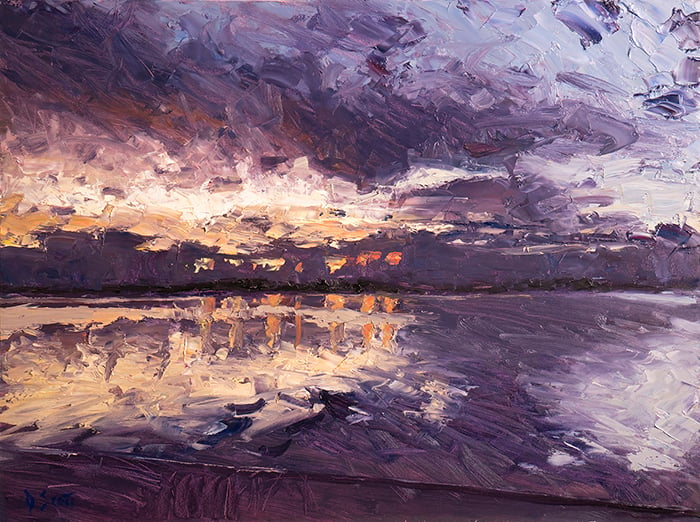
- Color is relative, so if you need to make an orange seem vivid and strong, then try surrounding it with a dull blue (like in Vincent van Gogh’s painting below).

Thanks for Reading!
I appreciate you taking the time to read this post and I hope you found it helpful. Feel free to share it with friends. If you ever want to learn more, check out my Painting Academy course.
Happy painting!
Dan Scott

Draw Paint Academy


You have so many beneficial lessons. Thanks for taking the time to help all of us who need your lessons.
I am currently taking art classes, but the information you give is adding to my list of valuable instruction, I use orange a lot, and have been discouraged by the color fading away. This should help, thanks.
Happy to be able to help and add to your learning! Thanks Carolyn, Dan
Where would I find a list of all the colors and whether they are considered cool or warm? For example, how would I know if a yellow has blue in it, or “leans toward the blue?”
Hi Peggy
I don’t have a list like that. But this color wheel may be useful:
https://www.handprint.com/HP/WCL/cwheel06.html
Thanks!
Dan
Wow – what great way of explaining. I will do some exercises. Thanks again.
Sounds good Claudette! Dan
Thanks for the details.I may likely to read again.I think colour wheel will help us in putting the mix of colours where it needs then , for painting.
Yes it should do Rajan! Thanks, Dan
Thank you Dan! Making a color chart of these colors would be a good source to go to when a certain color orange is needed quickly!!!!
Very true Joan!
Dan I am really enjoying your articles
Thank you so much
Cheers Chris
Glad to hear Chris! Thanks, Dan
Thank you Dan That makes sense and I love all your articles. Please keeep it up.
That is great Mabel! Definitely more to come.
Great lesson thanks
Thanks Heidi.
Hi Dan,
Thank you very much for sharing! Great information! I love orange.
No problem Janine. Thanks, Dan
Thank you so very much for sharing these insightful information! I am really fond of the orange color and use them a great deal on my work.
Thank you S D
My pleasure Souky. Glad you enjoyed the post. Keep up the good work! Dan
Many many thanks –Ann
No problem Ann. Dan
Your articles are always so spot on. I can hardly get into the studio to make a new color chart. My students develop a better understanding of color each time I use these charts.
Thanks Sue. Dan
Although I have been painting since 1964, and own a library of art books that has set me back a small fortune, I STILL find something worth reading in each of your posts Dan. So thank you and keep up the wonderful work that you do!
p.s. I use orange in plethora of my paintings, for sunsets and Autumn scenes.
Thanks for your kind words! I am just happy to be able to help. Thanks, Dan
Thank you so much for explaining the mixing process…so clearly! I realize now, that you don’t always have to desaturate with the complement!
Happy this has helped you Dolores! More to come. Dan
Thanks Dan, I’m loving all this info. Cheers Helen
That is great Helen! Keep up the good work. Dan
Thank you, this was a very clear example on mixing the perfect orange it will be handy for an ice cream painting of a cremecycle.
Perfect Beth! Happy to have helped. Thanks, Dan
That’s a great lesson and that technique can be used for mixing other colours and a great to go reference chart.
Thank you.
It certainly can be Eimer! Happy to hear you enjoyed the post. Dan
thank you Dan, although I read through it quickly, i shall return to it. I love orange!
Sounds good Christine! Thanks, Dan
Thank you for providing so much great information. I’ve been painting a few years and painted a few years when I was younger but never had formal training. I will never travel to “anywhere” to see the work of the masters so even though the pictures you publish are not original they are a good representation. Also you provide instruction in a way that the information takes hold. Thank you
i love your work so much