
Complementary colors are basically colors that are on directly opposite sides of the color wheel. So blue is a complement of orange, red is a complement of green, yellow is a complement of violet and so on.

Complementary colors provide striking visual effects when paired together. Claude Monet said this about complementary colors in 1888:
“Color makes its impact from contrasts rather than from its inherent qualities….the primary colors seem more brilliant when they are in contrast with their complementary colors.”
What he meant was that red for example has no meaning or power by itself. But, when paired with a complementary color (being green), you are able to properly see the richness and warmth of that red.
Color is all relative.
The impressionists were masters of color and were very clever in how they used complementary colors to create stunning visual effects. Let’s now go through some of the paintings by Claude Monet and Vincent van Gogh which utilize complementary colors.
In the painting below of van Gogh’s bedroom, you have the very intense red of the bedsheet which contrasts against the dull green of the floor. You also have the intense orange of the bed frame which contrasts against the weaker blue of the walls and doors.

In the flower painting below, the vibrant red on the wall contrasts against the dull greens of the table and leaves.

Similarly in the following painting, the contrast between red and green is used to draw attention to the vibrant flowers.

In this portrait of van Gogh, he used a simple combination of blues and oranges to create a very striking contrast. His face almost jumps out of the canvas at you.

A similar color combination was used in the portrait below but the more vibrant blues appear to dominate the much weaker oranges in this case. Notice how in the previous painting van Gogh’s face appeared to really come forward in the painting, yet it seems to be the opposite in the painting below.

In this landscape van Gogh contrasted the vibrant oranges in the foreground against the rich blues in the sky.

In this painting, the yellow sun is contrasted against the dull violets in the mountains and all throughout the painting (you can even see violet in the field of grass in the foreground). Have a think about how powerful that yellow color would appear if it was just painted on a white canvas with no other colors.

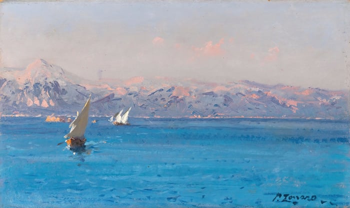
In this painting by Claude Monet, you have a striking contrast between the dull blues and the rich oranges in the sky.

In this painting, the vibrant reds and yellows contrast against the dark greens and violets.

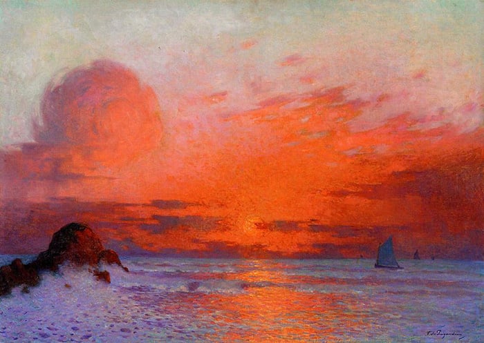
Finally, in this classic painting by Claude Monet, the sun is contrasted against the dull blue grays. The orange of the sun is actually not that intense (compared to say a cadmium orange straight from the tube). But, when the rest of the painting is dull blue-gray, it looks very intense.

Want to Learn More?
You might be interested in my Painting Academy course. I’ll walk you through the time-tested fundamentals of painting. It’s perfect for absolute beginner to intermediate painters.
Thanks for Reading!
I appreciate you taking the time to read this post and I hope you found it helpful. Feel free to share it with friends.
Happy painting!
Dan Scott

Draw Paint Academy


thank you for all your insights and beautiful examples
I love this! the colors the brush strokes no wonder I’m drawn to their paintings! Thank You Dan!!
I so much want to paint like this!
Paintings always “stand out” using Complimentary Colors ….unbelievable!
This rule should always be in memory when creating!
Great reading once again! An inspiration for today’s work
Thanks Christine! Dan
i love Vincent van gogh..
Very helpful and inspireing.
Very informative. The paintings proved your point very effectively. Thanks.
Wonderful examples of complimentary colors. Thanks
No problem Victoria!
Dan
Wonderful description of the impact of using complementary colors.
Thanks Katherine!
Dan
Be yourself when you paint. Let your personality show and with your own take on it . Don’t forget the complementary contrasts. Practice. ..
Donald
Couldn’t agree more thanks Donald!