A split primary color palette refers to a palette of colors with both warm and cool variations of the primary colors (being red, blue and yellow). The purpose is to mix a wider gamut of colors. I explain this in more detail below and cover the following in this post:
- Color Wheel Using Just the Primary Colors
- Color Wheel Using the Split Primary Palette
- Disadvantages of the Split Primary Palette
- Additional Readings
- Want to Learn More?
- Thanks for Reading!
Color Wheel Using Just the Primary Colors
Mixing a color wheel using just the three primary colors reveals some limitations of our paints and highlights the importance of the split primary palette.
The colors on my palette are cadmium red, ultramarine blue and cadmium yellow. I start by arranging them in a circle, equal distances apart.

I then use a palette knife to mix secondary colors (orange, purple and green).
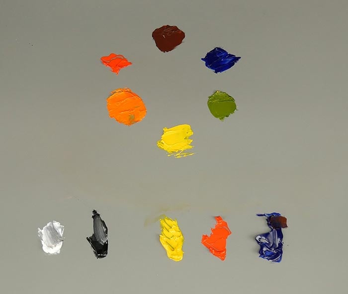
Finally, I take my palette knife and gently blend the colors together to complete the color wheel. I try to ensure there is an even gradation between the colors.


Key Observations
Here are some of the key observations from this color wheel:
- The orange is rich and intense because cadmium red and cadmium yellow are both vivid colors which lean towards orange.
- The purple seems dull. This is because cadmium red leans towards yellow. By mixing ultramarine blue with cadmium red, I am essentially mixing all three primary colors together to some extent. This results in a toned-down version of purple.
- The green seems even duller than the purple. This is because ultramarine blue and cadmium yellow both lean away from green and contain traces of blue. So again, by mixing these two colors together, I am essentially mixing all three primary colors together to some extent.
This primary color palette would be ideal for portraits, warm interior scenes or even still lifes, provided that you do not need vivid purples or greens. But it may feel restrictive for landscape painting.
A dull version of this primary color palette would be the Zorn palette, which includes yellow ochre, ivory black and vermilion (red). Ivory black in this case acts as a very dark blue. With this limited color palette, Zorn was able to paint stunning portraits and interior scenes filled with warmth. But for most of his landscapes, he expanded his palette to include more color.

Color Wheel Using the Split Primary Palette
I will create another color wheel but this time with a split primary palette which includes:
- Cadmium red (warm red)
- Alizarin crimson (cool red)
- Cadmium yellow (warm yellow)
- Cadmium lemon (cool yellow)
- Ultramarine blue (warm blue)
- Cerulean blue (cool blue)
Note: I am referring to warm and cool in a relative sense. Alizarin crimson is cooler than cadmium red but warmer than any blue.
I start by arranging the split primary colors in a circle.

I then mix secondary colors by using the primary colors which lean towards the secondary color I am trying to mix. For example, to mix purple, I use alizarin crimson and ultramarine blue (both colors lean towards purple).
Tip: Really dark colors sometimes need just a touch of titanium white so that you can properly see the color. In this case, I add just a touch of titanium white to my purple.

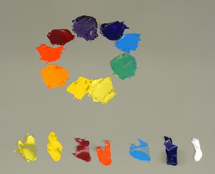
Finally, I complete the color wheel by blending the colors together.


Key Observations
Here are some of the key observations from this split primary color wheel:
- The orange is still rich and intense, obviously, because the same red and yellow are used.
- The purple is much cooler and richer due to the use of alizarin crimson rather than cadmium red. Alizarin crimson is a cooler red which leans towards purple.
- The green is much more vivid due to the cool yellow being mixed with the cool blue.
The split primary palette is ideal for landscape painting, as it allows you to mix rich secondary colors which you will frequently encounter in nature (particularly green). When you are outside painting the landscape, there is more light and this usually results in more color.
Disadvantages of the Split Primary Palette
Whilst the split primary palette allows you to mix a much wider gamut of colors, it does come with some disadvantages:
- More colors mean more complexity. But this is only a disadvantage if you don’t know how to deal with the additional colors.
- In most cases, you will not need to mix a vivid green, orange and purple, especially for still life or portrait painting. Sometimes, a partial split primary palette is all that you need. For example, in landscape painting I often have a red, blue and warm and cool yellows to give me more options for mixing greens.
- The split primary palette is still not perfect, in that you will not be able to mix every color with it.
Additional Readings
A Comprehensive Guide To Color Theory For Artists
The Zorn Palette – What It Is And How You Can Use It
Want to Learn More?
You might be interested in my Painting Academy course. I’ll walk you through the time-tested fundamentals of painting. It’s perfect for absolute beginner to intermediate painters.
Thanks for Reading!
I appreciate you taking the time to read this post and I hope you found it helpful. Feel free to share it with friends.
Happy painting!
Dan Scott

Draw Paint Academy

Dan,
Can I use this in my art class to have my teacher help practice this exercise?
Thank you,
Ann
Hi Ann. Of course! Dan
Dan,
Can I use this in my art class to have my teacher help me practice this exercise?
Thank you,
Ann
I would like to thank you so very much for sharing your knowledge and experience. I am unable to afford the lessons I would like, so your tutorials help more than you may imagine.
Kind regards
Carolyn
That is fine Carolyn, glad you are enjoying the information! Thanks, Dan
I wish someone had told me this years ago! It took me a long time, and some vague references from other artists to figure this out – mostly through trial and error. My art instructor didn’t tell us this. I love the way you explained it. Thank you!
Thanks Sheryl. Dan
Thank you so very much! very helpful indeed,
No problem! Dan
Thanks…interesting reading! How aabout explaining the use of transparent primary and secondary color…why some artists begin their paintings with a transparent color..etc., etc. this is mystifying to me!
Er zijn opties voor mij open gegaan na deze uitleg, erg fijn en bedankt.
Merrill
Happy to have helped Merrill. Thanks, Dan
Very helpful. Thank you. A lot of instructors have referred to using a cool and warm choice in the primary colours, however, none explained the reason for it as simply as you have here.
Glad to hear this Jean! Thanks.
You’re a good teacher, Dan! You explained how to use the primary and split palettes very well, especially with the photos of how you mixed the colors! Thank you!
Thanks Liz! More to come. Dan
Thanks Dan, as always, a well presented and clear explanation of the topic. I look forward to reading all of your posts.
Glad to hear Susan! Thanks, Dan
I’ve learnt so much from this , very cleverly explained !
Thanks Irene! Dan
wow! thank you so much! I learn so much by reading your posts and carry out them in my canvas. I’m so glad! thank you a lot. All these explanations about understanding colours is so important and fascinate me.
Glad to hear this Dorit! Happy to be helping you. Thanks, Dan
Dan, I am enjoying your lessons via this page. I cannot afford to pay for the course or obtain the books so I am taking as much advantage as I can of your section.
That is fine Beryl! Thanks, Dan
Thanks for detail about the colour mixing.
No problem Rajan.
15 years ago I had an art teacher who only wanted me to use the split primary palette plus white. We had to use lemon yellow instead of Cadmium Lemon and we had to make our own black. My teacher insisted we could mix any colour with the split primary colour. I certainly learned to mix colours very well. It was hard work but well worthwhile. Thank you for the above lesson. Nowadays I use the earth colours often which I buy.
great post!
Thanks Lila, Dan
I started to use the Split Primary color palette a couple of months of ago and it has really helped me. Instead of Cerulean blue I use Prussian blue but I think I will try Cerulean now. Prior to this I laid out all the colors on my palette and it confused the hell out of me. I think for beginners it is best to mix your own colors. Thanks for explaining this so simply.
A really great lesson. I feel much more confident now.
Thanks Sylvia! Glad to hear. Dan
Dan, this was the most enlightening post on Colour Palettes that I have come across. Beautifully explained and displayed. I’m total learner and unfortunately Cannot afford Courses or Classes. I love reading your posts, they are so inspirational. Thank you, Dan.
That is great Carol! More to come. Dan
I enjoyed reading about the split pallet. You explained it in a very simple and understandable language . Thank you very much. I’m a junkie in buying paints , I have all types of blues phthalo, cobalt, Windsor, cerulean,UM. Now I’m should try to purge them and to limit my collection.
Sounds good. Keep up the great work! Dan
I’m so glad I stumbled upon your site. This is excellent! When it comes to this particular topic it’s something I’ve felt and used but never heard it explained. Thanks, I’m looking forward to reading more of your articles 🙂
Dan, this is very helpful. I have a question I feel foolish asking – what is the difference between a color that says “hue” and just the color – like would I want cerulean blue hue or cerulean blue? You have probably addressed this somewhere and I missed it! Thanks so much for all the help you give us!!1
Hi Joan
My understanding is that the “hue” on the end means it is a lower quality paint. But it is usually cheaper.
Thanks!
Dan
Hi Dan. I’m your biggest fan. Thank you so much for this concise and easy to understand information you willingly share. Am I able to forward this to my students. Love R
Hi Robyn! Thanks for your support. Yes of course, that is no problem. Thanks! Dan