
Let’s take a look at Vincent van Gogh’s iconic Café Terrace at Night. I’ll cover:
- Key Facts and Ideas
- Striking Contrast and Color in the Night
- Value (Light and Shadow)
- Brushwork and Outlining
- Composition
- Key Takeaways
- Want to Learn More?
- Thanks for Reading!

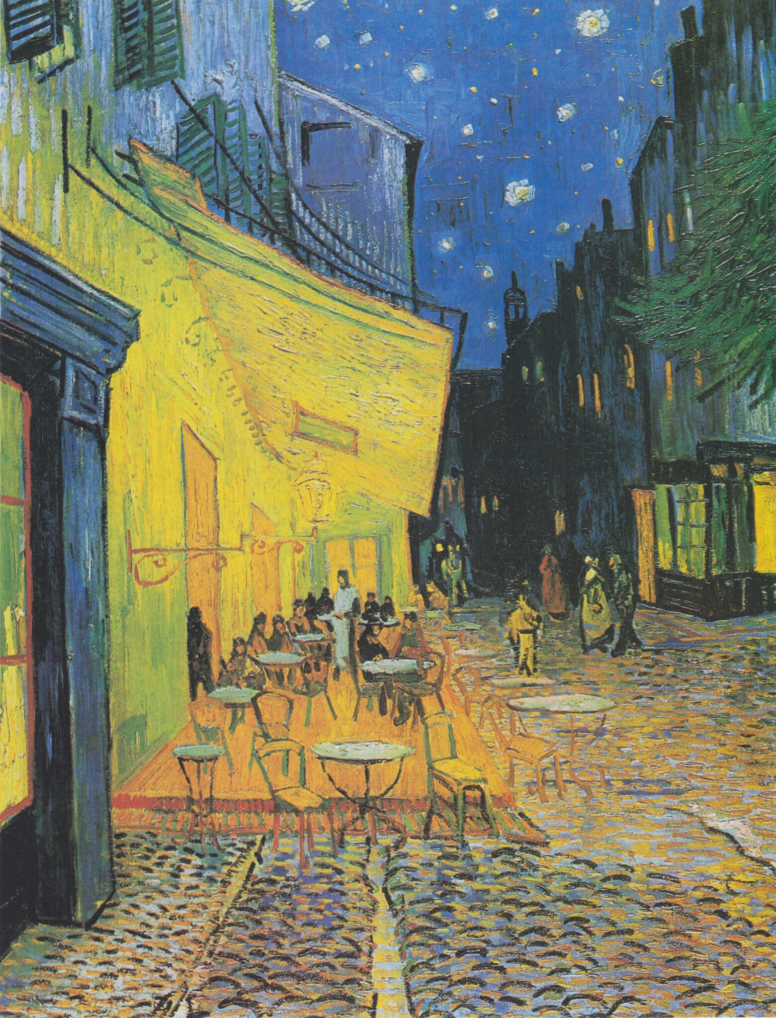
Van Gogh describes it well:
“On the terrace, there are little figures of people drinking. A huge yellow lantern lights the terrace, the façade, the pavement, and even projects light over the cobblestones of the street, which takes on a violet-pink tinge. The gables of the houses on a street that leads away under the blue sky studded with stars are dark blue or violet, with a green tree.” Vincent van Gogh in a letter to his sister, 14 September 1888.
I’ll walk you through the entire process using one of my recent paintings. You’ll see how I go from idea all the way through to reflecting on the finished painting.

Key Facts and Ideas
- It was first exhibited in 1891, then titled Coffeehouse, in the Evening (Café, Le Soir).
- Van Gogh painted on location. You can stand in the same spot he painted and see the café which was renamed Café Van Gogh (now that is smart marketing!).
“I enormously enjoy painting on the spot at night. In the past they used to draw, and paint the picture from the drawing in the daytime. But I find that it suits me to paint the thing straightaway.” Vincent van Gogh in a letter to his sister, 14 September 1888.
- Van Gogh didn’t sign the painting. Not sure why, as he signed most of his other works.
- The painting features van Gogh’s iconic depiction of a starry night, with deep blues and bright stars. He would continue this theme in Starry Night Over the Rhône (which he painted the same month), The Starry Night, and the background of The Poet: Eugène Boch.
- Below is a preliminary sketch of the painting. It provides insight into how van Gogh thought about the composition, patterns, and details.
")
- The positioning of the stars is accurate. Astronomers have since used the stars to trace the painting’s creation date to 16 or 17 September 1888 (source: Kröller-Müller Museum, where the painting is held today).
Striking Contrast and Color in the Night
“Now there’s a painting of night without black. With nothing but beautiful blue, violet and green, and in these surroundings the lighted square is coloured pale sulphur, lemon green.” Vincent van Gogh in a letter to his sister, 14 September 1888.
The painting features striking colors, as you might expect from van Gogh. Bright yellows and oranges against deep blues and greens. A powerful combination.
")
The colors aren’t realistic, but they work. Van Gogh had a knack for weaving vivid colors together without it appearing garish or overdone. He painted from emotion and instinct rather than relying strictly on observation. He closely observed but wasn’t bound to what he saw. Just look at the stars-he positioned them in the precise spots, yet exaggerated their appearances. That’s perhaps why his work is so special and iconic. He captured how he saw, interpreted, and experienced the world.
(A note on painting with emotion:
Every great painting needs an injection of emotion. Otherwise, we may as well just take photos. But, you don’t need to take it to the level of van Gogh’s work.
A safer approach might be to rely on observation but push certain elements that really speak to you. For example, say you’re painting a landscape with some beautiful flowers in the foreground. You might want to push the saturation of those flowers to draw attention to them, whilst staying true to observation for the rest of the painting.)
The striking contrast between yellow and blue is softened by the use of color gradation. Notice how the yellow light on the wall gradually turns green. Then that green gradually turns blue at the top of the building. That weak blue leads to the rich blue of the sky. Van Gogh is using color to lead us through the painting.
")
Van Gogh used black for outlining and for the dark buildings in the distance. The use of black is clever-it makes the sky look alive and filled with color by comparison.
“It often seems to me that night is still more richly coloured than the day; having hues of the most intense violets, blues and greens. If only you pay attention to it you will see that certain stars are lemon-yellow, others pink or a green, blue and forget-me-not brilliance. And without my expatiating on this theme it is obvious that putting little white dots on the blue-black is not enough to paint a starry sky.” Vincent van Gogh
There’s a strong contrast between the bright yellow and white stars and the rich blue sky. It mimics the contrast in the foreground of the bright yellow and orange café against the cool blue and green surroundings.
As mentioned earlier, van Gogh painted on location at night. I’m not sure if you have tried painting at night, but it’s a logistical nightmare. It’s hard to see what you’re painting. The colors on your palette look different. Reds don’t look like reds, yellows don’t look like yellows. You are working in the dark, both literally and figuratively. Van Gogh acknowledged this challenge in a letter to his sister and explained it was the only way he could faithfully capture the night’s brilliance.
“It’s quite true that I may take a blue for a green in the dark, a blue lilac for a pink lilac, since you can’t make out the nature of the tone clearly. But it’s the only way of getting away from the conventional black night with a poor, pallid and whitish light, while in fact a mere candle by itself gives us the richest yellows and oranges.” Vincent van Gogh in a letter to his sister, 14 September 1888.
Value (Light and Shadow)
Here’s the painting in grayscale, so we can clearly see the interactions between light and shadow:
")
The busy café is much lighter than the rest of the painting. So there’s contrast in both hue (yellow against blue) and value (light against shadow).
(Tip: If you really want to make a statement in your painting, overlap two or three contrasting elements. For example, thick, warm, and light against thin, cool, and dark.)
To me, the sky also looks darker in the grayscale compared to the full-color image. My eyes are confusing rich color saturation with lightness (a common pitfall in painting).
The grayscale also highlights an interesting pattern: the bottom left corner is light with dark accents; the top right corner is dark with light accents. Although some paintings, especially van Gogh’s, are best witnessed in color, it’s worth looking at them in grayscale as it often reveals value patterns you would otherwise miss.
")
Brushwork and Outlining
Van Gogh used blocky, linear brushwork. This in itself creates interesting patterns and character.
Notice how his brushwork follows the contours of the subjects. He used verticle brushwork for the walls, diagonal brushwork for the café ceiling, a tile pattern for the sky, and horizontal dabs for the ground. Other than that, his brushwork is roughly the same regardless of the subject’s nature (he used the same linear brushwork for the buildings as he did the sky).
He made use of outlining to reiterate forms. Look at the chairs and tables, the edges and detailing of the buildings, and the people wandering the streets. Edgar Degas used a similar technique, painting with flat planes of color plus strong outlines to depict form.
")
You can see van Gogh’s brushwork up close in this high-resolution photo of the painting. You should also take a look at this Google Arts and Culture page. (Note: There seem to be numerous photos of the painting with vastly different colors. I haven’t seen it in person, so it’s difficult to say which is the most faithful to the real thing.)
")
Composition
The architecture in the painting provides a strong sense of perspective. Notice how the edges converge towards a vanishing point on the horizon line (which is hidden behind the buildings). Cityscapes like this are perfect for conveying linear perspective. It’s harder in landscapes, where you are mostly dealing with organic shapes.
(Tip: It’s always good to lean into the natural traits of the subject. If painting a linear cityscape, lean into the lines and perspective. If painting an atmospheric landscape, lean into the depth; make those distant blues a touch blue-er. I learned this from Steve Huston.)
The dark doorway on the left and the dark buildings on the right frame the sides of the painting. They contain our attention on the light areas around the middle.
")
The busy café is the focal point, but it doesn’t dominate the painting. It’s competing against the night sky’s rich blues and bright stars.
Below is the painting with a three-by-three grid over the top (created using my grid tool). Some key observations:
- The corner of the café ceiling comes to the top horizontal.
- The people gravitate around the bottom horizontal.
- The cafe is off-center to the left.
- The two verticals roughly mark the start of the sky on the left and the start of the buildings on the right.
(Refer to my post on the rule of thirds for more information.)
")
Key Takeaways
- Can you use any recurring themes in your work? Like the starry nights in several of van Gogh’s works.
- Van Gogh painted with both observation and emotion (leaning towards emotion). Consider how you can incorporate emotion into your work, without departing too far from the subject.
- Be careful not to mistake highly saturated colors as being lighter than they really are.
- Looking at a painting in grayscale can reveal interesting patterns that you might have otherwise missed.
- Let your brushwork follow the contours of the subject.
Want to Learn More?
You might be interested in my Painting Academy course. I’ll walk you through the time-tested fundamentals of painting. It’s perfect for absolute beginner to intermediate painters.
Thanks for Reading!
I appreciate you taking the time to read this post and I hope you found it helpful. Feel free to share it with friends.
Happy painting!
Dan Scott

Draw Paint Academy


I can’t even draw a stick figure let alone paint and I just stumbled upon your article, which I found fascinating. I don’t know anything about art but I sure know what I like and dislike. Van Gogh is wonderful and so is Gauguin and Monet. Your knowledge is inspiring! Thank you Dan…Sue P.
For years I taught elementary school age about the great artists. Your comments and tips were enlightening and brilliant. Thank you!
Love all your annalergy ,all ways makes me think .Vincent is one of my favourite impressionist Artists.This is a good article. Thanks.
Was the preliminary sketch painted by Van Gogh? Or was that something you created for the purposes of demonstration? (Great article!)
Hi Anthony! The sketch was by van Gogh.
Fabulous analysis. I hope to take your course in the future when I have time.
Thank you very much! I visited this cafe in Arles in 2014 and the hospital where Van Gogh stayed after the loss of his ear which may have been cut off in a fight with Gauguin. The house where he lived in Arles was destroyed in WWII to my disappointment. But, at least the nearby cafe survived. I recommend the historical novel about Van Gogh entitled, The Yellow House.
Hi everyone, everthing behind said everywhere in the word about this painting is bullcrap, biggest lie ever, keeping people in dark, Cafe night Terrace is the best painting in the word by the best artist in the word number 1, this painting shit over monalisa, I have got most of the answers about this painting and I’m still finding more everytime I look at it. This painting is priceless, I have got the one and only painting of it, one in the museum is fake, I laugh when I look at theirs, what a joke, don’t insult van gogh his work is far greater than what you put in that fake painting.an gogh has chosen me to bring his best artwork out to public so people will see what really art is. It’s going to blow up the art world. And van gogh, s dream is going to come true.
Wonderful. Thank you
Thank you! These post inspire me.
As many of us, I only have gratitude towards your sharing your knowledge. Thank you so much.
Thank you so much for sharing. I truly enjoyed this critique!
Thanks, Dan. My challenge is to the whole picture painting itself. That probably why only a second or third rendition sees appropriate more often then not.
Thank you so much for doing this. I have been painting for a while but always learn something new.
I’m always newly inspired by by learning and relearning from the Masters works and the way you present them. Thank you!
Rita
I am so thankful for finding your information which help me to learn a lot from you. I wish I could learn more. I started oil painting during the pandemic plein air with few art lovers.
Thanks a lot!
Sincerely,
Sunhee
I thoroughly enjoy reading your insights on this painting. I learned so much. I find it so inspirational to learn what artists do with their paintings. I like to look at black and white value scales before I develop my color values for paintings. Now I additional factors to consider that makes painting so interesting and hard. Thank you!
This analysis is exactly what I need, having become stuck over colour values during a painting. Your point about confusing colour saturation with lightness is very helpful, thank-you.
One of my all-time favorites. Thanks, Dan. I read (from you?) that the stars in this one were not just arbitrarily placed, for balance or whatever. That’s actually how the sky looked that night. They took the coordinates to a planetarium, dialed back the sky, and determined the exact time he did this. Haven’t verified that account, but amazing if true.
Definitely! And I very much wish that understanding and learning about his pain could in some way stop the stigma toward mental illness. He donated “Starry Night” to the hospital that helped him. He was aware then and, I am certain, he would be today.
Thank you for this post into Van Gogh. In lockdown I started two projects sketch endeavour to improve drawing and Walking with Gogh, an exercise for me in trying to emmulate his work using pens and getting hopefully to understand his compositioning and colour pallet. I did Starry Night first then White cottage in olive trees, both were revealing and many of your comments re colour contrasts and use and brush direction fitted my discoveries. This week I did Night Cafe as I thought it was called. I did it from a very poor photo on my mobile. Your article here, oh how I wish I had seen it with the sketch in particular as I could barely make out many details. I am pleased with all my versions so far and can recommend anyone to walk with a favourite artist.
What a beautiful post. Thank you for this art masterclass!!
Thank you 🙂 I am in the process of painting the sky and it was good to learn about the master through you.
This was an Excellent lesson on a painting I’ve loved since childhood. Your insights helped me understand the mechanics. I’ve studied it but did not understand what I was seeing. I appreciate the link to the other articles – the ability to see where he lived, what he saw, where he now rests. I spent over an hour seeing the painting in a whole new light – I just wanted to let you know how Much you have helped me wrap my head around ways to improve. I’m starting your 30 Days of Creativity and I’m full of energy going in. Your emails remind me of nightly conversations w other artists from college (the 70s) to remote workshops I’ve done thru the years. Thank you, Dan. You’ve made my zeal for painting come back to life.
More of these “explanations” or discussions !! They are excellent for people like me who have never had any art education !
Please continue with insights such as this!
It has really made me a better painter
Your indepth analysis of the painting, imparting so much on the artist Van Gogh himsel and his techniques is truly remarkable. I feel so in touch with the painting and the artist after reading it. Truly remarkable. Much appreciated.
I very seldom write reviews, but found myself so moved by your article I had to thank you openly.
Thank you very much for your outstanding , informative and moving article.
How informative and interesting. To look at that painting and then look at the breakdown of the different sections by the simple brushstrokes shown and the amazing pre planning by Van Gogh ( me to take note and do this). Thank you, such a useful mini class.
Thanks a lot for sharing your knowledge. Now I will also be able to look a bit deeper into a painting. I enjoy your posts and I learn a lot, thankyou.
Marie Ferreira.
Hey Dan
It is your best post so far. Really learned a lot and enjoyed it.
Thank you
I have already read that Van Gogh would use a special type of yellow color (Yellow Oxide) in his paintings.
I wanna try to use it.
But, I don’t have Yellow Oxide. Can I make use of another one instead?
Your comments opened my eyes to see this painting in a different light. Thank you.
I did a 1000 piece jigsaw puzzle of this painting last year during Covid and it nearly drove me crazy. So I feel like I know every inch of it.
But I learned plenty from your analysis.
Thanks, Dan
Van Gogh is so marvellous! Your comments so useful. I love the way the chairs disappear into the cobbles of the street. Greyscale ideas fascinating.
What a wonderful painting. Thank you Dan.
I did not appreciate Vincent’s work until I saw it in person, up close. I
was fascinated by his brush strokes. And I still am.
What an enjoyable, interesting and informative read! Thank you Dan for sharing your insights and knowledge with us.
Loved your awesome observational comments!!!!!!!!!!
Thank you for your generosity in sharing this knowledge and analysis. Very interesting and helpful.
Thanks again for reconfirming the wonderful history of art. Learning to paint makes Art History all the more interesting!
Fantastic insights thanks
Like your lesson plan including the analysis of the painting. Keep it coming.
It makes me wonder if VG even thought of all elements he incorporated—he seemed to paint so intuitively, as if “THIS is how I want it, see it.”
Thank you so much for these analyses – I’m learning so much! I have a poster of this painting in my dining room, so I look at it every day, but never saw it as I do now. So helpful!
Thank you so much! I really appreciated the analysis of this painting.
Thanks for the insights. I’ve loved that painting without much understanding. You provided depth. I am humbled however by the virtuosity you unpack.
You give me eyes to see!
I’m really enjoying these compositional breakdowns!
Thank you for a wealth of knowledge!
I love reading your posts. As an author, they make me feel like I could write knowledgeably about painting even if I never will be great at it myself. 🙂
Thanks! Van really knew his stuff. If I could only put his ideas to work for me!
Excelente explanação, excelente guia p/ uma pintura harmônica.Grata.
Love your explanations and advice. Thank you for this pleasurable art experience.
That was an aha moment for me .those are the exact watercolors I’m attempting to use in a landscape photo I took on a trip out west..I is really beautiful but a challenge for me a beginner..I love watercolors because it tells it own story.
I did a copy of this painting by van Gogh, my favourite painter, about a year ago when our lockdown started here in Israel. I’ll put it on my Pinterest page and my website because I can’t attach it to this comment. I really enjoyed the challenge and think I did a fairly good job for a very amateur painter with little experience.
Always look forward to your communications,
Thanks
I have always loved Van Gogh. So thank you for making his work more meaningful.
I have loved his paintings for many years. I find that I have looked but not really “seen”. Thank you for opening my eyes.
Thank you, Dan. You have analyzed this beautiful painting from so many points of view… Really useful! As a beginner, I am trying to learn the theory, but cannot always see my faults having little practice. I’d like to know the answer to one question (2, actually): do you think Van Gogh and other famous painters were planning their masterpieces according to all such rules (e.g. the roof coincidence with the upper horizontal line)? Inspiration, vibes, the joy of self-expression… all these emotions during the painting process exclude “cold” reasoning, calculations and analysis. What do you think? Thanks beforehand.
This is a wonderful article. Thanks for sharing.
Very, very informative!! I learned so much! The trained eye can see so much more than the average eye!
Thanks so much for this really interesting critique of a wonderful painting. Even though we’ve seen it a million times, it’s so helpful to really look deeply. You’ve pointed out things I’d never noticed before!
Hi, this is one of three Van Gogh paintings that I love the most. It’s exciting to see it in grey scale and I’ve learned from your analysis of it. Thanks so much.
Once again, an excellent critique of what’s going on in a painting. Thank you!
Thank you for your expert and very interesting ‘dissection’ of this painting. I think I can feel the emotion thanks to your commentary.
I read/review every email you send out and love your descriptions and teaching information. Your artworks are terrific and soon I want to buy your art book. Thanks for sharing your knowledge about the old masters. Makes me want to hurry up and retire so I can continue painting.
Thank you so much for this.
It has greatly influenced me. I always painted stars white. As an astronomer I should have known better.
I have always strived to paint flowers ‘true to life’. Why? When you can paint particularly items of interest brighter……
Thank you, thank you, thank you.
I have forwarded this to people in our local art group, family and friends.
Thank you for this brilliant insight on this painting!
This was excellent reading thank you
Could you please explain maybe in different words what you mean by saying be careful not to mistake highly saturated colours for being lighter than they really are ?
I can help you.
High saturated colors can be called neons,
or brilliants. These colors are as bright as they are fresh from the tube.
Many times mistakes happen when one tries to alter them with white. It turns it lighter but paler. The strength, loudness, vibrancy or boldness (saturation) is lost. It’s better to mix a color nextdoor to make it seem lighter. Neon Red next to Neon Orange or Neon Magenta. Use white as a highlight after it dries.
Also think neon signs and LED lights. They are rich, bold but kinda dark.
Also against dark backgrounds they seem brighter but on bright white they almost disappear. Hope it helps.
Dan, your analysis of paintings is so thorough and instructive.
Thank you for preparing and sharing this.
I don’t feel qualified to help you because I am a beginner, but since no one else replied to you I am going to try to explain what Dan is saying. Any experienced people correct me if what I am saying is wrong to Joan.
Bright yellow in particular can look ” light” to a beginner like myself if it is next to a say blue that is medium in value. For example, Cad yellow medium is so attention causing, (it screams at me) so it makes you assume it is a light tone… especially next to medium tone cooler colors. The only TRUE way to know if something is a light color is to put a grey scale value finder next to your saturated yellow and see if it is really a medium tone instead of light yellow like you assume. (You can buy a grey scale finder in an art store or download one for free on the internet) Check to see if the blue and the yellow are actually the same value or if they are the same. Our eyes can trick us… especially if you don’t have a grey toned palette where you KNOW anything lighter than the neutral grey of the palette is light and all things darker are dark values. A light color yellow would have white in it…. that would make it less saturated. Another way to tell lights from saturated bright colors is to take a photo with your I phone and put it in grey scale. (Have someone show you how to do this on your phone) Sometimes what you think is a light color is actually a medium tone and your composition doesn’t pop like it should because there is no light against the darker value colors. Feel free to e mail if you need any further explanation. Hope I am not confusing you more.
Wow never seen this before. Fallen in love with it.
Just a beginner in acrylics. Taking away SO much information from your insight. Thanks for sharing!
Jody
I am a watercolourist for 50 +years. Found the article absorbing and thought provoking
Find the article worth studying many times. Thank you.I wonder if your courses are relevant to me,
Thoughts please.
Would be so fun to go back and take art history course again! Until then, you are the best !
Fascinating incite into masterful work
This was extremely informative. I will be forwarding this to some of my other artist friends.
Thanks for sharing your knowlege
Did Vincent have a sister? I didn’t know that.
The dark railing on the top of the cafe awning, in the upper, middle third of the painting, does it belong to the cafe or the building next door? Why do you think it tips outward? Does the roof supporting this railing slant?
I think it is a cable which helps to hold the Cafe awning. Bert
In my guess, the dark railing is to open or close the cafe awning (or if it’s a fixed one to support it) ;D
Josiane Monti,
J’ai trouvé cela trés interessant et très instructif.
Merçi.
I use wool to create 2 D pictures and do not have a background in painting. I find your tutorials so informative and take something away every time: thank you for sharing your wealth of knowledge. Many people can paint but not every painter will share or can teach others.
Your article is a good refresher course for me for things I’ve forgotten, never learned, etc.
I’m 85 and have been painting most of my life.
Thanks.
hi Grace – I too am long of tooth and love to paint…I am learning from Dan and so enjoy his information on the old masters.
Thank you, I found that very interesting and helpful!
I emoted this. Thank you
You are SO generous with your knowledge, Dan. Thank you for this analysis; I will share it with my high school art students who just happen to adore this painting!
Thanks so much for this. There is so much to learn, every little bit helps. Much appreciated
I enjoy your emails and your mini-classes. I learn so much. Thank you for doing this.
I adored this! Thankyou so much for enhancing the pleasure of the Work so descriptively. I have learnt so much from this.
Linda UK
Definitely! And I very much wish that understanding and learning about his pain could in some way stop the stigma toward mental illness. He donated “Starry Night” to the hospital that helped him. He was aware then and, I am certain, he would be today.
Thank you so much.