
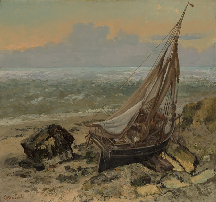
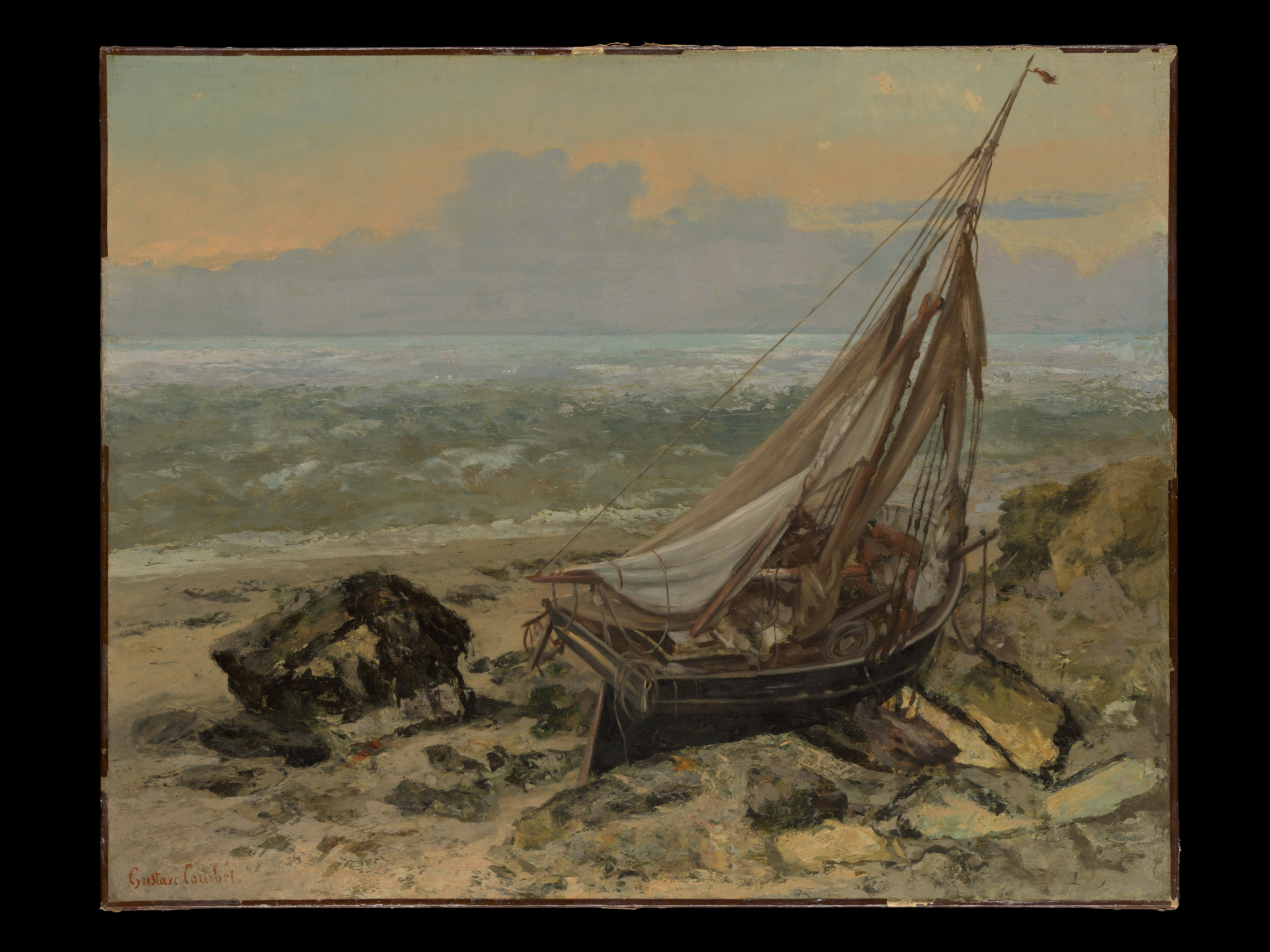
Let’s take a closer look at The Fishing Boat by Gustave Courbet. I first saw this painting at the European Masterpieces exhibition back in October 2021. I remember it catching my eye despite it being a somewhat quiet painting in a room full of vibrant color and contrast.
I’ll cover:
- Key Details
- Soft Pastels and Dark Accents
- Value (Light and Shadow)
- Brushwork and Detail
- Composition
- Frame
- Key Takeaways
- Other Readings
- Want to Learn More?
- Thanks for Reading!
(Click here to see a high-resolution photo of the painting.)
I’ll walk you through the entire process using one of my recent paintings. You’ll see how I go from idea all the way through to reflecting on the finished painting.

Key Details
- Medium: Oil on canvas
- Dimensions: Height 25.5 in (64.8 cm); width: 32 in (81.3 cm)
- Date completed: 1865
- Current location: Metropolitan Museum of Art, New York
Soft Pastels and Dark Accents
Courbet used a restrained color palette. Mostly soft pastels and dark accents; no rich or vivid colors.
It’s not easy to paint with restrained colors like this. The color relationships tend to be subtle and nuanced. It’s also a gentle balance between doing enough to make the painting interesting, and not overdoing it with too much color.
The soft pastel colors and dark accents complement each other nicely. The pastels make the dark accents appear darker and sharper, and the dark accents make the pastels appear softer and lighter.
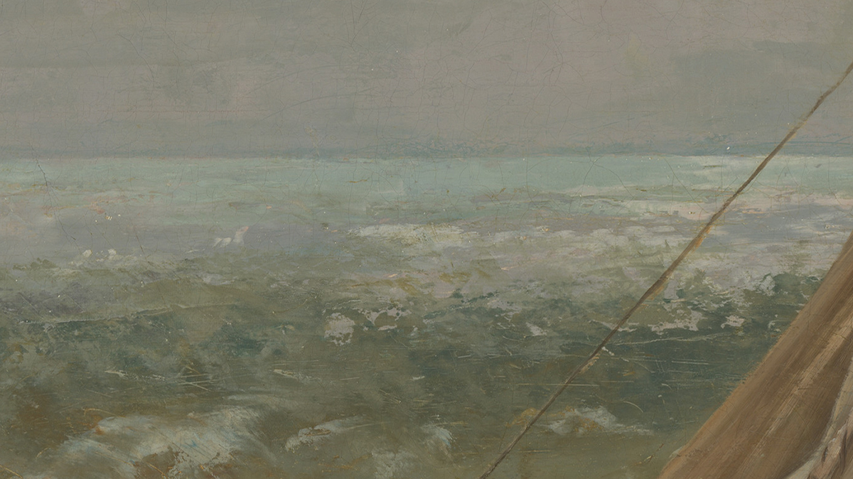
There’s a soft color gradation in the ambient sky. from pale green to orange. The colors melt into each other. If you look closely, it seems that Courbet scumbled orange over the top of the pale green rather than blending the two colors together. This gives the sky a transparent appearance.
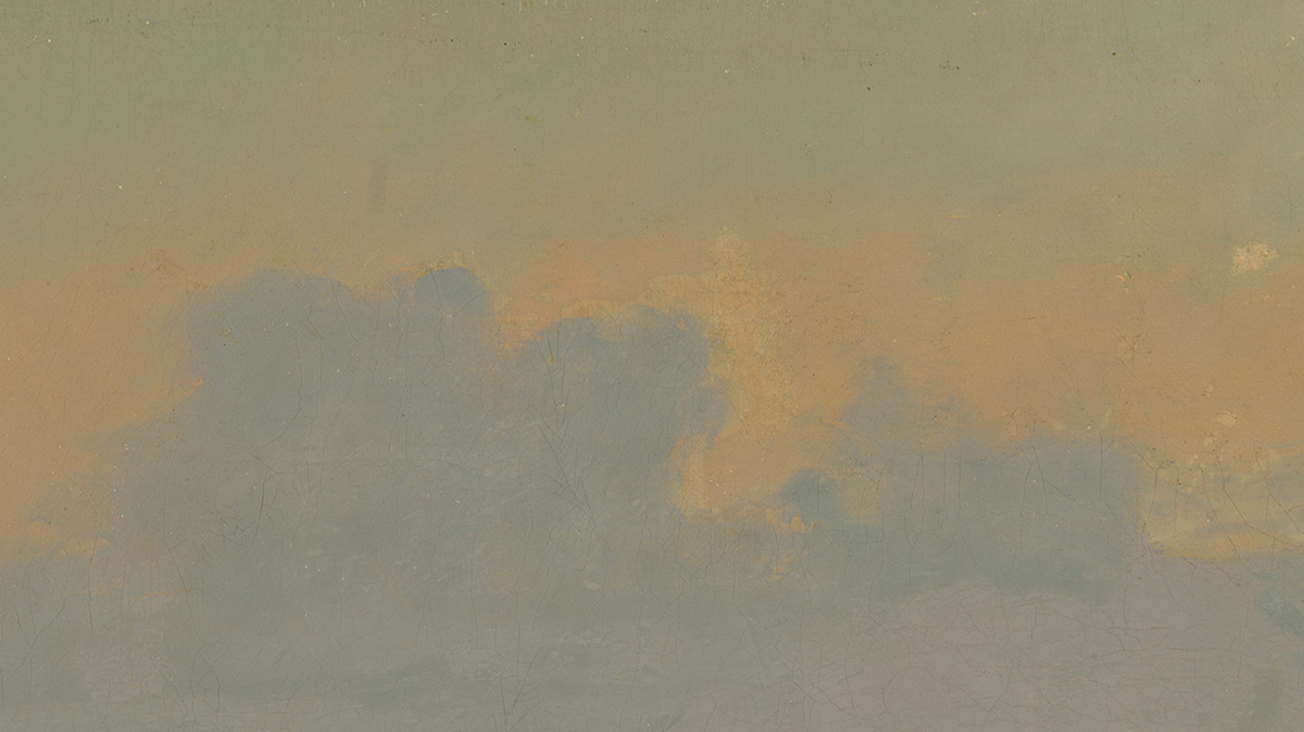
The orange also provides temperature contrast against the cool greens and blues. It’s this warmth that gives the painting a soft glow, as if Courbet painted with light itself. It reminds me of Claude Monet’s The Rocks at Belle-Île, Port-Domois, which I wrote about a few years ago.
The dull blue clouds separate the ambient sky and ocean. The clouds are basically a flat color shape, but notice how they are a touch darker around the top edges. This helps bump up the contrast against the lighter colors.
A faint blue line represents the horizon line. It adds depth and plays into the idea of a vague, low-lit scene (a crisp horizon line would look out of place here).
Regarding the ocean, look at the light colors that represent whitewash and breaks in the water. It’s possible that you see these colors as being lighter than they really are due to something called color constancy. Color constancy is essentially an autocorrection system for the way we perceive color. I won’t get into the details as it’s a complex area. All you need to know for this post is that white objects in shadow can appear lighter than they really are and you need to adjust for this when mixing colors.
Value (Light and Shadow)
Here’s the painting in grayscale so we can see all the values:
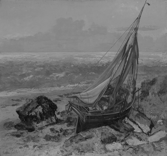
Most of the colors are compressed within a tight value range (they are similar in lightness), apart from the dark accents. This gives the painting a simple and concise value structure.
Look at the sky in particular. In the full-color image, the sky is full of life and vibrance, but it’s flat in the grayscale. This tells me that hue and saturation are doing most of the work, not value. Courbet kept the value relatively constant but varied the hue and saturation. This is a good way to inject complexity and sophistication into the painting without compromising the value structure.
The dark part of the ocean is similar in value to the shore. This allows for a smooth transition between ocean and shore, particularly on the right-hand side where there’s no whitewash.
The compressed values allow the dark accents to really command attention. There is no lead-up or gradation to the dark accents; they are just there.
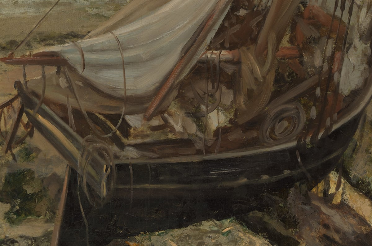
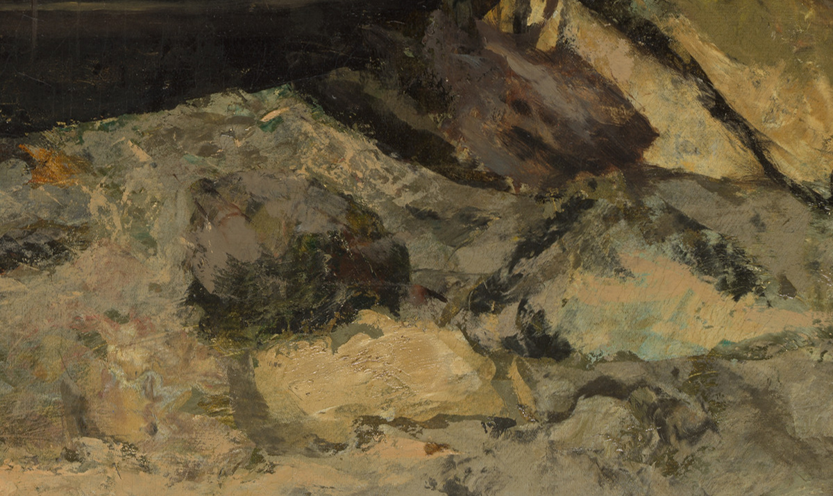
Brushwork and Detail
Courbet varied his brushwork to play into the inherent nature of each area. Refined, geometric brushwork for the boat. Rough, broken brushwork for the rough, broken shore. Rough, horizontal brushwork for the turbulent ocean. Soft, smooth brushwork for the quiet, still sky.
This creates an interesting contrast between the different areas, particularly between the refined and geometric boat and the more painterly surroundings. It also helps focus our attention on the boat, as our eyes are naturally pulled towards areas with a more refined finish.
One of the challenges of using different brushwork for different areas is that it can be difficult to make all the parts work together as a whole. You must find other ways to link the parts together in some kind of harmony. In this case, Courbet united the parts with a tight and harmonious color theme and a distinct style.
Below are some closeups of the painting:
Composition
The painting follows a standard composition, with a strong focal point, a few other key points of interest, and a distinct foreground, middle ground, and background. There’s also a sense of balance between the small area of concentrated detail and sharp contrast against the large area of soft contrast and “quiet” space.
The shoreline creates a diagonal that runs through the painting. This adds depth and perspective and plays well against the flat horizon line in the distance.
Below is the painting with a three-by-three grid over the top (created using my grid and grayscale tool). I have two key observations:
- The horizon line is smack-bang along the top horizontal. If you’re ever unsure where to position the horizon line and how much space to give to the sky and land, the top and bottom grid lines are safe options.
- The boat is around the bottom-right-hand intersection. The intersections are considered to be aesthetically pleasing areas in a painting; not directly in the middle yet not too close to the edges either. This makes the intersections ideal positions for the focal point.
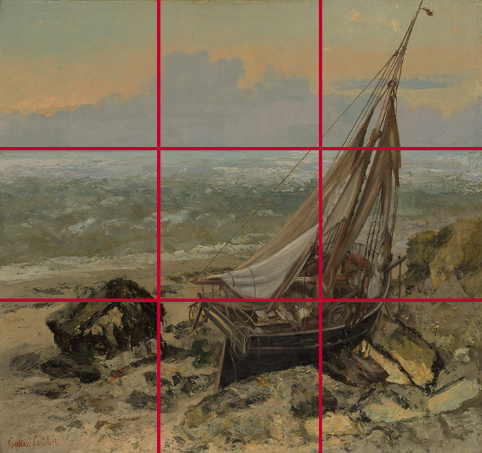
One aspect of the painting that goes against standard composition theory is the mast. See how it kisses the top edge of the painting. It works in this case, but usually, you would push the mast further in or further out of the painting. Having objects kiss the edge like this can appear unnatural and awkward.
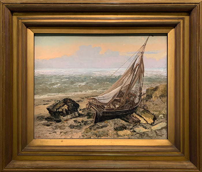
Frame
The painting has a marvelous gold frame that complements the colors nicely. One of the benefits of seeing these great paintings in person is getting to see them framed and in scale. The frame is often a work of art in its own right.
Key Takeaways
Here are some of the key takeaways from this post:
- Painting with a restrained color palette can be challenging in that you must do enough to make the painting interesting without compromising the subtle and nuanced relationships.
- Good use of temperature contrast can make your painting glow as if you painted with light itself.
- White objects in shadow can appear lighter than they really are.
- Painting within a compressed value range whilst varying the hue and/or saturation of your colors allows you to create interest without compromising the value structure.
- A good rule of thumb is to match your brushwork to the nature of the object. The challenge with doing this is making all the parts work together as a whole.
Other Readings
A Closer Look at Gardanne by Paul Cézanne – This painting was also exhibited at European Masterpieces.
European Masterpieces – Monet, van Gogh, Rubens, Velázquez, and More
Want to Learn More?
You might be interested in my Painting Academy course. I’ll walk you through the time-tested fundamentals of painting. It’s perfect for absolute beginner to intermediate painters.
Thanks for Reading!
I appreciate you taking the time to read this post and I hope you found it helpful. Feel free to share it with friends. Let me know your thoughts on the painting in the comments.
Happy painting!
Dan Scott

Draw Paint Academy

I particularly enjoyed the discussion of compressed values instead using hue and saturation to focus interest and contain the value to the primary focus of the painting. I have a lot to think about! Thanks, Robin
Hi Dan
I’m a 94 year old artist who’s been painting for 50 years. I’ve been successful in art shows, yet I am learning from every one of your well written lessons. You have also helped me see new things in old paintings.
Thank you so much for sharing.
Beautiful
I deeply cherish your works, it is always interesting to discover new artist and artworks. I loved the fact that you reckoned the frame and analyzed it. Thank you very much, I really appreciate you efforts. You have accomplished a great work!
Very interesting analysis; thank you. I loved seeing the painting in the frame.
I feel, in this course, I am gradually absorbing some key lessons. Thank you.
Like the evocative drama using restraint colours.
Am 87 and do not paint or once in a blue moon, but always read & appreciate all you valuable expert comments.
Dan, I do not see this work as quiet and understated at all! The fact that the pretty little boat is heaved upon dry land, cast among rocks is extremely dramatic. The subdued colors are very moody in my opinion. And a desolate mood at that. Thank you for the very good analysis however.
I should have wrote that it appeared understated compared to some of the other paintings in the exhibition! Dan
Thank you Dan, I really appreciate your emails! Something I have always wanted to know and written so eloquently and clearly understood.
Good review, Dan! I was amazed at reading it and being able to follow along with you! -Liz
I echo the positive comments by the reviewers including your introductions to lesser know artists, your interpretation of their work, hue and greyscale, values and so much more. You are such a valuable source of incisive and helpful information. Amy S Lemley picked up on your comments about the right frame for the right painting, this so important and I include a session on this subject on course I run for students and groups.
I look forward to opening your emails. I learn so much! The introduction to artists I
know little about and their paintings is so interesting but your critique of their work
is so valuable. You are able to explain the how’s and why’s so clearly that I am able
to look at other paintings with a new appreciation. Thanks so much:)
Great in-depth review of this lovely painting. Thank you!
Glad you mentioned the frame. My art books ignore framing. But the right frame can really enhance a picture. I wish there was more discussion about it, I usually am just hope for the best…
Good Evening Ms Lemley
You are so right in that art educational sources ignore the subject of framing which is so important in the final presentation of your work. How I approach the subject with my students are as follows:- I produce four copies of the same painting. The first painting is unframed and unmounted and however good the painting is it lacks something.
The second identical painting has a mount around it but the mount is the wrong colour and does nothing for the painting. The third painting has the mount and a incompatible and Ill-matched frame around it, it looks all wrong and diminishes the visual effect of your work. The fourth painting is framed in, what I feel is, the right frame and right mount. The students get it and job done.
I agree. I always offer up a frame as the painting proceeds. It helps enormously in my opinion. I understand Victorian painters frequently finished paintings in the frame.
Thank you for all of your closer look posts, always so enlightening. I particularly enjoyed the discussion in grayscale, with your comment on hue and saturation. A true aha moment!
Lovely painting! I wonder if the colors are so brown-ish because of the old varnish. Has it been cleaned recently?
Each time I open your email, I find your understanding and appreciation of artists’ work, their skills and their differences. The time you spend pointing the details out is inspiring. Thanks, Margaret
Lovely interpretation of the elements of this work.
Really great observations, especially love the discussion of values, the restrained palette which I am a big fan of, and the compositional aspects.
I love reading your explanations about these pieces. Thanks for introducing me to new works and authors!
It’s really amazing art. It’s showing lots of details & I respect your observations . Thanks so much