
Color temperature generally refers to how “warm” or “cool” a color is. But if only it were that simple.
It seems every artist has a different interpretation of what color temperature means in art. In this post I want to break down color temperature and what it means for us artists.

- What Does Color Temperature Mean in Art?
- Color Temperature and Psychology
- Color Temperature in Relative Terms
- The Color Temperature of Light
- What Color Temperature Means for Us Artists
- Summary
- Want to Learn More?
- Thanks for Reading!
I’ll walk you through the entire process using one of my recent paintings. You’ll see how I go from idea all the way through to reflecting on the finished painting.

What Does Color Temperature Mean in Art?
Color temperature has a few meanings depending on your perspective.
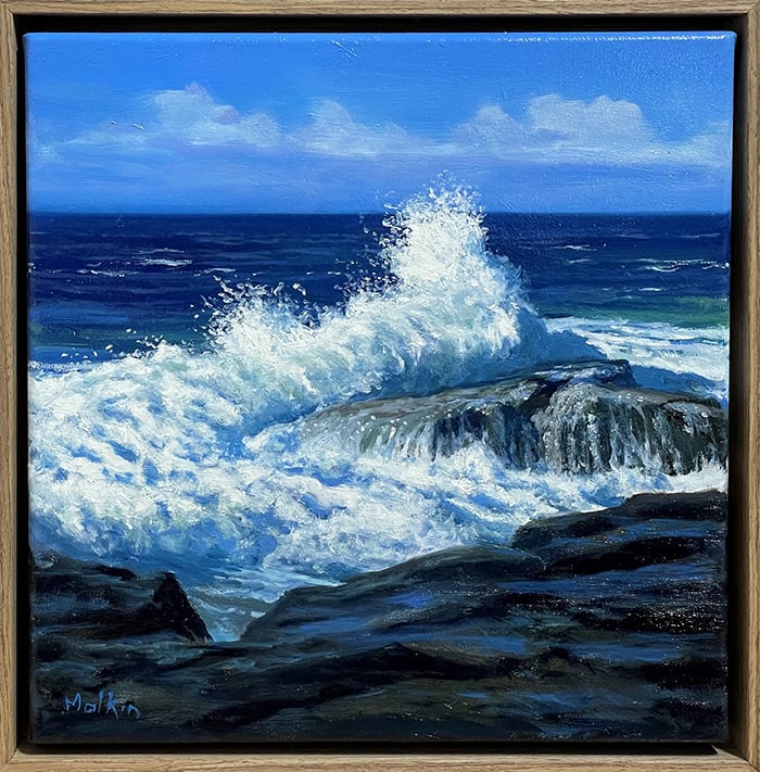
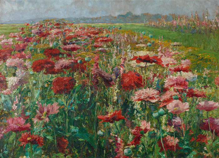
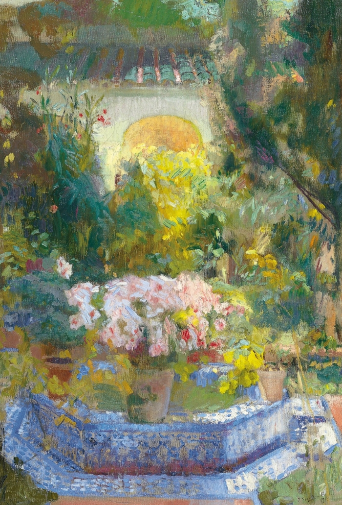
In relation to our paints, color temperature refers to our perception of a color as being either warm or cool. Many artists like to split the color wheel into warm and cool colors, shown below:

So reds, oranges and yellows are generally considered to be warm colors, and blues and greens are generally considered to be cool colors.
But it is important to note that the color temperature of our paints is only perceptual. Our paints do not have any intrinsic or fixed color temperature. We merely associate certain colors as being either warm or cool based on the surrounding colors (more on this later).
Color Temperature and Psychology
Have you ever thought about why red is considered a warm color and blue is considered a cool color? Especially given the fact that as an energy source gets hotter, it gets bluer. And as that energy source cools, it goes to yellow to orange to red.
So from a physics perspective, our traditional use of warm and cool to describe colors is actually backward. But we are painters, not physicists, so this inconsistency does not trouble us.
The reason we perceive certain colors as being either warm or cool has much more to do with psychology rather than physics. There are many psychological triggers that influence how we perceive colors. We generally associate blue with “cool” things such as water, ice and a clear blue sky. On the other hand, we generally associate red with “warm” things such as fire, blood or a sunset.
Color Temperature in Relative Terms
The problem with splitting the color wheel into warm and cool colors is that it implies color temperature is absolute, that is, certain colors have fixed and unchangeable temperatures. So a red is always warm and a blue is always cool no matter what.
But this is a very narrow way of thinking and it leaves a number of questions unanswered, like:
– If you have two different reds for example, are they both the same temperature?
– What is the warmest color and what is the coolest color, if any?
– Can a color have no temperature?
As an artist, I prefer to think about color temperature in relative terms, rather than absolute terms. This is because colors cannot exist by themselves. You can only identify a color if you have another color to compare it to.
Saying that blue is a cool color is just not a helpful statement. Sure, when compared to red, it does appear to be a cool color.
But what happens when you place that blue next to another blue? Are both blues the same temperature, or is one cool and the other warm in relation to each other?
If we think of color temperature in relative terms, then the first blue is slightly warmer than the second blue, as the first blue is closer to red/orange/yellow. But if we were to assign some kind of fixed temperature to colors (like many artists do) then you may just consider both blues to be cool.
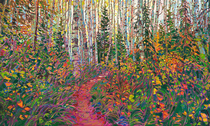
When you start to think about color temperature (and color in general) in relative terms, then you will see a much wider range of possibilities for using color temperature in your paintings. Rather than just trying to contrast a warm color like red against a cool color like blue, you will see opportunities to create subtle temperature contrasts within the blues and reds. That is, you could go from a warm blue, to a cool blue; or a warm red, to a cool red. This is how you can achieve these stunning color vibrations all throughout a painting. An artist who comes to mind when I think of vibrating colors due to subtle temperature shifts is Steve Huston.
When most people think of color temperature, they think of these sharp contrasts of orange against blue, or green against red. But color temperature contrast could be as subtle as a slightly warm gray against a slightly cool gray.
In practice, I am always asking myself….
“Is this color warmer or cooler than the color next to it?”
That is what color temperature comes down to for us artists. One simple question.
The Color Temperature of Light
So far in this post, I have talked about color temperature as it relates to our paints. But, as I discussed already, our paints do not have any intrinsic color temperature, just a perceived color temperature. Light on the other hand does have an intrinsic temperature.
Below is a color temperature range for light which is measured on the Kelvin scale plus some interesting reference points:

Light over 5,000K is a bluish-white color and is considered cool and light which is under 5,000K has a yellowish-white to red color and is considered warm.
Why is the color temperature of light important? Because it influences everything we see!
If you paint under the warm light of a sunset, then the colors you see will be vastly different to the colors you would see under the cool light of an overcast day.
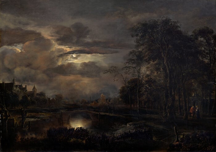
Claude Monet demonstrated this through his series of paintings on water lilies, haystacks and the Rouen Cathedral.


Same subject, but vastly different colors due to the different color temperature of the light which illuminated the castle.
What Color Temperature Means for Us Artists
Our goal as artists is to tell a story about what we see using our paints. Part of this involves understanding what we see and then using the tools at our disposal to create some kind of faithful representation of that.
In terms of color temperature, we cannot replicate the actual temperature of light. But, we can use our paints to give the illusion of the light. There are two parts to this:
- Figuring out what the color temperature of the light is; and
- Using our paints to create the illusion of this light.
So if the light which illuminates our subject is the warm orange light of a sunset, then you need to select your colors to mimic how the light works. In the painting below, the yellows and reds appear warm in the context of the rest of the painting. This creates the illusion of the warm light of the sunset. But, if I were to surround those yellows and reds with more vibrant yellows and reds, then there would be no illusion of warm light in the distance.

Summary
Here is a recap of what we have discussed:
- Our paints do not have an intrinsic or fixed color temperature. Blue is not always a cool color and red is not always a warm color.
- The color temperature of our paints is relative. That is, the temperature of a color is purely based on what you surround that color with.
- Light does have an intrinsic temperature which is measured on the Kelvin scale.
- The color temperature of light is one of the most determining factors to the colors which you see. The colors you see under a warm light will be vastly different to the colors you see under a cool light.
- It is important to understand the distinction between the color temperature of our paints (which is perceptual) and the color temperature of light (which is intrinsic). They are really one in the same, as without light there is no color. But understanding the distinction will also help you understand the limitations of our paints (refer to the point below).
- We are not able to replicate the appearance, including temperature, of light. But what we can do is use our paints to create the illusion of light.
- The better your understanding of light, the better you will be at creating the illusion of that light.
Want to Learn More?
You might be interested in my Painting Academy course. I’ll walk you through the time-tested fundamentals of painting. It’s perfect for absolute beginner to intermediate painters.
Thanks for Reading!
I appreciate you taking the time to read this post and I hope you found it helpful. Feel free to share it with friends.
Happy painting!
Dan Scott

Draw Paint Academy

The “Before the sun goes down” painting shows clearly the interaction of warm and cool colors. Thank you for this valuable lesson.
I thought the article was extremly helpful in decerning the temprature of the color, of the binary structure we are trying to create in our art work.
You are doing an awesome job. I’m from Pakistan. I have learnt a great deal from your courses especially this basic one. I took basics for granted but now after reading this article, it really cleared my vision… Thankyou and keep sharing more….
I got assigned this or school homework, and its been very helpful.
I’m puzzling over something and would love a reply. In your example of a warmer and cooler blue, assuming true blue is the coolest of all colors, then would you say that any deviation from true blue whether towards the green or toward the violet, is a warmer blue? Both move away from the coolest true blue towards the warmer side of the spectrum. I understand that it becomes relative only comparing side by side. However, true blue is in the eye of the beholder. In the squares you used as an example, I see the top as true blue and the bottom slightly greener, while you see to top as slightly violet and the bottom as true blue. Comment.
Hi Kathy
Thanks for the comment. There are no right or wrong answers to your questions. Color is based on perception, so what I see, might be different to what you see. I take a fairly loose approach to color temperature which can be summarized into a simple question: Does my color need to be cooler or warmer compared to the surrounding colors?
Dan
Thanks for your reply. Still a little unclear. Still wondering about a fine point since sometimes it becomes important when reading about color temperature:
Do you agree that it’s possible to describe both a greenish blue and a violet blue as WARM? This would be unique for blues since it is clear from the color wheel which direction is warmer for reds and yellows. Can you see the dilemma? Is it a clockwise or counter clockwise movement toward the warm side of the color wheel?
Thank you.
I believe in relation to the original “true blue” that you are referencing they are both warmer. One is warmer with the addition of yellow, one is warmer with the addition of red. If you think true blue is the coolest colour then all others colours (clockwise or anti-clockwise) must be relatively warmer.
Thanks for this article, i am self taught and feel this is one of the hardest elements to grasp as it affects every other aspect of the painting and can make or break the piece
No problem Stacey! Thanks, Dan
Thank you very much for your approach
I was looking for another insight of the theory of the color and I think I found here what I was looking for.
I’m painting with ink and watercolour and I hope I can apply this on my paints.
Have a nice day
Teresa
So interesting…. I’ve never had temperature, warm/cool explained. I really appreciate this article and thank you very much. I’m a self taught painter and haven’t painted consistently through the years since I’ve picked up a paint brush. I also really enjoyed the article on edges – soft/hard/fading. Blessing
Thank you for the clear explanation and examples. Definitely need to learn more!!
Great stuff Dan. You have opened my mind and understanding for painting. I have been doing a lot of photography and find many similarity how to think and judge colors and objects. Thank you
The above description and explanation of color temperature concept and the intrinsic value of light it applies to color was awesome. Thank you so much…
My pleasure thanks Anne! Dan