
Vivid colors usually get all the attention, so this post is dedicated to the subtle beauty of muted colors.
I find that one of the most common problems of beginner painters is that they completely overlook the importance of muted colors in favor of the more flashy vivid reds, blues, oranges, purples, and so on. If you find yourself rarely using any muted colors, then this post should be an eye-opener.
- What Are Muted Colors?
- How to “Mute” a Color
- Why Should You Use Muted Colors?
- Some Master Paintings Which Feature Muted Colors
- Want to Learn More?
- Thanks for Reading!
What Are Muted Colors?
Muted is just another word for gray, dulled or desaturated. It refers to colors which have a low saturation (or chroma). The opposite of a muted color is a vivid color.

How to “Mute” a Color
To mute a color, you can just mix it with any of the following:
- Black (this will also darken the color);
- White (this will also lighten the color);
- Gray;
- The complement of the color (for example, you can desaturate blue by mixing it with orange); or
- An earthy color such as raw umber or burnt sienna.
Each of these methods will produce slightly different results, but the saturation of the color will decrease.
Why Should You Use Muted Colors?
Vivid colors sure have their place. But it is usually far more effective to use vivid colors sporadically, in combination with muted colors.
The impact of vivid color is greatly diminished if you surround it with other vivid colors. For example, take the red below which is surrounded by a vivid green. The vivid red and vivid green fight each other for attention. You may find this color combination to be jarring and uncomfortable to look at.

If I half the saturation of the green, the color combination is much more pleasing to look at. The green recedes and the red takes center stage.

One of my favorite painting techniques is to combine a base of muted colors with small bursts of color. For example, a base of dull blues, purples and browns with some splashes of vivid orange at the focal point.

When you use a base of muted colors, you have much more control over where you direct people to look in your painting, as you can use relatively more color and detail around your focal point.
If your whole painting is created using highly saturated colors, the colors will compete for attention and people will not be sure where to look.
This is not to say you should only ever use vivid colors sporadically. There may be times when it is perfectly suitable to let vivid colors dominate your painting. Vincent van Gogh comes to mind here. But few people would be able to get away with using such vivid colors like van Gogh did.
In a technical sense, van Gogh’s use of color was extremely adventurous and unrealistic. But that is part of the appeal of his artworks.

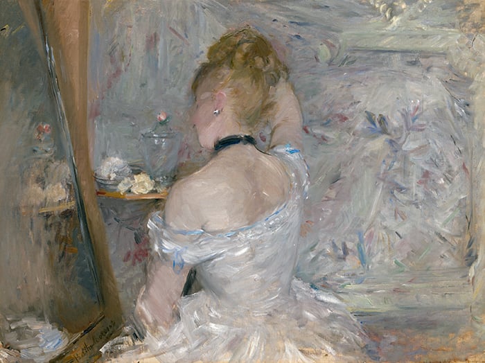
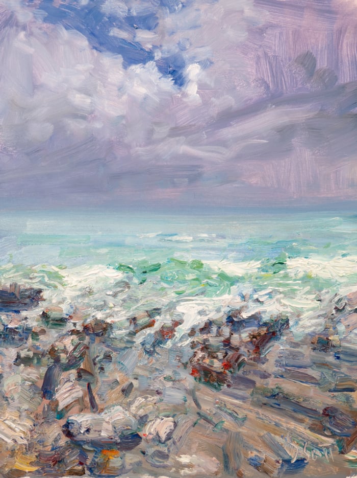
Some Master Paintings Which Feature Muted Colors
Here are some master paintings which effectively utilize muted colors. I find these paintings have a completely different feel compared to the vivid paintings of van Gogh and other expressive artists. The paintings are generally calming to look at and demonstrate a subtle dance between colors.
Anyway, enjoy these beautiful muted paintings. Let me know your favorite in the comments.


Want to Learn More?
You might be interested in my Painting Academy course. I’ll walk you through the time-tested fundamentals of painting. It’s perfect for absolute beginner to intermediate painters.
Thanks for Reading!
I appreciate you taking the time to read this post and I hope you found it helpful. Feel free to share it with friends.
Happy painting!
Dan Scott

Draw Paint Academy

I really like several of these paintings. Afternoon in New York because it has a sense of life and motion to it. Home at Montclair has an ethereal sense of homecoming. But, A Street in Venice by John Singer Sargent captivates me. I want to walk down that alley and explore! Maybe it’s the contrast.
I have stubbled across you today while searching hints for colour mixing and understanding, and I totally enjoy your chatty articles – I feel like I’m just in the room with you talking about art! (While sitting in NSW Australia)
I love the ‘A street in Venice’ and ‘Seascape’ – so good.
I’ve always had a deep heart for muted colours and I hope to push into them more and more. I clearly also LOVE vivid colours (just need to see my Art Pinterest board to know that!) and one of my very favourite artists is Leonid Alfremov, of whom I have a huge official reproduction of his hanging on my wall!
But I feel like there is a special secret to be discovered between the mutes and the vivids and I hope to discover it….. 🙂
I’m in agreement with Gayla Burson’s choices of her favorite paintings (Seascape, & Landscape by Moonlight). Additionally, I would like to include my favorite “Late Afternoon in NY”, 1900, by Childe Hassam, to those 2 masterful paintings. Also, I really enjoyed viewing and selecting favorites out of the entire list of the above masters paintings; it takes a master painter to compile such a complete assembly of muted paintings.
Joaquin Sorolla, Seascape, 1904 is my favorite painting, but George Henry, River Landscape By Moonlight, 1887 runs a close second with the vibrant blue and glowing moon. I’m always drawn to the ocean, water, ominous clouds, and pop’s of color. I enjoyed viewing all of them. Since I use watercolor, I enjoy thinking about how each one would translate in my medium. Thank you for your insight regarding muted colors.
Hi Scott
Lake Keitele by Akseli Gallen-Kallela
Stands out to me as virtually a monochrome as the blue and green are so muted. The effect is stunning.
I find some muted paintings spook me, as it is what I can’t see in the darkness, but they do express a calmness and are perhaps more personal in their impact.
Dear Scott,
thanks very much for your posts and yes, I find them very helpful. As you have asked which paintings we like, I would say that all than you have chosen here are explendid and very ilustrative about what you want to explain. The George Inness, Home At Montclair, the ones from Sargents and the pastel from Degas are maybe more appealling to me. Thanks again and have a great day,
María R.
I found your tips on muted colours very useful, I often try to use them but I’ve not yet captured the impact of contrasting with spots of vivid colour to focus attention and highlight vital elements. I also sometimes struggle to pinpoint and mix the exact colour and end up wasting paint (and with Acrylics they soon dry out so it’s hard to reuse them) I found the examples very interesting too and particularly liked Aleksey Savrasov, The Rooks Have Arrived, George Inness, Home At Montclair and Lake Keitele, Akseli Gallen-Kallela – inspirational!
Hi Jane, I too become a little frustrated with acrylics drying quickly. I’ve been using Golden Open paints as well as mixing in high gloss or matte finish mediums to the paints and that seems to help with dry times on the palette. I also know that people like to spritz their palette with water….but I get so into my process that I usually forget to do that. There are also water soluble oils, but I’ve never tried them so can’t speak to them.
Do you use a spray bottle? Occasionally mist acrylics with water. Keeps them from drying out indefinitely.
Color theory is endlessly fascinating. I could study those paintings for days and miss a lot. I love that. Thank you for sharing.
You are helping me to think of myself as a beginner. l thank you deepy.
I am more than passionate about Van Gogh, and my palette is disturbingly saturated. My eye is drawn to blatant purple/orange combinations. Yet, I found great beauty in the Russian landscapes, and I thank you for tempering my primal urge to put red next to green. In fact, I recently completed a black and beige pattern on clay. Thanks.
Hi Dan, whilst the entire work lose me to far away places, I enjoyed the thrill. But equally so, I find your naming there-under so interesting. It challenges me to have thoughts of my own. Magnificent work!
I’m sorry but these extremely muted pictures (colors) just make me feel depressed. The only picture I truly enjoyed was that of The Ballet by Degas and no doubt I prefer it because of the content. (Love ballet). But I do soooooo much appreciate the education you give us in your posts!
Hi Judy
I too prefer more colorful paintings!
But glad you are enjoying the information I put out.
Thanks
Dan
This was an eye-opener for me. I have been working on a watercolor painting from a photo that was a snowy evening that is basically in the grey tones. I fought it and put in all this color, thinking it would make for a much better painting. I was in reality fighting nature. The beauty of this photo was its low tones. I will be starting a new painting with the true low key nature tones.
Thank you for all your articles, they are easy to understand and informative
All the best with your next painting! Glad this article is helpful to you. Thanks, Dan
This is so helpful, and the examples are wonderful. I am working on a painting from a photo of large round hay bales stacked to one side of a field. The light comes from the left side behind the bales….so they are dark and I have been fussing about the muted colors in the whole photo, except for the sky. Thanks so much for all of your articles.
Favorite. Easily Degas, The Ballet Class.
rooks have arrived is my favorite. The contrast of the tall bare trees in the foreground with the dark building in the back is quite compelling. Also the small reflection of water on the ground gives the eye a rest from the heaviness and a realism.
Thanks Michelle! It is a beautiful painting. Dan
Wow! Dan, you are so generous! I always enjoy reading your lessons. The paintings you use as examples are truly wonderful! Thank you so much!
I havent met them all but I dont think i have ever met a painting that I didnt like, muted or vivid. my preference is muted with a dash of subtle vivacity , or the other way around. I like the mysteriousness of subtleties. Thanx, Dan, for all the excellent work you are doing. it is very informative. I have learned a great deal from your blogg.
Thanks for sharing Dennis and the kind words. Appreciate it.
Dan
Muted colours create great moods. And also seasonal art is enhanced as well as moody cityscapes. A quick way to mute colours is to water down a white paint and wash over a couple times to get the feel you want. I enjoyed your write up about the importance of muted artwork.
The Ballet class. Degas. Viveca Dahlen
Thanks Viveca! Great choice. Dan
Hi Dan, I like your lesson and samples of paintings are amazing! Exactly about muted color I start to think about and you give me a good idea and knowledge how to use this color. Thanks so much!
Thank you….I see what you have pointed out and is very helpful
Glad to hear Lorri 🙂
Dan
I can see exactly what you mean. I loved the examples of muted colours you presented. Gave me much room for thought. Thankyou
No problem Leah thanks for the comment!
Dan
Dear Scott, The Beauty Of Muted Colors ,which is like a kind of ” Meditation “, We love the Beauty Of Muted Colors ” All religions, arts and sciences are branches of the same tree.” — Albert Einstein.Thank you so much for sharing with us who live in Taiwan ! All the best !