
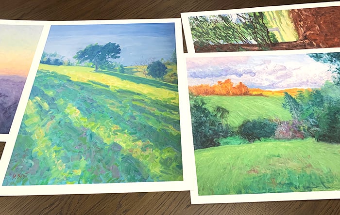
This is a detailed guide on how to paint color gradations. I wrote this in light of a recent painting, Morning Lookout (shown below). It’s a study of the early morning’s subtle color gradations just before the sun peers above the horizon line.
I cover:
- Color Gradation Meaning
- Color Gradation Techniques
- A Note on Different Mediums
- Other Examples
- Key Takeaways
- Want to Learn More?
- Thanks for Reading!

I’ll walk you through the entire process using one of my recent paintings. You’ll see how I go from idea all the way through to reflecting on the finished painting.

Color Gradation Meaning
Color gradation refers to the transition from one color to the next. That transition might be smooth or sharp.
Below is a simple example. It features a smooth gradation between different hues.

The image below features the same colors, but the gradations between them are sharper and more abrupt.
")
The nature of the color gradations you use in painting conveys a significant amount of information. So not only do you need to pick the right colors to paint with, but you also need to paint the right gradations between those colors.
A smooth color gradation might suggest ambiguity (think a foggy landscape or a dark interior painting like Henry Tuke’s A Sailor’s Yarn). Or realism (think of the subtle skin tone gradations in Peter Paul Rubens’ work). Or the gradual change from one object or area to the next (think the change from clear water to the sandy shoreline).

A sharp color gradation suggests clarity or some kind of significant change in the subject.
The gradation might also vary in terms of quality or roughness. The color gradations on a tree trunk tend to be rough compared to, say, the color gradations on an egg or any other smooth object.
It’s important to note that these are all relative terms. A sharp color gradation in one painting might be a smooth color gradation in another. Consider color gradation as a scale between sharp and smooth, rough and refined.
Let’s go back to my Morning Lookout painting as an example.

The sky changes from blue to green to yellow to orange to purple. The colors get darker as it goes from the sky to the distant land, and darker yet as the land gets closer in perspective. These are all color gradations. The nature of them is important. Imagine if I had painted the sky with abrupt changes from blue to green to yellow to orange to purple. It would look like the side of a cake, not the morning sky and its pastel colors.
Color Gradation Techniques
Let’s run through a few techniques for painting color gradations.
The simplest technique is to blend one color into the next. This will create a natural and smooth gradation, depending on how refined your brushwork is. For a rougher color gradation, use rougher brushwork.
This is the technique I used for both Morning Lookout and Fraser Island, High Key (below). For painting the sky, I worked blue into green, and green into yellow, and yellow into orange, and so on. I left the brushwork rough, but you might prefer a more refined finish.

Blending is perfect for capturing delicate skin tone gradations. Take John Singer Sargent’s Portrait of Madame X (below). The colors melt into each other. The smooth and refined color gradations capture her youth and softness. They also contrast nicely against her sharp and intricate facial features, hair, and clothing. Remember, painting is all about contrast.

")
Instead of blending two colors together, place an intermediate color between them. For example, say you have blue and yellow. A dab of green in between would help smooth the color gradation (green being what you get when you mix blue and yellow). If you have yellow and red, place a dab of orange in between. If you have green and blue, place a dab of greenish-blue in between. You get the idea.
You might use this technique over blending if you prefer a more blocky, broken appearance. Or if the paint has dried on your canvas, making blending impossible.
The technique of the Impressionists. Nicolai Fechin describes it well:
“To avoid murky results, it is necessary to learn how to use the three basic colors and to apply them, layer upon layer, in such a way that the underlying color shows through the next application. For instance, one can use blue paint, apply over it some red in such a manner that the blue and the red are seen simultaneously and thus produce the impression of a violet vibration. If, in the same careful manner, one puts upon his first combination a yellow color, a complete harmonization is reached – the colors are not mixed, but built one upon the other, retaining the full intensity of their vibrations.”
It typically involves painting with small dabs of distinct color. Instead of painting the sky with smooth blue tones, you would use dabs of blue, white, gray, and perhaps a touch of green or purple. The dominant color of an area is the sum of many small dabs of color. (Refer to my post on broken color for more details.)
It’s a rough technique by nature. You won’t get the smooth color gradations of blending. But you do have some control over how rough the gradation is.
Take Child Hassam’s Sunset at Sea for example (below). The water transitions between areas of blue, green, red, and yellow. Some areas are more distinct than others. Notice how each area contains dabs of color from the surrounding areas. The yellow areas contain dabs of green. The green areas contain dabs of blue and yellow. The red areas contain dabs of yellow and green. These familiar colors help soften the gradation between the areas.
The same goes for the sky, though it has much sharper color gradations.

Below is a painting from Claude Monet’s Waterloo Bridge series. Look at the bridge in particular. There’s a relatively smooth color gradation as you go from the bridge, to the bridge’s shadow cast over the water, to the water in light. Blue, to blue-green, to green-blue with dabs of yellow and white.
")
John Russell’s work also comes to mind. It’s similar to that of Claude Monet, but his use of broken color was often more dramatic.

Here’s a closeup I took at the New South Wales Art Gallery. Look at all those wonderful textures and colors. Notice the slight overlap in colors as it goes from light to dark. The more overlap, the softer the color gradation.
")
Hatching is a shading technique where you draw parallel lines to darken an area. The closer and thicker the lines, the darker the result. But we can also use it to soften color gradations.
Say you want to soften the gradation between a light and dark area. You could use dark hatching to push into the light area, or light hatching to push into the dark area, or both. Steve Huston does this often in his paintings. Peter Paul Rubens as well. Refer to one of his sketches below. He used hatching to transition between light and dark areas. The hatch lines also reiterate the structure and form.

Layering involves painting a thin, partially translucent layer of paint over another layer. It can produce fine, almost ethereal color gradations. Joseph William Turner’s The Fighting Temeraire is a great example. Thin washes of color contrast against the impasto brushwork.

Below is a closeup. Notice how effortless some of those color gradations appear.
")
Layering is particularly suited to watercolors. As an example, refer to Edward Compton’s painting below, particularly around the shadows.

You can create color gradation by varying the density of color either by using more strokes, more pressure, or thicker paint.
For example, if you paint a thin wash of color over a white surface, some of that white surface will show through. As you continue to build up paint in an area, the color will get stronger, resulting in a gradation from weak to strong color.
Below is another example. It’s an extract from my sketchbook (thanks to New Masters Academy for reference). Notice how some areas are richer and darker as a result of more strokes and more pressure on the strokes.

A Note on Different Mediums
Your painting medium will somewhat determine the color gradation techniques you use.
Oils: Versatile by nature. Suits any technique.

Watercolors and Gouache: Suits thin washes or intermediate color. Blending is also possible, though the outcome is unpredictable compared to oils.

")
Acrylics: Suits blending or intermediate color. Layering is not as effective as the paint dries too fast.
Pen and Pencil: Suits hatching, broken color, or density.
Other Examples
Let’s run through a few other examples, starting with Emily Shanks’ In the Flowers.
The color gradation from the foreground to the middle ground is softened by the grass and flowers shooting upwards and tapering off. The middle ground to the background is marked by a soft edge.
The girl has sharper color gradations. This suggests light, clarity, and focuses our attention.

Fechin was a master of painting with instinct. Below is Lady in Lilac. The face is delicately rendered with soft color gradations. The rest of the painting features broken color and an almost abstract finish. Fechin was clearly not limited to any few techniques.

In Monet’s Sailboat at Petit-Gennevilliers, there’s a pleasant contrast between abrupt and soft color gradations. Abrupt being the dark clouds, vivid white and yellow highlights, and the burst of orange in the sky. Soft being the rest of the sky and water.

Marie Bashkirtseff’s The Artist’s Sister-in-Law is a play between the subject’s soft skin tones and the sharp color gradations of the surroundings. Also, notice the relatively sharp gradation from light to dark on her face. This suggests a single, strong light source. (The nature of the gradation tells us a significant amount of information.)

Key Takeaways
- Picking the right colors is just part of the challenge. You must also paint the right gradations between those colors.
- Color gradations can be sharp or smooth. The nature of the gradation conveys a significant amount of information about the subject.
- You can create color gradations using blending, intermediate color, broken color, hatching, layering, or by varying the color density.
- Your painting medium determines the suitable color gradation techniques.
Want to Learn More?
You might be interested in my Painting Academy course. I’ll walk you through the time-tested fundamentals of painting. It’s perfect for absolute beginner to intermediate painters.
Thanks for Reading!
I appreciate you taking the time to read this post and I hope you found it helpful. Feel free to share it with friends.
Happy painting!
Dan Scott

Draw Paint Academy
Renaissance painters taught us that truth appears not in outlines but in the gradations of light and shadow. Your teaching gives those gradations names, methods, and the courage for the hand to follow.
Thanks goodness I can review this again. So much information that once thru is not enough time to understand all that is described.
Thank you for sharing this again. What a wealth of information. I will have to read and re-read it to absorb it all. Just wish I could take in-person classes with you. I have learned more from you than all the lessons I have taken over the years.
Thanks for this really helpful information. There is so much for a beginner to learn and you present the information in a way that draws me into the famous paintings with a more discerning eye. We are planning to play and learn with your suggested techniques in our little group of budding and mature artists.
Thank you for your generous sharing of your knowledge with interesting connections to other artists. This makes your comments very clear and expands our fascination of other artists, some we may not have met before.
I have learned so much from you.
The pictures along with the explanations make it so clear. Thanks so much for sharing your knowledge.
you demonstrate knowledge and teaching skills. Thank you
blending with watercolor is one of my goal.
Thank you so much for your generosity in providing this information. An article I will return to again and again.
What a wonderful analysis of color gradation. I will be reading it again and again. Your write up of Degas’s movement and costumes was so great too. Excellent job and simple informative. Thank you so much.
This was very illuminating. Can you comment on these techniques for pastels?
Thank you for the clarity of information, very interesting and really feel I am learning!
Thanks so much for all your helpful tips. I have only been painting with oils since this beginning of the year and have a lot to learn. I have been following Bob Ross’s video tutorials so I have used washes on a fairly regular basis. My question is, what part of color gradation applies to realistic landscapes? I’m not even sure how color theory applies, when I am painting exactly what I see from a photograph.
Hi Dan,
Thanks for sharing your knowledge and your informative posts. I always look forward to hearing from you. Thank You so much.
These specialized weight loss supplements by leading weight loss supplement manufacturers are fast becoming the preferred option for both men and women looking to achieve their desired shape. Find the best weight loss supplements and measures to reduce weight quickly.
https://www.exportersindia.com/blog/best-weight-loss-supplements-and-measures-to-reduce-weight-quickly.htm
I have trouble with what brushes to use. When I need to make a fine line it always comes out too thick. The articles have been very helpful
Thank you very much,very helpful and inspiring!
Thanks. I appreciated differences in use of media.. I prefer Watercolor and acrylics to oil. Been working with pencils (colored and graphite). Most ideas in oil as you do but am looking forward to Watercolor live with Eric Rhoads in January.
Thanks Dan. That probably explains it. When I used watercolour canvas paper, the watercolours just moved around on top.
As usual, your lessons are clear and very helpful, especially because you include real examples and explain them. Thanks for sharing so generously, Dan!
I was confused, however, when you said you used watercolour on gessoboard . . . Since I’ve never used gessoboard and really don’t even know what it is (or using gesso), this is a mystery. Since I like using watercolour, I’m wondering what I’m missing.
Hi Barbara. It’s Ambersand gessoboard. A sturdy alternative to canvas. There’s a link to it on my supplies page:
https://drawpaintacademy.com/supplies/
But it’s more for oils or acrylics. Watercolors wouldn’t be suitable. I was probably referring to using thin washes of oil paint.
Thanks! Dan
Thank you for all your posts. I have learned a lot (and relearned what I forgot!). I have recommended your site and your classes to friends. Keep up your good work!
Thanks a lot. Very, very interesting and good documentation. Really nice discover others painter’s works at the meantime.
Really good work, thank you again.
Thanks for this very informative presentation of colour gradations, although as a complete beginner I may need to reread it until the penny drops. Love your emails and am thinking of joining your course in the New Year.
thank you very much for this leson. i am anew artist and this information was invaluable to me thank you for sharing it with me. i am learning a lot from you.
kathy robinson from SC
As always Dan u r so succinct in your teachings, your example so spot on w/them. I keep them all in a notebook- further reinforcement for my memory cells! Thanks again for all the information u so willingly share. Ellen
The sunsets in my area are magnificent, but when I turn to the east I see a pastel “rainbow.” It’s as beautiful as the sunset!
I am so grateful for the huge amount of information you share so freely. It is tremendously helpful.
Thank you
Thanks for the guide and beautiful paintings, very inspirational. I’m a starter, will try some techniques provided. Really appreciate your hard work.
I’ve been painting a long time and It’s so wonderful for you to share and teach such great insights. I don’t care how long we’ve been painting we can always learn and or be reminded of all these great principles and techniques. Thank you Dan for all your hard work and research it has not gone unnoticed.
This was Wonderful !, I love all the information that you have given and also the different Artists.
It has helped me understand much easier. You tell it for some of us beginners that truly Need to understand and WANT to learn as much as they can. THANK YOU SO VERY MUCH!
Thanks Dan, for the reply.
Thank you so much for all this insight into various techniques! I not only love the techniques, but I’ve learned about artists that I’d never even heard of. It’s really great to get the instruction and then see examples. I’m really glad I subscribed to you!
Thank you very much for all this valuable information.
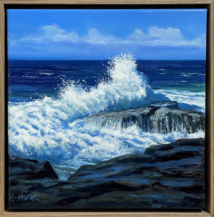
Than you so much for this info. I needed it for the seascape I am presently painting.
Very helpful with great illustrations
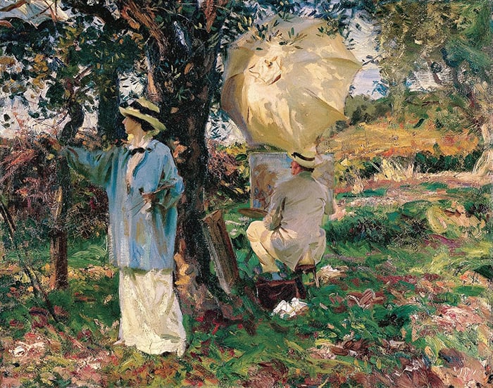
Dan, love your work on Morning Lookout. Will you feature this painting on At the Easel?
Many thanks for sharing your knowledge and what must be a massive amount of effort to pull together these many wonderful reference paintings. I always learn so much from your teachings.
My pleasure Jeffrey! Yes – I’ll put together an on the easel post for that painting. Will email when published. Cheers! Dan
Dan thank you for your interesting and good documentation. I enjoyed while learning from the inspirational beautiful paintings and your from your teaching.
Already written.
Kindly reply my today’s mail requesting you to tell when the gradation should be smooth and when sharp.
Smooth gradation is like going/”mixing to neighbouring colours of the colouring wheel. Am I correct?
But then sharp gradation, as per your ideas, is only clear demarcation of boundaries? Any next colour.
Hi Dan i am feeling so uplifted by your pictures and your visit to the New Zealand Gallery. Using your eyes make all the difference .thankyou
Dan, thank you so much for sharing your knowledge and experience – you are an excellent teacher.
Thanks also for the lovely examples of the lessons you teach.
Hi Dan. I very rarely leave comments but this latest post from you has moved me to write. I have followed you from your first beginnings online and have marvelled at your incredible knowledge and generosity in sharing. So many artists are secretive about their technique or demand high prices. There is something unique and special in the Aussie physic which you have in spades, a warm, sharing gift
Not often found in humanity. Sincerely thank you.
Hi Francetta! Nice to hear from you. I think I did a critique for you in 2017? Doesn’t time fly. Really appreciate the kind words. Just glad to help! Thanks Francetta. Dan
Wonderful explanation with the appropriate technique. For the benefit of novices like us please clarify what you meant by a ‘thin layer’. Is it softening the colour with white or adding a solvent. Also how to get the base colour to show through. Usually, the topcoat completely covers the base layer. The examples you have taken and the accompanying notes are very relevant, it is the process of achieving the result that baffles me.
Thanks Ananda! By thin layer, I’m usually referring to a thin layer of oil paint plus solvent. But it could also mean a thin layer of scumbled color, or oil paint plus linseed oil. Dan
A well-researched article compacted to give practical orientation to your subscriber community. My compliments and thanks for your significant effort.
Astonishing insights much appreciated. I can’t wait to attempt to apply this deep appreciation and these resounding lessons. Thank you for your generous application of ideas.
Excellent explanation and examples. I really appreciate you sharing your wisdom and experience with us.
Thank you so much for this. I appreciate especially the description of the differences in uses of the different media. I play/paint in watercolor, acrylic and a bit of oil, so I have seen the differences but never thought them through in my head. Also very grateful for the reintroduction to John Peter Russell. I have seen many of his paintings in galleries and like them, but haven’t really focused on him until today. Working on an acrylic where I am dappling some of the same bold colors Russell used on top of each other. And working on a watercolor with layers of color.
Thanks Dan for the wonderful clarification, but I am not clear when to go for gradual and when sharp.
Thanks,
Dipak.
Hi Dipak. Depends on what you are trying to convey. The answer will probably by in the subject. Is there a sharp change between colors? Or is it soft? If in doubt, fall back to observation. Paint what you see. Hope this helps. Dan
As always so helpful thank you
Plenty of excellent comments on the use of painting colour etc, thank you so much for your time and effort Dan.
The instruction and comments provided are interesting and helpful. Happy Thanksgiving.
Easy to follow information on the use of colour. As with all your tips, your information is easy to follow. Your reference photos are well chosen to illustrate your written comments.
Thanks for helpful ideas and gentle reminders of how much enjoyment comes from putting paint to canvas.
Thank you, Dan, for the extremely important information on color gradiations and the different techniques. I will value this information each time I pick up my paint brush.
Thanks for sharing these thoughtful insights and passing on this knowldge. Stay safe and happy painting
I am always struck by the clarity, applicability and generosity of your postings. I am stockpiling them to return to when I get stuck. Thank you for all you provide.
Dan, you explain details about as well as anyone I’ve read or studied. I have taken your courses and love every time I get your email updates. The examples you use in this post to illustrate your points are outstanding, including your own work. Thanks for these tips and help.
I have so much respect for your knowledge and generosity. Your explanations are clear and common sense. Thanks so much.
Very useful and practical information. I will be using one tip today.
Thanks for your helpful posts.
Thank you for the information and discussion. I always love reviewing the paintings with your comments. My next painting, already sketched on watercolor paper will use some of these techniques. I did effect a wash using acrylic color and lots of water on my last painting, but I totally agree with you, the paint dries too fast. I look forward to your emails and studies!
Incredibly well put, cannot wait to get to painting today!
I appreciate so much the wealth of knowledge and insight that you share in every post.
Thank you for very needed and useful information .
Thank you so much for all the information. I greatly admire your generosity in sharing so much information.
A wonderful breakdown of gradation techniques. Never thought about it before and this helps me to achieve the results desired. Thank you so much !
Thanks for this. Great paintings for illustration. Fechin does my head in.
We are so fortunate to have such a gifted artist and well trained educator. Thank you for you generosity.
Thanks for your good advice, Dan, everything you say is true. I’ve not been told anything I didn’t know but I have been reminded of things I’d forgotten. Thanks again, very inspirational.
Thank you so much for sharing this valuable information, so very helpful.
Once again, awesome information Dan! This exercise made me think to ask you how to apply a “wash” in oil painting. How to mix and when to use it would be useful information.
Thanks Dan
Hi Mary! I often use thin washes of color at the start of the painting. Oil paint + odorless solvent to thin the paint. You can see these washes in many of my on the easel posts: https://drawpaintacademy.com/categories/on-the-easel/
But you can’t do this in later stages, as the paint will crack.
You offer so much insight, thank you, Dan.
Thank you for your detailed guide on how to paint color gradiation. I will be using it for my own paintings!
Tremendously informative. I am struggling at the moment with some shadows and a misty atmosphere. I found the answer in this great Post. Thank you for sharing.
i am have problem with shadows do put this picture help me lot….
Enjoyed reading, and your showing of examples, about blending of colors and soft and hard edges. Caused me to look at some of my paintings from earlier this year and see how this was applied. Thank you.
Hi Dan
I appreciate your generosity in sharing such valuable insights.
Thank you, I found this fascinating, lots to think about!
Take care,
Rose
Superb information about gradation which calls me to action!
Many thanks
Thanks for this. Its a concise and comprehensive summary of techniques for blending.
Superb information about gradation which calls me to action!
Many thanks
Thank you 😊
Excellent! Thank you for sharing and inspiring!
I learned something today. Thank you for sharing your painting tips. I will keep them in mind for my own work that I do,
What a wonderful analysis of color gradation. I will be reading it again and again. Your write up of Degas’s movement and costumes was so great too. Excellent job and simple informative. Thank you so much.