
Contrast is everything in art. Without it, you may as well leave the canvas blank.
It is one of the principles of art which refers to the striking difference between two elements. For example, there is a strong contrast when you place a vivid red next to a dull green, or a rough texture next to a smooth texture, or a hard edge next to a soft edge, and so on.
With clever use of contrast you can focus attention on the key features in a painting. Knowing when to create a stunning contrast and when to leave an area slightly uninviting is a powerful skill which separates good artists from great artists.
In this post, I dive a bit deeper into the different ways to create contrast and how to use it to improve your paintings (rather than detract from them).
- Color Contrast
- Texture Contrast
- Shape Contrast
- Edge Contrast
- Detail Contrast
- Additional Resources
- Want to Learn More?
- Thanks for Reading!
I’ll walk you through the entire process using one of my recent paintings. You’ll see how I go from idea all the way through to reflecting on the finished painting.

Color Contrast
When most people think of color contrast, they think of a clash of red against green, or purple against yellow. This is what you would call hue contrast. But you can also break color contrast into value contrast and saturation contrast.
Value Contrast: Refers to the contrast between light and dark colors. Every color has an underlying level of lightness. A saturated yellow is lighter than a saturated blue. So when you place a yellow next to blue, there is a contrast in hue and value.
Our eyes are very responsive to value contrast, much more so than hue or saturation contrast. That is why value is widely considered by artists to be the most important aspect of color.
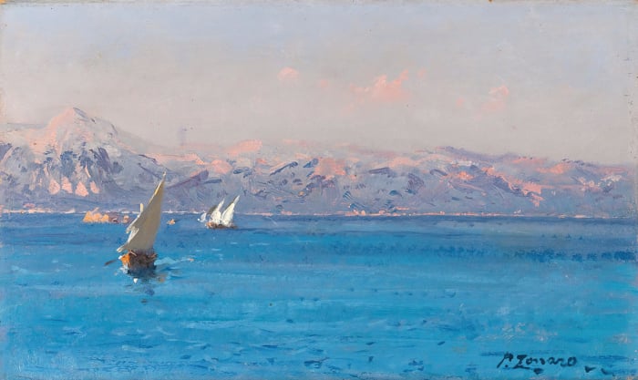
I am fascinated by paintings which have a sharp contrast between light and dark. Below is one of my recent studies which has a dark foreground framing the high-key background.

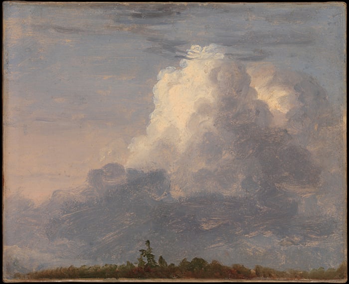
This painting by Claude Monet also comes to mind when I think of a sharp value contrast:

Hue Contrast: Hue contrast refers to the contrast between different colors on the color wheel. It is independent of value and saturation (though they often play a part). Colors which are on opposing sides of the color wheel have a strong contrast. These are referred to as complementary colors.
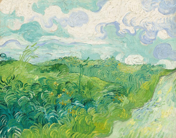
Vincent van Gogh relied heavily on hue contrast, using sharp jumps between complementary colors to create a stunning effect.

Saturation Contrast: Refers to a contrast between saturated and dull colors. For example, a saturated yellow against a dull yellow. Many people overlook this kind of contrast, but it can add a very powerful element to your painting.
In this painting, I relied mostly on saturation contrast to give the yellow the intensity it needed for the sunset. I used a cadmium yellow straight from the tube, which has a sharp contrast against the dull oranges, blues and purples in the rest of the painting. There is of course some hue contrast, but it is not as significant.

The image below demonstrates value contrast, hue contrast and saturation contrast in that order.

Many artists do not think about color contrast in terms of value, hue and saturation. Most of the time they take a very general approach to color.
When you think of color contrast in terms of the three individual elements, you start to see so many more opportunities in painting. Instead of just contrasting a red color against a green color (hue contrast), you could bring value and saturation into the mix by contrasting a dull and dark red against a saturated and light green. Or you could create a very subtle contrast between different greens in your painting by keeping the hue the same and just altering the saturation.
Tip: When you change one aspect of a color (the value, hue or saturation), there are usually implications on the other aspects. For example, if you make a color lighter with white, you also reduce the saturation but the hue will stay roughly the same. When you make a color lighter with yellow, the saturation will not change as much but the hue will change. I like to think about color like a triangle of influence. When you change one side, always consider the implications it has on the other two sides of the triangle.
Texture Contrast
You could create a strong contrast between smooth and rough textures. This is a powerful technique which I wrote about in this post. Here are some of the applications of texture contrast:
- To create a sense of depth in your painting by using rough texture in the foreground and smooth texture in the background.
- To create a stronger contrast between your lights and darks by using thick paint for your lights and thin paint for your darks.
- To paint the illusion of numbers and activity. More texture can indicate there is more going on.
In the stunning painting below by Ivan Shishkin, notice how he created the illusion of texture in the foreground, and how this contrasts against the smooth texture of the clear sky and background.

Shape Contrast
Shape contrast could refer to rigid and organic shapes, or long and short shapes, or circles and rectangles. I often make use of shape contrast in the overall design of my paintings.
In the painting below, notice how the shore in the foreground, the river and the treeline create three rectangular shapes which contrast against the more organic shapes created by the sky and mountain. This high-level analysis is important because if the mountain was not there, the sky would form yet another rectangular shape which would not be ideal in terms of composition.
On a more specific level, there is shape contrast between the organic shapes of nature and the rigid shape of the house.

When you start to break your subject down into basic shapes, then you are able to create interesting shape contrasts which may not be obvious on first glance. You may also pick up composition mishaps which you would otherwise fall straight into.
If you want to see great use of shape in landscape painting, then check out the paintings of Edgar Payne.

Edge Contrast
In painting, you have hard, soft or lost edges. You can help people navigate through your painting through the clever variation of the edges you use.
Our eyes like to follow hard edges, but if you only use hard edges (have no edge contrast) then your painting may appear jarring and cartoonish. If you only use soft edges, then your painting may appear hazy and out of focus (which is not necessarily a bad thing, if you are going for that look).
You can make a powerful statement by contrasting hard edges amongst mostly soft or lost edges, like in the painting below. The hard edge which represents the outline of the subject contrasts against the soft and lost edges used in the rest of the painting. This brings the subject forward in perspective and pushes everything else back.

Detail Contrast
One of the most common problems in painting is trying to capture every single detail, no matter how insignificant. By doing this, it becomes confusing as to what the key features are in your painting as everything is rendered with the same level of detail.
As a general rule, I like to use more detail for key features and less detail for areas which are less significant. This sounds obvious, but it can be difficult to follow, especially if you are not completely sure what your key features are.
If you are not sure what to use detail on and what to simplify, then ask yourself….
“What am I trying to say through this painting? What are the most important features which I want to paint.”
Then simplify the rest.
In the painting below, notice how your eyes naturally gravitate towards the left where the buildings and boats are positioned. This is because of the increased level of detail and activity used for these areas, compared to the rest of the painting which is nothing more than general blocks of color.

Additional Resources
What Are The Principles Of Art (Or The Principles Of Design)?
Visual Elements – The Building Blocks Of Your Painting
Want to Learn More?
You might be interested in my Painting Academy course. I’ll walk you through the time-tested fundamentals of painting. It’s perfect for absolute beginner to intermediate painters.
Thanks for Reading!
I appreciate you taking the time to read this post and I hope you found it helpful. Feel free to share it with friends.
Happy painting!
Dan Scott

Draw Paint Academy


Helpful article. Thanks for sharing
this is so helpful. I appreciate the images and how you break down the contrast in the image. that helps tune my eye to see it.
Really great article about contrast in art.
Great lecture. This is such a complex subject which stimulates us to think deeply about how we create a much more interesting painting. Thank you.
I went searching for the difference between contrast and value. Your article explains it very well and I thank you. I have pinned this to my board!
Splendid article, congratulations! What about Chiaroscuro in art, can you elaborate on this please?
Kind regards,
Victor Costachescu
Hi Victor
Here is another published article of mine on Chiaroscuro you might enjoy.
https://drawpaintacademy.com/chiaroscuro/
Thanks!
Hiiiii…plz help me
Can we do shading for two different contrasting fruits ?
Such a helpful article!! thanks for sharing ~~
No problem thanks Tranh!
This has always been a mystery to me. You have put it so beautifully that even I can understand it.
I am just sorry that I cannot download the pictures as well as I would have loved to save it on Word to refer back to later. I think you have a new fan.
Really glad to read that thanks Liz!
A most informative article. Thank you Dan.
Thanks Joanne!
Wonderful! This is a lot to digest, Much Appreciated. Thank You!
No problem thanks Chris!
This was a very useful. Specially What am I trying to say through this painting… A lot to think about
Thanks Rosanna!
Excellent commentary and examples. There is a lot to digest here. I also see how I could improve my paintings using some of these ideas. Thank you!
Cheers Patrick!
Wow, this is a mouthful! I’m keeping this info as referance material. Thank you for a good lesson.
Regards,
Hetta
Thanks Hetta, Dan
This was an especially helpful article.
Thanks Diann!
Very good. I’ll hold on to this and refer back.
Thanks Ann