
The seascape can be a challenging subject to paint. Water is unpredictable by nature and has translucent and reflective qualities which can be a pain to deal with. In this post, I’ll give you several tips to help you effectively paint seascapes. These are aimed at beginner artists, but more advanced artists may also find them helpful.
- 1. Capture the Gesture of the Seascape
- 2. Build the Structure of the Seascape
- 3. Understand How to Paint Reflected Light
- 4. Make Use of Broken Color
- 5. Soft and Hard Edges
- 6. Match Your Brushwork to the Nature of the Seascape
- 7. Create Harmony Using Common Colors
- Additional Readings
- Thanks for Reading!

I’ll walk you through the entire process using one of my recent paintings. You’ll see how I go from idea all the way through to reflecting on the finished painting.

1. Capture the Gesture of the Seascape
Gesture in art usually refers to the gesture of the human body. But I like to think the seascape also has a gesture that describes the general ebbs and flows of the water. Without gestures, your seascape painting may end up looking robotic and disjointed. I see many attempts at the classic crashing wave seascape, where the wave looks bolted onto the rest of the ocean rather than an extension of it.
To capture the gesture of the seascape, consider what the water would look like if you could only use a single line to paint it. This line will represent the most basic gesture of the seascape. You can then use this line to build up structure and form.

2. Build the Structure of the Seascape
As with gesture, the seascape has a general structure that you should try to capture. This structure may be simple or complex, depending on the type of seascape you are painting.
A calm seascape with glassy water will have a very basic structure. You are essentially just painting a flat surface. A rough seascape during a storm will have a more complex structure as the water chops and churns.
Try breaking the subject down into boxes, cylinders, and spheres. You can paint anything with these shapes, including seascapes.

3. Understand How to Paint Reflected Light
Water is partially reflective by nature, so some light will bounce off it. This bouncing light is what creates reflections in the water.
Depending on the stillness of the water, the reflections could be a mirror image of the sky above or a shattered mirror of broken color.
A tip for painting accurate reflections is to use darker lights and lighter darks. So the lights will not be as strong and the darks will not be as deep as the sky (or whatever is being reflected).

4. Make Use of Broken Color
The broken color technique is perfect for capturing the translucent and reflective nature of water. It also allows you to build up some interesting texture for the water.
If you look closely at the ocean, you will not see just one solid color (even though it may look like that from a distance). You will probably see different blues, greens, yellows, and purples on a clear day. During the sunset, you will probably see different reds, oranges, yellows, and purples.
The broken color technique involves using unblended strokes of distinct colors. These colors could be closely related (light blue and dark blue) or completely different (red and green). The colors you use will obviously depend on what kind of seascape you are painting.
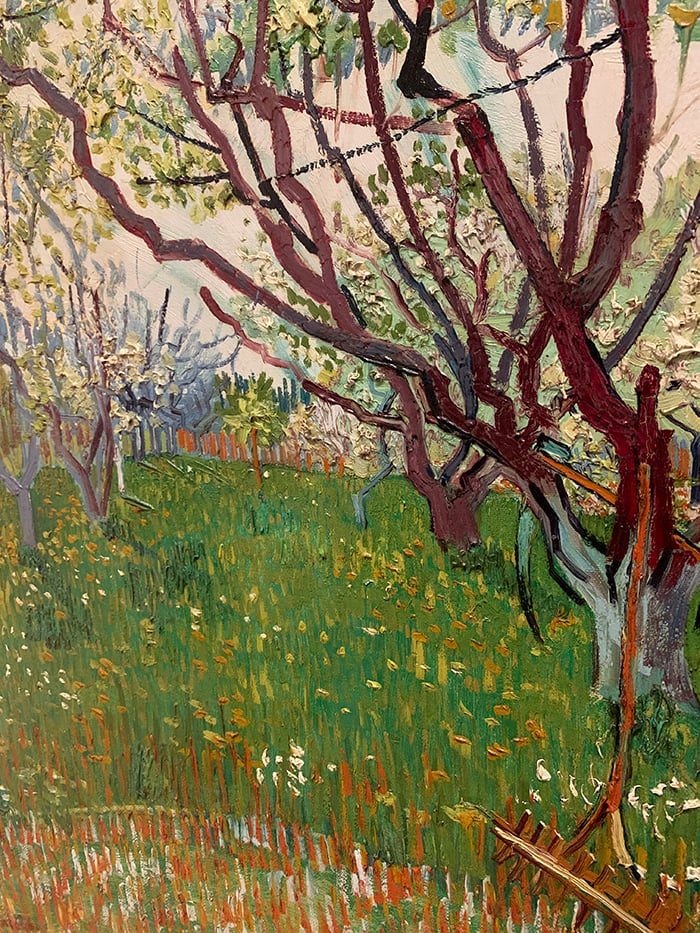
The stunning painting below by Claude Monet is a great example of broken color.

Here is a close-up of the water to give you a better look at all the broken color. Notice how little rending is done by Monet. Without the rest of the painting, this section looks like nothing more than a mess of broken color. But step back and it all comes together.

(I wrote more about this painting on the Artists Network.)
5. Soft and Hard Edges
You need to pay careful attention to the types of edges you use in your seascape painting. Here is a summary of the different edges you can use:
Hard edge – A very crisp transition between the two shapes.
Soft edge – A smooth transition between two shapes.
Lost edge – A transition between two shapes that is so soft that you can barely see it.
Most of the edges in seascape paintings will be soft or lost. This is because water is not a rigid structure and there is usually a gentle transition from one area of the water to the next. But a few cleverly placed hard edges can have a huge impact amongst mostly soft and lost edges. Here are some appropriate places for hard edges:
- The top of a crashing wave.
- The horizon line which separates the sea from the sky on a clear and sunny day. On an overcast or stormy day, a soft edge may be more appropriate.
- The edge which separates the clear water and white foam.
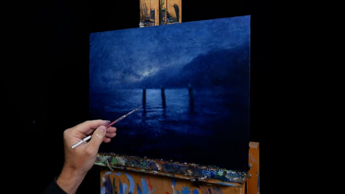
- Important contours of the water, as demonstrated in my painting below.

6. Match Your Brushwork to the Nature of the Seascape
Here is a general tip that I find particularly useful for seascape painting. Try to match your brushwork to the nature of the seascape.
For example, if you are painting the crashing waves of the turbulent seas, try using broken and exaggerated brushwork.

If you are painting the calm water of a morning seascape, then use long and smooth strokes.

By doing this, you will build up a texture that matches the seascape you are painting. The individual strokes will also reinforce the gesture and structure of the seascape.
Tip: Mix up your brushwork to add a sophisticated level of contrast to your painting. A calm seascape may have small areas of turbulence where you can add some strong brushwork (like where the water is breaking on the shore). A story seascape may have calm areas between the crashing waves where you can add some more subtle brushwork.
7. Create Harmony Using Common Colors
In seascape painting, the water will share many common colors with the sky due to reflected light. For this reason, I will often jump back and forth between the water and the sky to make sure there are common colors used for both areas.
For example, say I am painting the highlights on the fluffy white clouds in the sky. I could take these light colors and use them to paint the whitewash on top of the water. I could take the light blues from the clear sky and use them to add some color variance to the water. I can take some of the dark greens and blues from the water and use lighter versions of those colors for the clouds.
I do a lot of this kind of back-and-forth work when painting seascapes. The end result is usually a sense of harmony through the use of common colors.
Additional Readings
Seascape Painting Tutorial – Learn How To Paint This Simple Tasmanian Seascape
Inspiring Seascapes By Frederick Judd Waugh
Thanks for Reading!
I appreciate you taking the time to read this post and I hope you found it helpful. Feel free to share it with friends. If you ever want to learn more, check out my Painting Academy course.
Happy painting!
Dan Scott

Draw Paint Academy


Thank you for this detailed write up! I’m saving it and intend to refer to it step by step for practice. I’m self taught and these are very helpful 😊
Hello Dan: Your Painting Tips and lessons are very informative and helpful. I sincerely appreciate your detailed explanations and guidance. I would like to enroll in your class as soon as I can. I enjoy very much reading and learning from your postings. Thank you again.
Dan: your comprehensive and informative expositions are very helpful indeed. I really appreciate your direct, confident approach to the most complicated of subjects. Inspirational! You are the Steve Irwin of painting.
hi Dan, as the others here, I thank you for taking the time to share your wonderful knowledge in a way that i can understand. i am a complete beginner and because of my limited mobility i cannot go to classes so I am teaching myself to paint by reading post such as yours and by reading books. it is a very hard thing to do! but I LOVE the peace and joy I feel when i practice painting! i have to say Dan that your words are the easiest to follow! i hope to read more of your teachings, thanks a million, Dan, kind regards, Chris
Super POST. Very informative. Keep up THE good POSTING. Thank you.
Your emails are amazing so very helpful. I have recently started using acrylic paints and find it’s very different to using graphite pencils. (which I did really enjoy) Please keep your emails coming.
Great read and very informative.
thank you
Hi Dan
Thanks for your generosity, in short supply at the moment…
I paint with watercolour and wondered if the suggestions above would work for that medium?
Thank, Sheila
Thanks Sheila. Yes most of the information should be applicable to watercolors. The main difference is the way watercolors are applied and the techniques used. But most of the fundamental concepts are still the same.
Thanks! Dan
I enjoy and learn so much from your lessons. Thank you ever so much.
Thank you Dan for your instructions. It is wonderful to relate to the masters and I appreciate you explaining things so clearly.
Blessed are the ones whose generousity is expressed by sharing knowledge and years of experience and perfectioning in art. It shouldn,t be but it is the way it is.i live in a small town here in Brazil and it is known and famous for a concentration of artist but they are very closed and live apart of we simple mortals . It ,s a shame. I feel progress on my motivation and development in art and I owe it to your articles. Congratulation!
Very useful tip. I was struggling with painting sea. Especially your teaching on the structure of the sea helped a lot. Thank you Dan.
Reza
I don’t know how I found you, but I’m grateful for it. You are a gift to beginners, your explanations and descriptions are so spot on. I’ve been painting part time for 50 years, and I’m still learning, still taking a class, and so enjoying your emails, thank you.
This is my favorite post and lesson so far! It’s very relevant to my interest. Following a recent trip to Maui, I was inspired to create my first seascape. It was really fun but I’d like to do it again with more accurate light reflection, etc. Thanks for your tips Dan.
really learning !
thanks.. with the introduction to intricate details.. and marvelous examples.
the waves invite the attention..
Happy to be able to help you Shiva. Dan
These sort of information are great for beginners as these provides them a way to hang the wall art easily besides these there are various methods too which you can easily apply during hanging of art works by the help of these tips.
Thanks! Happy to just be able to help. Dan
I have enjoyed reading and learning your tips, thanks again for the material from the academy.
No problem Warren! Happy to help. Dan
Just wanted to say thanks for all of the information and detailed topics. Spent about 6 hours today reading your articles. Thanks your for sharing your knowledge and look forward to more. 🙂
-Deion
So kind of you to spend so much of your time reading my articles! Sounds like you are enjoying the information which is great to hear. Thanks Deion. Dan
WThaks lot for your kind information.I amself learner of water colour in land Scape.Wish u all the best .
No problem Raj! Thanks, Dan
The sea was always a problem for me, because of it expressions and colors, I think I would never paint that so good like these paintings 🙁
I have three paintings that are essentially done, but the water part is Not Right. I. Hoping this will help me finish all three. Love the first tips of shapes.
Hi Dan. Excellent study material. Thanks – keep on painting!
That was very useful.. have to have another look at mine thanks Dan
Hi Dan,Thanks for the info. on Seascapes,found them very very helpful.
I have been painting watercolours for not very long & have a lot to learn.
I love painting boats & seascapes,I really don’t know what attracts me
to them,but love painting them!
Thanks again, judy
Found your tips on painting the sea very informative. I am a portraitist. Trying to learn to paint landscapes, seascapes etc.
Thank you! So much information — really helpful.
Thank you for sharing your knowledge of painting. I look forward to your postings.
Glad to hear thanks Fran 🙂 Dan
All great information, Dan! Teaching students about the structure of waves and how light and dark values formed that structure in their seascapes always amazed them.
Thanks Jim!
This is a very useful post. Thank you for sharing. I am a beginner and I find it really tough to paint reflections and light/shade {and I love such paintings}.
Thanks Tarang! Dan
Thank you! These are really usefull instructions. I ‘m going to subscribe when I’m sure I can make time to work with it. So I hope you continue your messages!
Thanks Lorijn! Glad to hear 🙂 Let me know if you have issues subscribing.
Dan