
In this post, I will walk you through one of my recent paintings based on a photo my brother took in New Zealand. I will cover:
- Supplies and Equipment
- It All Starts With a Blank Canvas
- Reference Photo
- 1. Prepare the Canvas And Sketch the Composition
- 2. Sky, Water and Mountains
- 3. Greens in the Middleground
- 4. Darks in the Foreground
- 5. Add Detail
- 6. Sign and Photograph the Finished Painting
- Additional Readings
- Want to Learn More?
- Thanks for Reading!
Here is the finished painting:

I’ll walk you through the entire process using one of my recent paintings. You’ll see how I go from idea all the way through to reflecting on the finished painting.

Supplies and Equipment
These are the colors I used for the painting:
- Burnt umber
- Ultramarine blue
- Cobalt blue
- Viridian green
- Alizarin Crimson
- Cadmium red
- Cadmium orange
- Yellow ochre
- Cadmium yellow light
- Titanium white
This is painted on a 16×20 inch thin-edged stretched canvas using oils.
As for the brushes, I used a variety of medium to large filberts and flats and a small round brush for detailing. I also made use of the palette knife for some detailing and to build up texture in certain parts of the painting.
For my palette I used a gray wooden tabletop palette.


It All Starts With a Blank Canvas
Every painting starts the same – a blank canvas on the easel. My first goal is to get rid of the white on the canvas and build a strong foundation for the rest of the painting.

Reference Photo
Below is the reference photo I painted from (thanks to my brother for taking it). Below are some of the key features of the photo which I want to emphasize in my painting:
- There is a sharp contrast between the dark foreground and the high-key background.
- The purple/blue mountains in the background create a beautiful sense of depth.
- The colors are so vibrant that it appears surreal (this is typical of New Zealand).
- There is a sense of calmness due to the glassy water and reflections.
I wrote more about painting from reference photos in this post.

1. Prepare the Canvas And Sketch the Composition
I stain the canvas with burnt umber and quickly sketch the general composition. This is how I usually start an oil painting.
Tip: It can be useful to indicate where your dark areas will be during the sketch. I like to scribble in the dark areas, as you can see in the sketch below (look at the mountains and where the dark reflections in the water will be).

2. Sky, Water and Mountains
For the blues in the painting, I mainly used cobalt blue rather than ultramarine blue. Cobalt blue tends to be slightly cooler than ultramarine blue, which was more suitable for this landscape.
For the water, I used the same type of blue as the sky but just a value darker. As a general rule for painting accurate reflections, you should paint light colors slightly darker, and dark colors slightly lighter in the reflections. I wrote about this in my post about painting water.

What interested me about this scene is the gradation in color from a slight purple to blue as you go from left to right. So I focused on picking this color gradation up in the painting.
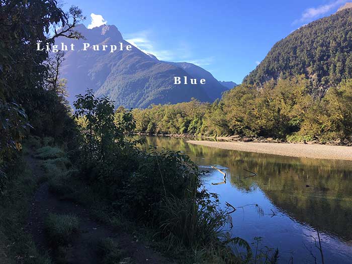
It was also important that I picked up the change in value as the mountains recede into the distance (they get lighter in value the further they are away). This was essential for capturing the depth of the scene. If I had painted any parts of the mountains too dark, then it would have messed up the depth in the whole painting.

3. Greens in the Middleground
For the greens, I used a mix of ultramarine blue, yellow ochre and viridian green. In the middle-ground there are two main parts – the dark area on our right and the lighter part which follows the shore of the river.
The dark part is slightly further away, so I do not need to paint this with as much detail. The green part which follows the river requires much more detail and texture.

For the reflection of the trees in the water I used a large brush to drag the color down into the water. I am not using much detail here as it is really just to cover the canvas with the approximate color.
The sandy shore is a gray-orange color with very little detail or texture.

4. Darks in the Foreground
By this stage, I really wanted to block in the dark foreground so that I could see how it worked with the rest of the colors in the painting. This contrast between dark and light was one of the main features which made me want to paint this scene.
As this area is all in shadow, it does not require much detail and I can use very loose brushwork. The dark color is just a mix of burnt umber, ultramarine blue and some viridian green. If you look closely, you can also see there is a slight temperature change to indicate the dirt path.

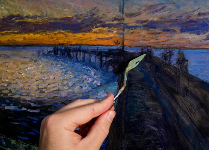
5. Add Detail
With all the colors blocked in, I started refining and adding detail to what was already on the canvas.
For the sky, I picked up the light clouds and added a bit more lightness around the edge of the mountains. I also created some texture with my brush to add a bit more variance.

Tip For Using Stretched Canvas: As you are painting, you may want to extend the colors over the edges of your stretched canvas. This makes your finished painting look presentable even without a frame.

I actually made a mistake at this stage of the painting by adding too much color saturation in the greenish-yellows. This made the painting look slightly jarring.

I reduced the saturation by adding some more grayish-yellows. At this stage I also started adding a bit more variance to the reflections in the water. This was a tricky part as I needed to create the illusion of all the different colors being reflected, but I also had to make it appear calm and tranquil (so I needed to be careful with adding too much texture).

Here I just added some finishing touches in the water and some more details in the foreground.

6. Sign and Photograph the Finished Painting
Here is what I did after finishing the painting:
- Signed it
- Cleaned up the edges of the canvas
- Took high-quality photos
- Recorded the details and updated the gallery
I discuss what I usually do after finishing a painting in more detail in this post.
Here is the finished painting. It looks slightly different to the other photos as I used a different camera. I also provide some close-ups below so you can see my brushwork.

You can see some of my palette knife work below, along the edge of the shoreline. The palette knife can be fantastic for creating these sharp, rigid strokes of broken color. You can also break up edges by dragging one color into another to create some interesting results.

I also used the palette knife to add some of the tiny details, like the branch sticking out of the water below.


Additional Readings
Painting Tutorial – New Zealand Reflections
Painting Tutorial – Afternoon In Queenstown, New Zealand
Oil Painting – The Ultimate Guide For Beginners
Want to Learn More?
You might be interested in my Painting Academy course. I’ll walk you through the time-tested fundamentals of painting. It’s perfect for absolute beginner to intermediate painters.
Thanks for Reading!
I appreciate you taking the time to read this post and I hope you found it helpful. Feel free to share it with friends.
Happy painting!
Dan Scott

Draw Paint Academy


Can’t wait to try this Dan. I am a newbie, just been paining about a year, using acrylics.
Great! Let me know how it goes.
Dan
trima kasih atas panduannya Dan , sangat membantu saya yg sedang belajar melukis
So enjoy your step by step paintings, it gives me something to mull over during the day!
Thanks Dan.
Glad to hear Julia! Dan
Thanks for this step by step explanation Dan. This is very helpful. It is a very nice painting!
Thanks Victoria! Appreciate the kind words. Dan
Brilliant article again Dan. Lovely to share the process and see your beautiful finished painting. Great information as always. Thank you
Hi Leonie, glad you enjoyed it. Dan
This is so fabulous and interesting. Thanks so much Dan !!! Really appreciate your posts.
Sherrie
Thanks Sherrie! Dan
This is valuable lesson for me in terms of technique, but I really want to also practice with different color combinations to see which one best vibrates with me. thank you for your great tutorial !
Thanks Anh! Dan
This is beautiful and since you were kind enough to go step by step, I hope you don’t mind if I flagrantly copy it – with a credit to you, of course!
Thanks for all your tips….BTW – I am using acrylics since I am not at home right now. Any suggestions for doing this painting with acrylics?
Hi Ricky
I would paint this the same with acrylics – you just need to be aware that the paint dries much faster. No problem if you want to copy it. Feel free to email me a photo once you are done. Dan
Wow, that was so helpful to see a step by step process. Thank you for doing this Dan.
No problem Linda, glad to help! Dan.
Thanks again, Dan! You are helping me grow as an artist with every post!
Really glad to hear thanks Deborah. Dan