
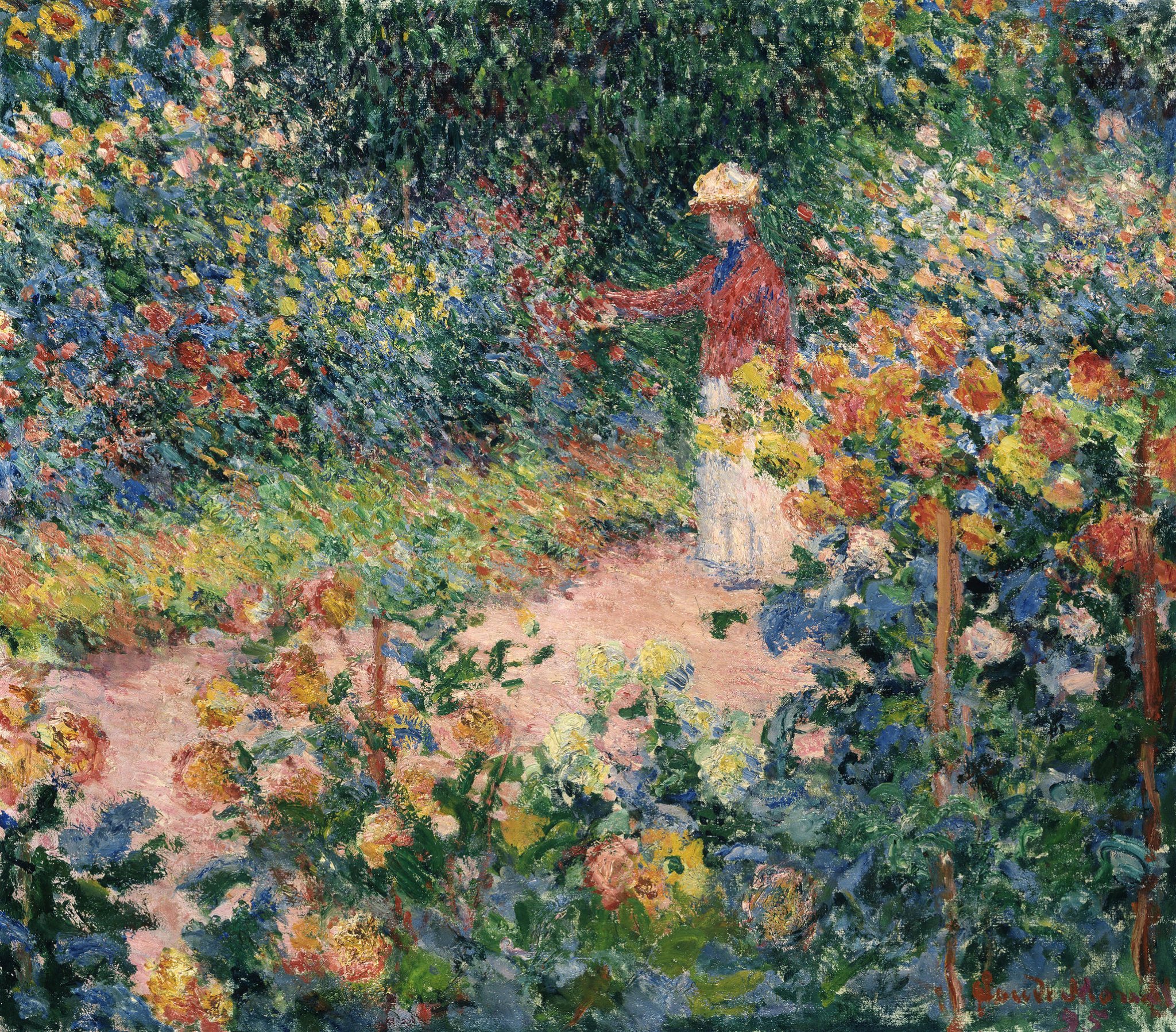
I stumbled across this painting by Claude Monet, Garden at Giverny. What a shimmering display of color!

(Click here to download a high-resolution photo of the painting.)
Some key observations:
- This is a great example of broken color. Up close, it’s a patchwork of greens, yellows, reds, oranges, and blues. Broken color allows you to inject rich colors into a painting without it appearing overdone. That’s because you can break up the rich colors with dabs of some other color. A slab of ultramarine blue appears much stronger than dabs of ultramarine blue woven together with dabs of green, light blue, purple, etc.
- There’s a vague figure in the painting, perhaps Monet’s wife. Broken color allows her to melt into the surroundings. Notice the use of common colors between the subject and the garden, particularly the reds.
- People tend to be strong focal points (we are naturally drawn toward other people). But in this case, the garden is the focal point and the figure is just part of this environment. The way you paint the subject determines its importance.
- Green is the dominant color in terms of the space it takes up. The reds and yellows are small but strong accents.
Feel free to share your thoughts about the painting in the comment section below. If you want to learn more, you should check out my Painting Academy course. I’ll walk you through the time-tested fundamentals of painting. It’s perfect for absolute beginner to intermediate painters.
Happy painting!
Dan Scott
Draw Paint Academy


Actually Scott, the skirt and hat are the lightest valuecareas in the painting and the light colored had stands out against the darkest area, so not only is she a person which always draws attention but also the values make her stand out.
I like the warmth of the angled path bordered by the darker tones and the brightness of the figure’s hat in contrast to the dark. I like how the figure connects with the garden (touch). I can imagine the fragrances.
the subjects IS the garden not the figure..
Thanks Dan for this instructive chapter. Broken colours is an interesting subject and also an important component of impressionist painting .
The link to the high resolution of Monet’s painting was “unavailable.” I am wondering if you can fix this. I would really love to see it. Thank you so much.
Thanks Ruth! Were you able to get it working if you went back to the post again? It seems to be working on our end.
I have loved the impressionists since I first saw them. The images speak to my soul. I loved seeing them in person in France.
I love Monet. Thank you for reminding me of this painting.
The use of colour is intriguing especially when primaries are placed adjacent to each other. The composition doesn’t work for me and the female figure is too static and I disagree that she blends into the landscape. She is a detracting focal point.
Thank you Dan for sharing another wonderful painting from Monet. I love his work of color, what a master.
John R.
This is exactly what I saw at Giv. Then I put on my glasses… :B)
loving this painting soooo much—thank you for sharing—-I also saw a CAT peeking out–lower center right—-
His colours that are all over the place makes it look easy…but how deceiving is that.
His mixing pallet I am sure would make a great offbeat colour picture….but he really brings you into and looses you in nature. Stunning.
Beautiful painting and helpful comments. Thanks!
Thanks for sharing, Dan, both the paintings and your always interesting comments. I do like Monet, although this isn’t a favourite….. perhaps it’s just a touch too pretty for my liking! Hardly worthwhile art critique, I know!)
Thank you Dan , for sharing this painting.
I have a book of Monet’s paintings.
dee money
Yes, Monet’s gardens are like tapestry! I spent a wonderful morning there a few years ago and felt just like the figure in the painting, immersed in the beautiful flowers. It is fascinating to see these paintings up close. They are huge, like the size of the wall of a small room, but no large sweeping brush strokes to fill in those large spaces. The paintings are thousands of tiny dots of color, arranged in a way that creates these beautiful scenes.
I’d like a discussion on what colors are in this painting. What paint colors were on Monet’s pallet and how he combined them to get these colors. Which colors are cool and which are warm?
Interesting painting. Monet shows little to no detail yet his tonal values and placement allow the viewer to ‘see’ the garden. I imagine the lady to be examining a hollyhock, for example. I find the figure to be the focal point, in that, she is the brightest spot,yet subdued so as not to overwhelm the painting. Her placement puts her in front of your eye as well. The rest of the painting seems to flow around her easily. I have a new appreciation for Monet.
Art in the eye of the beholder.
This is such a lovely painting and new to me. (It feels like a gift each time a brand new painting is seen.) Such blended color that works wonderfully together.
Thank you again, Dan, for expanding my knowledge of Art and love of it.
Charlotte Huebner
What a breathtaking painting! Love the way colors are laid down next to each other almost like a tapestry. This style is unique to Monet. He was the great Plein Aire artist and truly a master of his brush.
Thanks for sharing with us.
I love the way you compare his spots to tapestry. As someone who used to do needlepoint, this gives me a whole new way of process what I’m seeing in this painting. Thanks. I will try to do a “tapestry” style painting soon.
Complete beginner but love the use of colour and the skill in Monets brushwork which combines to give a wonderful ‘romantic’ scene .
I have always found the DIRECTION of Monet’s paintings very interesting…e.g. here the eye sweeps from lower right to upper left of the canvas, as if all were being blown by a stiff breeze.
Compare to his Water Lilies…
Discussion of art in the novel by Anne Tyler called French Braid. The art she describes mimics the relationship dynamics going on in the family —-small and detailed and intense at the moment but blurred and softened by years and generations. Both are in each painting. The extreme detail is some symbolic object while the background is blurred. Interesting.
Love Anne Tyler’s books. This is one I haven’t read. I’m going to put it on my list to read. Thank you.
Nah. l never like ptgs with every color in the rainbow. Sorry.
Interesting – I love it. The impressionists just make me happy 😊 like I’m outdoors on a summer morning. But we’re all different.