
Let’s take a look at a stunning portrait by Gordon Coutts, Waiting. I first saw this painting at the New South Wales Art Gallery. It stopped me in my tracks, despite it being a subtle painting in a dramatic room. Until that point, I had no idea who Coutts was. But it prompted me to learn more about his life and work. That’s the power of a single painting.
I’ll cover the following:
- The Concept of "Waiting"
- Value (Light and Shadow)
- Edge Contrast
- Highlights and Key Structures
- Rule of Thirds
- Key Takeaways
- Other Resources
- Want to Learn More?
- Thanks for Reading!

(Click here to download a high-resolution photo of the painting.)
I’ll walk you through the entire process using one of my recent paintings. You’ll see how I go from idea all the way through to reflecting on the finished painting.

The Concept of “Waiting”
The whole painting is about the concept of “waiting”. An immaculately dressed lady sits with a distant stare. Her bag packed ready to go. She plays the part well.
Waiting is a tricky concept to depict. It’s subtle and nuanced, unlike anger or joy. Below are some key observations:
- Context plays an important role. The bag by her side, her jacket resting on the chair, her outfit and boots. She clearly has somewhere to go.
- She has a distant stare and relaxed facial features. There’s no sense of joy or tension. No hint of a smile or tensing of the jaw. She is off in her own head.
- There is a sense of tension in her hands. I get the idea she is fidgeting in anticipation. That’s what I do when I’m waiting for something.
")
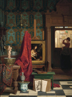
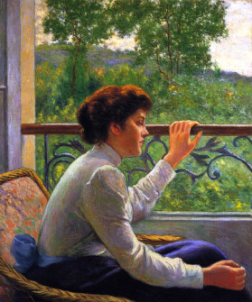
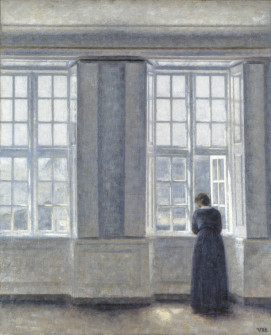
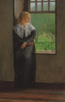
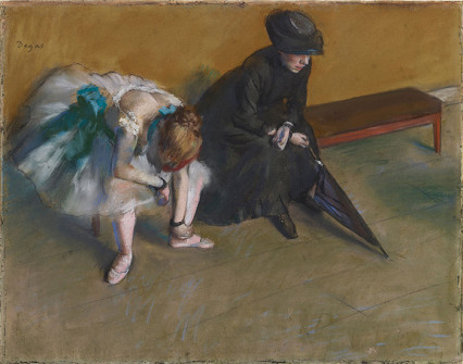
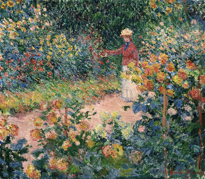
Below are some others paintings that convey “waiting”. It’s worth looking for similarities between these works. Notice the subdued emotions, the use of negative space, and where the subjects are looking.
Value (Light and Shadow)
Below is the painting in grayscale. The subject is depicted with a full value range, from near black to near white. The background, on the other hand, is muted and compressed. Our eyes are particularly sensitive to value contrast, so our attention is drawn to the subject. The background falls back in terms of attention.
This isn’t what you would see in reality. The background would have stronger darks and highlights. Coutts exercised his artistic license to manipulate the value range in order to direct our attention.
Tip: As the artist, you have the power to depart from the reference. You can exaggerate, cut, include, crop, or mute certain elements. But do so with reason. Use your artistic license to push your ideas about the subject. You’re in risky territory if you depart from the reference without reason.
")
I created a notan of the painting using Photoshop (see below). This is the most basic design of lights and darks. It reveals an interesting and organized design. Notice how we can make out the subject even in this abstract form. That’s the power of putting the right values in the right spots. You can convey a significant amount of information about the subject with a few light and dark shapes.
")
The notan also reveals two subtle links between the subject and her surroundings. Her hat links with the sky’s reflection on the window. Her dress links with the light grass in the background. These links are less distinct in the full-color image. The notan tunes out much of the noise and allows us to see these basic value patterns.
")
Edge Contrast
As with value, there’s edge contrast between the subject and background. The subject is sharp and crisp. She is depicted with mostly hard edges. The background is relatively soft and out-of-focus. Like we are looking at it through our peripheral vision. It is depicted with relatively soft edges.
The softness of the background mostly comes down to the use of rough brushwork. But the reduced contrast also plays a role. For example, take the two shapes below. Look at the edges separating the colors. The edges are sharp and distinct.

Watch what happens when we reduce the color contrast. Instead of orange against blue and red against green, we now have vivid orange against a weaker orange and gray against a lighter gray. Notice how the edges separating the colors appear softer and less distinct, even though the color transition is just as instantaneous. By reducing the color contrast, you can create the appearance of softer edges.

Highlights and Key Structures
Highlights play an important role in reiterating key structures in the painting. The tip and bridge of the subject’s nose, above her lips, and the contours of her ear. The edges and corners of the chair and shoes. These highlights act as exclamation points for these key structural areas. They tell us that there’s a significant change in the surface plane.
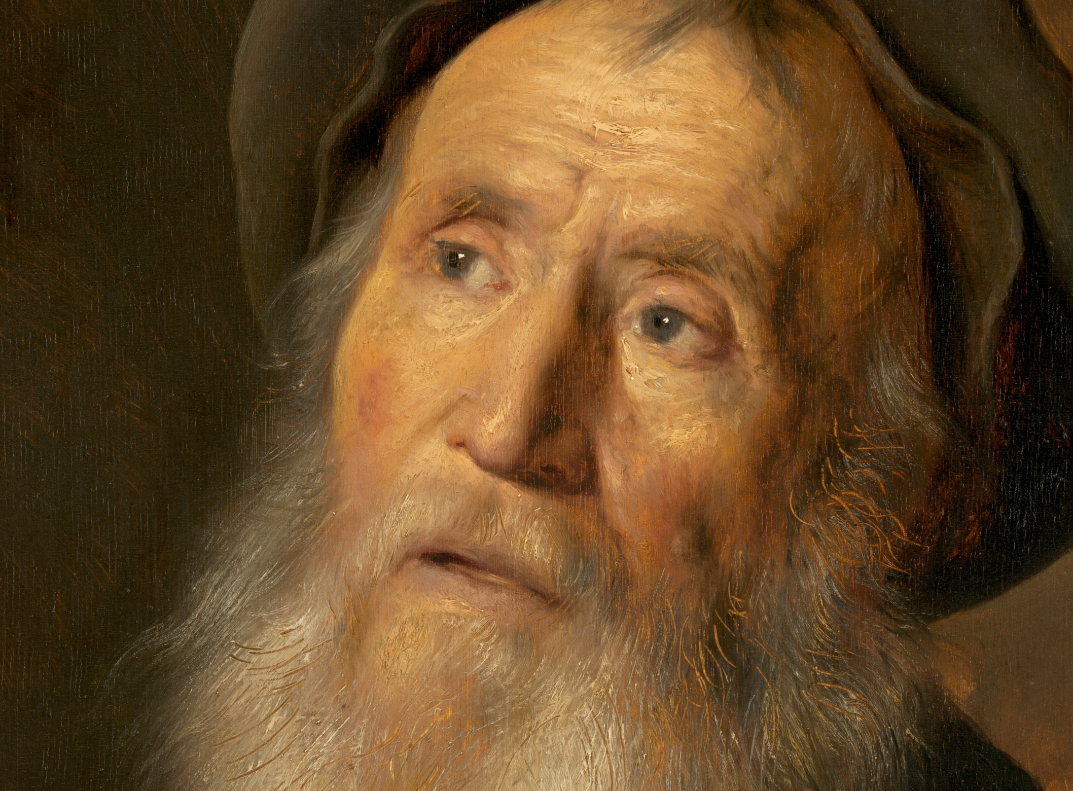
The fact that there are only a few highlights on her face suggests youth and feminine qualities. Compare this to Jan Lievens’ Bearded Man With a Beret (one of the paintings analyzed in Composition Breakdown). More highlights, more contours. Fewer highlights, fewer contours, smoother surface.
The highlights are also subtle in terms of color. There isn’t much contrast between the highlights and the surrounding light midtones. Even the glimmer of light in her eye is subtle. This plays into the understated nature of the painting.
")
")
Rule of Thirds
Below is the painting with a three-by-three grid over the top (created with my free grid and grayscale tool), plus some key observations regarding the rule of thirds:
- The subject’s torso follows the left vertical.
- The wall pushes just past the right vertical.
- Her body creates a diagonal line that moves through the top left and bottom right intersections. Notice the dark accents at each end: her hair and her boots.
- Her hands are close to the top right intersection.
- Each segment is unique.
")
Key Takeaways
Here are some key takeaways from this painting:
- A single painting can have a dramatic impact. Until I saw this painting in the New South Wales Art Gallery, I had no idea who Coutts was. It prompted me to learn more about his life and work.
- “Waiting” is a tricky concept to depict. It’s subtle and nuanced. Look at master paintings about waiting and observe the similarities. You can do this with any subject or concept.
- Coutts exercised his artistic license to manipulate the value range. He compressed the background, pushing it back in terms of attention.
- A notan can reveal fundamental value patterns that can be hard to spot in the full-color image.
- By reducing the color contrast, you can create the appearance of softer edges.
- Highlights reiterate key structural points.
- Fewer highlights, fewer contours, smoother surface.
Other Resources
- More “A Closer Look” Posts
- NSW Art Gallery – Painting Details
- Rule of Thirds – What It Is and How to Use It
- Ultimate Guide to Composition
- Wikipedia – Gordon Coutts
- Composition Breakdown
- Exploring the Masters Email Series
Want to Learn More?
You might be interested in my Painting Academy course. I’ll walk you through the time-tested fundamentals of painting. It’s perfect for absolute beginner to intermediate painters.
Thanks for Reading!
I appreciate you taking the time to read this post and I hope you found it helpful. Feel free to share it with friends.
Happy painting!
Dan Scott

Draw Paint Academy


Thank you Dan. Thoroughly enjoyed this. I always learn something new when I read your emails and click on the links. Wonderful.
Impressive ! Dan Thanks for the post . your efforts are really appreciated.
wonderful clarification .life changing information ….Thank you so much.wish i can remember & apply .
Dan, thank you for your insightful observation.
Brilliant reading and learning! Thanks for all time and effort that you put into these documents. It is much appreciated.
Thanks for the clear presentation ,really enjoyed reading and learning offered by the articles 😀.
Wonderful painting, beautifully critiqued. Thank you Dan.
Thank you, what great insight into depth perception and muting/highlighting areas using colours and shades of,
Fantastic analyses. Love this painting. You always bring out points I would not think of.
I wonder how to apply this to landscape here in Florida. I always get my values to much the same
outdoors.
Gloria
Dan,
Thanks for all your thoughts on “Waiting.” I had not seen this painting. I love it. It captures waiting to a tee! Thanks for expanding my world.
Thank you for this share. Most informative and inspiring.
I find myself thinking about the concept of waiting as it plays out in the South African context. Those long queues in the African Sun. The elderly who make a day out on pension day with their chairs and lunch. So much useful technical information as well. You are most generous.
You are a great teacher Dan. Thank you so much for sharing your knowledge
Wonderful discussion of a painting I instinctively liked. So much information!
Thanks!
Thanks for your email mentioning the artist, Gordon Coutts. I have admired his paintings for years. Until now I never knew the artist name. I have a few of his books with his painting.
I have been painting for sixty years and am still learning the different artists and their techniques and have recorder all of your articles in your newsletters. You have helped me improve on my paintings and I want to say thank you. I enjoy painting and I am always happy when someone likes my painting enough to want it. I feel the good Lord has a hand in the talent I have. It a pleasure to give my paintings to friends and family who will enjoy them. Thanks again for your newsletters. I throughly look forward to receiving your next ones. This is the first time I have commented on your articles.
Thanks for your email mentioning the artist, Gordon Coutts. I have admired his paintings for years. Until now I never knew the artist name. I have a few of his books with his painting.
I have been painting for sixty years and am still learning the different artists and their techniques and have recorder all of your articles in your newsletters. You have helped me improve on my paintings and I want to say thank you. I enjoy painting and I am always happy when someone likes my painting enough to want it. I feel the good Lord has a hand in the talent I have. It a pleasure to give my paintings to friends and family who will enjoy them. Thanks again for your newsletters. I throughly look forward to receiving your next ones.
I like that it ‘stopped you in your tracks” Dan. We are so spoilt with images all around us now days but its nice to think a clever painting can still have that impact on our senses. Cheers Dan, Peter
You open my eyes and make me see things I would otherwise miss. I must reread your short sentences multiple times until I can experience what you are seeing and saying.
Thank you, thank you
Thank you Dan for sharing your knowledge of painting. I am learning so much & looking at paintings in a different way now.
I forward your emails to my students. You are very generous to take the time to illustrate the concepts that you write about. Thank you very much.
Joanne
Dan you have explained light and dark harmony very well esp. by giving example of Gourdon Couttes’s painting. Thanks for introducing to great artists and their works.
You are an amazing art teacher.
Thanks once again for sharing such valuable knowledge.
Love this educational tour of this painting. I am just a beginner and this is amazing information for someone who is just starting out. Thank you, Dan! I plan to share with my daughter who loves art and art history.
Your analysis helped me appreciate this painting in a whole different way. Thanks
Thank you, Dan! All your e-mails are so happy and helpful!!
Beautiful. Thanks
This looked like a photograph rather than a painting. Thanks for the lesson! I am working with the thirds in my future paintings.
Great article and wonderfully analyzed. Thanks Dan .Your efforts are greatly appreciated.
You area great teacher !
I love learning from you!
Very informative and makes one really look and understand for you are a gifted teacher clear and to the point, thank you for the wonderful post for I have seen this painting and now look at it so differently… thank you so much
Came away after reading this article more informed re: color/contrasts for subtle soft edges. Thank you.
Ps. Loved the introduction to this artist and that beautiful painting, Good Luck!
I so enjoy receiving your emails. You introduce me to artists I’ve never heard of before, or have heard of but unfamiliar with their work, or help me understand why I love certain artist’s work (Sargent comes to mind). I appreciate your ability to analyze each painting as it gives me a more critical eye for all art I view, as well as being able to apply this knowledge to my own painting endeavors.
As you’ve shown us, Gordon Coutts’ work should be a well known quantity in art galleries and print stores everywhere. Thank you for your great work, Dan, it is most appreciated by all of us.
Many thanks for your detailed critique and introduction to Gordon Couttes, an artist unknown to me. I shall read your piece several times. It is a very good teaching aid. Best Wishes Jane
My God, you are a wonderful teacher! Many thanks.
Thanks for the study, Dan. I love this painting and the way it was composed. What an excellent artist! Your study gives us all education on how Coutts achieved this masterpiece! It reminds me of James Tissot’s “July: Specimen of a Portrait”.
Thank you for the article and the break down of the painting, very interesting, thought provoking and educational.
Thanks Dan. It’s always such a breathe of fresh air to read your articles in these horrid times.
I need your articles to make me understand better. Thank you. You have become a part of my journey in learning.
Like others, thank you for all your interesting and enlightening posts. They have been a source of great joy to me, especially during this last year.
With regard to ‘Waiting’ by Coutts. I find it so fascinating to hear how others view a painting/photograph. My immediate reaction, to this painting, was that the subject was miserable; no joyful anticipation of her forthcoming trip so it was great to view the painting through different eyes and in greater depth.
I agree with you, Sue. I feel her tension, almost dread, at the imminent journey. What wonderful painting! Dan Scott, your analysis not only educates me about painting techniques in general but about this particular act of creation. Thank you!
Oh goodness, what a wonderful, compelling and detailed essay. Thank you so much for sharing your knowledge and observations.
I always love reading your articles and looking at paintings through your eyes.
Dan I’m intrigued, how does Coutts get the yellow cast into the blue dress without it turning green?
I am not an oil painter, but use acrylic. So the drying time is definitely a concern in oil. May I guess (having painting in oils decades ago) I would guess the pale yellow is added after the (looks to me to be) pale violet. Confident strokes of colour, with no brush blending on the surface. This would avoid any mixing of the two colours.
But of course, like you, I an eager to hear from Dan on this question. 👍👍
Thanks for that, the distant gaze is compelling and Coutts is a new discovery for me. Very interesting analysis.
Really educational for one who never studied art, like me.
It’s great to learn about other artists, famous or not.
You do a terrific job, spreading your knowledge freely.
Many thanks.
My sentiments as well. Thanks for expressing them so well.
I feel the same way! So grateful for Dan’s knowledge and sharing of this!!!
I totally agree. Beautiful description. Thanks
Really good article!
Never knew of this painting until you shared. Thank you!
Great! Waiting in different scenario and contexts. Amazing examples to enrich knowledge for creating the view, shadow and shades.
Wonderful, Dan!