
When I ask my readers what their single biggest struggle is in painting the most common answer by far is….
“I want my paintings to look more realistic”.
I think it is always important to have some quality of realism to your paintings no matter what style you paint in. Otherwise, people will be left wondering what you have actually painted.
It is also important to note that painting realism does not mean mindlessly copying what you see. You can still use your creative license to change the subject in your painting whilst retaining a quality of realism.
These tips are not intended to help you create perfect recreations of photographs. Rather, these tips will help you create paintings which have a quality of realism but still look like paintings. That is after all that I believe to be true realism.
Anyway, here are 5 tips to help you create more realistic paintings. I cover:
- Get Your Values Right
- Utilize Hard, Soft and Lost Edges
- Focus on the Important Elements and Simplify the Rest
- Take Advantage of Visible Brushwork
- Question What You See
- Want to Learn More?
- Thanks for Reading!

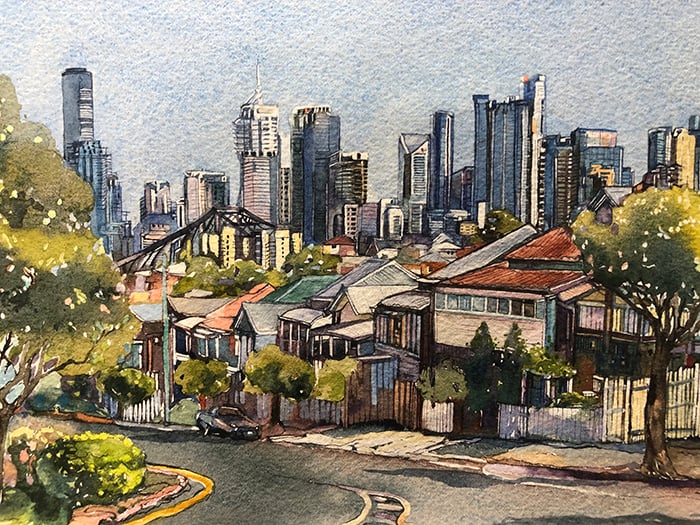
I’ll walk you through the entire process using one of my recent paintings. You’ll see how I go from idea all the way through to reflecting on the finished painting.

Get Your Values Right
Value is the first and most important tip in this post for creating more realistic paintings.
Value is how light or dark a color is and it is widely considered to be one of the most important elements of a painting. If you are able to paint with accurate values, then your painting will have a quality of realism regardless of how accurate your edges, colors, shapes and other elements are.
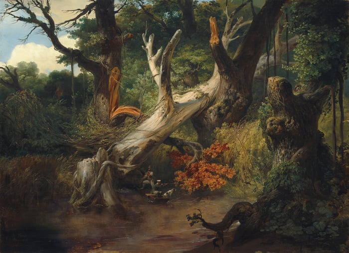
Just look at some of the beautiful paintings by Sir Arthur Streeton like the one below. Notice how realistic it appears, without actually having all that much-refined detail.

If I take color out of the mix, you can see how accurate all the values are.

Streeton’s paintings have an almost effortless feel to them. He was able to paint in such a relaxed style whilst retaining such a quality of realism due to his incredibly accurate values.
You should also note that when I say accurate values, I am usually referring to the value relationships (how light/dark a color is compared to the colors which surround it) rather than the actual values which you see in life. The value relationships are what you should really be trying to capture, especially if you are compressing the value range in any way (painting in a high or low key). So instead of looking at a color and asking yourself…
“Where is that color on the value scale?”
… a better question might be:
“How light/dark is that color compared to the surrounding colors?”.
Utilize Hard, Soft and Lost Edges
Edge refers to the transition from one shape to another. This edge could be hard, soft or lost.
A hard edge means there is a very crisp transition between the two shapes.
A soft edge has some kind of gradation between the shapes. So the transition is smooth.
A lost edge is one where the edge is so soft that you can barely see it. This usually occurs when there are two shapes next to each other which have the same color. Lost edges do not give you much information about the form of a subject.
The image below demonstrates the different types of edges in action:

There is a hard edge to indicate the transition from the dark background to the light building. There is a soft edge to indicate the change in the plane of the building wall. There is a lost edge where the ledge protrudes from the side of the building. Notice how the hard edge provides you with the most information about the subject, the soft edge provides you with some information and the lost edge provides you with basically no information.
Edges are incredibly powerful as they can tell you so much about the subject without having to use much detail.
For example, a soft edge might indicate that there is not much visibility. A hard edge might indicate that there is a strong light source pointing directly at the subject or that there is a significant transition from one shape to another.
A common problem I see with beginner painters is that they only use hard edges. This can give a painting a very unnatural appearance, even if you get everything else right.
Focus on the Important Elements and Simplify the Rest
I am a huge fan of simplification in painting. I think the decision to ignore or leave out detail is much harder than to just include every detail you see.
Simplification in painting works in two ways:
1. It can reduce the “noise” in your paintings.
2. It adds emphasis to the elements which are actually important.
My suggestion is to identify the few things which most interest you about the subject you are painting. Be extremely specific. It could be the way the light is bouncing off the grass or an interesting shape arrangement. Usually, there will only be 1-3 things which really interest you about a subject.
Then, just focus on painting those things. Try to simplify the rest.
If you are able to paint the important elements in your painting with accuracy, then you are 80% there in terms of realism. It is not as important that you render the other elements with complete accuracy as these areas will be out of focus.
If you cannot identify anything in particular which interests you about the subject, then maybe it is time to choose a different subject to paint.
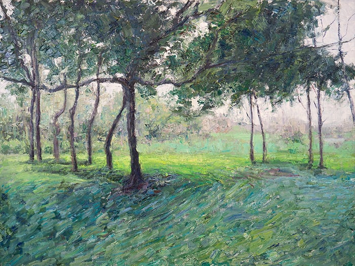
In my painting below all I really wanted to capture was the subtle gradation from saturated yellows in the foreground to dull purples and blues in the background, whilst painting within a narrow value range. So I focused on that. I did not try to render every strand of grass or perfectly match the blue of the sky.

Take Advantage of Visible Brushwork
Visible brushwork is one of the most interesting aspects of traditional painting in my opinion. But so many beginners completely ignore it and in some cases try to relentlessly blend and smooth all the beautiful brushwork.
You can use visible brushwork in many ways including:
- To create physical texture in your painting.
- To create a sense of movement in your painting by using suggestive brushwork.
- To create a beautiful broken color effect which looks like a mess of color up close, but as you step back everything just seems to work together. The result can be a stunning vibration of color.
Visible brushwork is what gives a painting that painterly feel.
The painting below by John Singer Sargent is a fantastic demonstration of brushwork. From afar, the painting looks incredibly realistic. But as you look closer at the painting, you can see these surprisingly bold strokes of color and clearly visible brushwork. The painting is certainly not all blended and refined like what many artists think creates realism.


Question What You See
Unfortunately, our eyes will often play little tricks on us and what we think we see is not actually what is there. This is most apparent in color and value. For example, in the image below try to identify if square A is lighter/darker/equal in value to square B. The answer may surprise you.

You most likely answered that square A is darker than square B. But in fact, they are both the exact same color (see the image below).
If you are seeing square A as being darker than square B, then what is happening is, your mind is making an adjustment for the apparent shadow created by the green object. I won’t go into more detail on this here as it is a tricky topic (I discuss this topic more in the Painting Academy). The point is that what you see is not always what is there.

Also, what you see may be influenced by any preconceived ideas you have about a subject. For example, you might be inclined to paint a tree with a little bit more green than is actually there or the sky with a little bit more blue, merely because of your preconceived ideas about these subjects. It is also why we tend to draw the head slightly too large in portraits, as we subconsciously place more importance on the head over other parts of the body.
So it is important that you learn how to see like an artist. Break everything down into the basic elements like shape, edge, color and line. For example, instead of painting a crab, paint the shapes, edges, colors and lines which make up that crab:

Want to Learn More?
You might be interested in my Painting Academy course. I’ll walk you through the time-tested fundamentals of painting. It’s perfect for absolute beginner to intermediate painters.
Thanks for Reading!
I appreciate you taking the time to read this post and I hope you found it helpful. Feel free to share it with friends.
Happy painting!
Dan Scott

Draw Paint Academy

Thank you so much. Dan Scott. Your teaching is good. It can ease the tension while learning.
Hi Dan
Great information. I’m attempting a study of The Girl with the Pearl Earring. The edges of the face are very soft. I’m having trouble doing that. Can you help with the technique?
Nick
Hi Nick
Have you checked out Dan’s post on edges? It might be helpful.
https://drawpaintacademy.com/edges/
Chontele
I really got what you said in this article of how ! Showed me to look a little deeper thank you !
Love your simple, perceptive observations about common mistakes.
I’ve learnt about these points after many many years of practice and learning from others.
You are a born teacher. Thanks Dan.
Dear Dan,
I have learned so much from you I cannot describe. In beginning to learn the craft of drawing, you have been a major influence. You have also improved my eye in analyzing the paintings of other artists. Thank you sincerely,
John
Dear Dan!.. Thanks for wonderful examples ..to share the intricate ideas and methods. Your emails are source of learning and joy, both! For any budding painter or established artist, your posts bring freshness.
Thanks!
I often forward your emails to my class members. Your examples are very helpful in explaining various ideas for making art. Thank you for being so generous with your information.
How do I join?
Hi Sandra. I will send you an email to discuss this further 🙂 Chontele
This post is very timely.I am struggling with a painting done this winter.I believe the values are working but the edges continue to be a problem.
Thank you I wil take note of this and use this is helpful because my paintings always end up dim . I will take on board what you said,
Thank you I wil take note of this and use this is helpful because my paintings always end up dim and muddy thank you for your advice .
I love these emails. They are a luxurious masterclass for me. Todays example on tones was amazing. Im going to bring it with me when I do my plein air work. Thanks so much…again.
Thanks for short &sweet note
Muchas gracias. Me resultó muy útil.
Thank you,
I am a beginner and this post illuminates some skills to be gained.
Wonderful ideas. I will follow them. Thankyou.
i was so encouraged by all your information, you spoke to my core. It means so much to see in words what i am involved in. Now I am starting to relax my accurate value and go for the next concept of balance and emphasis. You are a true teacher. thank you
The explanation of edges was very helpful . It was explained simply Thanks so much I can see I am going to learn a lot from you hopefully to the point that i am proud of what I do
The advice you gave on dark, soft and invisible edges where extremely helpful to my inexperience landscape creations. Thank you very much. I’m looking forward to following your website.
That’s wonderful to hear! Happy the article helped. Thanks, Dan
For whatever reason, I’ve taken a turn toward abstraction recently. If you have suggestions in that direction, I’d be very interested. I’m consciously working at NOT slavishly copying reference photos! And if it’s going to stay snowy, I’m not going outside to paint, either.
Dan,
I enjoy these easy, informative, lessons immensely. I realise which mistakes I usually make. I’ll keep your tips in mind before I start with another painting.
Thankyou.
Dan: As usual, your explanation is so enlightening. I still ha ve to learn a lot about value although I think my biggest problem is “noise”. Your tutorials are helping!! With images it’s much easier to understand. Thank so much!
Dan,
I enjoy these easy, informative, lessons immensely. I realise which mistakes I usually make. I’ll keep your tips in mind before I start with another painting.
Thankyou.
Dan,
Thank you for clear explanation. I’ve checked my last work with monochrome photo and have found so many mistakes in value!
And I absolutely forgot about different edges. You give so nice visual examples!
Thanks Olga! Dan
Dan,
Your instruction is so clear and concise. You have helped me to understand many aspects of painting. I enjoy your lessons very much. (By the way what is a person’s “website”?)
Magdal
Thanks Magda! That is just in case you have your own art website.
I really enjoy your posts. You have a way of explaining things that are easy to understand, especially when you show examples. Thanks, Debra
Thanks Debra!
Brilliant notes .dan thank u soo much
No problem Vinodhini!
Thank you very much. Beautiful examples.
No problem Ina! Dan
Dan, you are a brilliant teacher! I appreciate how your clear & concise explanations with use of visual examples make learning a complicated craft easily understood by beginners. As a teaching artist working with profoundly disabled adults who have limited language skills, your presentations have helped me help them. Thank you!
Hi Sandy, thanks so much for the very kind words! I am glad the posts help.
Dan