
The principles of art (or the principles of design) are essentially a set of criteria that are used to explain how the visual elements are arranged in a work of art. These principles are possibly the closest thing we have to a set of objective criteria for analyzing and judging art.
Art is a notoriously gray area when it comes objectively defining what is great and what is not. An artist of one era may be mocked during his lifetime, yet revered after his passing (such as Vincent van Gogh). The principles of art help combat this gray area to some extent. They allow us to communicate what makes a great painting great with an element of objectivity and consistency.
The following is an explanation of what the principles of art are and how you can use them to benefit your own artworks. I cover:
- Pattern
- Balance
- Emphasis
- Contrast
- Harmony And Unity
- Variety
- Movement
- Proportion
- Scale
- Summary
- Want to Learn More?
- Thanks for Reading!
I’ll walk you through the entire process using one of my recent paintings. You’ll see how I go from idea all the way through to reflecting on the finished painting.

Pattern
Pattern is a very important design concept that refers to the visual arrangement of elements with a repetitive form or intelligible sequence.
Pattern is not always obvious. It could be a simple underlying notan design that dances between light and dark in some kind of sequence. Or it could be the use of similar color patterns throughout your painting.
In the painting below, notice how the top arm of the subject almost blends into the background, and how the legs blend into the cloth, and the cloth blends into the rest of the foreground. This interlinking pattern drags you through the painting and creates a very interesting design.

Balance
Balance is concerned with the visual distribution or weight of the elements in a work of art. A painting could be balanced if one half is of the same visual weight as the other half. Or, you could have a small area of heightened significance which is balanced against a much larger area of less significance, like in the painting below. In the painting below, notice how the dark areas used for the boat and foreground appear balanced against the much larger area of soft, tinted colors.

Emphasis
Emphasis is a way of using elements to stress a certain area in an artwork. Emphasis is really just another way to describe a focal point in your artwork. In the painting below, there is a strong emphasis on the moon through the use of color contrast.

Contrast
Contrast is everything in art. Without it, artwork would be nothing but a blank surface. Contrast can come in many forms:
Texture contrast: A contrast between smooth and textured. Many of Vincent van Gogh’s paintings are great examples of texture contrast in action.

Color contrast: A contrast between light and dark, saturated and dull or complementary colors (hue contrast). For example, in the painting below, the highly saturated red contrasts against the relatively dull colors in the rest of the painting.

Detail contrast: A contrast between areas of detail and more bland areas, like in the painting below.

Shape contrast: A contrast between different shapes (rectangles and circles). For example, in the painting there are the curving shapes created by the winding paths, water and trees contrast against the rectangular shapes of the buildings.

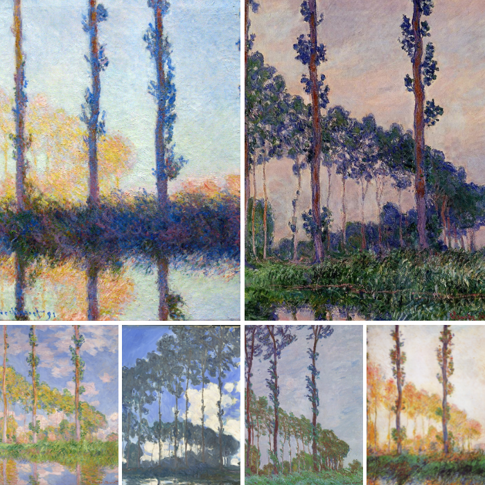
Interval contrast: A contrast between long and short intervals. In the painting below, notice the variation in the lengths of the intervals between the trees. The interval contrast can be used to create a sense of rhythm in your artwork.

Harmony And Unity
Harmony is a bit vague compared to some of the other principles. Generally speaking, it refers to how well all the visual elements work together in a work of art. Elements that are in harmony should have some kind of logical progression or relationship. If there is an element that is not in harmony with the rest of an artwork, it should stick out and be jarring to look at. Kind of like an off-note in a song.
You will usually be able to tell just from judgment if all the elements are in harmony. It will just look right. However, if the painting looks off, then it can be difficult to tell if that is because there is no harmony between the elements or if there is some other issue.
When I think of harmony, I think of the peaceful arrangements of color in Monet’s series of water lilies.

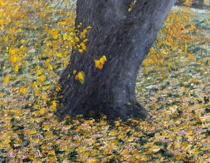
Unity refers to some kind of connection between all the visual elements in a work of art. Like harmony, this is a bit of a vague term which is difficult to objectively use to analyze art. The painting below demonstrates a strong sense of unity through the use of a similar hues used throughout the painting. Even though there is a strong contrast between the light and dark areas, there is a sense of unity created through the use of similar hues (dark yellows, oranges and greens are used in the foreground and light yellows, oranges and greens are used in the background).

Variety
Variety refers to the use of differing qualities or instances of visual elements. Variety can be used to break up monotonous or repetitive areas.
Below is a painting with lots of variation in color, shape and texture, yet not so much that it loses any sense of harmony.

Below is a painting with comparatively less variance. The result is a much calmer painting.

Movement
Your paints cannot physically move, but you can arrange the paints in a way which gives the illusion or suggestion of movement.
One of the most effective techniques for creating movement in your painting is to use bold and directional brushwork. By doing this, you can suggestively push your viewer around the painting as you please. You could also suggest movement through repetition or pattern.
Below are two examples of paintings that demonstrate a great sense of movement.


Also, I could not talk about using movement in art without some mention of Vincent van Gogh.

Proportion
Proportion concerns the relationship between the sizes of different parts in an artwork. For example, the width compared to the length, the area of the sky compared to the land or the area of foreground compared to the background.
Some proportions are considered to be visually pleasing, such as the rule of thirds and the golden ratio.
In the painting below by Giovanni Boldini, notice how the proportions of the female subject’s hands, face, feet and torso are all accurate. If Boldini painted the hand too large compared to the rest of the subject’s body, there would be an issue of proportion.

Scale
Scale refers to the size of an object compared to the rest of the surroundings. For example, the size of a man compared to the tree he is sitting under or the size of a mountain compared to the clouds. Scale is different to proportion in that scale refers to the size of an entire object whereas proportion refers to the relative size of parts of an object. For example, the scale of a man relative to the rest of the painting may be correct, but the proportion might be wrong because his hands are too large.

Summary
I hope this post clarifies to you what the principles of art are and how you can use them to help understand and communicate your thoughts about art.
It is also important to understand that a great painting does not have to tick all the boxes in terms of the principles of art. Most of the great paintings will only demonstrate a few of the principles.
So do not think of the principles of art as a set of overarching rules which you must comply with. They are merely a way to help us understand and communicate our thoughts about art.
The principles of art allow us to place some kind of objective reasoning behind why a great painting is great. This is important as it keeps us from falling into a vague space where art is no longer able to be defined or critiqued (much like what has happened with modern art).
Want to Learn More?
You might be interested in my Painting Academy course. I’ll walk you through the time-tested fundamentals of painting. It’s perfect for absolute beginner to intermediate painters.
Thanks for Reading!
I appreciate you taking the time to read this post and I hope you found it helpful. Feel free to share it with friends.
Happy painting!
Dan Scott

Draw Paint Academy


Thanks for sharing principles of art skills. I love artwork, and going to exhibits is one of my habits. I do have an appreciation when it comes to works of art. I like the topic in your article about the principles of art. Guide, I love the variety among all of them because I am after colorful arts; when you mention that variety talks about kinds of painting with various colors, shapes, and textures.
I like the topic in your article about the principles of art guide. I love the variety among all of them because I am after colorful arts; when you mention that variety talks about kinds of painting with various colors, shapes, and textures. Thanks for sharing principles of art skills. I’m fond of artwork, and going to exhibits is one of my habits. I do have an appreciation when it comes to works of art.
I appreciate that you share principles of art skills. I love artwork, and going to exhibits is one of my habits. I do have an appreciation when it comes to works of art. I like the variety among all of them because I am after colorful arts; when you mention that variety talks about kinds of painting with various colors, shapes, and textures. Reading your article is very interesting.
Hey, Dan! Thank you so much for presenting this thorough examination of the principles of art! While there is alot of information all over the web, most of it is fragmented. I believe you referred to this problem in describing your own early experiences. With your post on the visual elements, this information will be a boon to my improvement! Thank you, again!!!
artistic expression of what art principles are at their basics, laudable work
What a fantastic overview of the principles; succinct and supported by wonderful examples. I am a teacher of Art and this is one of the best ‘unpackings’ of this topic that I’ve come across. I hope you don’t mind if I share this link with my students. Great job!
Dan. I’ve taken private lessons and even college courses at some prestigious institutions.. I have read books and books and searched for someone to summarize the basic principles. What I’ve found in your articles like this one is more informative than any of the instruction or reading I’ve done to date. No one ever seems to go into the backbone and skeletal underpinnings of painting in a way that a layman can make sense of. I’ve come to think that at times many instructors can’t describe it because they don’t know or understand the basic principles. Modern art attitudes seem to say “paint for feeling or emotion” and then they say no one can tell you how to do that. But I think there are guiding principles that underlie all art. Otherwise it is just meaningless noise. Thank you so much. Your words will be an influence on my future work and study.
I am a struggling artist. Meaning this way as I am not a blurred abstract type. And I hate that spatters with no sense and are something a two year old in a temper tantrum could do; make money. Ugh!!! Put effort into your work do something more challenging. For god sake why do we call this art.
Dan Scott replied to Dennis Francz on 1 st April 2018. That happens to be April Fool’s day here in the UK. 😉 A useful response re modern art.
It is also an apposite explanation of current politics in UK and USA.
Your emails are generous and uplifting, Thanks
Fantastic article Dan. You have given us many more things to consider when creating a painting. Great examples of other artists to explain the different elements. Thanks for all your help
Thanks Leonie glad to help! Dan
I found this very informative. I am new to the painting scene and there is so smuch information out there that I find it confusing at times. Are your
frees painting classes watercolour, or acrylic, I dable in both.
Thank you.
Very Valuble! Viveca
Great post Dan, thank you! Your last sentence should be another principle of art. So often traditional art is compared side by side with modern, non-representational abstracts and so often traditional art is poo pooed by the critiques as non creative and kitsch whereas anything enigmatic and open to interpretations, or even better shocking or ugly, gets the glory and acclaim.
somewhere, somehow, someone has managed to define and critique modern art and it has become very popular with many people. how did this come about, as it seems to have no relation to classic style or any logic whatsoever?
Modern art has gone to great lengths to throw any sense of logical critique and definition out the window so that they can sell confusion and mystery. That is what I think anyway.
Dan
Modern art appeared with Design at the same moment when the Classical art was revised conceptually under pressure of mass production which demand public education. There are much more higher orders of logic in modern art which is development of classical art. Design has no logic being parasite of technology-you can draw any nonsense possible to produce which attracts crowds more than beauty . Actually all modern art is design which is based on rejecting any CRAFT. Few samples of modern art could be considered as art…Francis Bacon playing with the concept of space made with amazing craft. Duchamp is the father of design and Kandinsky is the father of modern art-both stated their principles very clear at the same time.
I love art! There is no beginning and no end in sight. Just when you see light at the end of the tunnel someone will throw more bricks on the road to satisfaction! It is the ultimate challenge for people looking for a stimulating hobby.