
What is atmospheric perspective? Atmospheric perspective (or aerial perspective) refers to how the atmosphere affects how we see objects as they recede into the distance. Atmospheric perspective indicates that as an object recedes into the distance relative to the viewer, we see that object with reduced clarity, value and color saturation. In addition, objects in the distance appear to have a relatively cool color temperature.
In this post, I will go into some more detail on what atmospheric perspective is and how you can use it to create the illusion of depth in your paintings.
- Atmospheric and Linear Perspective
- Atmospheric Perspective and Realism
- The 4 Keys to Creating the Illusion of Atmospheric Perspective
- Summary
- Want to Learn More?
- Thanks for Reading!

I’ll walk you through the entire process using one of my recent paintings. You’ll see how I go from idea all the way through to reflecting on the finished painting.

Atmospheric and Linear Perspective
There are two types of perspective – atmospheric and linear. As noted above, atmospheric perspective refers to how the atmosphere affects how we see things. Linear perspective, on the other hand, refers to the relative size of objects and how an object appears smaller as it recedes into the distance.
Knowledge of both atmospheric and linear perspectives is essential for learning how to paint with accuracy. But most of the time when we think of perspective we only consider linear perspective.
Leonardo da Vinci was one artist who understood the importance of atmospheric perspective and, based on his extensive writing on the subject, considered it to be of equal importance to linear perspective in painting. Many of da Vinci’s paintings have an almost ethereal feel to them due to the clever use of atmospheric perspective to create the illusion of depth.

Atmospheric Perspective and Realism
Atmospheric and linear perspectives are both essential parts of creating realistic paintings as they reflect how we actually see things. However, linear perspective is much easier to demonstrate when architectural elements are present (like in the painting below by John Singer Sargent). Obviously, in landscape and seascape paintings, architectural elements are not always present, so we must instead rely more on atmospheric perspective to create the illusion of depth.

The 4 Keys to Creating the Illusion of Atmospheric Perspective
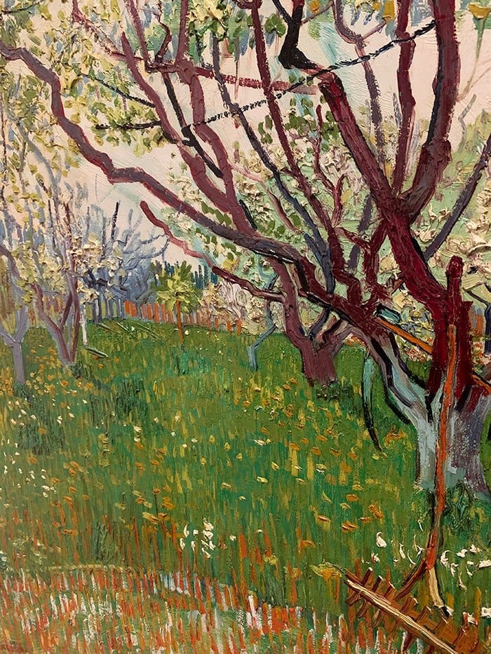
1. Texture
Texture can refer to two things:
– The physical texture of your paint; or
– The illusion of texture in your painting (for example, using the scumble technique to create the illusion of dry bark on the side of a tree).
To create the illusion of depth in your paintings, you can use more texture in the foreground contrast against a much smoother background. This reflects how we actually see detail. When you are looking at a landscape scene, you are able to see all the tiny details and textures in the foreground – all those stones, strands of grass, branches, insects, plants, etc. You can paint these details with increased texture in the foreground, both with a physical build-up of paint and with increased activity in your brushwork and colors.
But as you look further into the distance, all these little details and textures disappear and smooth out into a general mass of colors and shapes.

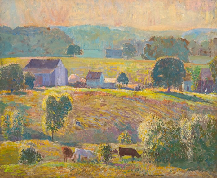
2. Value
Value is how light or dark something is, on a scale of black to white (with black being the lowest value and white being the highest value). You can read more about value in this post.
When an object recedes into the distance, it appears as though it has a higher value than it actually is. In other words, objects in the distance are tinted (a few values lighter).
In the painting below by Claude Monet, notice how the distant cliffs on our left have a higher value (are lighter) than the cliffs which are closer to us. Also, notice how the sky sitting just above the horizon is lighter than the rest of the sky. This pushes these areas back in the painting and creates that illusion of depth.

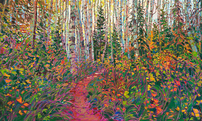
3. Clarity
This is a simple concept but one which beginners seem to struggle with. When you look at an object in the distance, it will appear to have much less clarity and detail than when you view that same object up close.
So when you are painting those mountains in the distance, you do not need to paint all the rocks, shadows, trees and other particular details. You can really simplify the detail to create the illusion of atmospheric perspective.
In some cases, you may even want to over-simplify the background to really exaggerate the sense of depth in your painting.
In the painting by Turner below, compare the level of clarity between the foreground and the background. The background almost has no detail and is merely there for atmospheric effect. The most detailed part of the painting is the part which is nearest on our right.

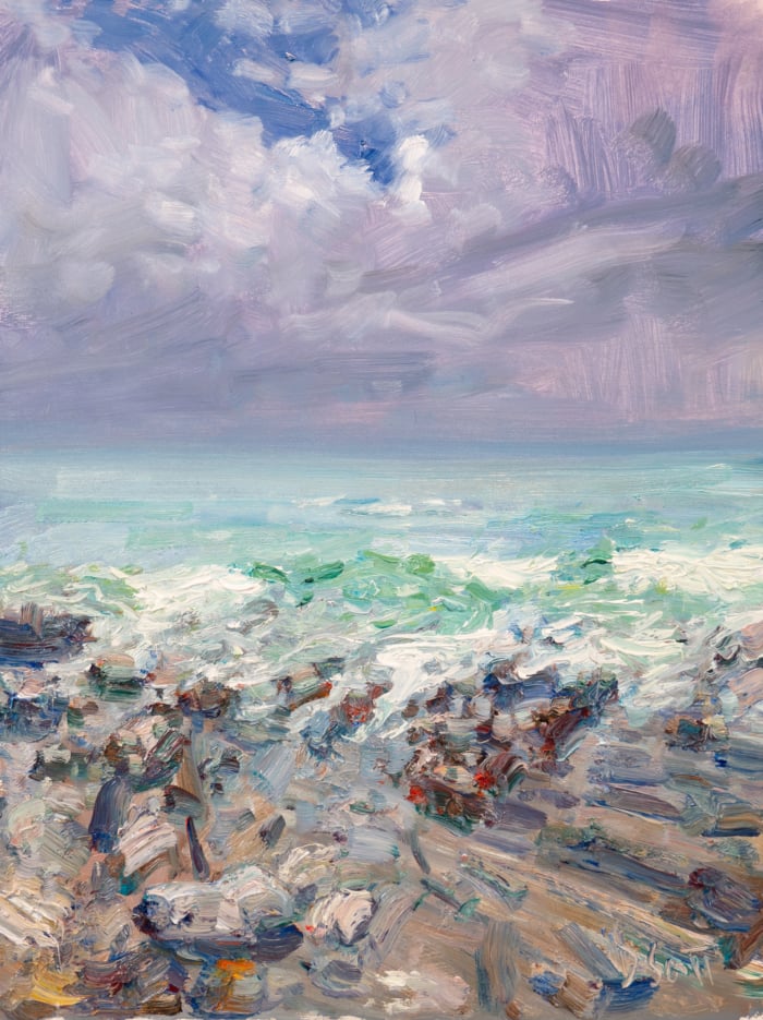
4. Color Temperature And Saturation
Generally, the color temperature of an object tends to shift towards the cool side (which is on our left in the color wheel below and includes the blues, purples and greens) as it recedes into the distance. Colors also appear less saturated (less intense) in the distance.

Now, remember we are talking in relative terms here, so you can still have warm colors in the distance. But they will be cooler than what you see up close. For example, consider an object which is a bright orange. Up close, it will look very orange of course. But as that object recedes into the distance, the orange will take on a slightly cooler and less saturated appearance (as if you had mixed in some blue or purple with that orange).
In the following paintings, take note of the color temperature of the background relative to the foreground.


Summary
I hope this post helps you better understand what atmospheric perspective is and how you can use it to create the illusion of depth in your paintings, particularly your landscapes and seascapes where you are not able to easily demonstrate linear perspective. If you have any tips you want to share, please add them to the comment section at the end of this post.
Want to Learn More?
You might be interested in my Painting Academy course. I’ll walk you through the time-tested fundamentals of painting. It’s perfect for absolute beginner to intermediate painters.
Thanks for Reading!
I appreciate you taking the time to read this post and I hope you found it helpful. Feel free to share it with friends.
Happy painting!
Dan Scott

Draw Paint Academy


I don’t understand the second argument about lightness, or value. Most of the paintings I see here have slightly darker backgrounds than foregrounds, which feels natural: the effect lowers the interest of the viewer, hence it’s less saturated, darker, less detailed, with colder hues. It guides the viewer back to the main subject.
There is one exception in some of the paintings (da Vinci, Monet, …): the sky color is more “desaturated” in the distance because of the nature of Rayleigh scattering (angle), the haze, etc., and the lightness increases because of our relative perception of those colors.
This was so informative! It was put so succinctly that all could digest. Thank you very much I shall refer to it again.
Gracias por los apuntes muy interesantes y me servirán mucho para realizar futuros trabajos. Saludos desde México.
Suas dicas realmente são excelentes! São detalhes que fazem uma diferença muito significante nos nossos trabalhos, quando entendemos o que vemos, fica mais fácil de reproduzir! A partir de agora, estou enxergando com outros olhos, graças a você. Muito obrigada.
Thank you so much for the article about this fascinating subject. Greetings from Chile!
Thank you Dan, this post was so informative. It helped me to see how I can improve my paintings and use better atmospheric effects.
Thank you…explained very understandable…I always have problems with depth in my paintings…well I am a beginner.
Thank you for the article on atmospheric perspective and for your demonstrations of one point and two point perspective. I have had it before but it seems so much clearer now in the way you present it.
well explained, thank you
Thank you for this helpful insights into colors and depths.
Thanks Dan. Love your articles.
I continue to enjoy so much your posts, they are filled with so much information. This one was really great!
Happy to help Deborah! Dan
Hello Dan,
Thank you so much for sharing these wonderful lessons for those of us with no other access to learning how to paint. Some of us also have limited access to the internet due to poor bandwidth signals, living rurally with blocking mountains and so forth. Your presentation is so good and easy to understand.
I do have a question about your ebook- due to the above mentioned limited access to the internet, is your book available in a print form? It’s hit and miss with signal here, and then access to the signal through shared computers and limited availability. Please advise. Thanks again for this- your delivery is factual, with a warm delivery that puts on no airs. Pretty refreshing.
Thank you very much for this very insightful article, I learned a lot from it. I’ve seen the Mona Lisa at the Louvre a couple of times but never paid attention to the details in the background. You’ve taught me to be more observant as well as how to add depth to paintings.
Great article. The examples and color wheel help bring it to perspective.
Thanks, Dan. You always give me something to think about!!
No problem at all Linda!
Dan
Thank you so much for all this insight. Although I knew in theory that colours became cooler and less detailed as they were further back it was good to see your examples and it’s made me think more carefully about the flowers in a field I’m about to try to paint
No problem at all Anne!
Dan