
Variety in art refers to the use of different qualities or instances of visual elements. It is the opposite of repetitive or monotonous use of the elements. In this post, I cover:
- Color Variance
- Line Variance
- Brushwork Variance
- Technique Variance
- Shape Variance
- Edge Variance
- Thanks for Reading!
Below is a great demonstration of variety by Tom Thomson. Notice all the different colors, lines, shapes, and brushwork. The end result is pleasing and interesting to look at (the goal of most paintings).

For the purpose of composition, below is a painting by Claude Monet which demonstrates a limited variety of elements. But that is appropriate for this foggy depiction.

Below I discuss some of the different ways you can incorporate variance into your paintings below.
I’ll walk you through the entire process using one of my recent paintings. You’ll see how I go from idea all the way through to reflecting on the finished painting.

Color Variance
There are three primary ways you can vary your use of color:
- Value (how light or dark a color is);
- Saturation (how rich, vivid or intense a color is); or
- Hue (where a color is located on the color wheel).
Below is an example of color variance in terms of value. There is hardly any change in saturation or hue.

The stunning Impressionist painting below features color variety mostly in terms of value and saturation. Light and saturated colors are used to draw your attention towards the focal point in the painting, being the faces of the four ladies. There is limited hue variance, with mostly different red and yellow tones being used.

Monet’s work is a fantastic example of hue variance. If you look closely at the painting below, notice all the distinct colors-blues, purples, greens, reds, oranges, yellows.

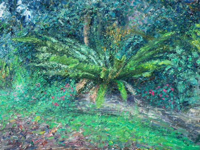
Below is another example of color variance in terms of value and hue by Monet. There is a strong value contrast between the shadowed trees in the foreground and the high-key background. If you narrow down on the background, notice how it is all painted within a very tight value range, but there is a wide variety of different hues (yellows, purples, greens, blues, oranges).

Line Variance
Line is perhaps the most fundamental of all the visual elements. It basically refers to a mark that spans between two points. Your lines can be:
- Thick or thin
- Broken or continuous
- Long or short
- Straight or curved
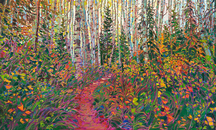
In the remarkably realistic painting below by Ivan Shishkin, the trees form verticle lines throughout the painting which vary in terms of thickness, length, and color. Overly repetitive use of line in the painting would appear unnatural and rigid.
There is also a pleasing contrast between all the verticle lines and the horizontal or diagonal lines formed by the edges of the path, river, grassy land, and the tree canopy and floor.

Nicolai Fechin was a master of line work. In his drawing below, notice the delicate and clean lines used to outline the subject’s face and features; the rough lines used for her hair; the short, tapered lines used for her eyelashes; and the soft lines used for her lips and nose.

Brushwork Variance
Many beginner painters tend to develop a bad habit of overly repetitive brushwork. They use the same strokes over and over again without thinking.
There are so many different marks you can make with your brush which vary based on:
- The way you hold your brush;
- The pressure you use;
- The amount of paint you use;
- The fluidity of the paint (how much medium you use);
- The surface you are painting on;
- How dry your brush is; and
- The angle of the brush.
Joaquín Sorolla’s work is a masterclass in brushwork. Look at the variety of his strokes in Bacchante below. Short, aggressive strokes are used for the background areas. More refined and blended strokes are used for the female around the center. Solid strokes are used for the deep red wall in the corner. So much brushwork variance, but it all seems cohesive and purposeful. I get a feeling of organized chaos.

Fechin is another artist who comes to mind when thinking of brushwork variety. He used all kinds of strokes and tools to create his dynamic paintings.
In Lady in Lilac below, notice how most of the painting appears like nothing but an abstract arrangement of colors. But as a whole, it all seems to work. The intricate brushwork used for key features gives context to the rest of the painting.

Technique Variance
Technique basically refers to the means and methods by which you apply paint to canvas. Some of the main techniques are scumbling, glazing, linework, and palette knife work. But the only limit in this area is your imagination.
Joseph Turner’s work features a masterful range of techniques, from ambient scumbling to intricate linework. Below are three of his paintings. I suggest you take a look through his work to get some ideas of how you can incorporate varies techniques into your work whilst retaining a sense of cohesiveness. You should also check out my post on his painting below, The Fighting Temeraire.


Shape Variance
Nothing stands out more than a lack of shape variance. It tends to look bland and unnatural if you use the same circles or squares throughout your painting (unless you are painting rigid architecture).
Your shapes can be:
- Big or small
- Geometric or organic
- Solid or weak
- Light or dark
- Colorful or dull
Shape is a strong feature in Claude Monet’s Arch to the West from Etretat below. The cliff forms several strong shapes in the positive and negative space (the positive space being the cliff and the negative space being the sky in the background).

I have outlined these dominant shapes below. When I think about shape, I first think in terms of these dominant, big-picture shapes.
")
I can break the dominant shapes down into smaller, more intricate shapes, as shown below. Notice all the variety in these shapes; no two shapes are the same.
")
If you want to see more examples of shape variance, you should check out the work of Edgar Payne. He was a master of using shape to depict the natural environment.

Edge Variance
An edge represents the transition between two shapes. It can be either hard, soft, or lost.
Edge variance is essential if you want to paint with a quality of realism. If you only use hard edges in your painting, then it will look very harsh and rigid. If you only use soft edges in your painting, then it will look blurry and out of focus.
Venice in the Fog by Sargent is a beautiful demonstration of edge variance, with soft edges used to depict the moody background, and hard edges used for the busy foreground.

Below is another example by Sargent. Notice how hard edges draw your attention towards the beggar’s out strung hand, which is a key feature of the painting.

Thanks for Reading!
I appreciate you taking the time to read this post and I hope you found it helpful. Feel free to share it with friends. If you ever want to learn more, check out my Painting Academy course.
Happy painting!
Dan Scott

Draw Paint Academy


Nice Happy to read it.
How would you define a Unique Variant when it come to a piece of art?
Thank you Jim…
I’ve learned so much in this one post! It really helped to explain the terminology I’ve been learning in my art class. The way he breaks down the work and explains it in photos is so helpful! You should make a textbook. I’ve added you to my favorites. Thank you!!!
For a book I’m writing, I’m seeking an example painting that exhibits the widest variety of types of marks. The best examples I have come up with so far are by Cy Twombly. What paintings might you point to?
Every time I need a suggestion that works, you have what I need in a well explained post. Thank you!
Very intresting and informativ mail i especially like those with Pictures and text. I learn so much.-Viveca