
In this post, I will discuss what positive and negative space is and how you can use it to improve your paintings.
- What Is Positive and Negative Space?
- Positive and Negative Space Illusion
- Positive and Negative Space as a Composition Tool
- Interlinking Positive and Negative Space
- Positive Space Is Not Always More Important Than Negative Space
- Want to Learn More?
- Thanks for Reading!
I’ll walk you through the entire process using one of my recent paintings. You’ll see how I go from idea all the way through to reflecting on the finished painting.

What Is Positive and Negative Space?
Positive space refers to areas where the subject is positioned. Negative space is the area surrounding the subject. Or in other words, positive space is the main focus area whilst negative space is the background.
For example, if you take a cloudscape, the clouds are the positive space and the blue sky is the negative space.

I have outlined the negative space below. Notice how the negative space forms these unique shapes. This is an important part of the overall composition. The area which is not outlined is the positive space.

However, this is assuming that the clouds are the main focus. Sometimes, the main focus of the painting is not clear.
Positive and negative space is inherently subjective. Some people may see one area as being a positive space, but others may see that same area as the negative space. This is because the way we all perceive the world varies from person to person. What I see may be completely different from what you see.
Positive and Negative Space Illusion
Several positive and negative space illusions have been developed to illustrate that our perception varies from person to person. Below is one of the most famous positive and negative space illusions:

Take right half of the above image and think about if you see:
a) A vase; or
b) Two faces.
My initial observation was a vase. To see the vase, my mind must assume the black area is the negative space and the white area is the positive space.
If you see the two faces, then you are assuming the white area is the negative space and the black area is the positive space.
On the left side, the vase is much more apparent due to the added detailing. You can still see the two faces, but you may need to change your focus.
The point is, positive and negative space is to some extent subjective. However, this illusion is an extreme demonstration of the differences in perception. Most of the time, the positive and negative space will be obvious and everyone will see the same thing.
For example, in the cloudscape painting earlier in this post, I think it is safe to assume almost everyone will see the clouds as the positive space.
Positive and Negative Space as a Composition Tool
Positive and negative space can form an important part of your overall composition. You can use positive and negative space to create a sense of balance and rhythm.
Balance
Balance is one of the basic principles of design and refers to how well all the elements are balanced with each other. There are no hard and fast rules to determine if a painting is balanced or not. It is usually just based on your own observation.
In terms of positive and negative space, a small area of busy, positive space (when I say busy I mean a lot is going on) can be just as powerful as a large area of quiet negative space.
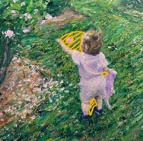
In the painting below, the positive space would be the subjects in the center at the table. The negative space is the floor and wall. Notice how much area the positive space is taking up compared to the negative space. But it appears balanced, to me anyway. This is because the positive space is busy. There is more saturation in the colors, more contrast and more detail. The negative space on the other hand, is comparatively smooth, dull and less detailed.

Rhythm
Rhythm refers to the underlying “beat” of your painting, much like in music. Rhythm can be created through repetition, alternation and pattern.
You can use positive and negative space to create a sense of rhythm by:
- Using repetition and patterns in the shapes and intervals created by the positive and negative space.
- Alternating between positive and negative space in a rhythmic manner.
In the painting below by Claude Monet, notice the rhythm created by the alternating positive (boats and the cliffs) and negative space.

To be honest, I do not actively think about rhythm whilst I am painting. But it is always in the back of my head.
Interlinking Positive and Negative Space
An interesting technique that you can use to strengthen the design of your painting is to interlink the positive and negative space by using areas of matching value, hue or other elements.
For example, take a look at the painting below. The positive space is the subject in the center. The rest of the painting is the negative space. Childe Hassam interlinked the positive and negative space through the use of similar values and hues. The orange of the hair and the skin tones are a similar hue to the background. The hand is a similar value to the background.
, 1918")
Positive Space Is Not Always More Important Than Negative Space
Many people would assume that positive space is more important than negative space as it is the area that is in focus. But I think that is a flawed way of thinking about positive and negative space.
Positive and negative spaces exist together. There will pretty much always be areas in focus and areas which are not in focus. You should think about positive and negative spaces as a team rather than opposing forces.
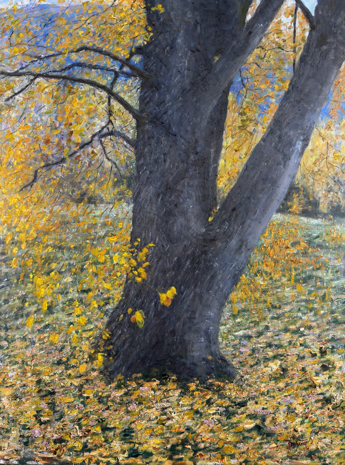
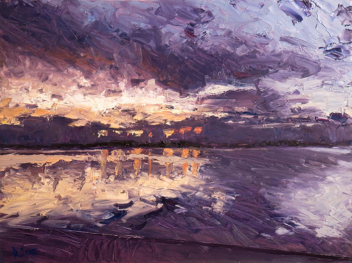
In the painting below, I do not consider the negative space any less beautiful than the positive space (which I perceive to be the bridge, land and sun). The vast area of vibrating hues in the negative space is just as interesting as the small areas of positive space with high contrast. It is all nicely balanced.

Negative space does not need to be bland. It should by nature take the backseat, but you can use more subtle approaches to create a variance in the negative space such as subtle changes in hue within a narrow value range.

Anyway, I will leave you with some more beautiful paintings below. Observe the paintings and consider:
- Is positive and negative space a feature of the painting?
- Is the positive and negative space balanced?
- Is there any rhythm created by the positive and negative space?
- Are there any interlinks between the positive and negative space?


Want to Learn More?
You might be interested in my Painting Academy course. I’ll walk you through the time-tested fundamentals of painting. It’s perfect for absolute beginner to intermediate painters.
Thanks for Reading!
I appreciate you taking the time to read this post and I hope you found it helpful. Feel free to share it with friends.
Happy painting!
Dan Scott

Draw Paint Academy


As someone who’s just starting to explore drawing, this concept really opened my eyes! I always struggled with making my compositions feel balanced, but the example with the Rubin vase was such a lightbulb moment. Do you think practicing with silhouette sketches is a good way to train my brain to see negative space more clearly?
Thank you for the clear explanation of positive and negative space in art and highlighting the subjective nature of perception. It emphasizes that what one person sees as positive space, another may see as negative space due to individual perspectives. I hope to grow as an artist by effectively utilizing positive and negative space to create visual impact and convey my message!
Am a Primary School Teacher teaching without any resource until I find this path.
It’s really helpful.
Thanks much.
This is very informative and useful post. Thanks for sharing!
Dan,
I have been painting portraiture in pencil and pastel for the last 16 years. Have done several landscapes in pastel and oil. But felt the need to improve on my skills.
Your course is very helpful. Thank you for your wonderful method of teaching.
Marianne Winter
Dan I really enjoyed your discussion about positive and negative spaces. I am retired just started watercolor about 4 years ago. I have found working with negative painting to be my cup of tea.
Hi Dan, I am a student of painting as a hobby and relaxation. Using negative/positive space is something that continues to baffle me (and I know I am not alone in this). Your article has helped me, to some extent, clear some areas of my confusion. Thank you.
Glad to hear this Justin! Keep practicing and keep up the good work. Thanks, Dan
Not sure of myself to paint. Yet I am so much more interested after reading your emails.
Thank you for educating me on art! I so enjoy!
Happy to help Terry! Dan
Gràcies Dan
Veritablement els teus post m’han ensenyat molt
Happy to be able to help you out Josep! Thanks, Dan
Thank you Dan,
I am thoroughly enjoying your Emails , and although just a beginner , I think I learning something from them .
Thank you so much again.
Great to hear Jill! Happy to be helping you out. Thanks, Dan
Another great artitle Dan- especially the reminder that negative space plays an important role and how the degree of detail/saturation/value contrast can make the visual weight of a small area much more compelling. Your selected visuals are always so useful in clarifying your point. Thanks!
Thanks Ellen! Dan
I find something helpful in all of your articles, Thankyou.
That’s great to hear Jean! Dan
What an enjoyable article , especially as I am a beginner in painting with oils.
Thanks Noelene!
I like your writing composition. I found it very interesting. Thank you for sharing.
Very interesting reading, I will think about this when composing my next painting, thankyou!
HI Dan, and thanks infinitly for these explications on positive and négative Space.
Also, for balance and rhythm that I did’nt how to réalise on my paintings.
Now, I think I can progress.
Thanks, Dan. As you say, this is not always something you focus on directly, but perhaps something to consider from time to time as the painting progresses.