Let’s take a closer look at Marie Joséphine Charlotte du Val d’Ognes by Marie Denise Villers. I first saw this painting at the European Masters exhibition. It was a popular painting in a room full of great art.
I’ll cover:
- Who Painted It?
- Subject
- Light and Shadow (Value)
- Color Theme
- Edges
- Framing
- Additional Resources
- Key Takeaways
- Want to Learn More?
- Thanks for Reading!

(Click here to see a high-resolution photo of the painting.)
Who Painted It?
There has been uncertainty surrounding who actually painted this work and who the sitter was. Today, it hangs in the Met Museum as Marie Joséphine Charlotte du Val d’Ognes and is attributed to Marie Denise Villers. But even this attribution is only probable at best. Here’s a rough timeline regarding the painting’s attribution. If you want more information, art historian Anne Higonnet has an excellent article on the painting that you can read here.
- 1801 – The painting was exhibited at the Paris Salon and then spent several generations in the Val d’Ognes family private collection. During this time, it was thought that it was by French artist, Jacques Louis David.
- 1917 – The Met Museum acquired the painting and adopted the attribution to David.
- 1951 – Art historian, Charles Sterling, questioned the attribution to David, partly because David was absent from the 1801 Salon. He proposed that it might have been Constance Marie Charpentier who painted it. She did exhibit at the 1801 Salon and painted in a similar style to that of the painting. The Met Museum accepted this new attribution.
- Around 1980 – The Met Museum withdrew any attribution from the painting and the sitter and renamed it Young Woman Drawing.
- 1996 – Art historian, Margaret Oppenheimer, proposed that it was painted by Marie Denise Villers. Refer to the article by Higonnet as to why. This was accepted by the Met Museum and stands today.
I usually wouldn’t show this much interest in the attribution timeline of a painting, but in this case, it raises an interesting point about how the perception of the artist affects the perception of their artwork.
Since its creation, the painting has been critically claimed for the most part. This is despite the numerous changes and uncertainty surrounding the artist who painted it. Perhaps the mystery added to its allure. However, the critiques appeared slightly more favorable for the artist who was initially thought to have painted it, David, who was a prominent male artist. Of course, the sex of the artist should have no part in how we perceive an artist or their artwork. But back then it did, unfortunately.
Once the painting changed attribution to Charpentier, some critics began to notice minor flaws. For example, critic and historian, James Laver wrote in 1964, “Although the painting is extremely attractive as a period piece, there are certain weaknesses of which a painter of David’s calibre would not have been guilty.” The artwork didn’t change, but some people’s perceptions of it did.
The takeaway here is that an artwork is rarely considered in isolation. We judge it, whether aware or not, in relation to the artist and the circumstances surrounding it. Sometimes this is favorable to the artist, sometimes it’s not. But whatever the case, we artists have little control over how the world perceives us and our art. Think of the early Impressionists like Claude Monet and Vincent van Gogh. They were dismissed then, yet revered today.
Subject
The painting appears simple at first glance, but there’s a lot going on.
It depicts a young woman seated in a room with a drawing pad. She looks back at us as if we are the subject of her sketches. She is illuminated with sunlight coming in from a broken window. In the distance, a couple chat intimately on a balcony. Let’s dive a bit deeper.
The room is actually part of the Louvre. At the time, the Louvre was one of the few places where women could freely learn and teach art together. This is why Higonnet believes the painting was done by another woman, not by a man (David) as initially thought.
The sitter is thought to be Charlotte du Val d’Ognes, who was an aspiring artist who had to give up her aspirations when she got married.

The building in the distance: Higonnet identified the building as a domestic residence across the Seine. She further suggests it might have been Charlotte du Val d’Ognes’ home at the time the portrait was painted.
The broken window is an interesting aspect. Perhaps that’s just what Villers saw. Or perhaps it represents the separation between two, at the time conflicting, paths in life: the aspiring artist in the foreground and the domestic married life in the background.
Historian, Bridget Quinn, sums it up well:
“… two young women longing to make art found themselves in a brief period of opportunity, when instruction, exhibition and even fame were possible.” (Source)

Light and Shadow (Value)
Let’s move on to some of the technical features of the painting, starting with light and shadow (value).
Sunlight illuminates the room through the broken window and wraps around the subject and her drapery. The rest of the room is dark and there aren’t any obvious signs of another light source. This creates a strong value contrast.
Below is a grayscale of the painting, revealing all the different values. We can segment the painting into three distinct value groups: the darks that represent the back of the drawing pad, the wall and window frames, parts of the drapery over the chair, and a few other details; the mid-tones that represent the shadows of the subject and parts of the background through the window; and the lights which represent the highlights and parts of the sky.
There’s an interesting reversal pattern between the foreground and background. The foreground is made up of a relatively light subject against dark surroundings. The background (through the window) is made up of relatively dark subjects against light surroundings.
The room’s dark wall plays a simple but important role of being a point of contrast in the painting. It allows the highlights of the subject to appear bright and crisp. Light colors for the wall would reduce the contrast and therefore diminish the impact of the highlights.
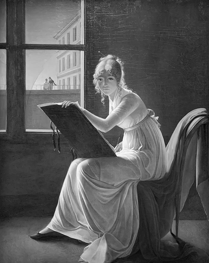
A two-value notan of the painting (see below) reveals an interesting value pattern. Notice how it goes from light in the top left corner to dark in the top right corner, then dark, then light, then light, then dark.

Whilst a two-value notan is helpful for seeing the broad arrangement of lights and darks, a three-value notan is perhaps more faithful to the subject (see below). That’s because the painting is made up of three dominant value groupings.

Color Theme
The colors are subtle and beautiful. As French author, André Maurois put it:
“Its colors have the fineness and rarity of Vermeer’s. Perfect painting, unforgettable.” (Source)
There’s a sense of warmth about the painting, with the stronger colors being red and orange tones. Pale and dull blues play more of a complementary role. This plays well into the idea of a warm interior scene.
There are several color links throughout the painting. The back of the drawing pad is similar in color to the back wall. The light skin tones are similar to the light architecture colors. The dark skin tones are similar to the lights on the floor. The pink belt is similar to the pink highlight of the drapery over the chair. These subtle links connect distinct areas together and create a sense of harmony throughout the painting.
This painting is also a great demonstration of what you can achieve with a limited palette. I’m not sure exactly what colors Villers used, but it doesn’t seem extensive. From the looks of it, just a handful of hues varied in terms of saturation and value. Keep in mind that for every color, you can create an infinite range of variations by adding black, white, or gray.
Edges
The edges play an important role in reiterating the nature of the different objects. Hard edges reiterate the idea of rigid, geometric architecture. Soft edges reiterate the idea of soft, youthful skin, flowing drapery, and shadows cast on the floor. They also play well off each other; hard edges make the soft edges appear softer, and vice versa.
This painting is also a good example of how an edge’s perceived hardness changes as the color contrast changes. Look at the edge along the subject’s back and head. It appears harder at the bottom of her back where the color contrast is sharper. The edge appears to get softer around her shoulders, even though the change in color is just as immediate. More contrast = edge looks harder; less contrast = edge looks softer.

Framing
The painting is of course wonderful, but credit also needs to be given to that frame. It’s a work of art in its own right. But it doesn’t compete with the painting for attention. Rather, it complements and contains your attention on the painting, as a good frame should.
Also, notice how the dimensions of the frame are mimicked within the painting itself by the window frame. See the draw-over below. This may seem like an insignificant point, but consider what the painting would look like if the window had landscape dimensions. Odd I imagine.
Tip: When analyzing master artworks, it’s a helpful exercise to consider what it would look like if you changed certain aspects. This can help you narrow down on seemingly minor but important details that make the painting work.

It’s worth noting that you should not compare your unframed pieces to that of these exhibition pieces. A good frame can take a painting to another level and a masterful frame like this is simply an unfair advantage.
Additional Resources
Broad Strokes: 15 Women Who Made Art and Made History by Bridget Quinn
Wikipedia – Portrait of Charlotte du Val d’Ognes (Marie-Denise Villers)
Met Museum – Marie Joséphine Charlotte du Val d’Ognes (1786-1868)
Key Takeaways
Here are the key takeaways from this post:
- An artwork is rarely considered in isolation. We judge it, whether aware or not, in relation to the artist and the circumstances surrounding it.
- Simple paintings often have complex undertones. It can pay to dive below the surface.
- Keeping your values within two to three groups helps convey a strong and concise image.
- Use notan to unveil subtle value patterns that you might have otherwise missed.
- Edges can reiterate the nature of the subject. Consider using hard edges for solid, rigid objects and soft edges for ethereal, fluid objects.
- A good frame complements the painting but does not compete with it for attention.
- Don’t compare your unframed work to framed work.
Want to Learn More?
You might be interested in my Painting Academy course. I’ll walk you through the time-tested fundamentals of painting. It’s perfect for absolute beginner to intermediate painters.
Thanks for Reading!
I appreciate you taking the time to read this post and I hope you found it helpful. Feel free to share it with friends.
Happy painting!
Dan Scott

Draw Paint Academy

Thank You!
Thank you. This is a wonderful insight.
Thank-you I thoroughly enjoyed reading and viewing! It is an amazing work, I love it! The young lady also looks so naive and beautiful as though she’s questioning and appealing to her vision. Oh I wish! The only sadness is giving up art when married! Bless
This is so interesting. Such a tender painting. Thank you so much for helping to unravel it’s provenance.
Fantastic, in-depth analysis. The story behind the painting and the technical details of it, make it far more interesting than I had originally thought.
Thank you for your insight and expertise
Dan, your review is enlightening and delightful to read. Thank you for sharing this in-depth analysis. I look forward to seeing your presentations on artists’ works, especially on those with whom I am not familiar. Most appreciated.
I think this is a self portrait of the artist. Thanks for analyzing the painting. It’s so easy to just look and take it all in. It’s more difficult to put what we see into words on paper sometimes. You pick up the subtleties.
Makes you become an observer in tour own work…and how important framing is to a piece of art
Thank you so much for your insights and analysis. I remember writing an essay about this painting when I was in high school (in the sixties).. brought back so many memories.
Excellent review and insights. Thank you for your very thoughtful posts.
To read this commentary while viewing a painting I probably would have noted as an interesting piece in the style of David – – my hat is off to you, Dan. Became a member of your Inner Circle due to respect for your in depth analysis of this meaningful and masterful work of art.
Your in-depth description of this beautiful painting has taught me a great deal. Your simple explanations of complex detail is amazing.
Thank you so much.
Very interesting and informative information.
Thank you.
Would you please specify the size of the painting?
Hi Charlotte. It looks to be 161.3 cm (63.5 in) × 128.6 cm (50.6 in). Thanks! Chontele
Dan, thanks for your encouraging emails.
Bob Durocher
I always enjoy your analysis of paintings! Are there any LOST edges in the portrait? I see some on her shoe and on the background window frame.
Thank you for your insight, research and analysis. A pleasure to read.
Thanks for analysis of great painting
Great analysis. Really helps me to understand how paintings are constructed.
Thank you so much. This is a wonderful insight.
Thank you! I enjoyed reading your review of the painting and will borrow your process as I look at others, including some of my own. It’s never to late to learn.
This was very informative. I love this painting! Thank you
Thank you for this wonderful analysis. What a beautiful painting it is!
I so enjoyed this review and painting Thanks Blessings. Rev Joy
It may be lost in the process of photographing the painting, but to me the cloth is “lit”, but it doesn’t convince me it is lit by “sunlight”. I don’t get the sense of warm light, cool shadow, transitions, etc.. The values are spot on, but I don’t feel the same way about the color temperature. Is it just me? This sort of subtlety is hard to judge when you aren’t standing right in front of the painting. And I am no expert when it comes to things like this. It’s just my feeling about the painting.
I first saw this painting in the 80s in a book about female artists and it was love at first sight. However, I always saw it of a mysterious woman drawing by moonlight, connected to the lovers in some way, perhaps questioning the paths she could take. I still prefer my mysterious night light but thank you for pointing out other aspects of which I was unaware.
Bonjour, je suis très intéressée par votre étude artistique de ce tableau. Il représente l’une de mes ancêtres et sachant dans la famille que l’original est au MET, nous avons tous des copies dans nos familles. Je suis actuellement en train d’essayer d’en faire une copie ( acrylique “aquarellé”), pas facile. Merci encore pour cette passionnante étude
Thankyou Dan for your wonderful analysis of this gorgeous painting, I could study it for hours!
I also agree that she might be connected with the couple in the distance, and feel that it is a self portrait, possibly even with regrets about her future in marriage and her Art, this being expressed by her viewing life through a broken pane!
An interesting history !
The drawing board is at an extreme angle suggesting action. The subject’s gaze is level, in line with the right angles around here. The level gaze is calm, and direct. But then there’s her half hidden hand, holding a drawing tool, almost hidden, mysterious, poised like the hand of an archer. Bullseye !
This is a fascinating painting. I can’t figure out the lighting on the face? Both eye sockets are lit and the nose and R side of face are in shadow?
Awsome. Artist awsome post
Very interesting , much appreciated.
Anytime
Thank you for articulating my feelings toward this review and how it expresses a tremendous view of the work
Hello Dan – great review of a great painting – intelligent & comprehensive.
You should create a book of your analytical reviews of paintings.
PS: Could you possibly send me a link to your most extensive coverage recently on Aspects of colour please. Regards Owen
Such a comprehensive in-depth analysis of a stunning artwork! Thank you for sharing!
Thank you again for your insight into this painting. I love the way the artists painted back then and I feel the mystery is still unsolved of the actual artist.
When I. Shift I’m going to get more into painting. Oil and water based painting. And sketches. Etc. love Dan. And is. Posts etc
Thank you Dan, your reviews are a treasure!
Dans. Reviews. Are. Awsome and very informative Thankyou Dan
A lovely painting. I especially like the lighting on the face. The dress is done in the folds of Michaelangelo’s Sistine Chapel paintings. Along with that I also see a reference to his “Pieta” in how the body is elongated to suit the composition. If she were to stand up, just like Mary in the “Pieta” they would both be over 9 feet tall.
I’m sure the artist studied in Italy and in France like most great artists of the time did.
A beautiful portrait and I enjoyed the history lesson as well.
Thank you
Frank
Lovely portrait. Fascinating controversy. Loved it all . Thank you for the details.
Wonderful insights! great article..Thank you
Wonderful painting! Thank you for such revealing analyse. It opened my eyes to fine details…
I love your art reviews that not only contain a historical perspective but a stylistic critique. I would love to see you put these reviews on YouTube. You have an approach that I find most enlightening and shows deep understanding of the artist. Just a thought.
Thank you for taking the time to review this painting in such depth. There was much to see that I didn’t notice when first looking at the painting. Thanks also for including the information about the painting’s masterful framing which is now another subject I’d like to pursue.