
In this post, I take a closer look at The Fighting Temeraire by Joseph Mallord William Turner. It is one of those interesting paintings where the more I look, the more I seem to uncover.

I cover:
- Key Facts and Ideas
- Color
- Composition
- Brushwork
- Key Takeaways
- Additional Readings
- Want to Learn More?
- Thanks for Reading!
I’ll walk you through the entire process using one of my recent paintings. You’ll see how I go from idea all the way through to reflecting on the finished painting.

Key Facts and Ideas
Here are some of the key facts and ideas about the painting:
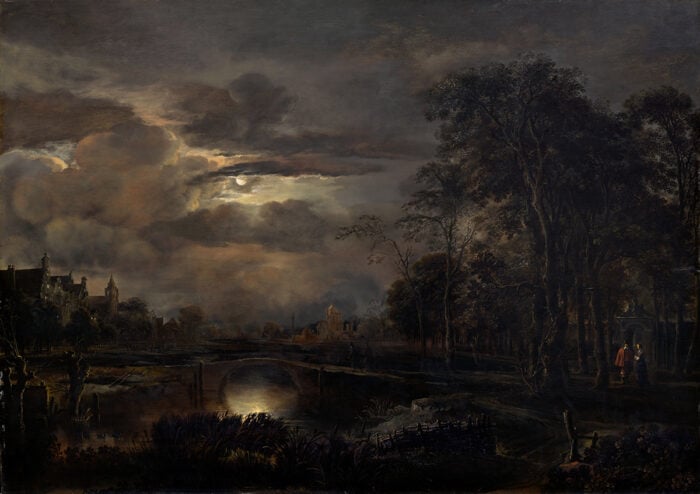
- The actual name of the painting is The Fighting Temeraire tugged to her last Berth to be broken up, 1838, but it is often more simply referred to as The Fighting Temeraire.
- The focus of the painting is the HMS Temeraire, a 98-gun ship of the Royal Navy remembered for its influential role in the Battle of Trafalgar.
- The painting depicts the Temeraire’s final journey to a London shipyard. In the painting, the Temeraire appears grant and complete, but that was only Turner exercising his artistic license. In reality, the ship was nothing but a shell of its former self.
- The painting was exhibited at the London Royal Academy in 1839, a year after it was created. Accompanying it was an excerpt from a poem by Thomas Campbell named “Ye Mariners of England”:
“The flag which braved the battle and the breeze,
no longer owns her.” (Source)
- The painting was a personal favorite of Turner, who refused to sell it during his lifetime. He left the painting to the nation following his death.
Color
Color is a major aspect of the painting, with subtle changes in temperature and saturation.
The top left-hand corner is painted with soft blues and weak grays. You can see a glimmer of the distant moon in the sky. Its pale white reflection hits the clouds and ocean below. This creates an interesting juxtaposition against the sunset and its reflection on the other side of the painting. Night meets day; light meets dark; cool meets warm.
As you move towards the sunset, the colors get warmer and more dramatic. Relatively saturated oranges and yellows are used to create the illusion of light. Note that these colors are still fairly weak when compared to colors straight from a tube, but they stand out from the weak surrounding colors.
")
Along the horizon line is a streak of cool blue just below the sunset. This helps separate the sky from the ocean and also adds some immediate color contrast for the warm colors above. Notice how Turner also used more value contrast (the contrast between light and dark) with the dark clouds just above the sun.
The Temeraire was painted in a relatively high key (light colors). This gives it an ethereal and mythical appearance, especially when compared to the robust and brash appearance of the tugboat pulling it.
")
Composition
In terms of composition, dominance is given to the moody sky with the ocean taking up only a small area at the bottom of the painting. But there is a sense of balance due to the higher level of activity on the water. Remember, small areas of “noise” can have the same, if not more, importance than large areas of “silence”.
Despite the importance of the Temeraire in the composition, it is given a relatively small area. Turner took a more ambient approach for the composition, opting to include more of the surrounding sky and ocean rather than solely focusing on the ship.
In the image below, I placed a three-by-three grid over the painting to get a clearer idea of how everything is positioned. Notice how the Temeraire is positioned around the bottom left-hand intersection. These intersecting lines are considered to be aesthetically pleasing and “safe” places to position your focal points.
On the other side of the painting, the sun is setting around the bottom right-hand intersection. This is an interesting compositional choice by Turner, as it splits your attention between the Temeraire and the sunset.
")
The arrangement of the Temeraire, sunset, and clouds creates a subtle triangular arrangement, as indicated below. It is always worth looking for these geometric shapes in paintings. At the very least, it will train you to see in terms of shape, which is a useful skill when breaking down a subject you are about to paint.
")
I should also note that I doubt Turner was actively thinking about this kind of compositional theory at the time of painting, but it is worth pointing out for the purpose of discussing what makes this painting work.
Brushwork
In my opinion, Turner’s greatest strength was his remarkably diverse brushwork-from ambient scumbling to delicate rendering.
In this painting, the sky and ocean are painted with a vast range of subtle tones scumbled on top of each other. There may also be some glazing involved. The end result is ambient and dynamic, typical of the fleeting appearance you would see in life. You cannot reach this kind of effect merely with solid, flat color.
Below is a close-up of a relatively “bland” area in the painting. Notice the diverse range of colors used and the subtle transitions in tone.
")
On the other hand, the Temeraire and the tugboat pulling it are painted with intricate detail and brushwork. Turner was a remarkable watercolorist, which explains his dexterity with a brush (watercolors are a fickle beast).
This varied brushwork adds another subtle level of contrast in the painting. But the contrast is not so strong that anything looks out of place. It still appears as a cohesive whole, which by far the most important aspect of painting.
")
Key Takeaways
Here are some of the key takeaways from The Fighting Temeraire which you might be able to apply to your own paintings:
- Feel free to exercise your artistic license to change the subject from time to time, if it is in favor of your big idea. In this painting, Turner painted the Temeraire in its grand, completed form, rather than what it was in reality: a battered shell of its former self.
- Do not limit yourself to just a few techniques. You can create so many different effects on the canvas merely by changing the way you hold your brush, or the amount of paint you use, or the tools you use. Turner’s work is a great demonstration of this, from ambient scumbling to intricate detail.
- For painting the illusion of light, contrast is your best tool. In this painting, Turner used increased color saturation to capture the sunset and the warm rays of light.
- Small areas of “noise” can have the same, if not more, important than large areas of “silence”. In this painting, notice how the small, “noisy” areas (the boats and sunset) feel balanced against the large, “silent” areas (the ambient sky and ocean).
Additional Readings
If you enjoyed this post, then you should also check out:
A Closer Look at Bedroom in Arles by Vincent Van Gogh
A Closer Look at Ophelia by John Everett Millais
A Closer Look at Portrait of Madame X by John Singer Sargent
Want to Learn More?
You might be interested in my Painting Academy course. I’ll walk you through the time-tested fundamentals of painting. It’s perfect for absolute beginner to intermediate painters.
Thanks for Reading!
I appreciate you taking the time to read this post and I hope you found it helpful. Feel free to share it with friends.
Happy painting!
Dan Scott

Draw Paint Academy


Thank you for the interesting, helpful comments on Turner’s composition, I will continue to. Gain from your dialogue and information.
Thank you for the interesting, helpful comments on Turner’s composition, Imwill continue to. Gain from your dialogue.
Dan,
Your critiques and perspectives are terrific, thank you for presenting interesting paintings with your astute observations.
The black vertical smoke stack of the tugboat marks a line at the bottom left hand emphasizing more the position of The Fighting Temeraire. And the belching saturated orange/black smoke from the tug’s stack
moving diagonally across the masts of the Temeraire implying its fateful doom. The tug’s orange/black smoke also presents symbolically as a competing counterbalance to the setting sun.
I really enjoy your selection of paintings and your observations.
Cheers,
David
Excellent insight to a great painting. This is a national treasure for us Brits. I’ve gazed at it many times in the National Gallery. There’s a fine cgi reconstruction of the scene in the film Mr Turner.
Below is a link to a smashing BBC radio broadcast on the painting.
Oh and one more thing…the painting gets a cameo in the James Bond film Skyfall.
https://www.bbc.co.uk/programmes/b081r260
I’m enjoying these takeaways and comments. Looking at the first picture in the article, you can almost see a line going from the red in the water up to the sun, passing through a lighter linear area and it continues in a darker linear area, up to a slightly purplish area. I’m assuming that the triangle isn’t just exactly on the white line, or then I would be very wrong.
As a wannabe painter, I enjoy how you bring out specifics that I hardly notice. Another said your analysis is wonderful and I agree with that. Makes me think and try to remember what to do/use when I really get into painting. Many thanks.
I absolutely love reading your wonderful posts and always learn so much! Thank you for all you share!
(random thought: the pretty phrase, “ambient scumbling” is really stuck in my head! :))
I have changed my email address. The on underneath the comment box is correct. chibatc@aol is no longer correct. I would miss your critiques on my favorite artist.
Best Regards,
Cherryl
Thanks Cherryl! I have changed this for you. Dan
Hi Dan:
Always look forward to your lessons & reflections.
Thank you so much. I love your analysis. It always gives me a better understanding of the artist and the technique. I am also confused about the top point of the triangle, though.
Dan, I enjoyed your article immensely and I am a huge fan of Turner. However the placement of your composition triangle puzzled me. What did you base the placement on: color, darkness? I could not find a reason for the top point of the triangle.
Hi Sally and Eva,
Perhaps I might be able to shed some light on the subtle triangle in question.
To me, when Dan mentioned the clouds it clicked. The subtle triangle’s top is placed within a value change of the clouds. Note that the top point is over the white hazy clouds.
To me, there is also a “S” shape, found in the clouds, that unites the top middle, swerves to the ships, smokestack smoke takes your eye back to the right down the stack or white sail, across the horizon and around again.
These elements of composition, shape and value, are subtle and innately cause you to move your eye around the canvas.
Most elements of composition are not obvious, but subtle…..
I’m enjoying these takeaways and comments.