
(My “On the Easel” posts give you a behind-the-scenes look at what I am working on, what went well, what went wrong, and things I learn.)
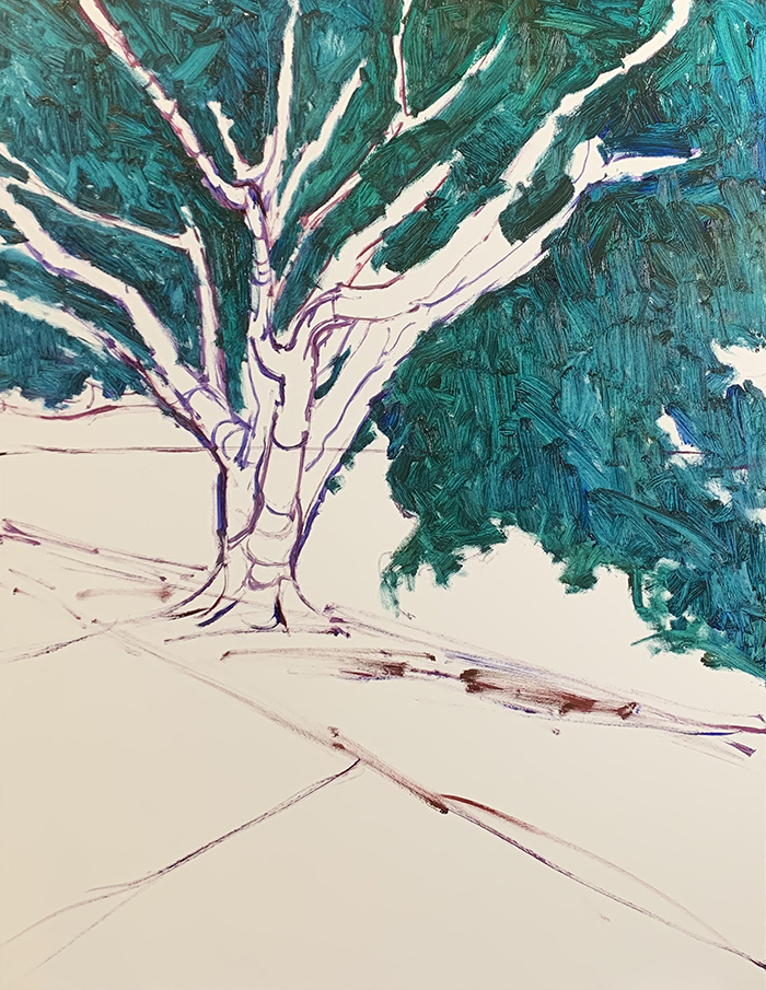
Let’s take a look at how I painted Brisbane City, White Light. It depicts a grand tree on the edge of the Brisbane river. It was an unusual morning. A thick fog filled the atmosphere and everything was bathed in a soft, white light.

Reference Photo
Below is the reference photo I painted from. Feel free to paint it for yourself. Click here for the high-resolution version.

(You can get access to all my reference photos in the Reference Photo Library.)
Details
- Oil on Ampersand Gessoboard. 18×24 inches.
- Main colors: Ultramarine blue, cobalt blue, cadmium red, alizarin crimson, cadmium yellow, cadmium yellow light, viridian green, transparent brown oxide, and titanium white.
Refer to my supplies list for more details on what I use.
Notes
- I painted this one in a more realistic style than you’ll typically see from me. Notice the careful rendering and restrained colors. It was slower to paint this way as the style is more demanding in terms of thought and brushwork.
- The tree in this scene is a complex and challenging subject to paint with all its branches, leaves, shadows, highlights, and mid tones. I spent more time than usual on the drawing and rendering to get the big-picture structures, forms, and colors right.
- Notice the areas on the branches that are a bit lighter and have a yellow tint. This is where reflected light is bouncing up off the ground and hitting the tree. It makes the shadows a touch lighter and warmer. This is one of the small details that convey a lot of information. I’m always surprised at how wrong that painting looks until I add the reflected light.
- The highlights on the tree around the middle create a soft link with the glowing-white white in the background.

Tip: Always look for opportunities to link different areas together. This will make your painting appear more cohesive and connected, rather than an arrangement of parts.
- Value contrast plays a big role in this painting. The dark foreground makes the white background glow by comparison. If I made the foreground too light, the background wouldn’t glow, no matter how much titanium white I used.
- I did a lot of reworking on the path at the bottom. It was a challenge to make it fit in with the rest of the painting. If I did too much, it looked overworked and out of place.
- I used rich and cool greens for the grass along the shore. To mix these greens, I used a combination of cadmium yellow light, viridian green, and titanium white.
Progress Shots


(Note: I use a different camera for photographing the finished painting than what I use for the progress shots. That explains the sudden change in colors at the end.)
Additional Resources
Thanks for Reading!
Thanks for taking the time to read this post. I appreciate it! Feel free to share with friends. If you want more painting tips, you should check out my Painting Academy course.
Happy painting!

Dan Scott
Draw Paint Academy
