
(My “On the Easel” posts give you a behind-the-scenes look at what I am working on, what went well, what went wrong, and things I learn.)
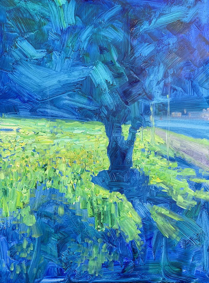
Let’s take a look at how I painted Brisbane City, Mist. This painting follows an impressionist style, with dynamic brushwork, exaggerated color, and simplified detail.

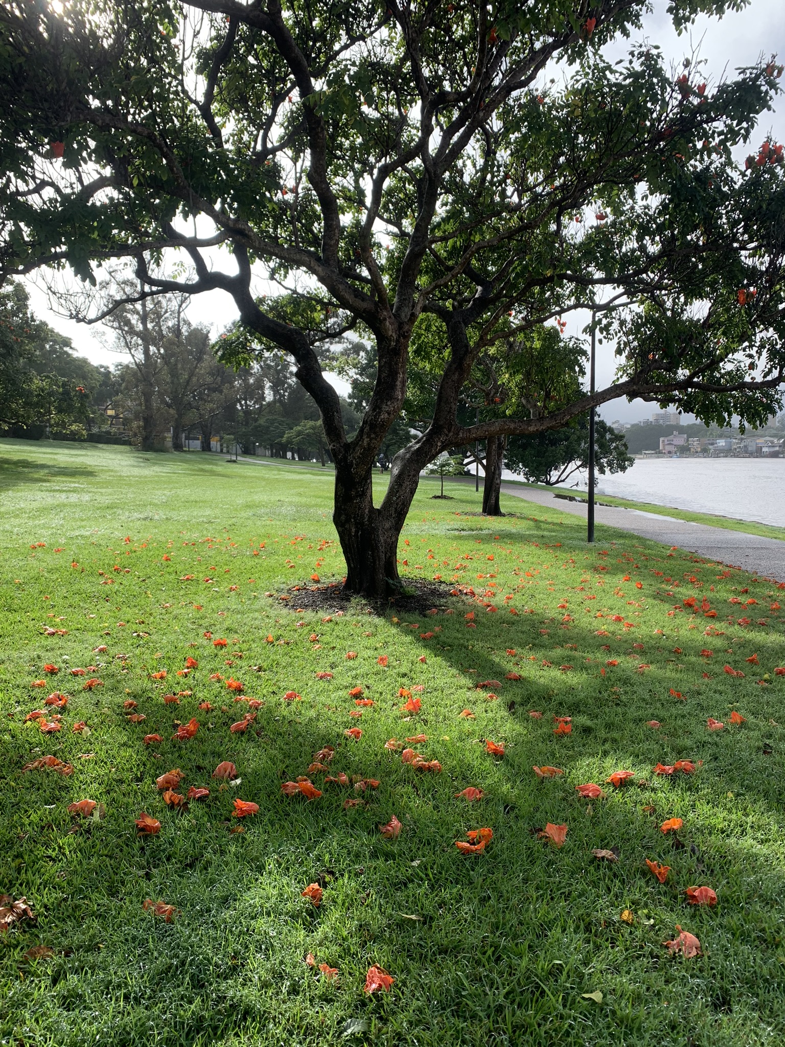
Reference Photo
Below is the reference photo I painted from. Feel free to paint it for yourself. Here is a link to the full-size image.

Details
- Oil on Ampersand Gessoboard. 18×24 inches.
- Main colors: Ultramarine blue, cobalt blue, cadmium red, alizarin crimson, cadmium yellow, cadmium yellow light, viridian green, and titanium white.
Refer to my supplies list for more details on what I use.
Notes
- I drew inspiration from both the reference photo and from my first impressions of the subject. The photo is helpful, but it’s those first impressions that are most valuable. The tricky part is remembering them.
- I started with a thin wash of ultramarine blue and viridian green. This formed the foundation for my shadows. It also played well with the overall color theme. As I added light yellow and green highlights, the colors slightly mixed with the blue, creating various green tones.
- I followed a theme of thick, warm lights against thin, cool shadows. This is a contrast of both texture (thick against thin) and temperature (warm against cool).
- Mist had enveloped the city and everything was bathed in soft, white light. The buildings in the distance were hardly visible and I needed to paint them with vague and simple brushwork.
- To paint the sky, I scumbled layers of light gray, yellow, blue, and titanium white. To make the sky “glow” like it did that day, I created a sharp value contrast between these light colors and the dark blues and greens of the tree and its leaves.
- The ground was scattered with flowers that had recently fallen and still retained their fiery colors. I used thick paint, rich colors, and simple brushwork to paint the flowers. I didn’t worry about making them look like flowers. Rather, I relied on the surroundings to give them context and meaning.
- If you look closely, you’ll see a few red flowers that have yet to fall from the tree.
Progress Shots
Step 1: Thin wash of rich color. Loosely indicate the major shapes by lifting paint with a paper towel.

Step 2: Work on the lights, using thick paint and directional strokes. Notice how the lights give form to the tree.
Step 3: Work on the glowing white sky, the water, and the buildings in the distance.

Step 4: Add dabs of saturated red and orange for the fallen flowers.

Step 5: Use a small flat brush to paint dabs of green for leaves.

Step 6: Render the tree trunk and branches, being careful not to overdo it.

Step 7: Start bringing it all together. This is all about connecting the pieces to make them seem as one.

Step 8: Finishing touches, such as the red flowers that have not yet fallen from the tree.

Step 9: Photograph the finished painting. I still need to sign it.
(Note: I use a different camera for photographing the finished painting than what I use for the progress shots. That explains the sudden change in color at the end.)
Additional Resources
Thanks for Reading!
Thanks for taking the time to read this post. I appreciate it! Feel free to share with friends. If you want more painting tips, check out my Painting Academy course.
Happy painting!

Dan Scott
Draw Paint Academy


