
I curated a selection of paintings that break the typical composition rules, yet work. The idea is to demonstrate that composition is not a black and white area. The rules and theories exist for a reason in that they work most of the time. But they should be treated more so as guidelines or suggestions rather than rule-bound law.
For each painting I share below, I’ll list the unusual composition aspects. And just to be clear, all these paintings work; this is not a post on what not to do.
Let’s start with Abram Arkhipov’s Smiling Girl. The subject’s head comes to the top edge of the painting. You typically would push the subject down and have some negative space at the top. But it works in this case as it plays into the painting’s intimate feel.

The horizon line is pushed to the top of the painting. The rule of thirds suggests you would take a more balanced approach by giving the sky more space.

The horizon line is in the middle of the painting. This can look overly symmetrical.

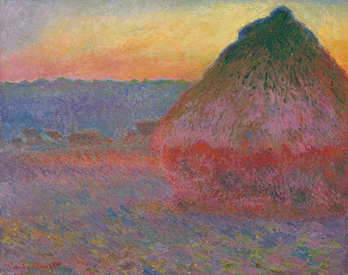
No strong focal point. The bridge melts into the background. Many of Monet’s paintings are like this. Instead of a strong focal point, the painting as a whole is in focus. His water lilies series is another example.
, 1899")
The tree at the top lines up with Kobe. A reader suggested that it would work better to push the tree to the left-hand side. I agree with this, however, sometimes I prefer to paint things as they are, rather than change them in favor of a better composition.

The sails extend past the top edge.

The subject’s head comes to the right-hand edge.

The man’s line of vision leads us out of the painting. A line of vision is an implied line. It doesn’t physically exist but it directs our attention. We want to look where others are looking.

Intricate detail is used for the whole painting (no simplification). Composition theory would suggest simplifying the background to focus attention on the dog.

The person on the right is looking directly out of the painting. His line of vision is an implied line that directs our attention.

The girl is in the middle of the painting. This can appear overly symmetrical.

The horizon line is pushed up.

The horizon line is around the middle of the painting. The two people in the foreground are partially cropped. Composition theory would suggest they be pushed up and included in full.

No strong focal point.

No strong focal point.

The horizon line is high and there are several cropped objects (the boat and basket down the bottom).

A cramped composition. But it plays into the painting’s intimate and close feel.

No strong focal point.

High horizon line and no strong focal point.

A low horizon line and cramped foreground. This adds drama to the sky.

The horizon line is around the middle and the foreground is dark and imposing. It’s a dramatic take of the landscape.

High horizon line and a large foreground.
, 1888")
The sun is in the middle, the horizon line is high, and the sower’s line of vision leads us out of the painting.

I’ll walk you through the entire process using one of my recent paintings. You’ll see how I go from idea all the way through to reflecting on the finished painting.

The Key Takeaway
The key takeaway is that you can break the rules and still come away with a masterful painting. However, the theories and rules exist for a reason. It’s best to understand them and be guided by them, but not bound to follow them.
Other Resources
Composition Breakdown Checklist Plus Email Series – To help you analyze compositions.
Composition Breakdown – An 8-week course designed to help you see, understand, and appreciate great compositions.
Want to Learn More?
You might be interested in my Painting Academy course. I’ll walk you through the time-tested fundamentals of painting. It’s perfect for absolute beginner to intermediate painters.
Thanks for Reading!
I appreciate you taking the time to read this post and I hope you found it helpful. Feel free to share it with friends.
Happy painting!
Dan Scott

Draw Paint Academy


Your point of view, Dan, is always gladly received and thought through. This post
struck in the most realistic way because I prefer to paint as I see it. Which makes
the composition “yours” in every way possible.
Thanks for your expertise.
Charlotte H.
Even though I have no pretensions to being an artist I love this article ‘Paintings that break the rules of composition’, and would like to quote it in a church service that will appear on Youtube. I believe that Monet and Renoir’s painting are out of copyright and it is all right for me to put them in a power point that will be part of my address. Is there any copyright problem with other paintings in your article. Talking about them without showing them wouldn’t mean much for my audience. As regards using your article you would of course be acknowledged, thank you.
Yes, I always think about composition as understanding the effect of arranging things. So the basic composition rules are there to create a feeling of comfort and lead your eyes in directions which bring a particular area into focus, etc, etc.
Breaking those rules will change the focus and can do things such as making the viewer look beyond the edges of the picture or bring a level of discomfort to the picture in subtle or less subtle ways. And those things can make a picture perfect for its own reasons.
Hi Helen… I am a pretty newbie painter… and don’t know a lot about composition and art rules but… I just painted this and wondered if by chance I can get away with the negative space on the right side. I feel like the right empty space does move viewers eyes away from focal point, but somehow feel there is some kind of effect going in where the red color is keeping eyes glancing back toward blue flowers. Am I making this up? Others have suggested I put something in right side of painting… but my heart is telling me not to. In a quandary!
Ugh! Unfortunately I am not able to attach this painting so you can see what I am talking about! I guess, I will just have to decide if, for what I am intending with the painting… will it be worth it to compromise that by adding something ti the right empty space!
Love the commentary
Thanks
Thank you, Dan, always very inspirational and educational. Appreciate your time and effort to help us to continue to grow.
Chris
Hey Dan,
I really enjoy the series that you do. You bring necessary attention to areas that are important to all, new or experienced. I like the gentle warnings about what is “supposed to be” along with the caveat of “not always”!
Thanks
These paintings do have their individual and very different focus points. A huge interesting sky. wonderful reflections, a field of roses etc…they seem to be more emotional and that is an interesting point of view. Thank you for organising such a marvelous group.
Thanks for sharing this wonderful and amazing article it’s very info material and plus I’ve been thinking of getting myself into it and get professional on it.
Thanks for sharing your knowledge, lot to learn and put to use!
I really enjoyed this article, and I totally agree with the point that rules are somewhat important in art but not sticking with them can create masterpieces. Especially in Pierre-Auguste Renoir, Rose Garden as I rarely see paintings that use this kind of horizon line. It gives me a perspective of a flying bird and feels so freeing.
This is my favourite blog about drawing guys. I read it almost everyday😊
I’m also a beginner graphic designer. I’m making mostly logos based on client’s own picture for example selfie. I turn the picture into cartoon style so the designs always look very unique.
💜
If you looking for a super unique logo for your brand or social media DM me on my instagram- julies.design
I know this is not true, but it’s hard not to think that some of the paintings have been inexpertly cropped after the fact by an editor trying to fill a space in the copy! It would be interesting to know the thought process of the artists, why they chose the composition they did.
So interesting, thanks Dan.
Thank you for the examples of composition, in such variety. Very interesting and helpful.
Thank you for all this wonderful touch of informative touches in painting, it has helped me so much !
Hi Dann! Thank you for a very informative post.
I enjoyed it a lot!
Usually I can’t stand a picture when some one is looking outward. This one’s the opposite. I love it. The gentleman is expressing his bordness perfectly. He has had enough politics for the day. I know how he feels. It made me laugh.It made my day.
I have learned so much from you. Thankyou.
Thank you for sharing, really interesting paintings.
I appreciate your presentation very much. By pointing out these differences from the established rules, and seeing the effects in these works, is very thought provoking as to possibilities. It depends how creative and imaginative the artist can be in expressing himself through his work. Ignoring the rules can certainly be extraordinary in getting the desired result. Thank you!.
Wow, thank you for showing these rule breakers. They are all beautiful and your explanations as to HOW they break the rules is awesome. Yet they WORK.
Thank yo Dan. 🙂
Recently I did a pastel painting for a zoom class and at the critique the instructor said….”well you have broken all the rules but it works. “ I love each of the paintings you shared with us and now those rules make me feel like I am in a straight jacket…yes, good to know them for sure but not have free expression hindered by them……
I agree.
If artists never broke “rules” then art since before the renaissance would not exist.
The only rule is what works for you.
Very interesting! What about the use of perspective in the ones with horizon changes?
Excellent presentation!!!!! I am what would be called a “newby” to art. I call myself creative as I use
what feels right, even if its dried weeds from the field! However, I like to study artists works and be
a critic to my tastes which seems to help me learn.
I will keep this presentation in my Favorites so that I can study it from time to time.
Thank you for your time to enlighten the wondering mind.
I have been reading just your general comments on this and other subjects. It has helped me bring into focus some of your in my paintings. I am an on and off again painter, fitting it in between work and raising my family. Now that the kids are grown and I am alone I have picked up my paintbrush and am starting to paint again. Your comments have been of tremendous help. Especially when I have looked at the painting , knew it was not right, but unsure as to what. Thank you very much for all your help
VERY interesting and insightful!!! Thank you!!
I like these paintings some over 100 years done. I learn a lot as I am new to paintings and its vocabulary, like cramped and cropped paintings. Nevertheless I found them nice to look at and compare the paintings. Looking forward to getting some more
Thank you for all the great pictures & advise . I am new to painting. I really enjoy it . It helps me to relax. I look forward to hearing from you again .
Thank you for sharing,rules give us directions, not keep us stack to imper.
Grata pelos valiosos esinamentos .
Grazie per le informazioni Che arricchiscono il nostro bagaglio di pittori in erba.
Thank you for all this great Info.
I appreciate you taking time for teaching us about Composition. This is hard for me, I’m more a Hobby painter.
But, Im so eager to learn which your Article sure will help alot for me.
Dankeschön, Anita M.Q.
If you place a rule of 3rds, and a golden section grid on these paintings you will see that most of them follow many of the rules of composition. Some of them even have elements of dynamic symmetry. There are a few broken rules here and there, but not as many as you might think. Also a figure looking to the outside of a painting may be telling an important part of the story. Edgar Degas, Dancer, is an awesome example of dynamic symmetry, as were many of Degas’s paintings.
Hi Mark. Your coments sparked my interest from a perspective point of view. I seem to miss the point of dynamic symmetry grids. Would love to see how a painting would be done using those elements. I mean showing at what point in painting. Is it a construction that happens in one’s mind while painting or is it a grid used prior to painting. See I don’t quite understand the concept.
Anything helpful would be appreciated. Thank you.
IS
Exactly
Thank you Dan, very interesting approach.
I love your posts. So inspirational!
Loving your content every time I dip in I learn something…. you make it easy. THANKYOU
I love to read you. Very informative and inspiring.
Your teachings are greatly appreciated.
I is sometimes pleasant not to follow the roules without feeling guilty…
Composition has always been my weak point. Thanks for this blog to help me get better at that part of painting!
Your posts are a joy to read, as well as educational and I so look forward to them and they are inspirational to say the least. So very grateful for your insights and wisdom . You are a blessing to many aspiring artists. You teach so well. Thank you
When going through this list I thought to myself if I was taking a picture of these things happening, that’s how They could be captured …cutting objects in half, wanting a picture of the foreground, focusing only on getting the person as big as possible in a picture. Interesting.
Thank you! This is wonderful. So much to think about and ponder.
Thanks Dan for sharing your knowledge, research and insights on beautiful works of art .
Such a great way start to the day especially when staying inside is the order of the times !
I always enjoy seeing your paintings
also.
Stay well …
🎨
Such a lovely collection Dan and so good of you to share.
Seems this could be a fun way to play with developing my own style by exploring my photos for similar compositions and see how I could develop them into a mini series.
I have not been very motivated of late with the sea-saw covid-19 situation and days and days of rain.
Thank you for your uplifting message. Be well, stay safe and at peace.
So interesting to read comments and watch paintings👍 Thank you🙂
Thank you for the generosity in sharing your knowledge. I enjoy looking and learning from the posts you send
Always enjoy your postings. It is good to see paintings with another set of eyes and interpretation. Thanks!
Thanks Dan…very informative as is the usual for your posts. My takeaway is that composition is mostly linked to the emotion of which you wish the painting to portray. Agree about the painting of Kobe…the composition points to the playfulness of the subject.
Thought provoking, thank you
I found this very interesting. I would like to add this thought. The only ‘rule’ about the horizon line is that it should not be in the middle. By saying that it is ‘cramped’ or ‘pushed’ suggests it is in the ‘wrong’ place. I think that those horizon lines allow the artist to spend more time on his focus ie. Clouds. Thanks! I enjoy your posts!
Yes, I agree that the high horizon line should not be called cramped or pushed as though it was inherently wrong.
Thank you, Dan… for sharing the research you do to advance your own understanding of painting with the rest of us… Always informative, often enlightening, never disappointing… You are a generous artist… and born teacher…
Well done! I enjoy your emails. It is interesting that even though their composition is off that these paintings still work. Thank you for sharing this information with us.
Thank you so much for posting this article about composition very very interesting when you look at how we are taught to look for composition before we paint…. interesting thought.
I humbly suggest that if you break the majority of these compositions down to shape and value and exam how each artist leads the eye through painting, you can explain WHY these are successful. The components are more than the sum of their parts. In the next news letter tell us why they are successful.
I agree. With most of these there is a reason for the painting working. For instance, I looked at the first high horizon with the water breaking over rocks. Those were a third down the painting and break the painting/become its focal point. Also the one ones where the gaze leaves the painting have other compositional flows which pull your eye around the painting, which the outward gaze enhances. Realky interesting to break each one down to find those things though! 🙂
Thank you for sharing. Good reminders of composition.
Very informative. Composition is challenging for me. I read all your cries and when you state them I understand. Thank you
Very interesting way of analyzing these different compositions. Always wondered why some well known paintings had their compositions work and some not.
Thanks Dan for this very interesting review of great painters and the information about exceptions used in composition rules.
Jacob
I really enjoyed this information about exceptions to the frequently used composition rules. I appreciate the freeing feeling of being able to do this and the uniqueness of the resultant painting. Thank you very much.
Thank you for the great information. Please continue. I do plan to take your courses as soon as I can. I need to finish my class with a local artist.
I am very new to painting.
It was an interesting read, opening my eyes to different ways to view the composition of a work with the thought on focus points.
Thank you.
A great help in understanding composition. Many thanks.
I learn such a lot from your teachings. You help me look at paintings in a more intelligent way and become a better painter. Thank you for being so generous.
I so agree!
I so totally agree! I feel the same. I have learned so much and enjoy his perspectives. He’s so on target.
This was very interesting, thanks.
Thanks for sharing these paintings. Very helpful .
Thank you. I read eagarly everything you post. Just a suggestion. From the very beginning I think the the Reference Photo Tool should include cropping. Without the possibility to crop the image, the grid is sometimes useless.