
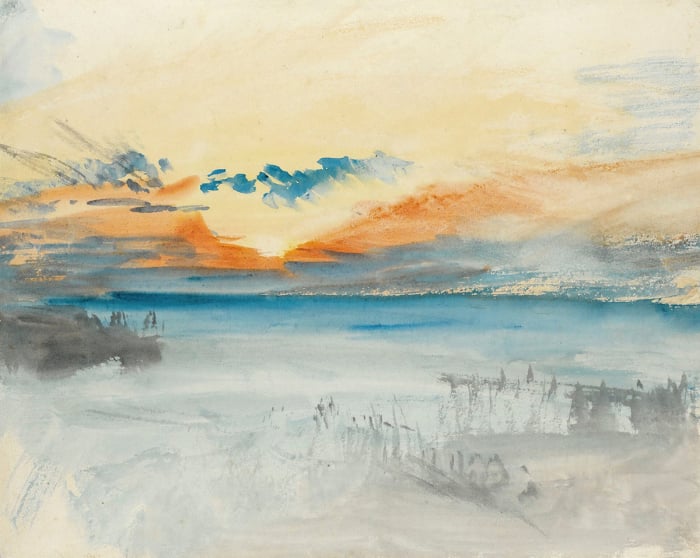
As some of you already know, I ventured on the Overland Track in Tasmania recently. The scenery there was stunning and of course I managed to take many reference photos to paint back in the studio.
I recently put the finishing touches on a painting based on the following reference photo. Here is a step-by-step landscape painting tutorial which will walk you through how I went about this painting.
- Analyzing The Reference Photo
- Preparing The Canvas And Sketching The Composition
- Start Painting The Sky And Water With A Dull Blue-Gray
- Block In The Rest Of The Canvas
- Consolidate Form And Color Harmony
- Finished Painting
- Close-Up Shots
- Additional Readings
- Want to Learn More?
- Thanks for Reading!

I’ll walk you through the entire process using one of my recent paintings. You’ll see how I go from idea all the way through to reflecting on the finished painting.

Analyzing The Reference Photo
I love all the dry yellows in this scene and the sense of depth with the mountains in the background. There was some slight cloud-cover so the light was defused. This kind of light is perfect for painting under, as it is not too strong, but strong enough to show all the colors. You will find that under the full strength of the sun on a clear day, the colors will all appear either tinted and washed out in the direct light, or lost into darkness in the shadows.
On first glance, there appears to be a gradual lightening of the scene as you go from the foreground into the background. But it is not actually a gradation in lightness (value), but color saturation. That is, the colors get duller (closer to gray) as you go from the foreground to the background.
This is demonstrated in the following grayscale image of the reference photo. Notice how the mountains in the background are basically the same value as the dominant values in the foreground.
This is why it is so important to understand the individual elements which make up a color. If you incorrectly identified the gradation in this reference as a gradation in value, then you would be making a serious error before you even place brush to canvas.

So the key to painting this scene is to keep all the values for the land within a very tight range, whilst gradually reducing the saturation as you go further into the distance. What appears to be a simple landscape scene at first glance, now appears to have some complex elements to it.
Preparing The Canvas And Sketching The Composition
I stain the canvas with burnt sienna, which is a perfect color to match the earth tones of the landscape. When staining the canvas, you should think about the overall color harmony of your painting. I used burnt sienna rather than raw umber in this case as this painting is in a generally high key and I do not need to hit those really dark values.

Start Painting The Sky And Water With A Dull Blue-Gray
The sky and water in this case are just light bluish-grays. As the water is pretty much just reflecting the color of the sky, I paint both these areas at the same time. However, I make the water about one value darker than the sky.

Block In The Rest Of The Canvas
The color harmony I want to achieve with this painting is a mix of warm yellows and dull purples and blues. I want the foreground to have the most saturated colors, then a gradual move towards dull purples and blues as you go towards the distance. But it is important that I keep all the values for the land within a narrow range.
I’m using a medium-sized filbert brush for most of the brushwork here. I save the smaller brushes for later in the painting.


Consolidate Form And Color Harmony
Here I just build on what is already on the canvas and consolidate the form and color harmony. A key thing I am trying to do here is either softening edges or making them harder. Edges are key to making all the elements in your painting work together.
If all your edges are too hard, then nothing will flow. If all your edges are too soft, then there will be no strong form or sense of emphasis.

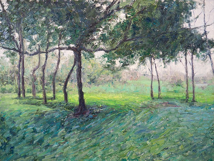
Finished Painting
Here is the finished painting. I like how it turned out.
On first glance, it is a subtle painting, but if you look closer you can see a complex arrangement of different tones and brush markings. I provide some close-up shots in the section below.
One thing I really wanted to achieve with this painting was to paint within a very narrow value range whilst having a gradation in color saturation (from more saturated colors in the foreground to less saturated colors in the background).

Below is a grayscale photo of the painting. As you can see, the land is all within a very narrow value range (ignoring any dark or light accents). This is surprisingly difficult to achieve and I suggest you try it for yourself.
Painting within a very narrow value range can produce a sophisticated harmony of colors at best, but at worst could appear flat and uninviting.

Close-Up Shots
I absolutely love the appearance of visible brushwork. For me, it is one of the key advantages that traditional painting has over digital art. Of course, you could imitate the brushwork in digital painting, but nothing comes close to the real thing.
Here are some close-ups of the painting which show the subtle brushwork and changes in tone.


Additional Readings
How To Mix Your Own Earth Tones
How To Choose The Perfect Reference Photo To Paint From
10 Landscape Painting Tips Perfect For Beginners
Oil Painting Tutorial For Beginners – Overcast Day In Bali
Painting Tutorial – Secrets On The Lake On A Bright, Sunny Day In Oils
Want to Learn More?
You might be interested in my Painting Academy course. I’ll walk you through the time-tested fundamentals of painting. It’s perfect for absolute beginner to intermediate painters.
Thanks for Reading!
I appreciate you taking the time to read this post and I hope you found it helpful. Feel free to share it with friends.
Happy painting!
Dan Scott

Draw Paint Academy


Great tutorials sir. I have a question sir, and is: in what practical way did you reduce the saturation of the colours in the distance. is it by adding little bit of black to it. Thanks
Very great tutor from which I have learned a lot and I will try to paint by following your points to improve my painting. Thanks a lot!
This is great, thank you for sharing.