
This is a detailed guide on painting within a compressed or narrow value range. Most of my paintings incorporate compressed values to some extent. It’s a simple but powerful concept. Learning it many years ago was one of those ‘a-ha’ moments that has stuck with me ever since.

What Does It Mean?
Painting within a compressed value range basically means keeping the value (lightness) of your colors fairly consistent whilst allowing for changes in hue and saturation. This is best understood by seeing it in action. Take the following landscape by Daniel Garber.
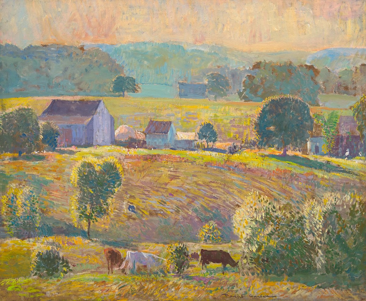
Notice all the different colors Garber used for the grass and ground. I can see yellows, reds, pinks, oranges, purples, greens, and blues. All these colors are compressed in terms of value (they have a similar level of lightness).
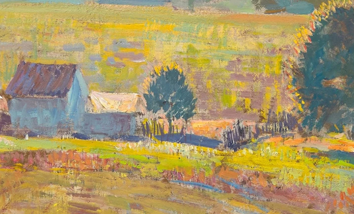
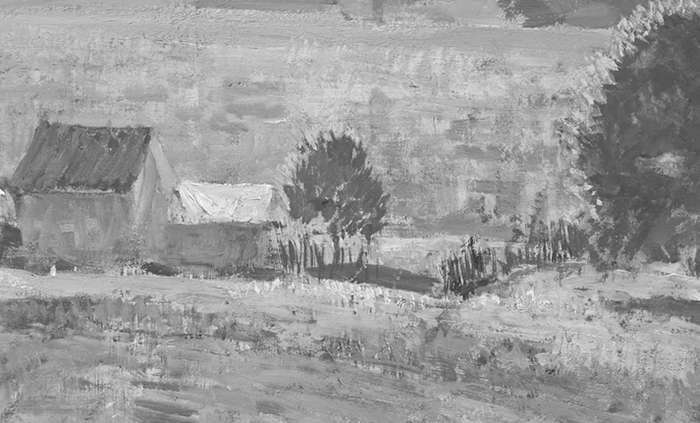
You can see what I mean in the grayscale below. The ground looks flatter and less varied with hue and saturation out of the equation. (That’s not to say there is no value contrast at all; it’s just limited.)
The same goes for the sky. Notice the subtle shifts in color and how this is not reflected in the grayscale.


By painting within these compressed value ranges, Garber kept the fundamental value structure simple and realistic. He then relied on changes in hue and saturation to inject life and flare into the painting. This is the main benefit of painting within a compressed value range. It allows you to add color variance via hue and saturation without compromising the fundamental value structure.
Here’s another example: a recent sunset I did based on O’Reilly’s Rainforest Retreat.

Look at all the color variance in the light areas. These colors are all within a compressed value range.


Effective Uses
Here are a few situations when you might find compressed values helpful, plus examples:
Painting open skies.
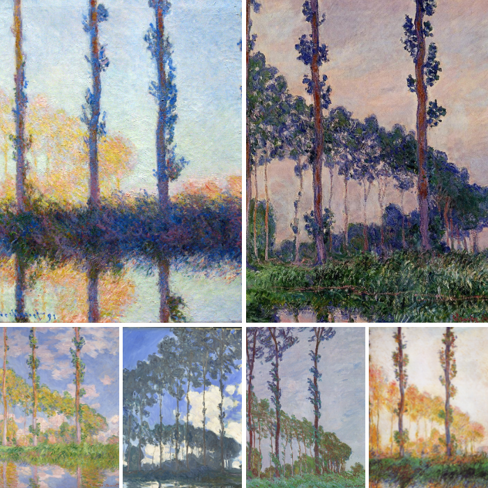
Open skies tend to be a bit bland by nature. You can inject some life and energy by compressing the values and varying the level of hue and saturation. For example, you could use different blue, green, and purple tones that are similar in value. This way, the open sky will still appear as an open sky, but there will be more complexity to it compared to just painting it a flat blue. Claude Monet did this in many of his landscapes.

Painting grass, plants, and leaves.
Use compressed values to simplify areas of grass, plants, and leaves into simple masses.


Painting background areas.
Use compressed values with hue and saturation contrast to create interesting yet understated backgrounds.

Painting shimmering water.
Use compressed values to convey a calm body of water while picking up all the dancing colors and reflections.


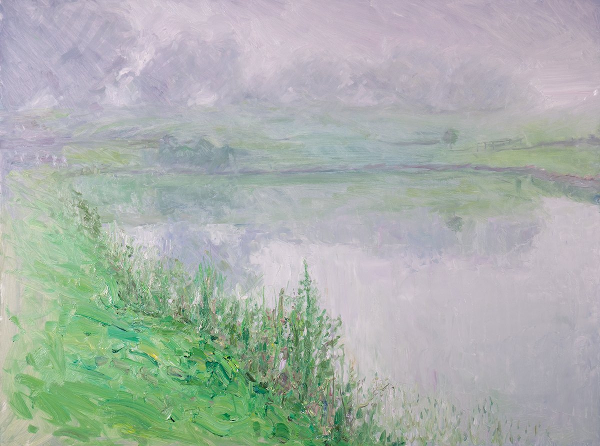
Painting foggy/misty scenes.
Use compressed values to push or exaggerate the effects of fog and mist. More compressed = more fog or mist.
Painting skin tones within the same plane of a face.
Use compressed values to pick up the subtle color shifts of the skin while staying true to the fundamental value structure.

To inject color variance in the shadows.
Use compressed values to add color to the shadows whilst keeping them strong and simple.

To convey atmospheric perspective (distant mountains and trees in a landscape).
Use compressed values to push areas back in perspective and make them appear more distant. More compressed = more distant.


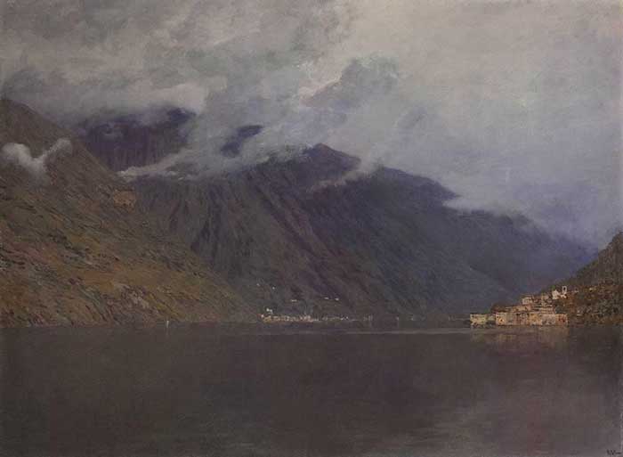
To push a dark or light theme.
Compress the values towards the light end of the value scale for a shimmering and high-key theme, like La Chula below. Or towards the dark end for a moody and ambiguous theme, like Lake Como.

Want to Learn More?
You might be interested in my Painting Academy course. I’ll walk you through the time-tested fundamentals of painting. It’s perfect for absolute beginner to intermediate painters.
Thanks for Reading!
I appreciate you taking the time to read this post and I hope you found it helpful. Feel free to share it with friends.
Happy painting!
Dan Scott

Draw Paint Academy


Dan, Your paintings are like dessert! The O’Reilly’s Rainforest Retreat is absolutely amazing in its depth and colors!! And, this explanation of compressed value is difficult for me to grasp, but with enough thought and practice, I think I’ll get it. Thank you so much for the detailed explanation. Soooo helpful! Excelente!! ~ jeannie from Mexico
Highly instructive. Really appreciate the clear explanations and beautiful examples. Thanks for your generous teaching!
Very well presented, Dan. Always some art tips to process here, encouraging to bring out my brushes once more; after some delays here. You are an example of good instruction; thanks Dan, from Calgary, Alberta
John
Yes! Very clear and inspiring, and the timing for me reading this couldn’t have been better – as I can now climb out of my rut. I need to print this out and stick it on my easel! Thank You!
Thank you, Dan. This post is so thought-provoking and clearly explained. I’m really excited to try implementing these ideas in my next painting!
A fascinating post Dan, with beautiful examples , your own included ,thank you so much.
Dan I fell in love with your painting American Mountains 2020, it was simply Beautiful, the rendering of the colours , shades of colour was just magnificent, I kept looking at it and finding one thing after another of amazing beauty in colour rendering How talened and blessed you are to see and feel and to be able to render it for it was a joy to view and view again and discover another aspect of beauty…. thank you so very much for sharing and enlighting ones mind , appreciate
One hears about this concept in various art talks and vaguely files it away as “OK, I think I get it,” but your well-thought out blog really unpacked it so well – the examples from masters were spot on and made me look at them with new appreciation! Thank you for caring so much about art and sharing your enthusiasm with us.
Can’t wait for the next post.
I’ve certainly been enlightened by this presentation Dan. I did not know the term compressed values before today. As usual I am so appreciative of your expertise.
Thank you so much, I look fiestd to your emails.
Rusty
Scott, what a great read, thank you, some beautiful examples.
GREAT post! A concept I never considered, but when illustrated, is so powerful. Thank you.
What exquisite you selected to highlight the subject matter. The painting of the girl in the meadow was particularly pleasing. But they were all joyful gifts to we lesser mortals Many, many thanks..
Long time reader of the newsletter, first time commenter. This post definitely wowed me!
Thank you, Dan, for this post! It explains clearly what I’ve been trying to figure out!
beautifully done. compact but complete presentation of the use of compressed values.
inclusion of notans solidifies the impact of the technique.
thank you so much.
Dan, this is excellent. My challenge remains, however, between understanding the difference between value, hue & saturation…
Brilliant! This should help me with a current problem in my landscapes. Thank you!
I knew the term, thought I understood, but you have illuminated the use and understanding of compressed values. Thank you
That is a fantastic post Dan. Your explanation of compressed values combined with the excellent examples has me inspired to try it in my next painting!
Me too, Marianne. I was thinking of just how I can increase interest in my current painting. Right now, it’s sorta Walmart! (Heaven forbid!!)
Thank you for this insight!! Highly useful and thought evoking.