
Harmony is a principle of art that refers to how well all the visual elements work together. Elements that are in harmony should have some kind of logical progression or relationship. It should just look like it works.
If there is an element that is not in harmony with the rest of the artwork, it should stick out and be jarring to look at; kind of like an off note in a song.
When I think of harmony, the first paintings which come to mind are Monet’s water lilies series:

Below are some more examples of harmony in art. I also cover:
- Harmony in Color
- Harmony in Shape
- Harmony in Value
- Harmony in Brushwork
- Harmony in Style
- Harmony in Subject
- Additional Resources
- Want to Learn More?
- Thanks for Reading!
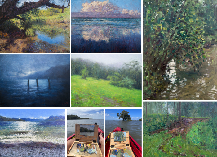
I’ll walk you through the entire process using one of my recent paintings. You’ll see how I go from idea all the way through to reflecting on the finished painting.

Harmony in Color
Harmony in color refers to paintings that utilize a fairly limited range of hues. For example, a painting that features mostly different tones of green or different tones of blue. Pablos Picasso’s The Old Guitarist is united by the dull, blue tones used in the painting. Even the orange guitar looks like it is bathed in soft, blue light.

Monet’s painting below demonstrates harmony in color with mostly greens and blues used. This is known as an analogous color scheme.
, 1899")
In John Singer Sargent’s Fisherwoman, notice the similar oranges and browns used for both the subject and the landscape. The subject’s dress almost blends in with the shore.

Harmony in Shape
Shape is a strong feature in most of Paul Cézanne’s work. The painting below from his Mont Sainte-Victoire series is united by the rigid, geometric shapes throughout the landscape.

Harmony in Value
Value is a powerful visual element that refers to how light or dark a color is. You can promote harmony in your painting by uniting colors that are under a tight or compressed value range. For example, a group of light colors has a certain harmony because they are all light. The same goes for a group of dark colors or colors within the middle-value range.
The two paintings by Monet below are in high key and utilize mostly light colors. Even though many different hues are used, there is a sense of harmony as most of the colors are in the light value range.


[Exercise] Place several different colors on your palette and observe the strong contrast between the colors. Then gradually add more white to each color. Notice how when more white is added, the more in harmony the colors appear to be.
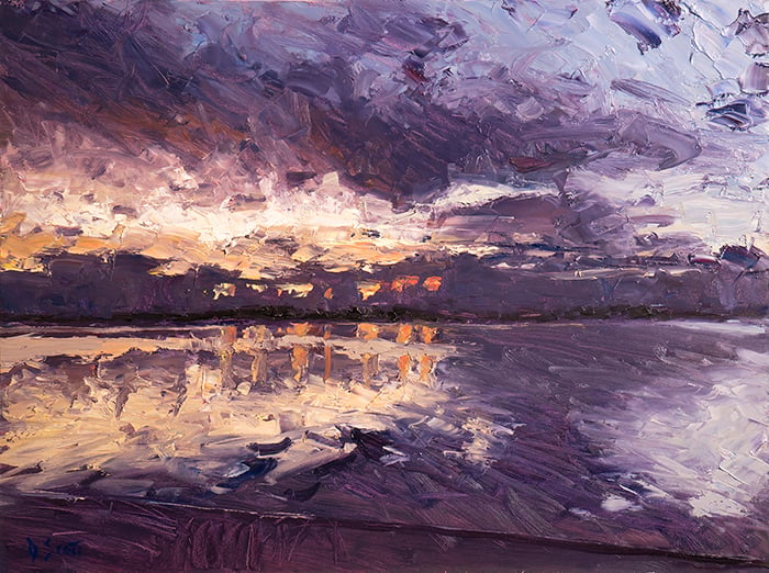
The painting below by Joaquín Sorolla, on the other hand, is united mostly under a dark value range, except the burst of light around the middle.

The painting in grayscale gives a better idea of how dark all the colors in shadow are.
")
Sargent’s Val d’Aosta features colors which are mostly around the middle-value range. There are no strong highlights or intense darks.

Harmony in Brushwork
Inconsistent brushwork is one of the most common reasons for a lack of harmony in paintings. Beginners tend to jump from tight brushwork to loose and rough brushwork without any logical progression.
The painting below by Sorolla features fairly loose brushwork throughout the whole painting which provides a strong sense of harmony. Even areas that are completely different are united by the loose brushwork, like the bright orange rocks and the deep blue ocean. It may have looked out of place had Sorolla carefully rendered the rocks whilst keeping the ocean loose and rough.

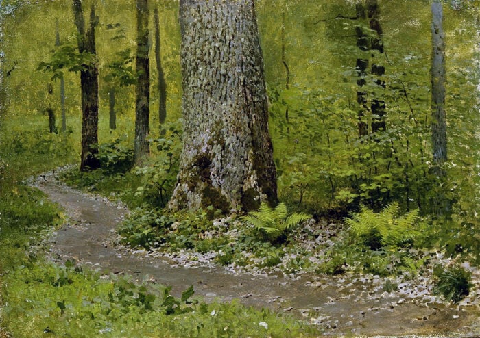
Moscow Courtyard, on the other hand, is united by the delicate and careful brushwork throughout the whole painting. Some areas are more simplified than others, but for the most part, the brushwork appears consistent.

Harmony in Style
When I think of harmony in style, Vincent van Gogh is first to come to mind. His paintings are characterized by bold strokes of exaggerated color.

Below is another example of harmony in style by Georges Seurat. He utilized a pointillism style, which involved painting small dabs of distinct color to depict form.

Harmony in Subject
Harmony in subject usually applies to busy scenes with vast numbers, like Pierre-Auguste Renoir‘s painting below. Umbrellas and other blue shapes take up so much of the painting that it creates a sense of harmony.

Monet’s water lilies series is another example; the vast number of water lilies creates a certain harmony throughout the painting.

Additional Resources
If you want to learn more about this topic, you should check out the other principles of art.
Want to Learn More?
You might be interested in my Painting Academy course. I’ll walk you through the time-tested fundamentals of painting. It’s perfect for absolute beginner to intermediate painters.
Thanks for Reading!
I appreciate you taking the time to read this post and I hope you found it helpful. Feel free to share it with friends.
Happy painting!
Dan Scott

Draw Paint Academy


Hi, would you be able to do something similar about discord in art and example work/ artists? Thank you!
This single article on harmony encapsulated so much that I need to know as a beginning artists. Very valuable, so much to remember too. Thank you.
thank you so much,now i can share it also to my sibling what I’ve learn about this art.
Thank you so much, I am very enjoying to see .
Love it.
Very very interesting and inspiring. Thank you for sharing
Thanks for an enjoyable and helpful tour though harmony!
Thank you very much for this article; I love the way you demonstrate each principle and as a serious hobbyist painter, I will be looking at my paintings from a much better perspective now and trying to make sure my work satisfies at least one or two of these ideas.
Your article Harmony in Art – with Master Painting Examples, is outstanding ,well written and nicely explained in lucid style.
Regards.
Great article Dan, there are so many things to keep in mind!!!
Thank you so very much for educating us as viewers. I truly appreciate being able to understand why great painting are masterpieces.
Sincerely,
Maure Albert
good evening sir. very informative. Thank you for the pieces of information.