
This post will be all about using an analogous color scheme to create beautifully harmonious paintings.

I will say first and foremost that a color scheme is not really that important. I rarely start a painting with a pre-determined color scheme in mind. The color scheme itself does not really create harmony, it is just a word used to describe colors that we think work well together. This is subjective and it changes from person to person.
The point is, color is not so simple that you can just apply a standard color scheme and all the colors will be in harmony. Unfortunately, painting is never that simple.
True color harmony relies on a complex interplay between all the colors in your painting. When mixing your colors, you should think of it as a beautiful dance as you move between all the different tints, shades, tones, temperatures and hues. Each color on your canvas needs to ‘fit in’ in order for your colors to appear harmonious, regardless of whether you have applied some kind of popular color scheme or not.
But, with that being said, there is a reason we put names on these arrangements of colors. People, in general, find them pleasing to look at. So it is important to understand the popular color schemes as it will help you better understand how we perceive color.
This post follows my previous post about a complementary color scheme.
- What Is an Analogous Color Scheme?
- Using Analogous Colors in a High Key
- Examples of Paintings That Use an Analogous Color Scheme
- Want to Learn More?
- Thanks for Reading!
What Is an Analogous Color Scheme?
An analogous color scheme utilizes colors that are close together on the color wheel. For example, blues, greens, and purples, or reds, oranges, and yellows.
These colors are considered to have a close relationship and when used next to each other could produce a pleasing harmony.

Using Analogous Colors in a High Key
An interesting thing about colors is that the harmony between colors seems to increase as they get lighter in value. This is because there is less contrast between colors in a high key.
When you combine an analogous color scheme with a high key, you can often produce a very pleasing harmony of colors.
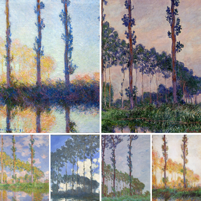
This can be demonstrated by Claude Monet’s paintings of water lilies. The first two paintings below utilize analogous colors and are in a middle to low key (the paintings are relatively dark). Take note of the color harmony.


Now compare those two paintings to the following two paintings which utilize similar analogous colors, but in a much higher key.

, 1906")
Which colors do you find to be more harmonious? Let me know in the comments.
You can read more about using a high key in this post.
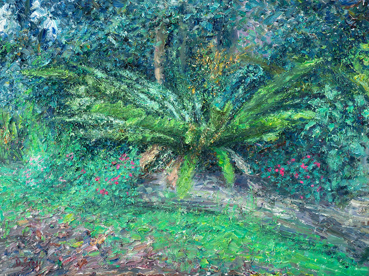
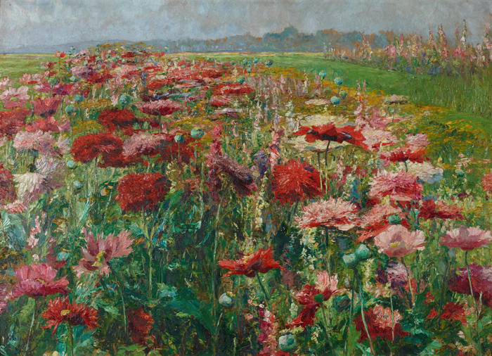
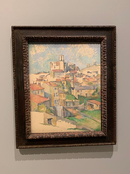
Examples of Paintings That Use an Analogous Color Scheme
Here are some paintings that utilize an analogous color scheme (or a mostly analogous color scheme):


Want to Learn More?
You might be interested in my Painting Academy course. I’ll walk you through the time-tested fundamentals of painting. It’s perfect for absolute beginner to intermediate painters.
Thanks for Reading!
I appreciate you taking the time to read this post and I hope you found it helpful. Feel free to share it with friends.
Happy painting!
Dan Scott

Draw Paint Academy


Brilliant. I’ve been searching for days to find something about color theory contextualised. This is the only site that actually has done this. Thank you
I love analogous colour schemes! Thank you for this article and the examples. Very helpful.
Thank you for clear explanations with plenty of examples. It is much appreciated
Thank you, I’ve always struggled with colour and you’ve helped to make it more understandable.
This is the post that led me to discover your site. I was searching for examples of analogous paintings. After reading this one and looking around at several others, I went back to the very beginning and started reading each one. It’s been like being enrolled in an art class. 🙂 Now I just have one “year” left to go.