
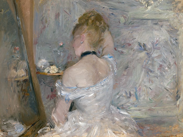
Let’s take a closer look at Woman at Her Toilette by Berthe Morisot. This is Impressionism at its best with fleeting brushwork and soft colors woven together in harmony. I’ll cover:
- Focal Point and Secondary Points of Interest
- Color Variance and Compressed Values
- Dark Accents, Soft Highlights, and Small Bursts of Color
- Linked Areas
- Straight Lines and Organic Shapes
- Design and Balance
- Contours and Outlines
- Key Takeaways
- Other Resources
- Want to Learn More?
- Thanks for Reading!
I’ll walk you through the entire process using one of my recent paintings. You’ll see how I go from idea all the way through to reflecting on the finished painting.

Focal Point and Secondary Points of Interest
The focal point is, of course, the woman at her toilette. She’s positioned in a prominent spot around the center of the painting. It’s not a typical portrait with the subject looking back at us. Rather, she’s looking off to the side at the mirror, unaware of our presence as the viewer. It’s more of a genre painting in this sense. Morisot and the other Impressionists often painted candid scenes of everyday life like this.
Her gaze creates an implied line, which is a line that doesn’t physically exist but is rather suggested or implied. This line leads our attention away from the woman and towards other key points of interest in the painting. We want to look where she’s looking. This weakens the focal point but strengthens the painting as a whole.
Tip: You don’t always need to smack the viewer over the head with the focal point. Sometimes, it’s better to restrain the focal point and spread attention between other points of interest.
The mirror is a secondary point of interest. It’s interesting how we don’t get a glimpse of the woman’s face in the mirror. Morisot cropped it out. Composition is a powerful tool in this sense. What you include and exclude can materially change the overall meaning and outcome of the painting.
Also, notice the positioning of Morisot’s signature in the bottom left-hand corner. It forms part of the scene as if the mirror is engraved. Vincent van Gogh also did this in a few of his paintings.

The other secondary point of interest is the shelf with flowers, a bowl, and a vase. See the closeup below. This is a tight cluster of detail, color, highlights, and dark accents. It acts as a bridge for our eyes between the woman and the mirror, leading our eyes from one area to the next. The nature of this area—intricate and delicate—matches that of the woman. The vase is a great demonstration of painting glass. The highlights, dark accents, and edges do most of the work in defining the glass.

Color Variance and Compressed Values
The painting features all kinds of soft colors woven together in harmony. Most of these colors are within a compressed value range, meaning they are similar in terms of lightness. See the grayscale below. Other than a few dark accents and highlights, all the colors are around mid to light gray. This simplifies the painting in terms of value, making it easier to comprehend and read. Morisot has taken the scene and all its “noise” and simplified it into this cohesive picture. That’s what artists do! We simplify the world around us into something beautiful and personal.
The compressed value range also gives the painting a soft and understated appearance. Compare it to one of Rembrandt’s dramatic interior paintings, with stygian blacks and brilliant highlights. Morisot’s painting won’t immediately command your attention when you walk into the room, but its subtle beauty will eventually catch your eye and pull you in its direction.

Below is a notan of the painting created using Photoshop. This is the most basic design of lights and darks. I use notan to reveal hidden patterns, strengths, or weaknesses in the value structure. In this case, the notan reveals a surprisingly strong design. Notice how we can make some sense of the scene even in this abstract state. Usually, painting within a compressed value range comes at the expense of the value structure. But Morisot did a good job capturing the subtle relationships between the light and dark grays. The notan also shows how important the dark accent is around her neck. It anchors the painting.

Dark Accents, Soft Highlights, and Small Bursts of Color
Dark accents, soft highlights, and small bursts of color give the painting clarity and meaning. In the closeup below, see how Morisot used dark accents to define the subject’s facial features, hair, and the major contour of her neck. These marks are sharp and efficient. They turn a haze of color into this elegant figure. They also trick our eyes into thinking the painting is more detailed and refined than it really is.
The highlights are soft. Look at the subject’s dress, her earring, and the glass vase. A kiss of light, nothing more. This plays well into the understated and elegant nature of the painting. Glaring highlights would overpower the painting.
The small bursts of color complete the painting. They don’t play a strong role, but the painting would look flat without them.

Linked Areas
This painting is a masterclass in linking different areas together using soft edges and common colors. Below is a closeup of the subject’s face. The soft edges allow the subject to melt into the surroundings. The edge of her nose hardly even exists. The only sign of it is a subtle color gradation from the pink skin tones to the muted background colors.


Below is a closeup of the woman’s dress. Notice the common colors between the dress and the background. Also, notice how the edge of the dress gets softer at the bottom, allowing the dress to melt into the surroundings. On a separate point, look how little pure white is used to paint this white dress. Not much. Pure white is only used for a few highlights around the edges. But the dress looks white because Morisot put the right colors in the right spots.

Straight Lines and Organic Shapes
There’s a pleasant contrast between the rigid, straight lines and the organic shapes. The straight lines represent the outline of the mirror, the edge of the room, and the ledge. The main organic shapes are the woman, the negative shapes created by her arms, and the flowers on the ledge.
The straight lines play an important role in making the rest of the scene appear more human. They also frame the side of the painting and add structure to an otherwise hazy scene.
Tip: Painting is all about contrast. If you want to accentuate the curves and gesture of the human form, frame it with rigid, geometric shapes and forms.

Design and Balance
Below is the painting with a three-by-three grid over the top created using my grid and grayscale tool. This helps us analyze the painting in terms of design and balance. Here are my key observations:
- The subject’s head is around the top horizontal grid line (1/3rd of the way down). The gridlines and particularly the intersections are considered to be aesthetically pleasing areas. You can use this knowledge to help position your focal point and other key points of interest.
- The ledge with the flowers, bowl, and vase is positioned around the left vertical grid line.
- The top of the vase meets the top left intersection.
- The right-hand side of the painting is quiet compared to the left. This quiet space gives our eyes a chance to rest. It also allows the left side to command most of our attention.
- Each segment is unique, even among the quiet segments.
I’m sure Morisot was not actively thinking about these things as she painted and I don’t recommend you do so either. These are just things to keep in the back of your head when you are composing your painting. Painting would get a bit dry if you only thought about it in terms of grids and design rules.

Contours and Outlines
At first glance, Morisot’s brushwork appears like a flurry of color. But if you look closely, you’ll see meaning in her strokes. Look at the subject’s back in particular. Morisot’s brushwork follows the broad contours up, down, and around. This is reiterated by the change in color for each change in plane. The planes get darker as they turn away from the light.
Note: Impressionism does not mean sloppy painting! You must still pay attention to fundamental details like anatomy, form, shape, contour lines, etc.

Key Takeaways
Here are some key takeaways from this post:
- A line of vision is a powerful implied line. It doesn’t physically exist, but it can pull attention toward certain areas in your painting. We want to look where other people are looking.
- You don’t always need to smack the viewer over the head with the focal point. Sometimes, less is more.
- When painting glass objects, focus on the highlights, dark accents, and edges rather than the object itself.
- Usually, painting within a compressed value range comes at the expense of the value structure. But Morisot did a good job capturing the subtle relationships between the light and dark grays. This is shown through the notan.
- Dark accents, highlights, and small bursts of color give clarity and meaning to the haze of color. These marks can be small but effective.
- You can use common colors and soft edges to link different areas together. This helps our eyes move through the painting.
- Painting is all about contrast. If you want to accentuate the curves and gesture of the human form, frame it with rigid, geometric shapes and forms.
- Impressionist brushwork can appear almost random at first glance. But look closely and you might find meaning and purpose behind each stroke.
Other Resources
Berthe Morisot – Fleeting Brushwork and Soft Colors
Édouard Manet – The Bridge Between Realism and Impressionism (Manet and Morisot were connected in many ways.)
Impressionist Art Movement – Masters Of Light And Color
Want to Learn More?
You might be interested in my Painting Academy course. I’ll walk you through the time-tested fundamentals of painting. It’s perfect for absolute beginner to intermediate painters.
Thanks for Reading!
I appreciate you taking the time to read this post and I hope you found it helpful. Feel free to share it with friends.
Happy painting!
Dan Scott

Draw Paint Academy


A very valuable critique. Adding Colour temperature to create dimension this artists painting is now one of my favourites. Thanks Dan.
Hi Dan. I loved this painting before I read your article. Having now read your fascinating analysis I appreciate the painting on a deeper level. Thank you for opening my eyes and mind to see more clearly.
Thanks for this wonderful analysis. Morisot sisters were phenomenal. Please analyse some works of Edma Morisot too. Thanks
Your analysis is always so helpful. Not a big fan of impressionist, I gain so much information from yours. I always look forward to reading them and learning. Tha
Gracias mil !
Su análisis me ayuda a ver tantas cosas que no había notado !!!
El placer de disfrutar una bella pintura aumenta y agradezco su sensibilidad y voluntad de compartir .
Se abren puertas que no sabía qué existían 🙏🙏🙏
I’ve always liked Morisot’s delicate and interesting brushwork and how she keeps to a high and narrow set of values – though I guess that is an impressionistic technique from a lot of them. This is a fine analysis, thanks very much.
Was most impressed with your analysis of this painting! Your explanation of her highlighting of the dress bringing the left side appear closer to the viewer and the gently darkening of the dress parts that were farther away makes a novice appreciate the understated skill of this impressive painter. Placing the picture in a grid enhances our learning as well. Excellent work, Dan! Your skill at helping us understand the skill of the painter is most appreciated. Thank you.
Joan Anderson
Thanks Dan, I find your commentaries so useful and can hear them as I paint.
Loved your analysis…. always comprehensive and well thought out… allows improved appreciation of the skill that goes into presenting an artistic piece..and gives insight into how to incorporate the same efforts into the works we all strive to paint!! Thanks Dan…
Wonderful analysis of this beautiful painting. Thank you.
I enjoy your informative posts. Helps me really ‘understand’ these wonderful artworks!
Thank you, Dan, for such a wonderful in-depth and completely absorbing tutorial which I shall keep to refer back to. Sandra Wilkes.
Thank you Dan for a very illuminating analysis of a subtle yet beautiful painting.
I did a copy of a painting by Berthe so she is near and dear to my heart. Thank you for this Scott.
Thank you for the guided tour of this lovely painting! Your painting tips are appreciated.
Can’t thank you enough for this article. I will definitely have to come back to the incredibly imp points which I need to apply. Wishing you a great weekend .
🙏🙏🙏
I found your information very interesting and enlightening. I don’t know much about Morisot but I really do love her work and Manet is one of my favourites.
A beautiful painting made even more so by your wonderful tutorial, thank you so much Dan.
Your commentary on paintings always have so much food for thought. They make me look at painting differently. Thanks so much.
Dan, Your honesty revealing an artist’s personality and work,
help to direct focus others to enjoy all aspects of their craft.
In other words….thanks….from a beginner.
I love all your Closer Looks but this was the best yet. An outstanding critique of an outstanding work of art. Bobbie Stearn
Your closer look articles are an inspiration and help me to think more about what I am painting and even what I want to paint. Thankful you cover so many important parts of the painting and the artist.
Thank you so much. This commentary is very helpful and interesting. You are so generous to share your knowledge of painting. This is more that I learned in art school!
That is the best explanation I have seen. Thank you
A lovely way to start the morning- this analysis and painting gave me joy.
Rich and stimulating article
Thank you so much
Most interesting, enjoyable and informative emails I get! What a gorgeous painting, thank you, again, for the analysis.
Thank you very much for doing these “Closer Look” articles. There is always something to learn about the paintings that you choose to highlight. My art instructor, who I hadn’t seen since the beginning of the pandemic, died recently. Today is his funeral and I will be hearing him- with his insights and knowledge and be very glad that I can now refer to your insights and knowledge as an echo. I often forwarded your articles to him and other students knowing that some would also find something worthwhile.
Excellent article! I really enjoyed the way you explained the details so that I have a better understanding of what makes this such a wonderful painting!
This was wonderful
This was great. I thoroughly enjoyed and learned from it. Thank you!
What an exquisite tutorial!
You summoned up perfectly, what I was thinking. I love reading Dan’s posts. He teaches us why we love art and helps us understand these incredible paintings. Thank you Dan 🙏🏼🙏🏼
Thanks for pointing out aspects in a painting that I for one would have overlooked . These comments are So helpful .
This was such an interesting article about this beautiful painting! Thank you.
I always learn so much as you take us through a painting.
Amazing!
I’m able to visit the Art Institute of Chicago several times a year, and this is one of my favorite paintings. You analysis was so clear, concise and instructive that I will enjoy it even more next time. I knew I loved it, now I have a better idea why!
Your “Closer Look” posts add a new dimension to my thinking about art, and also to my feeble attempts at creating it. If you had been teaching my art history classes in college, I’m sure I wouldn’t have slept through them – even at 8AM!
I agree!!!
Thank you. I really enjoyed your commentaries. Jean