I recently published a video walking you through my painting, Perth Gardens. You can watch it below. The painting took about four hours spread over several sessions. The video shows you some of the broad steps and decisions I made along the way.

If you don’t have time to watch the video, you can read the written version below.
I’ll walk you through the entire process using one of my recent paintings. You’ll see how I go from idea all the way through to reflecting on the finished painting.

Reference Photo
Below is the reference photo I painted from. I took this in Perth, Australia. I was there earlier in the year (2023) with my wife and daughter visiting old friends.

What I Used
Here’s what I used for this painting:
- Various brushes and palette knives.
- Ampersand gessoboard, 12 x 16 inches
- Paper towel
- French easel
- Glass New Wave Palette
- Odorless solvent
- Tablet (for viewing reference photos)
- Colors: Titanium white, raw umber, ultramarine blue, cobalt blue, viridian green, magenta, cadmium red, cadmium orange, yellow ochre, cadmium yellow, and cadmium yellow light.
Staining the Canvas
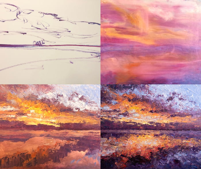
I start by staining the surface with transparent red oxide. This kills the white and provides a more balanced surface to paint on. The color of the stain doesn’t matter too much. I usually stick with browns and earth colors as they tend to provide a good middle ground to paint on, but I’ve also seen artists use bright cadmium red or ultramarine blue for the stain.
I then use paper towel to wipe away any excess paint and roughly map out the major shapes. I like to use this stage as an opportunity to warm up my hands and start feeling out the composition. I can’t make any mistakes here as I’m going to paint over all this anyway, so I may as well use that to my advantage.

First Strokes
I let the surface dry for an hour, then I begin working on the grass and ground. My main priority here is just to make a start and get these first few strokes out of the way. This builds momentum and each stroke that I make on the surface leaves hints as to what the next stroke might be. The last thing I want is to be stuck trying to make the perfect first stroke. I find it’s better to just get on with it and get those first few strokes over and done with.

As I paint, I’m always on the lookout for areas that have similar colors. That’s why you can see me jumping around painting different parts of the ground and grass rather than working on one area and then moving to an adjacent area. I do this mostly out of convenience. I already have this color on my brush and palette, so I may as well get the most out of it.
This approach also builds up a subtle color harmony between different areas. In the painting, I work my way into the darks and the rest of the land. I’m focused mostly on getting a strong foundation in place. Once I’ve done that, then I’ll worry about adding highlights and more intricate details.
I also prefer to work wet on wet, so I’m trying to get as much done as I possibly can, whilst the paint is still fresh and responsive. This means working fast and not getting caught up in the tiny details. It’s really important that I simplify the subject and tune out all the noise, especially with a subject like this where there’s a lot going on. Instead of seeing the subject as leaves, twigs, rocks, branches, highlights, and shadows, I look for basic shapes, forms, and colors.


Painting the Sky
Next, I start working on the sky. The sky plays a key role in the painting. It needs to pop and really play into the idea of a bright sunny day. This all comes down to contrast against the land and getting the saturation right. If I make the sky too light, it will appear timid and weak in terms of saturation, but if I make the sky too dark, there won’t be enough contrast. I need to get it just right. As for the color, I’m using cobalt blue plus titanium white. I also add a touch of ultramarine blue for the darker and richer parts of the sky. I’m fairly basic with my rendering of the clouds. All I’m really doing is working in a few strokes of titanium white amongst the blues.
The sky isn’t a focal point, so I can get away with being more abstract in my rendering. I’m also trying to stay within the overall style of the painting. It might look strange if I were to use careful and realistic brushwork for the sky and clouds and loose impressionistic brushwork for the land. The painting always needs to stand together as a whole. Notice how my strokes of titanium white are partially mixing with the blues. I’ve got no issue with this as pure titanium white may look a bit too strong and out of place. A lot of artists try to completely avoid mixing on the surface, but I find there’s nothing wrong with it as long as you can account for it and control it.

Working on Edges
I do a bit of work along the edge that separates the sky and land. I want the edge to be hard as this will add contrast and make the sky really pop. But I also want to weave the sky and land together to some extent. I do this through overlaps. I push the trees up in some areas and I pull the sky down in other areas, and I do this in a way that appears natural and organic. I don’t want the edge to be smooth and rigid. I want it to be broken and irregular as you would expect of trees and leaves.
With the sky now in place, I feel the contrast isn’t strong enough, so I go back to the land and make the shadows a touch darker. This will make the sky appear lighter by comparison. I start working on the highlights. Usually, I would leave the highlights until later in the painting process, but in this case, the highlights play such a foundational role that I need to add them in earlier. What I’m trying to convey with the highlights is light flickering and bouncing around the landscape. This is one thing the photo didn’t do a good job of capturing. It was much more of a vibration of light and color in person.


Highlights
For the highlights on the plants and the leaves, I use a round brush to add dabs of light greens and yellows. This roughly mimics the appearance of leaves and other details. It also allows me to build up texture and color variance. I focus mostly on making the color light enough to appear as a highlight but not so light that it appears out of place. I’m also paying close attention to the temperature. Some areas are a touch warmer in color temperature than others. I also start painting the pink flowers on the feature plant. I use mostly magenta and titanium white. For this, the flowers are a small but important detail of the painting. They add a level of complexity and interest. You might not notice them straight away, but they’ll eventually grab your attention.

I continue adding green highlights around the landscape. Again, I’m looking for areas that share similar colors so I can take full advantage of the green on my brush. There’s an interesting play between the warm and cool colors of the ground. The warm colors of the light, reds, oranges, yellows, and earth tones, which represent dirt, soil, rocks, and bark. The cool colors are all the different greens of the grass. It’s important that I pick up this play between warm and cool whilst painting within a compressed value range. The light colors of the ground all need to be around the same in terms of value or lightness. Otherwise, the ground would appear disjointed. I use multicolored strokes a lot here. To do this, I basically pick up a few different colors on my brush and leave them partially unmixed. Then I make a confident stroke on the surface. The subtle color variance plays into the idea of all the detail of the ground without me having to do that much work in the background. There’s a fair bit going on.
Focus on Shapes, Forms and Colors
If we zoom in on the reference photo, we can see several trees, plants, a park bench, patches of grass and dirt, and all kinds of patterns, shapes, and colors. When I paint these areas, I want to convey all these details. Without drawing too much attention to this area, I need to be quite vague and abstract in how I describe these things. As I did at the start of the painting, I focused mostly on painting the basic shapes, forms, and colors. So instead of painting a park bench, I focus on painting the dark shapes, forms, and colors that make up the park bench. I spend the rest of the painting tinkering, adjusting colors and edges, and trying to make everything work together as a whole. This can be quite a time-consuming process, even though it might only be the last 10% of the painting. One of the reasons for this is that when I change one area, that also changes the relationships it has with all the other areas in the painting. So one stroke might have a domino effect. Every time I make a change, I need to reassess all the relationships and see if any other changes are required. As part of this, I need to constantly step back from the painting and judge it as a whole. Otherwise, I might end up tunnel-visioning the tiny details.
I also try to constantly remind myself why I wanted to paint the subject in the first place. What was the big idea behind the painting and what was it about the subject that first caught my eye? I need to stay true to these ideas throughout the entire painting and make sure I don’t lose them along the way. In this case, it’s the flickering highlights and the sense of the bright midday sun that I want to capture.

Adjusting the Feature Plant
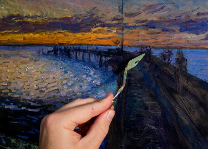
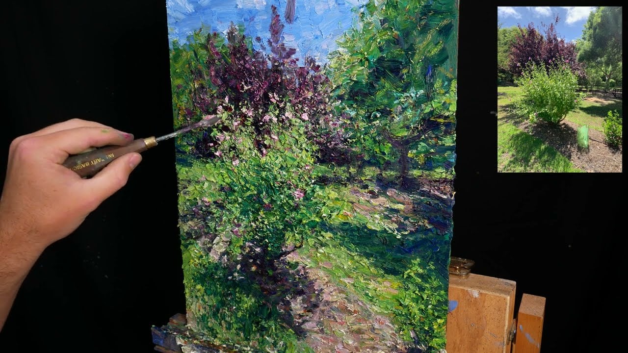
On that note, I realize around here that the feature plant just isn’t bright enough and doesn’t pack enough punch, so I go over the top with more highlights. It’s risky to make such a significant change this late in the painting, but I feel it’s a risk worth taking. The painting is almost finished. All that’s left to do is add a few tiny details here and there. I do this with the pallet knife. I want these finishing touches to be clean and sharp, and the pallet knife is really good at this. With brushes, it’s hard to avoid the colors mixing. I also like the contrast between brush strokes and pallet knife strokes, so I weave them together whenever I can.


Sign the Painting Complete
Once I’m happy with the painting and I see no more opportunities to improve on it, I sign it complete in the bottom right-hand corner using magenta, a small round brush, and a relaxed touch. Magenta contrasts nicely against the greens and the bottom right-hand corner seems to be like the right spot in terms of overall balance and design.
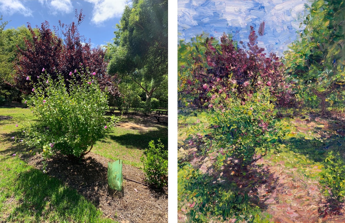
Here’s the finished painting alongside the reference photo. Keep in mind, my goal is never to copy the reference photo detail by detail, so there are some discrepancies. What I’m most interested in is creating a painting that’s interesting and conveys my ideas and experience with the subject.
I’m happy with how it turned out. I can look at this painting and be reminded of that day in Perth with Chontele and Elora. It wasn’t an easy subject to paint with all the noise and detail and how the different parts weave in and out of focus, I had to really simplify in order to make sense of it all.
Thanks for Reading!
I appreciate you taking the time to read this post. Feel free to share with friends. If you have any thoughts or questions, feel free to add them to the comment section below. If you ever want to learn more, start with my fundamentals course.
Happy painting!

Dan Scott