
Simplification in art involves taking the complex details which we see all around us and simplifying it into a story, or a work of art. With every painting I create, I look for different ways to simplify what I am trying to say.
In this post, I discuss some of the different ways you can simplify your paintings.
- The Colors on Your Palette
- The Number of Brush Strokes You Make
- The Value Structure
- The Brushes You Use
- The Level of Detail
- Want to Learn More?
- Thanks for Reading!
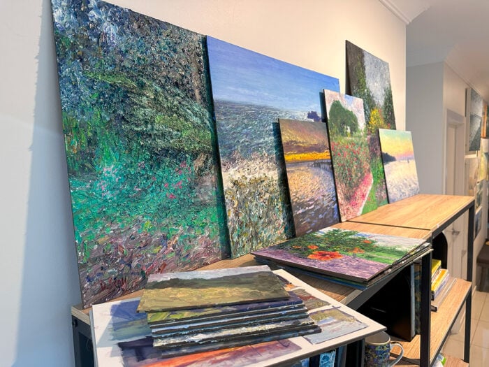
I’ll walk you through the entire process using one of my recent paintings. You’ll see how I go from idea all the way through to reflecting on the finished painting.

The Colors on Your Palette
Your color palette is the first place you should look if you want to simplify your paintings. The more colors you have on your palette, the more complicated it is to manage. Every additional color on your palette introduces a vast range of color mixing opportunities. In the right hands, this may be an advantage, but in most cases it is not worth the added complexity.
Painting with just a few colors on your palette is usually referred to as a “limited palette”. When I think of a limited palette, I think of Anders Zorn who was known to frequently paint with just cadmium red, yellow ochre, ivory black and titanium white (also known as the “Zorn palette“).

I recommend most beginners start with a very limited palette then expand from there if needed. This will force you to learn how to actually use and manipulate your colors. Knowing how to use color is far more important than the colors you have on your palette.
A good limited palette to start with comprises of red, yellow, blue (the primary colors), an earth color like raw umber and white. This will allow you to mix most of the colors you will need for your painting.
I suggest you take a look at the colors you have on your palette when you are creating your next painting and think about if all the colors are actually necessary. Do you really need three different types of green? Or that vivid orange?
The Number of Brush Strokes You Make
You should treat every stroke as an important step in your painting. If you are not sure about what to do with your next stroke, try to avoid mindlessly applying paint to the canvas until it works out (or until you end up with a muddy mess on the canvas).
Many of Russian artists demonstrate some remarkably efficient brushwork. It always amazes me the amount of information they are able to depict with just a single stroke of their brush.

Bato Dugarzhapov is another Russian artist who is worth checking out in terms of brushwork. He is one of those artists who just seem to see things differently.
The Value Structure
If you look around right now, you will see all kinds of values from light to dark. These values are probably not well organized.
For example, take the following photo which I took whilst running the other day. As you can see, there are light, dark and middle values scattered all over the place. If you were to try to paint this scene, part of your job as an artist would be to simplify these values into a more organized structure.

If I were painting this scene, one option I would consider to simplify the values would be to break the scene into a dark area and a light area, as shown below. The dark area is on the left in shadow and the light area is on the right. Within each of these areas, I would keep the value range very tight and would rely more on saturation and hue contrast to create interest. This would be an extreme form of simplification.

A less extreme form of simplification would be to break the scene down into smaller segments which share similar value ranges, as shown below.

The painting below by James Whistler is a perfect example of a neat value arrangement. Notice how the black dress, the chair and the black part of the wall seem to form a single object.

Note: If you ever do studies of master paintings, be aware that the artist has already simplified the subject. If you were painting that same subject from life, it would be up to you to simply the subject.
The Brushes You Use
My partner commented the other day on my painting process that I do not seem to change my brush all that much. I guess she figured that I use a different brush for every different circumstance – a fan brush for the leaves, a flat brush for the trunk of a tree or a clean brush for every new color I mix.
But I find that the brush type does not matter all that much. What is more important is how well you handle it. I rarely use more than a handful of brushes for a single painting since the majority of brushwork can be done with a few filberts and flats. These are my “workhorse” brushes.
As you become comfortable with all your brushes, it becomes less necessary to change between them. You will find that one type of brush can make similar markings to other types depending on how you use it. For example, if you turn a round brush on its side, it makes a similar mark to a filbert brush. If you use the thin edge of a filbert or flat brush, it makes a similar mark to a round brush. If you push down with a round brush, it makes thick marks like a filbert or flat brush.
This is not to say the type of brush you use is not important. Of course it is. But it is not as important as many people make it out to be.
When you are creating your next painting, consider if you are using too many brushes. Do you really need two different fan brushes (or a fan brush at all)? Do you need five small round brushes?
By all means, keep the brushes around, but try to limit the number of brushes you use during a painting. This will simplify your brushwork and your decision-making process.
In my seascape painting below, I used large filberts and flats for the whole painting, except for those small highlights on the water and the boats which I painted with a fine round brush.

The Level of Detail
A great artist knows what to say, but also what not to say. Knowing what not to say is harder than it sounds. Our default response in painting when we are not sure what to do, is to paint everything!
When creating your next painting, consider exactly what you are trying to say and what details are important. Then simplify the rest.
If you have mountains in the background which are not the focus of the painting, simplify them. If clouds are not the focus of your landscape, simplify them. Those rocks in the foreground, simplify them.
Also, don’t forget you can crop out parts of a subject entirely. If an area is not adding any value to the composition, then consider cropping the frame so that it is not included.
In the painting below by Ilya Repin, notice how little detail is actually used. The trees seem to be nothing more than a few dark lines on top of a green block of color. The male subject is just a few dabs of black and gray. But you know exactly what the painting is about. That is the power of context.

In the beautiful painting below by Childe Hassam, take a close look at the buildings. Notice how they appear to be relatively primitive, yet when looking at the painting as a whole they appear incredibly realistic.
If Hassam had painted the buildings with perfect accuracy and intricate detail, they would probably look out of place in the context of the painting. Always remember that you need to make your painting work as a whole. You want a beautiful painting, not beautiful parts.
Want to Learn More?
You might be interested in my Painting Academy course. I’ll walk you through the time-tested fundamentals of painting. It’s perfect for absolute beginner to intermediate painters.
Thanks for Reading!
I appreciate you taking the time to read this post and I hope you found it helpful. Feel free to share it with friends.
Happy painting!
Dan Scott

Draw Paint Academy


Thank you, Dan, for this very informative blog. The information you shared is exactly what I needed. I often find myself using too many colors on my palette, overworking the canvas with excessive brushstrokes, and buying far more brushes than necessary—then using them simply because they’re there. Most of all, I struggle with overthinking when I should be simplifying. This post was a great reminder and very helpful.
Hi Dan, I would just like that to say that I believe you deserve a medal or some other commendation for the manner in which you dispense such valuable information and instruction completely free of charge. In the short while that I have been receiving your posts I have learnt so much about so many different aspects of painting that I wish I had discovered you sooner. Thank-you again and again thank-you.
Thank you so much. This is very helpful.
Dan I am so enjoying and appreciating your blogs, tools, and encouragement. I have completed a great Fine Art Program, having had very little art instruction and am now practicing…and your program has been my new instructor. Thank you!
Your articles are very useful for me: simple, direct and clear. I’ve been reading and analysing them, and it is a huge help for my development as an artist. Thank you so much!
Hi. I’m Ben.
I want to first thank you for this article.second, I want to ask about colour. you said one should break the scene down into smaller segments which share similar value ranges. after I’ve done that, should I mix one colour for an entire segment, and just vary that colour roughly according to the different colours I see in that segment in nature?
You have a gift for expressing the complex in a simple, understandable way. Thank you for sharing your gift of writing about art in the form of these lessons.
Hey Dan,
Am just a beginner in acrylic painting and struggling to know about the RIGHT mixing of paints.
I want to use less colors but am afraid what if I couldn’t mix the color in right proportion (again) to complete my painting! And that how much color should I mix to complete my painting.
The other problem am facing is that the acrylic colors dry very fast once out of the tube.
Still, I would really appreciate this article which at least clears that we should concentrate on the subject and painting should look good in toto..
Thanks,
Tarun
I look forward to your articles. They are more than articles. They are outstanding teachings. I value them very much and save as many as I can.
Thank you.
Yet another fabulous read.
Thank you again Dan.
Thanks for all your articles and information. I even read the replys and appreciate your support of your followers.
Thanks Cora! That is nice to hear. Dan
Thank you for your time and sharing your expertise.
My pleasure Violet! Happy to help. Thanks, Dan
Thanks !Den . I hope you must have seen my water color painting . As per your advise by simplification article I shall follow it . I request you please remark the mistakes for my improvement in painting.
Hi Harsha, yes I saw it. I will email you about it later when I am back in the studio. Thanks! Dan
Hey Dan! I am so eager to really learn how to use simplification in my paintings. I have always over-reached and my paintings seem very immature. I deeply appreciate what you posted and am going to give it another try, albeit nervous.
Thank you so much.
That’s great Leslie. Feel free to email me with how you go, Dan
Really an important lesson,when I was in school my critiques always had” too much detail” I drew well,painted well,and color came easy..but composition was crucial and the simplification. My joy returned!
Glad to hear this Kathleen! Thanks, Dan
This was very helpful to me. Thanks a million.
No problem at all, glad you found the post helpful. Dan
Thank you, I learnt a great deal!!
Great to hear Sher! Dan
Your own paintings are really great art pieces. Thank you for all your advice and tips. Happy painting!
Thanks Elsa, appreciate your kind words! Dan
what i want to say in my painting…what to include…and what not…it is the real question. thank you so much Dan for your way to talk about it/
No problem. Dan
Thank you. Always need to be reminded about simplification and the many ways to achieve it. I love your no nonsense way of writing about art.
Thanks Linda, I agree! Dan
Thank you so much. I get more training from your posts than any ones else. I even signed up for the on line school. I appreciate the time it takes for you to put out such quality posts and art!
No problem at all, I am just happy to be helping! Thanks, Dan.
Hi Dan,enjoyed what you had to say on
making your paintings simple, also love paintings with
perspective part. The Balcony in the Crimea, as it takes
your eye to the water, which I love painting!
Also I usually put a black cat somewhere in my paintings!
Thanks Judy! Dan
Hi Dan, This post is very helpful as I am continually painting too much detail, even in the distant mountains. I just sent you thumbnails of a dull landscape and when I look at the color version it is too tightly done. I do reread your blog on this – painting more loosely, etc….I just have to keep at it but taking your courses has helped me for sure.
Great to hear Joan, happy to be helping you! Thanks, Dan
Absolutely and thank you for making painting more fun again like when we were kids just doing our own thing-painting what we wanted to paint. And before we cared what others thought of our joy in art not work. I feel inspired to paint again and this time not so concerned with immediate details. Less is more,Amen!
This post has opened my eyes to a new part of the painting proces that i want to master! Thank you so much for explaining that. I have recently started to paint freer and looser and am thouroughly enjoying it.
Without being so much aware of my ‘own style’ of painting, I have been asked by different people if i am maybe a descendant of van Gogh (being a Dutchie) or they say i paint like vanGogh and other times it’s more Monet, less colourful with those small dabbing strokes.
Only been experimenting so far, but fun in doing it!
That’s awesome Trudy, keep up the good work! Thanks, Dan
Well written article. I read about this subject matter all the time but your article makes it easy to understand and the paintings are perfect examples. Thank you Scott.
Thanks Jamela, great to hear! Dan
Thank you. Enjoyed the reading.
That’s great Herbert! Dan
A quick question about brush choice – when you say large filberts and flats were used, what is the size of the painting?
Hi Theresa.
I am talking about the brush sizes in a relative sense. So for larger paintings, I would use very large brushes but for smaller paintings, I would use more medium sized brushes. Thanks, Dan
loved the info., very helpful as I am always experimenting with color, design etc. never duplicate a painting
Good to hear Shirley! Thanks, Dan
I feel the same way about using another painting as more of an influence than a copy. Id like to add,if you are also a left handed painter who watches a lot of painting videos and you struggle usually following a right handed painter-try this- prop your iPad or cell phone facing a mirror and watch the video from the mirror. The painter instantly becomes a lefty! I was struggling til l tried this way and l am constantly amazed how much easier it is to follow techniques.
Thank you
I am just starting my painting classes and would like to learn every aspect. So far I think I paint to fast
Thanks Mabel! Dan
Thank you for the great information on simplification. I usually want to make things to detailed and it doesn’t always work. I think I will see things differently now, and relax more.
Sounds good Magda. Dan
Always a struggle for me-how much detail to include. This post helped me think through that process. Thanks, Dan.
Happy to have helped you Linda! Dan
Great post, Dan! I always used these points to get students to “learn how to see.” Especially cropping the composition (especially when using photos), simplifying, and limiting their palette. Things I have used for most of my 45+ years of painting.
Good work James! Thanks, Dan
Kitty gillane simply the best to Dan kt
Thanks it’s very simple and showed you how I can improve the process of painting
Great to hear Varda! Thanks, Dan
…..Thank You Dan, as All Ways You make Very Good sense……….I Have Struggled with this LONG. Trained to Paint Tight……………..But All along wanting a Sargent or Munnings …….tight or more loose,are both Wonderful,of course if done well…………………At this stage in the game, I want to free myself up……………………Thank You for Your Words…….Hope..
No problem at all, happy to help! Dan