
A few days ago, I published a timelapse of my O’Reilly’s Sunset painting (below). I thought it would be helpful to provide more information on how this painting came together and the lessons learned.

Timelapse Video
In case you missed it, here’s the timelapse video of the painting process:

Reference Photo
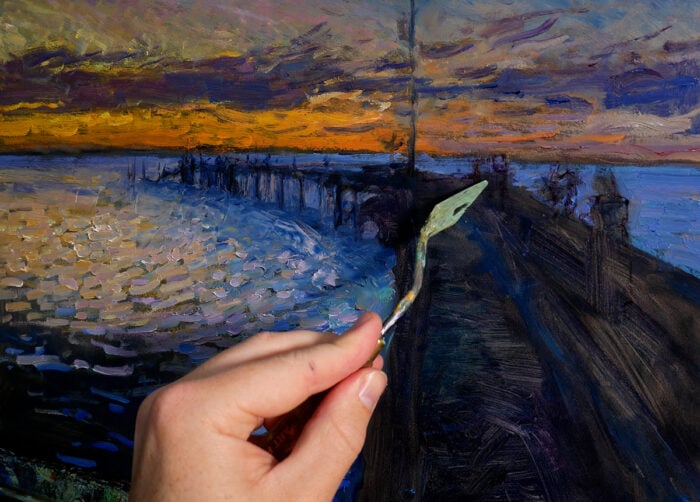
Below is the reference photo I painted from. I took it from the balcony at the O’Reilly’s Rainforest Retreat in Queensland, Australia, just after the sun fell below the mountains and clouds. The colors were more striking in person, but this photo captures the idea alright. Feel free to paint it yourself. You can also download a high-resolution version of the photo here.

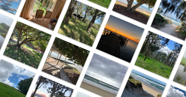
Get access to my entire reference photo library. Over 2,400 beautiful reference photos for you to paint from!
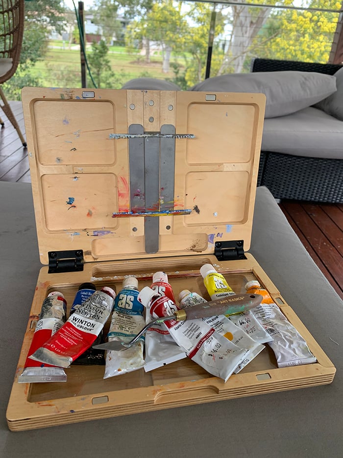
What I Used
- Brushes, palette knives, and oil paints.
- Surface: Ampersand gessoboard, 12 by 12 inches.
- Main colors: Ultramarine blue, cobalt blue, cadmium red, magenta, alizarin crimson, cadmium orange, cadmium yellow, cadmium yellow deep, cadmium yellow light, viridian green, transparent brown oxide, and titanium white.
Refer to my supplies list for more details about what I typically use.
General Notes and Lessons Learned
- I did a lot of back and forth with this painting in search of the idea. It certainly wasn’t a smooth painting process.
- At one point, I deemed this painting a failure as I could no longer see the finish line. But after a week-long break, I returned and was able to see it through to a passable finish. Far from perfect, but passable. It’s one of those paintings in which I can see the pain and frustration that I experienced, so I may see it differently from you. Ideally, I want the finished painting to look effortless, even if it wasn’t. The more you go back and forth, the harder it becomes to fake that effortless finish. This painting is a good reminder not to be too hasty to call it quits on a painting. Sometimes, it’s not going as poorly as you think.
- I started with brushes but found the palette knife to be a more effective tool for this subject, given its advantage in creating crisp strokes, distinct colors, and hard edges.
- I usually paint on surfaces with portrait or landscape dimensions, but I thought I would mix it up this time with a square, 12 by 12-inch gessoboard.
- My general strategy for this painting was to cover the surface with dark color, then go over the top and carve out the light areas. And by carving out the light areas, I would define and articulate the dark areas. This is an efficient approach for subjects with distinct light and dark areas.
Progress Shots
Step 1: Establish a dark foundation.
I cover the surface with dark color, mostly ultramarine blue. I loosely define the clouds and the trees in the foreground, but nothing more than that.

Step 2: Carve out the lights.
I mostly use a palette knife for the rest of the painting. I push the color variance in the light areas.

I’m fairly conservative with the lights. I start with more light-mid tones to set the stage.

Step 3: Consolidate and add more body to the clouds.
The clouds were looking a bit weak and timid, so I went over the top with stronger colors and strokes. In hindsight, I should have just left the clouds as they were and played into that weak and timid appearance. But hindsight is 20-20!

Step 4: Push the lights and saturated colors.
With the surface covered, it’s time to commit more to the light and saturated colors. I’m more careful with my strokes here, particularly around the edge of the feature cloud.

You can see I’m starting to use multicolored strokes to inject a bit of life and energy into the light areas.

Step 5: Experiment with different approaches for the feature cloud.
A lot of the back and forth in this painting had to do with the feature cloud. I couldn’t settle on an appearance and style. I would build it up with thick, impasto strokes, then scrape it down again.


Step 6: Continue to push the colors.
A key idea of this painting is light. So those colors need to really “pop.”

Step 7: Add the feature tree.
The feature tree shooting up across the sky plays an important role. It ties the land and sky together and acts as a point of contrast for the surrounding light and saturated colors. This was a tricky area as I had to paint in a way that my strokes didn’t mix with the colors already on the surface. I also had to use the palette knife with a touch of finesse so that the tree didn’t come off as being too brash.

Step 8: Refining touches and make sure all the parts work together as a whole. Also, continue experimenting with different finishes and styles for the feature cloud.
It was during this experimentation that I spat the dummy and put the painting aside as a failure, not expecting to return to it. It doesn’t look that bad, but for whatever reason, the vision I had in my head was not matching with what I had on the surface. I should have just committed to one approach rather than chopping and changing so much. But lesson learned for next time!


Step 9: Return to the painting after a week-long break and bring it to a passable finish. Sign in the bottom right-hand corner.
I’m not entirely satisfied, but it’s good enough! Now, onto the next one.
Want to Learn More?
We just wrapped up the Sunrises and Sunsets Workshop. Over 350 students went through and we have over 40 fantastic student examples on display, with more to come. We will open it up for public enrollment soon. Register your interest here to be notified.
Thanks for Reading!
I appreciate you taking the time to read this post. Feel free to share with friends.
Happy painting!

Dan Scott

