
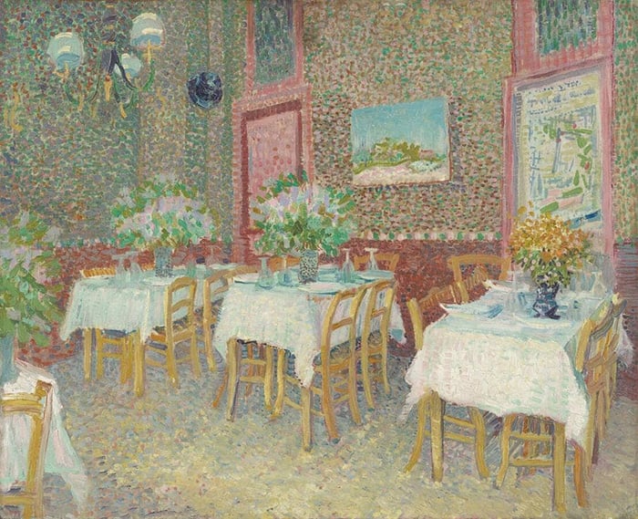
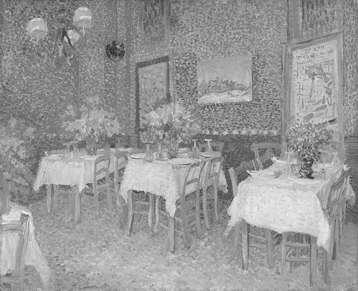
I was introduced to a new painting by Vincent van Gogh the other day, Interior of a Restaurant. I’m surprised that I’m still seeing van Gogh paintings for the first time, especially considering I’ve been writing about art for over seven years now. He may have lived a relatively short and turbulent life, but it sure was a prolific one. Let’s take a closer look at the painting.
- Key Details
- Intimate Composition
- Pointillism
- Compressed Values and Dark Accents
- Other Readings
- Want to Learn More?
- Thanks for Reading!
I’ll walk you through the entire process using one of my recent paintings. You’ll see how I go from idea all the way through to reflecting on the finished painting.

Key Details
- Medium: Oil on Canvas
- Size: 18 x 22 in (45.5 x 56 cm)
- Completed: 1887
- Current Location: Kröller-Müller Museum, Netherlands
Intimate Composition
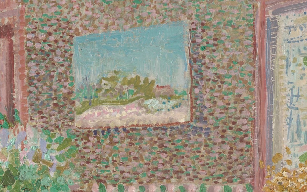
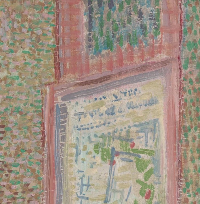
It’s an intimate and tight composition, with no windows or open doors. It feels like we are right there in the restaurant. This was one of van Gogh’s greatest strengths—being able to capture and convey the subject’s true essence. The only break we get from the confines of the room is through a painting on the wall depicting open sky and land.
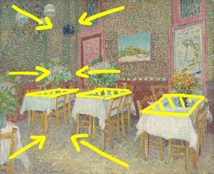
The rigid settings push a sense of linear perspective. As the viewer, we stand at an angle to the walls and the corner of the room is off-center in our line of vision. This results in all these diagonal lines that gently converge toward each other as they get further away. The tables also appear to flatten out as you go from right to left. Consider what the painting would look like had van Gogh painted directly in front of one of the walls. Flat and static I imagine.
Tip: The perspective and vantage point from which you convey the subject can greatly influence the overall composition.
As I was doing the above draw-over, I noticed several oddities in terms of perspective. For example, the painting appears slightly too flat in perspective compared to the rest of the wall. These slight oddities also play into the nature and charm of van Gogh’s work. It’s imperfect by design, as is life. And whilst van Gogh was not a stickler for precision, he did do enough to make it believable.
Below is the painting with a three-by-three grid over the top. This shows us how the painting is arranged in terms of the rule of thirds. The idea is that the gridlines and intersections are naturally aesthetic positions in a painting with mathematical foundations. See how the dimensions of the room roughly align with the left vertical and bottom horizontal grid lines and how each segment is unique.
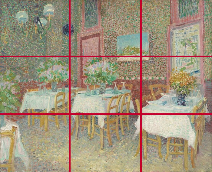
There’s an interesting sense of diagonal balance between the top left and bottom right corners. The top left is further and quieter.
Pointillism
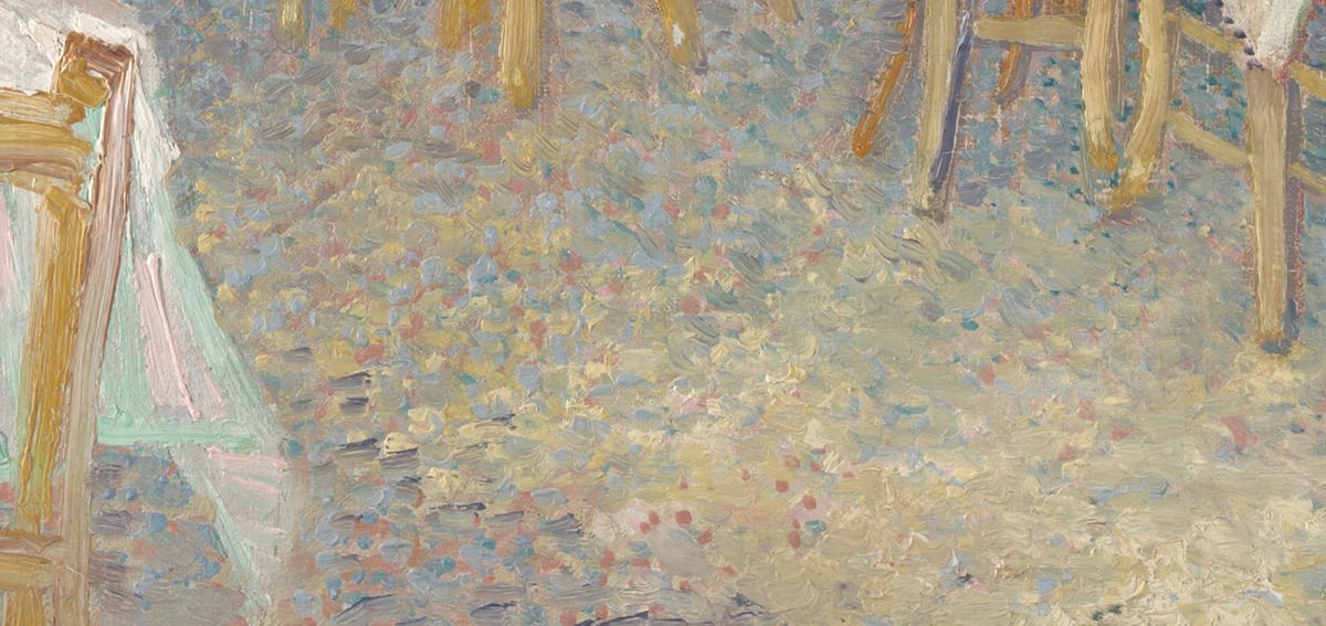
Van Gogh made good use of pointillism for the walls, floor, and flowers. Instead of blending the colors together, he painted distinct dabs of color in varying combinations. The result is a vibration of color that optically blends together.
It’s a particularly effective technique for injecting life and activity into otherwise bland areas. The downside is it comes at the expense of intricate drawing and rendering (you cannot hope to paint with the fine rendering of John Singer Sargent whilst painting with small dabs of color).
In the close-up below, notice how van Gogh suggests changes in the wall through changes in color. The more dramatic the change in color, the more dramatic the change in subject or environment.
The effect is more subtle with low-contrast colors. See parts of the tablecloths and how it’s hard to distinguish between the dabs of light green, yellow, and white. It also seems like van Gogh uses a different technique here. Instead of building up layers of distinct dabs, it looks like he painted a layer of white and then painted dabs of color over the top in the wet paint.
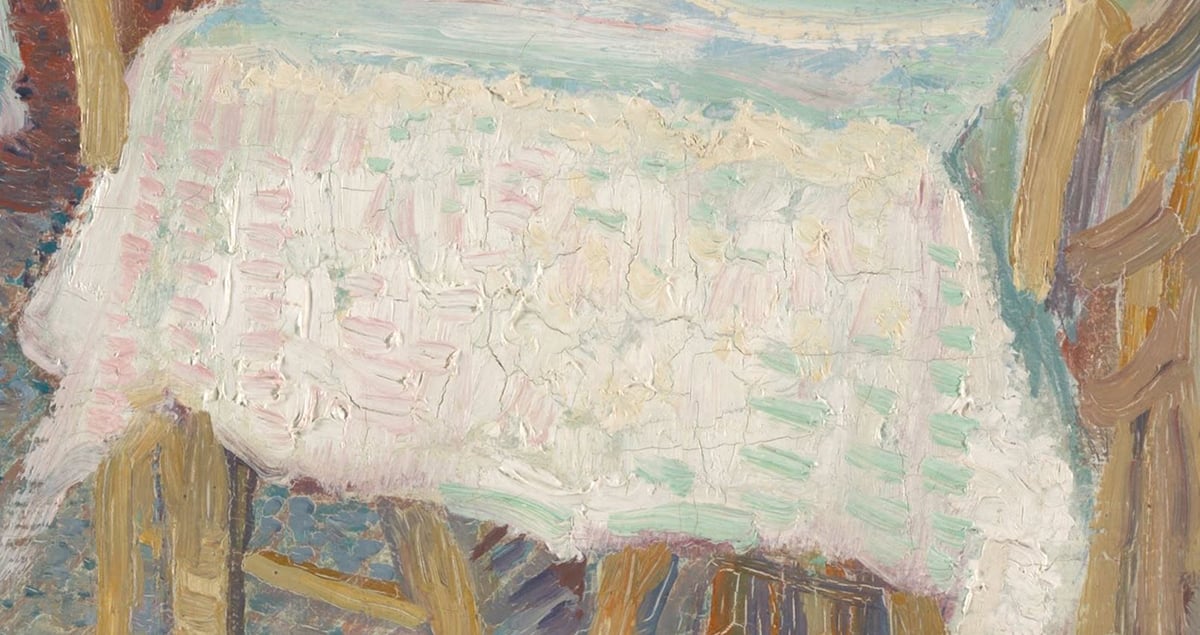
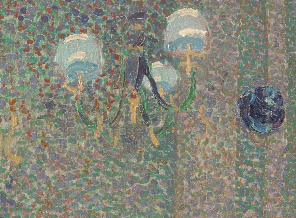
Van Gogh also used more solid brushwork for certain areas, such as the chairs, the painting on the wall, and the light fixture. This adds contrast and gives our eyes a break from all the dancing colors. Also, on a separate point, look at how van Gogh scratched details in the wet paint (refer to the close-up below). This is why it pays to look at paintings up close. You get to see all these tiny details that might otherwise elude you. Van Gogh was certainly not limited by technique; he did anything necessary to convey his ideas, whether that be scratching, dabbing, swirling, flat strokes, scumbling, and so on.
Compressed Values and Dark Accents
Below is the painting in grayscale:
Most of the colors are compressed around the middle to light gray value range. This makes the painting appear flat without color. It’s different to say, a painting by Rembrandt that utilizes a full value range from stygian blacks all the way up to brilliant highlights.
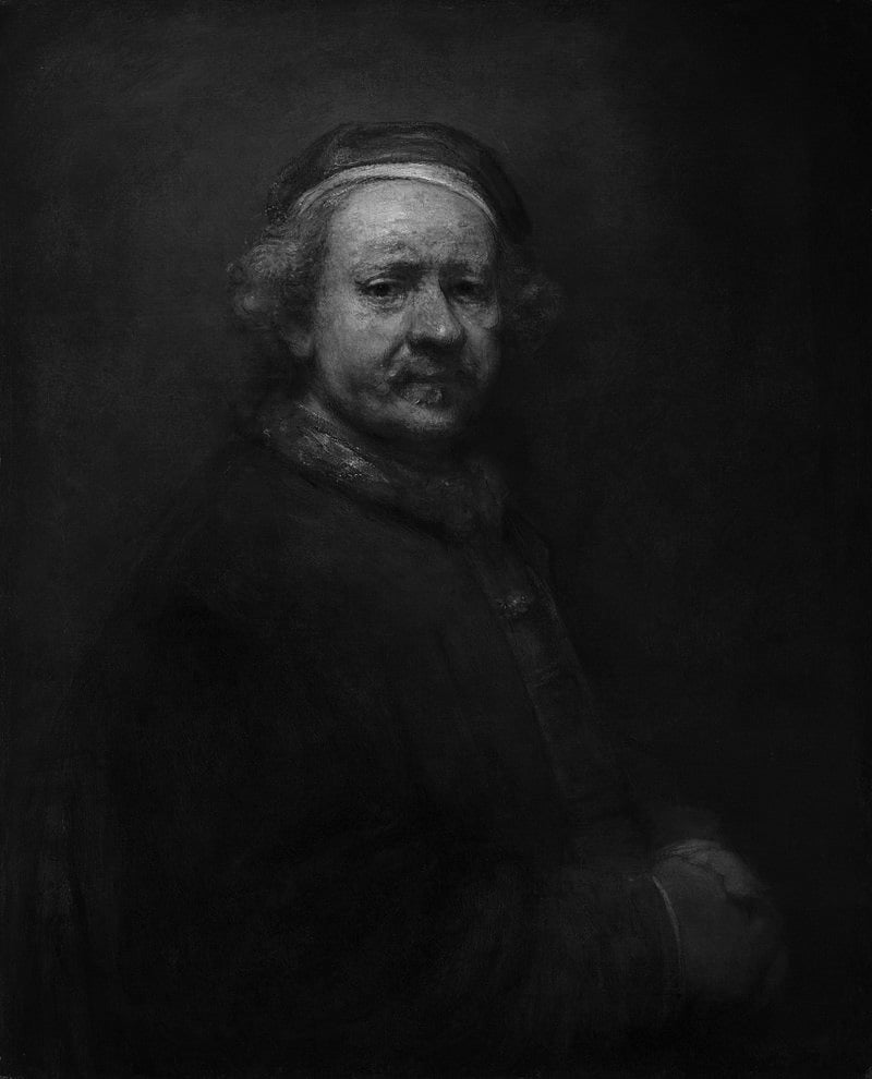
That’s the downside of using more color in a painting—it comes at the expense of the full value range. Unfortunately, you cannot paint with both the color of van Gogh and the drama, light, and shadow of Rembrandt. There’s always a trade-off.
There are two dark accents outside of the compressed value range. These act as small exclamation points that draw our attention and provide contrast for the lighter colors. This pairing of compressed values plus dark accents is one of my go-to strategies.
Other Readings
A Closer Look at Grass and Butterflies by Vincent van Gogh
A Closer Look at Café Terrace at Night by Vincent van Gogh
A Closer Look at The Starry Night by Vincent van Gogh
11 Interesting Facts About Vincent van Gogh
Want to Learn More?
If you want to learn more, you might be interested in Composition Breakdown. You’ll explore other great paintings and why they work.
Thanks for Reading!
Thanks for reading! What are your thoughts on the painting? Feel free to share in the comments.
Happy painting!
Dan Scott

Draw Paint Academy


I love this post and love this painting now! I hadn’t seen it before this. The way you showed and examined close up details was wonderful. The colors and textures Van Gogh created here are one of a kind. I enjoy the pointillism in this painting. Thank you for this!
I loved the “oddities of perspective”. If everything was painted in perfect perspective I think it would have lost a lot of it’s charm and visual interest. It’s a reminder that sometimes it’s good to bend or break an artistic “rule”. I especially like the light fixture, while most of the painting appears to be painted looking straight out into the restaurant, you can tell he looked up at the light fixture and painted it as he saw it from that perspective instead. I think by doing this it also makes you feel like you are really sitting down at a table in this restaurant and not just observing the scene at a distance.
Thanks for your essays. Always something new and interesting to look at in paintings after reading them.
This is such a late reply. Sorry. Holidays interrupted my thoughts about Art. But it was a much needed break and my head is clearer. Some pointillism works and is beautiful. I don’t feel that way about this one. Usually I like the sparkle it gives to Van Goghs, kind of broken color on steroids! As in his “Grass and Butterflies”. Just my preference.
Thank you Dan for letting me know about this great paint of Van Gogh.
Everything l wanted to say is captured in the other comments.it was such a pleasure to see this painting and your analysis of it.
I usually cannot look at pointillism as it confuses my brain and l become the equivalent of sea sick. However as van G.has combined this technique with several others l find it restful and quiet. Thankyou so much, such a pleasure to listen to your discoveries.
Thanks, Dan for this post. I never saw this painting before, and you made a great explanation about composition and painting method. I love Van Gough and his paintings! Thank again for sharing your skills!
Wonderful Dan . I love your informative thought-provoking posts.
Thank you for everything during the year.
Merry Christmas to you and your family and health and happiness in 2023.
Amazing analysis! Gives a new perspective to look at this painting. Thank you!
Thanks, Dan. As always you did an excellent job with the review. I can appreciate Van Gogh’s genius so much more through your eyes!
Thank you for this valuable analysis of Van Gogh art. I had never seen this particular painting, it is a pleasant scene. Your in-depth critique motivates me to work harder in my own art work. Thanks for all your research!
Great analysis. I love the impressionists the most and also loved it when you pointed out the pointillism. Seurat was the master of it.
Van Gogh has a very interesting style before he chopped off his ear. I love his cafe terrace at night and his starry night.
Thank you Dan for this Valiosisima Information . Van Goth always capt my attention for his realism and because his huge inspiration , that makes me think his big secrete it was that he believe in himself , I had the pleasure to read ones of the books that has been wrote about him and his life , and it was very painful , no one believe on him , but Theo and Himself . This is a wonderful paint , never I saw before ; I congratulate you by you big Analisis of each of the details , and you big capacity for explain all of it . Thank you again .
I definitely was able to
See more & better as the result of your analysis.
Thanks
Thanks again for a wonderful lesson. My entire art lessons of famous painters comes from you. You have really opened my eyes.
Thank you so much for all your thorough research. I just love any information about Van Gogh especially the Painting Techniques used in his Paintings. For my future in Painting (it’s only a Hobby for me). I will get more involved!!!!
Thank you again for your knowledge and inspiration.
Delightful Dan. Thank you. Inspiration for this fledgling artist to go forward.
Started my day off with a smile and excited to go forward. Thank you again,
CJLewis
Thank you for your as always thought provoking analysis. Just one word in answer to your you can’t have the colours of Van Gogh AND the drama and light and shadow of Rembrandt. Caravaggio.
Thank you for the very interesting information
I’m not sure about that. Having seen Carravagio’s paintings in Italy, he’s stays with his classical dark backgrounds only he uses his lights so fantastically. But he is a very different painter to Rembrandt and does use a wider range of colours.
That painting of Van Gogh’s when I first saw it, I thought it was Vuillard or Bonnard. It’s very beautiful.