
Let’s take a closer look at Claude Monet’s Poplars series. I’ll cover:
- Key Details
- Light and Color
- Composition
- Brushwork and Technique
- My Favorite From the Series
- Other Monet Series
- Poplar Paintings by Other Artists
- Key Takeaways
- Additional Resources
- Want to Learn More?
- Thanks for Reading!

I’ll walk you through the entire process using one of my recent paintings. You’ll see how I go from idea all the way through to reflecting on the finished painting.

Key Details
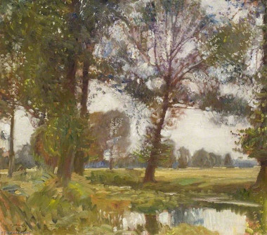
Monet painted the Poplars series in 1891 and 92. He did paint poplars on a few earlier occasions. The first was Meadow with Poplars painted in 1875. Another was Poplars in the Sun, 1887 (shown below). These early paintings are not part of the Poplars series, but they might have seeded the idea.

The series contains 24 paintings that depict a group of poplars that lined the Epte River in France. Unfortunately, there are limited records of the series and I could not locate photos of all the paintings. By now, those that survive must be scattered all over the world.
He painted the series immediately after his Haystacks series and immediately before his Rouen Cathedral series. It’s worth taking a look at this timeline of Monet’s work around this period. It shows how interested he was in the idea of painting the same subject over and over again in varying conditions. He painted series after series for the latter part of his career in his efforts to faithfully capture light on canvas.
To paint the series, Monet rented a boat to get to the location. He may have painted from the boat itself, as he had done on previous occasions (see his painting, The Studio Boat from 1876), or he might have painted from the shore. I like to think he painted from the boat. In any case, these poplars must have caught his eye. Boating to this location with all your supplies and painting from the boat or shore is no easy task.
Monet was also confronted with the issue of the poplars being sold and chopped down whilst he was painting the series. He reached an agreement with a local wood merchant to jointly purchase the poplars at auction on the basis they would remain standing for as long as Monet needed. He was in the prime of his career so he had the commercial means to do things like this.
Monet painted the series knowing it was to be exhibited by Paul Durand-Ruel in 1892, who paid Monet in advance. Monet used the funds to purchase his Giverny home, which would go on to become his chief inspiration and passion and the basis for his most prolific series, Water Lilies. We perhaps owe it to Durand-Ruel that we are here appreciating Monet’s work today. Were it not for his support both as an art dealer and as a friend, Monet and many of the other Impressionists may not have been able to paint for as long as they did.
Light and Color
The series may depict poplars, but it’s really about light and color and the relationships between them. The poplars were merely the vehicle for Monet to explore these elements.
Monet was clearly fascinated by the idea that the same subject can look wildly different under different conditions. A subject will look different on a clear, sunny day compared to a moody, overcast day. The subject doesn’t change, our perception of them does.
Keeping the subject constant allowed Monet to narrow down on the changes in light and color under varying seasons, conditions, and times of day. Below are some examples of this from his Poplars series. Take note of how unique each painting is despite the subject being roughly the same. When you approach the world with Monet’s curiosity, you’ll never be short of something to paint!
Tip: If you want to focus on a certain element in a painting, try keeping the other elements constant. Monet kept the subject constant so he could better focus on light and color. Another example might be to keep the color constant by painting in monochrome. This would allow you to focus more so on composition and design.
Different Seasons
As Monet painted this series day-in-day-out for over a year or so, he got to see the poplars throughout different seasons. He dedicated a few paintings in the series to represent seasonal changes. Below is his summer version. It’s glimmering and fresh and pleasantly balanced as you would expect from a warm summer’s day. Everything is bathed in light and the shadows are relatively cool.
Tip: A painting’s name can provide hints as to what the artist was focusing on and how they want us to percieve the artwork. In this case, the painting’s name suggests Monet was focusing on seasonal changes in light and color.

Below is Monet’s spring version. It’s soft and warm and feels like spring.

And here is an autumn version. The leaves are full of warm yellows, oranges, and reds. The sky is light and tinted with yellow. The greens along the shore are rich and dark and act as a point of contrast for the surrounding warm colors.
, 1891")
Different Conditions
Some paintings in the series tell the story of different conditions, like Poplars, Wind Effect (below). It’s an overcast day. The light is diffused by the clouds and the sky is muted and gray. The lights are relatively cool compared to the darks. The greens are rich and saturated. And notice how Monet’s curved brushwork suggests the windy conditions. You can really feel the wind’s pull against the leaves, branches, and grass.

Below is another overcast painting, Three Trees in Gray Weather. The colors here are more pronounced and there’s a warmer color theme. When painting overcast scenes like this, you can greatly change the overall appearance and ambience of the painting with a slight change in the temperature of the grays. A landscape in a warm gray will have a different feel to the same landscape in a cool gray.

Different Times of Day
The most obvious changes in light and color can be seen throughout the day. Poplars at the River Epte (below) depicts a clear, sunny day. Crisp clouds and blue sky are woven between the dark green poplars and land. The contrast is sharp, which suggests the strong midday overhead and to the front of us.
Interestingly, we tend to see less color under conditions like this with a strong light source out in front. The colors get lost in glaring light or deep shadows. But the striking contrast can make for a great subject. I first learned about this from the late Richard Schmid in his book Alla Prima II.

In Poplars, Evening Effect, Monet leaned into the blues, made the sky a touch lighter and more turquoise, and reduced the clarity. It’s not easy capturing the subtle nature of an evening.

Dealing With Changes in Light
The main challenge Monet faced in painting this series was the fleeting nature of the environment. He was only able to paint on a single canvas for about seven minutes before the light changed (source: Philadelphia Museum of Art).
Monet’s solution was to paint several canvases at once. He would return to the same spot day after day and work on the canvas that matched the conditions. When the light changed, he swapped to a different painting.
The simplicity of the compositions played well into this strategy. It allowed Monet to easily swap between paintings without having to completely re-adjust his mindset and strategy. The only thing he had to worry about was light and color.
One solution is photography. Instead of painting completely on location, you could use photos and paint in the studio at your own pace. But this was not as much an option for Monet as cameras were primitive compared to what we have today. And cameras, no matter how far they have come, are no substitute for what our eyes can do. A happy medium that works for me is to combine small color studies done on location with photos and work in the studio. This seems to give the best of both worlds.
Composition
The series has four simple compositions. One group has a line of many trees in the front and an S-shape of trees in the back. One group takes a closer perspective, with three trees in the front and the S-shape in the back. One has a group of trees forming a triangular formation. And one has a zig-zag formation.
In each variation, the poplars are arranged with a strong sense of rhythm and repetition. This contrasts against the unpredictable and untamed qualities of nature itself.
In the painting below, there are a few key composition elements:
- The row of trees in the front and their sense of rhythm and repetition.
- The snaking pattern of the treetops.
- The strong horizontal shape that represents the land and acts as an anchor for the composition.
Also, notice how the trees at the front are dark relative to the light-orange trees snaking off into the distance.

Here’s a different variation in the series. The poplars and their reflections form a rough triangular shape. And there’s an interesting play between the poplars (positive space) and the gaps exposing the sky (negative space).

There’s an interesting relationship between the strength of the compositions and the level of value contrast. The paintings with more value contrast (a bigger gap between light and dark) appear stronger in terms of composition, pattern, and repetition than those with less value contrast.
You can see what I mean with the two paintings below. For each painting, I provide a full-color, grayscale, and notan image. A notan being the most basic abstract design of lights and darks. The first painting has strong colors and a sharp contrast between light and dark. This is reflected through the grayscale and notan images. The composition is strong and concise.
")
")
This painting, on the other hand, has glimmering lights and weak shadows. The colors are stunning, but without color, the composition is weak and lacks foundation. This shows through the grayscale and notan.

")
")
Brushwork and Technique
I’m unsure how Monet painted, but there are hints in his paintings and history.
The first hint comes from the way Monet painted the series. He painted on location for over a year or so. He swapped between paintings to suit the environment at the time. The knowledge rules out a strict alla prima or wet-on-wet approach. Monet would have only been able to partially complete the painting wet on wet before the light changed. The rest of the painting would have had to be done wet on dry.
The closeup below confirms this. Notice the dark greens scumbled over the top. The broken color and lack of blending suggest a wet-on-dry approach was used for parts of this painting (but I could be wrong!).
")
In the two closeups below, Monet used thick paint to reiterate the lights. He also used his brush to reiterate the general shapes and forms (particularly with the clouds).
")
")
Notice the dark accents that give the trees form and meaning. Instead of painting every single detail, Monet laid down a foundation to set the general structure, then used dark accents and dabs of blue for the sky to do the rest of the work. Also, notice the weaker tones of blue and the small gaps through to the blank canvas.
")
The bottom of this painting (below) provides us with some great insight into Monet’s process. See the bare canvas around the edges. This tells us that Monet painted in a direct manner, rather than painting with thin washes of color. I imagine he did not use much paint thinner or additional medium, but that’s just speculation.
")
My Favorite From the Series
Monet would have intended for the series to be viewed and appreciated as a whole, but if I had to choose a favorite, it would be Poplars, Pink Effect. The high-key color theme gives the painting a soft, glimmering appearance. It also softens the otherwise abrupt sense of repetition and pattern.
Other Monet Series
Below are some of the other series Monet painted:


Poplar Paintings by Other Artists
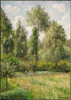
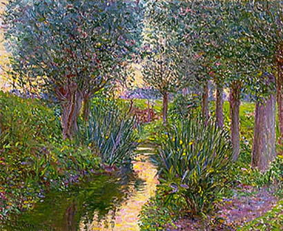
Here’s a gallery of poplar paintings by other artists including Camille Pissarro, Vincent van Gogh, and more. It’s always interesting to see how different artists interpret and convey a similar subject.


Key Takeaways
- Sometimes, you need to go to great lengths to paint great subjects. In this case, Monet rented a boat to get to the poplars and purchased them at auction to ensure they were not chopped down before completing the series.
- You can use color to convey different seasons, conditions, and times of the day.
- Painting the same subject over and over again allows you to narrow down on the changes in light and color.
- Strong value contrast can strengthen a composition. The poplar paintings with a strong value contrast also have a stronger sense of pattern, rhythm, and structure than those with a weak value contrast.
- Closeups of a painting can provide hints as to how it was painted.
- My favorite from the series: Poplars, Pink Effect.
Additional Resources
European Masterpieces – Monet, van Gogh, Rubens, Velázquez, and More
How to Paint like Claude Monet
A Closer Look at Impression, Sunrise by Claude Monet
A Closer Look at The Poppy Field by Claude Monet
A Closer Look at Woman With a Parasol by Claude Monet
Want to Learn More?
You might be interested in my Painting Academy course. I’ll walk you through the time-tested fundamentals of painting. It’s perfect for absolute beginner to intermediate painters.
Thanks for Reading!
I appreciate you taking the time to read this post and I hope you found it helpful. Feel free to share it with friends.
Happy painting!
Dan Scott

Draw Paint Academy


Cant tell you how much I appreciate your writing. As a late bloomer to art appreciation I have learned so much from your work. Thank you. Hope other works are in the process.
Thanks Dan for this interesting and informative article about Monet.
Love Monet and especially enjoyed your interesting article! Thanks so much! I
Thorough, absorbing and engaging. Thank you
Thank you so much for the article. Monet is my idol, he is the God of color. The poplar series is the strongest in my eyes because of the vertical composition holding everything together and leaving the freedom to concentrate on the changes in atmosphere by small changes in the composition and huge changes in color and brush work.
I take home from your article the thought to try more to work on the same composition with changes of color and mood, like in one of the exercises you suggested in your “Landscape Painting Masterclass”
Thank you for providing a greater understanding of painting through the poplar works of Monet.
Thanks once again Dan, I have read several books about Monet but your analysis makes Monet seem very special. Would you mind if I share some of your work on our art group newsletter?
Of course not! Thanks Norm.
Thank you for providing a clear explanation of Monet’s process in painting this series. Excellent suggestions for how we can apply this process.
Appreciated this in depth analysis. Thank you.
Excellent and so helpful! I’m committing to a series of waves (Lake Superior). This was just the inspiration I needed….
Awesome conversation! Thank you, Dan
As a art history student in college, I loved your analysis of Monet. Especially the brush stroke comments. I also work with poplar every day making picture frames.
Did you know that there was an impressionist with a greater eye than Monet? His name is Henry Hensche. He was a student of Charles Hawthorne of Provincetown, Mass. Relatively unknown, he was one of the greatest colorists in American Art History! Check out some of his work online.
I just looked up his work. Love it. Thanks for letting me know. Might write about him one day. Cheers!
I found this very informative and interesting.
This was an excellent newsletter. I’m looking at Monet in a different way.
I have seen many Monets living here in Chicago which has one of the largest collections, plus several exhibits, and a trip to Giverny and the Monet Museum in Paris.
But, as always, your critiques surpass all other information.
I lived in a house where the yard was surrounded by poplars, and the only element that cannot be described is the sound of the leaves in a breeze.
Thank you.
r the art education. I like the Poplars, Pink Effect also. I will reread this article many times to absorb concepts.