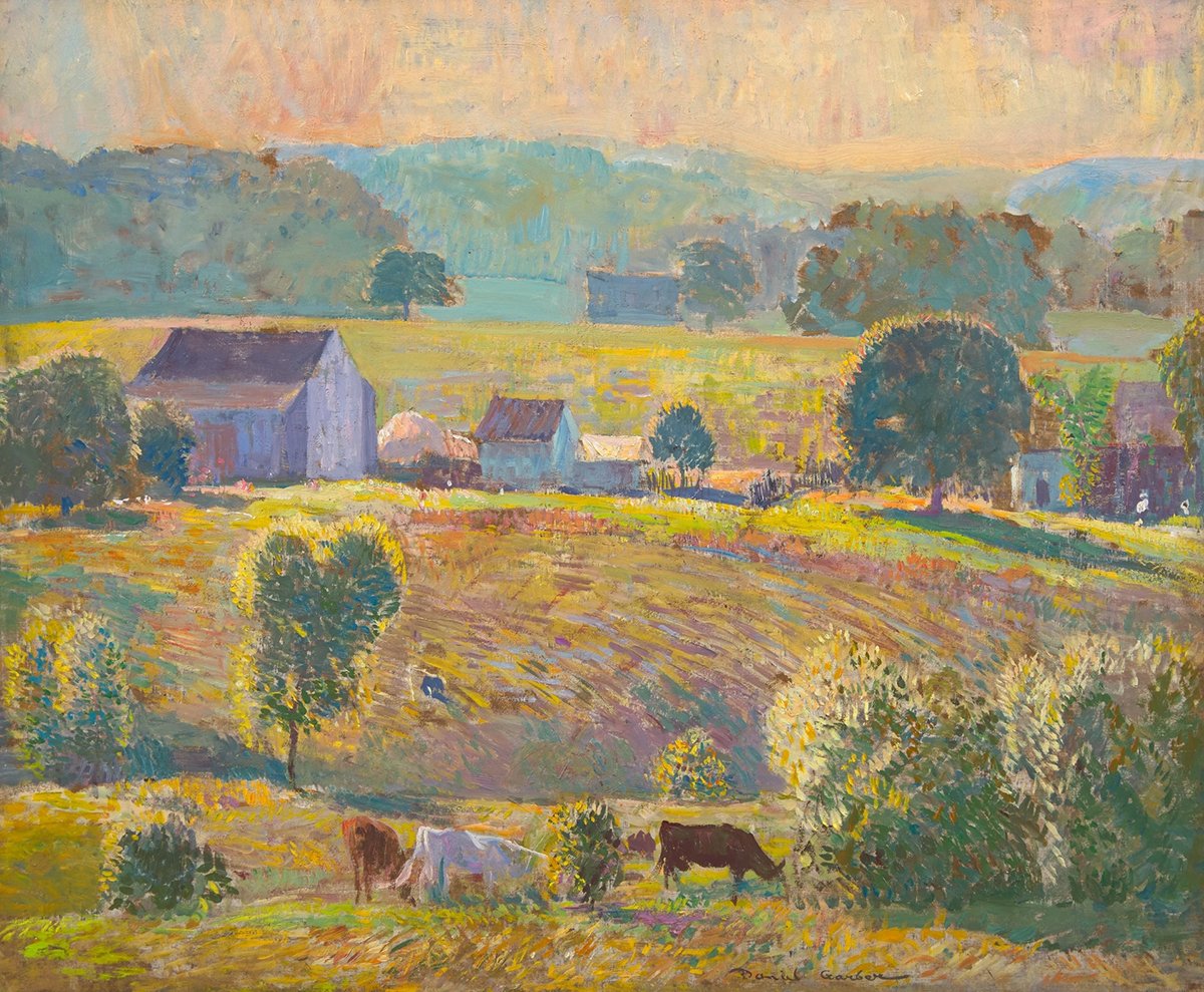
Let’s take a closer look at this stunning landscape painting by Daniel Garber titled September Morning. I love Garber’s work. He had a unique, peaceful style. This one caught my eye the other day with its crisp colors, rolling hills, and brilliant yellow sky.
(If you enjoy learning about beautiful art and master artists, you might also be interested in my Exploring the Masters email series. It’s free to join.)
Matching Brushwork to the Subject
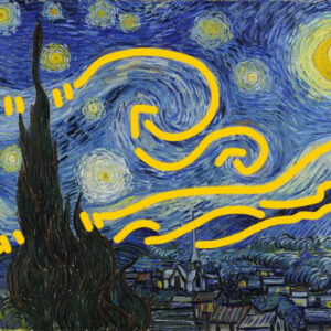
This painting is a great demonstration of matching brushwork to the subject. For the rolling hills, Garber used long, directional strokes to reiterate the contours. Notice how his strokes follow the contours up, over, down, and around. Vincent van Gogh did a similar thing, though more prominently.
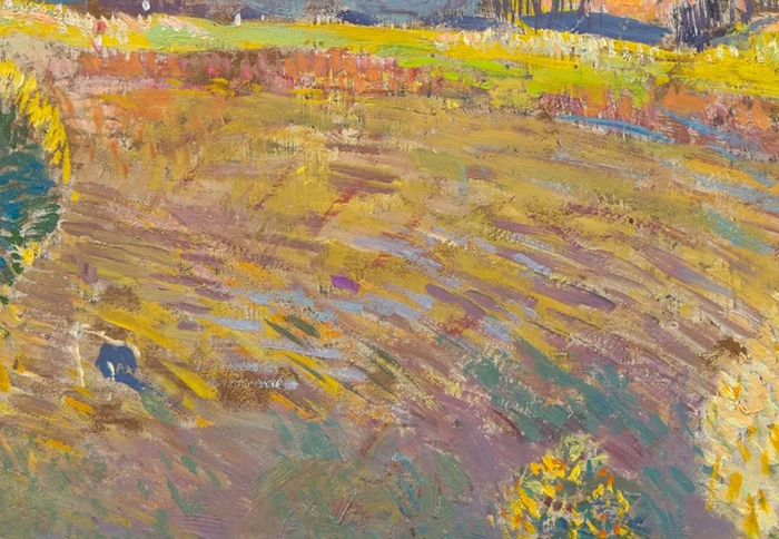
For flatter areas of land, he used flatter and more static brushwork.
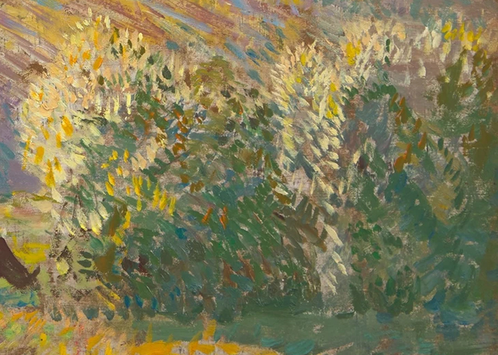
For the grass at the bottom, he used more vertical, punchy strokes to suggest individual grass strands and clusters. As this area is closer in perspective, we can see the grass with more clarity and detail. His strokes flatten out as the grass and land get further away.

He used similar punchy brushwork for the leaves, with more detail for the lights than the shadows.
For the architecture, he used flat color shapes and more rigid brushwork, with a bit of scumbling to suggest texture. The slightly rough and broken strokes help the buildings fit in with the overall impressionist style of the painting.
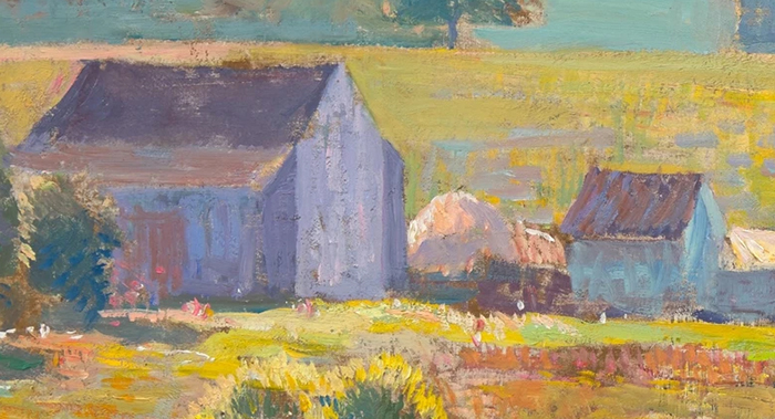
Tip: Matching your brushwork to the subject involves two steps. First, identify the subject’s defining characteristics and nature. Second, use your brushwork to play into those ideas. It’s simple but highly effective.
Compressed Values
Below is a grayscale of the painting so you can see all the different values (how light or dark the colors are). Most of the colors are compressed around the middle to light end of the value scale, plus a few dark accents. This is a tried and true strategy.
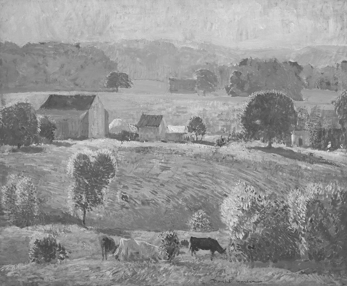
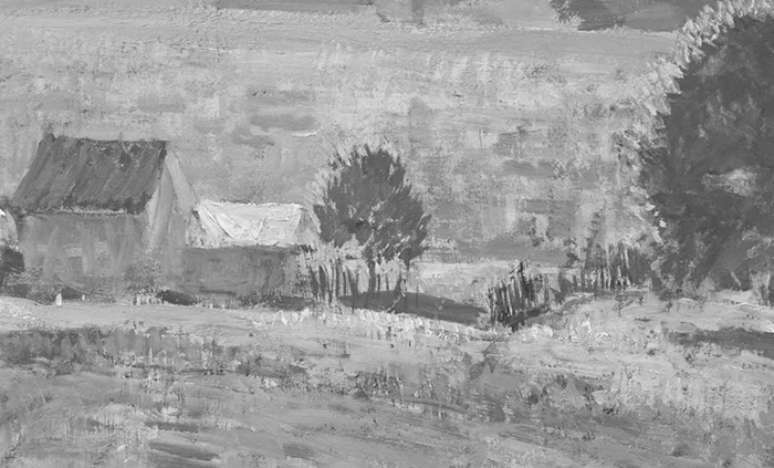
In some areas, Garber painted within a compressed value range and varied the hue and saturation levels. Look at the sky, the distant hills, and the areas of grass in light. By doing this, Garber was able to inject life and variance into the painting whilst keeping the overall value structure simple and concise. To see what I mean, look at the image below showing a closeup of the grass, and the grayscale version below that. The color image is full of life and energy and variance, with subtle shifts between light greens, yellows, oranges, and purples. The grayscale version is comparatively flat and lacks contrast. That’s because value is not a key driver in these light areas; hue and saturation contrast are. It also reveals that the light colors are all roughly similar in value.
Simplification
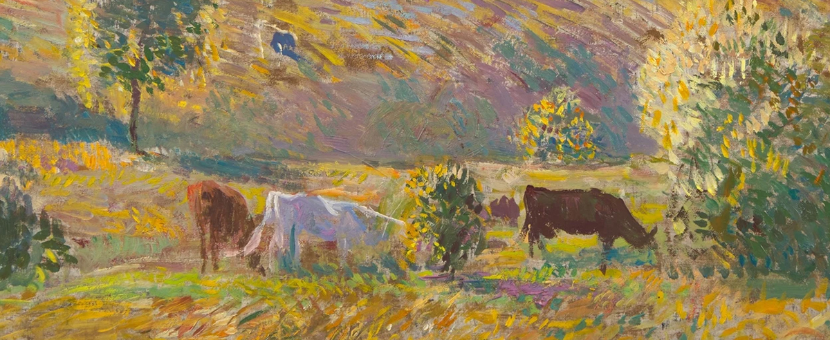
Garber was simplified in his rendering of the cows at the bottom, despite them being quite prominent in the painting. They are basically just light and dark shapes. It’s amazing how much information and realism you can convey by simply getting the lights and shadows right and placing them in the right context. But get them wrong and no amount of flashy and intricate brushwork can save you.
Atmospheric Perspective
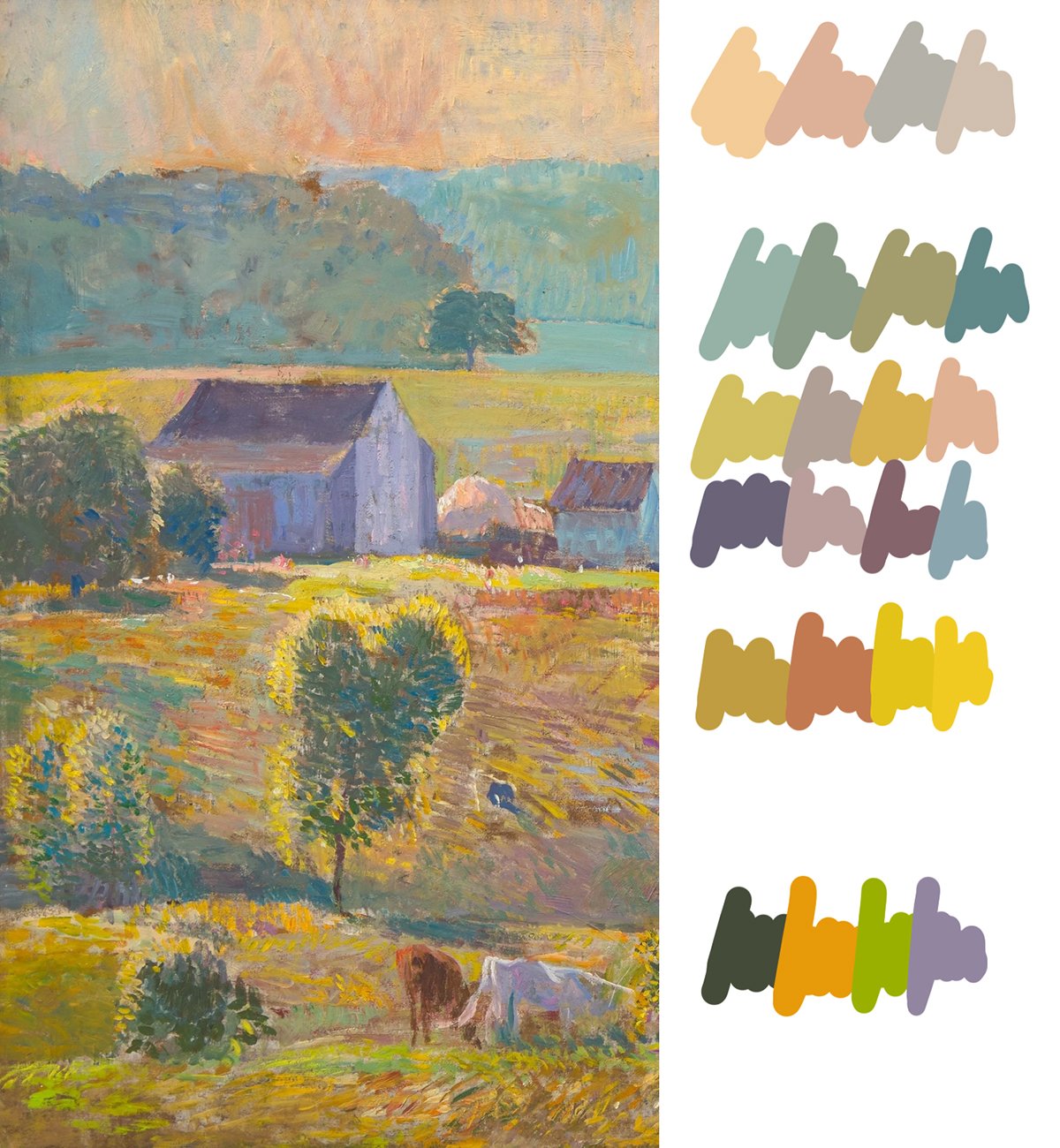
There’s a strong sense of atmospheric perspective, with the colors and contrast getting weaker as everything recedes into the distance (refer to the image below). It’s not a smooth gradation in color. Rather, there are several distinct steps as we jump in perspective from one area to the next. Smooth gradation = flat surface (open seas, flat landscapes, etc.). Step gradation = jumps in perspective (hills, mountains, overlapping objects, etc.)
Busy and Quiet Space
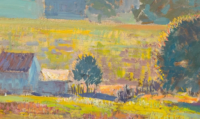
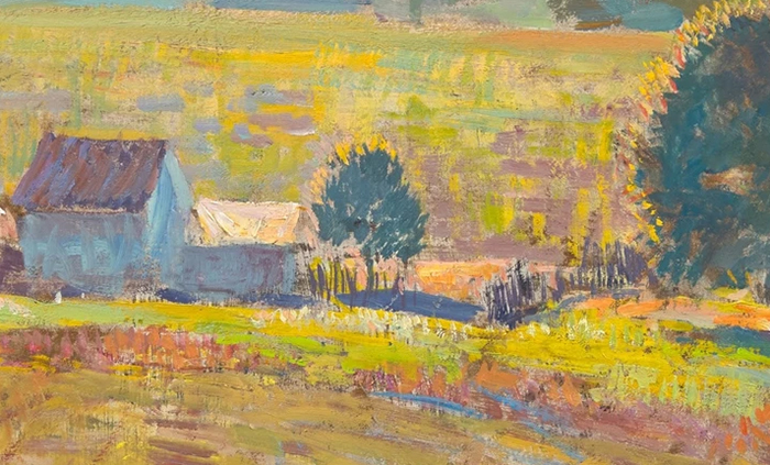
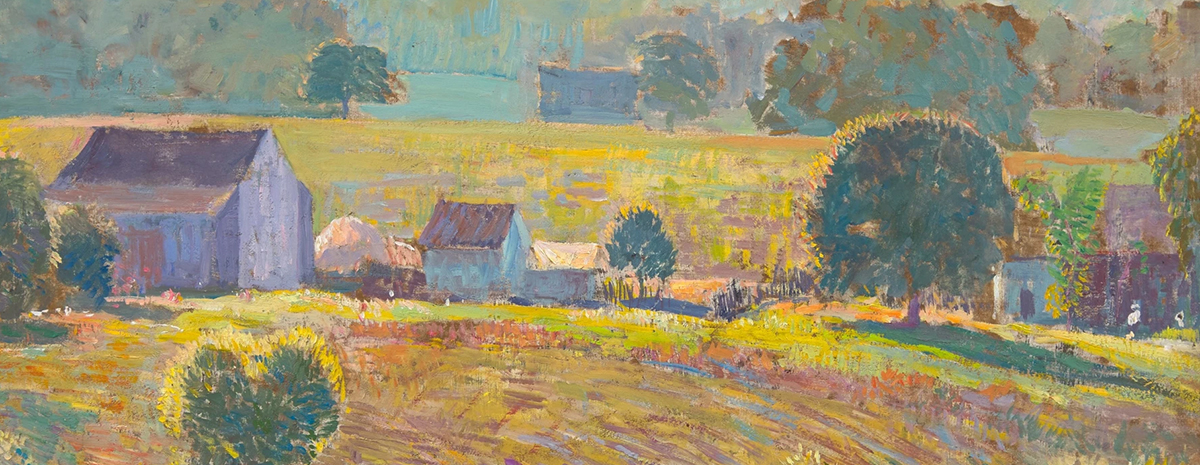
There are several busy areas of concentrated detail and contrast. See the area with the sheds and other structures below—hard edges, bright highlights, dark accents, and intricate brushwork all concentrated in this area. Our eyes bounce between these areas rather than being drawn to a single dominant focal point. The remaining areas are quiet and give our eyes a chance to rest. This mix of busy and quiet space is what makes for a balanced composition. Too much busy space can be overwhelming. Too much quiet space may appear bland and uninviting.
Key Takeaways
- Use your brushwork to reiterate the nature of the subject, as Garber did with his directional strokes for the rolling hills and the short, punchy strokes for the leaves and parts of the grass.
- Painting within a compressed value range allows you to inject life and energy without compromising the overall value structure.
- You can convey a significant amount of information about the subject by simply getting the lights and shadows right and placing them in the right context. The cows in this painting are simple, but they appear realistic at first glance.
- You can use distinct jumps in color to convey atmospheric perspective and jumps in space. In Garber’s painting, notice how the colors change as you go from one hill to the next.
- Quiet areas in a painting are important for giving the viewer’s eyes a rest. Too much busy space can be overwhelming.
Want to Learn More?
If you ever want to learn more, start with my Painting Academy course. I’ll walk you through the time-tested fundamentals of painting.
Thanks for Reading!
I appreciate you taking the time to read this post and I hope you found it helpful. Feel free to share it with friends.
Happy painting!
Dan Scott

Draw Paint Academy

